

Here I give you my top tips on how to make scientific presentations!
This thread is more focused on the content of your slides.
Thread 2 of 2! 🧵
Tweets by @NuriaMelisaMor1
This thread is more focused on the content of your slides.
Thread 2 of 2! 🧵
Tweets by @NuriaMelisaMor1

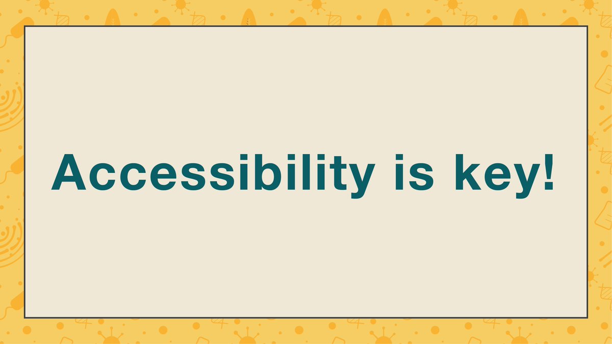
1. Accessibility on your slides is key! Please read my threads on the matter here:
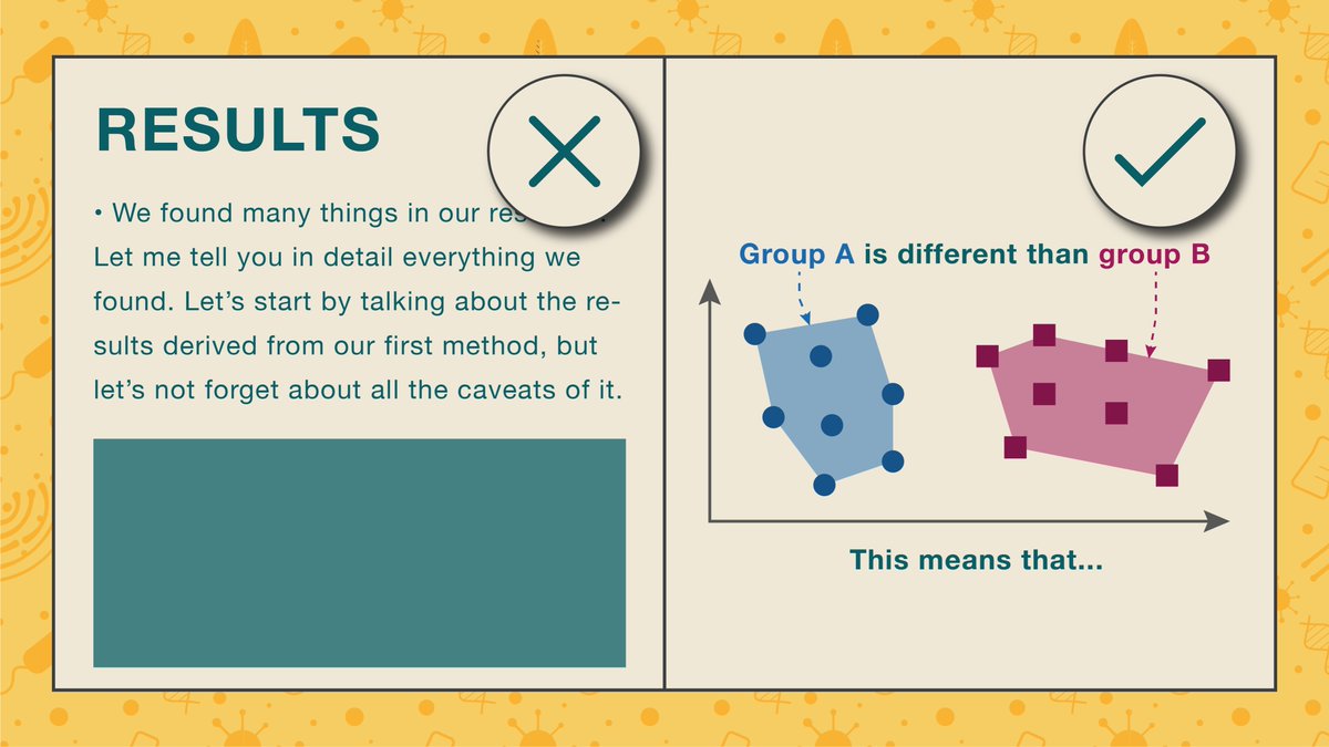
2. Avoid using too much text on your slides!
Don’t include paragraphs.
Bullet points are a good option, but don’t overdo them!
Use labels or descriptive headings instead.
Don’t include paragraphs.
Bullet points are a good option, but don’t overdo them!
Use labels or descriptive headings instead.
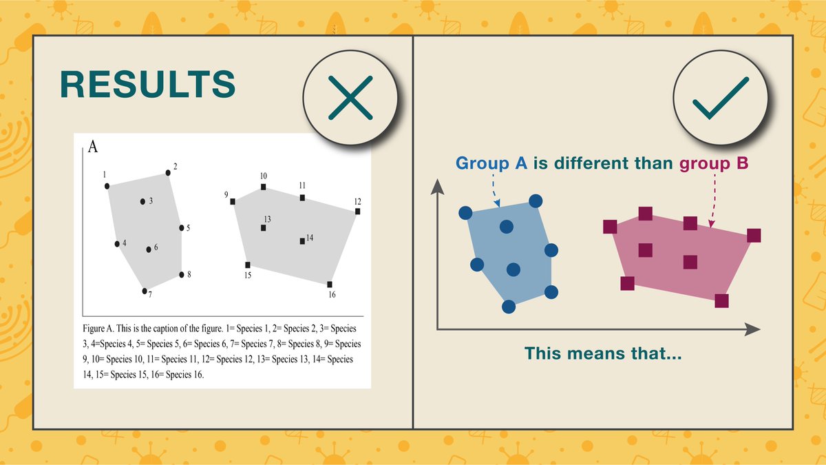
3. As with posters, try to re-draw your plots for PowerPoint.
Plots straight from R or Excel are not necessarily suited for the dimensions of your slide & can be too small to read properly.
Plots straight from R or Excel are not necessarily suited for the dimensions of your slide & can be too small to read properly.
4. Try giving a cohesive look to your slides.
For example, if you are talking about many groups throughout your talk & have multiple plots about them, make sure each has a distinctive look & stick to it throughout. (e.g., group A will always be blue circles)
For example, if you are talking about many groups throughout your talk & have multiple plots about them, make sure each has a distinctive look & stick to it throughout. (e.g., group A will always be blue circles)

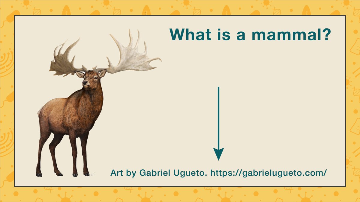
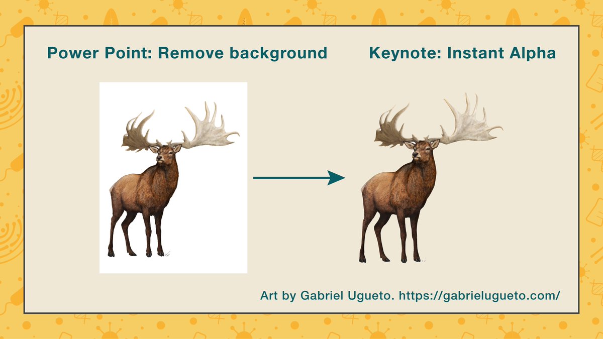
5. Always credit the artist!
It’s often absolutely fine to use someone else’s artwork for your slides, just make sure you credit them! I often add their names and, if possible, their websites.
It’s also ok to reach out to them and ask for permission!
It’s often absolutely fine to use someone else’s artwork for your slides, just make sure you credit them! I often add their names and, if possible, their websites.
It’s also ok to reach out to them and ask for permission!
6. If possible try removing the white background or find images with a transparent background.
Keynote and PowerPoint have a tool to easily remove backgrounds!
If possible, use high-res images.
Keynote and PowerPoint have a tool to easily remove backgrounds!
If possible, use high-res images.
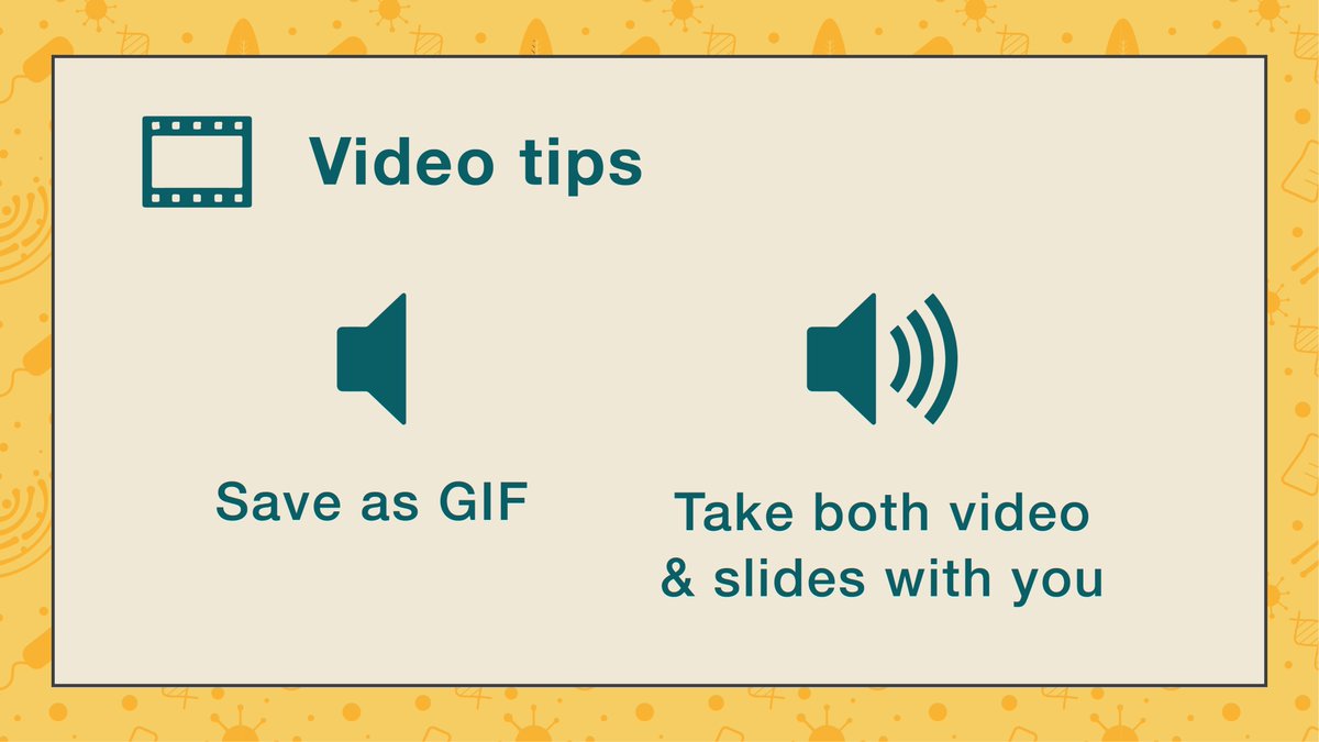
7. If you need to play a video without sound, try saving it as a GIF and add that to your slides.
If it has sound, make sure you save both in the same folder and take both with you to the conference! Otherwise it might not play!
Also, check if it plays in the venue beforehand!
If it has sound, make sure you save both in the same folder and take both with you to the conference! Otherwise it might not play!
Also, check if it plays in the venue beforehand!
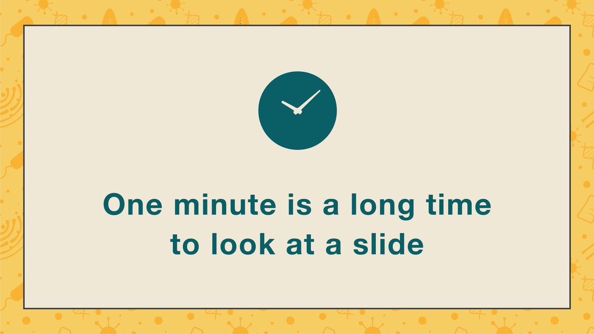
8. Don’t linger too much on a single slide.
Some people say that you should do 1 minute per slide but, personally, I think that’s too much!
Some people say that you should do 1 minute per slide but, personally, I think that’s too much!
However, I understand there’s things like plots you probably want to spend some time explaining in detail.
However it doesn’t mean you slide needs to be static.
Here’s a trick for making such plots more engaging without using the built-in PowerPoint animations.
However it doesn’t mean you slide needs to be static.
Here’s a trick for making such plots more engaging without using the built-in PowerPoint animations.
Say you have a plot that shows four different groups.
Make one slide with said plot. Don’t copy paste an image file of the plot though, draw it in Power Point with the shape tools.
Make one slide with said plot. Don’t copy paste an image file of the plot though, draw it in Power Point with the shape tools.
Copy and paste this slide. Remove one of the groups.
Repeat this process twice more until you end up with a blank plot.
Order them accordingly (blank one first, busiest one last)
Repeat this process twice more until you end up with a blank plot.
Order them accordingly (blank one first, busiest one last)
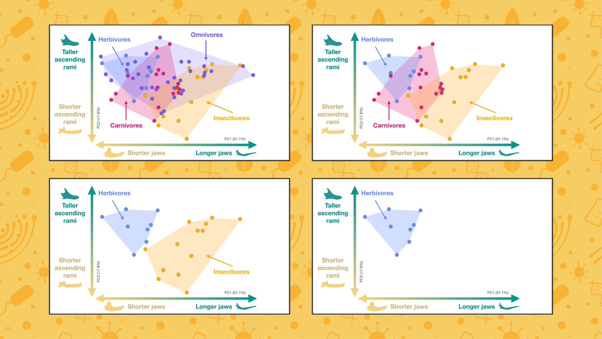
The different groups will start appearing as you move through your slides.
Make sure to sync your speech to said transitions.
Can you see the difference between the two?
Sound on! 🔊
Make sure to sync your speech to said transitions.
Can you see the difference between the two?
Sound on! 🔊

This way:
You don’t have to fiddle with the PowerPoint animations
You keep your audience engaged
And it’s more effective than using a laser pointer
You don’t have to fiddle with the PowerPoint animations
You keep your audience engaged
And it’s more effective than using a laser pointer
You can do the same thing with labels or if, for example, you need to have a table with lots of information you absolutely have to explain.
Hope these threads on making presentations have been useful, if you have any questions comment below & I’ll do my best to answer them!
Loading suggestions...