

TV UX is hard. Which is why it often sucks.
I’ve spent thousands of hours designing experiences for TV platforms.
I’ve distilled 7 core principles that you should follow for better UX on TV 🧵
I’ve spent thousands of hours designing experiences for TV platforms.
I’ve distilled 7 core principles that you should follow for better UX on TV 🧵
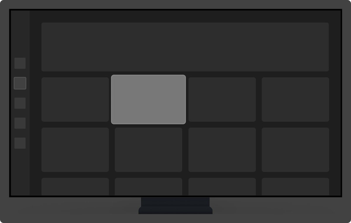
#1 Focus.
At every point in the experience, it should be extremely clear which element you are focused on.
You can use color, shape, size, and shadow to indicate focus. Always define default focus when landing on any screen.
At every point in the experience, it should be extremely clear which element you are focused on.
You can use color, shape, size, and shadow to indicate focus. Always define default focus when landing on any screen.
#2 Direction
TV input is usually 4-directional (D-pad). It should always be clear where your focus will move in each direction.
Keep in mind that focus on TV is one-dimensional (you can’t have status bars / sticky CTAs) and linear (everything is one step at a time)
TV input is usually 4-directional (D-pad). It should always be clear where your focus will move in each direction.
Keep in mind that focus on TV is one-dimensional (you can’t have status bars / sticky CTAs) and linear (everything is one step at a time)

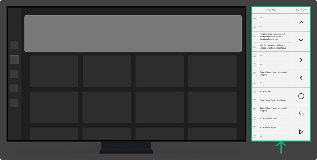
#3 Input
Your user can press any of the buttons on the remote at any point.
You need to define what happens in all those cases. Use the handy table below to define your remote interactions on all unique screens & states.
Your user can press any of the buttons on the remote at any point.
You need to define what happens in all those cases. Use the handy table below to define your remote interactions on all unique screens & states.
#4 Feedback
TV is a media consumption platform with simple button inputs, so it’s extremely conducive to sound feedback, which adds an extra layer of clarity and delight.
Add an extra column to your remote actions table to document sounds.
TV is a media consumption platform with simple button inputs, so it’s extremely conducive to sound feedback, which adds an extra layer of clarity and delight.
Add an extra column to your remote actions table to document sounds.
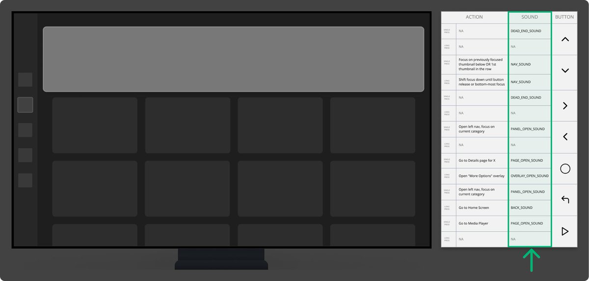
Remember that sounds can be triggered by both the user (button presses) and the system (notification/success/error). You need to document both.
#5 Density
TVs are not made to consume dense and text-heavy information.
A good rule of thumb is that each screen / module should be focused on one thing.
If you have a lot of info to communicate, either split it up or offload it to other mediums (desktop/ mobile).
TVs are not made to consume dense and text-heavy information.
A good rule of thumb is that each screen / module should be focused on one thing.
If you have a lot of info to communicate, either split it up or offload it to other mediums (desktop/ mobile).

Keep in mind that TV set-ups and usage contexts are a lot more varied than mobile / desktop in terms of distance from the screen, screen sizes, angle, etc.
Lower density is always a safer bet to accommodate more contexts.
Lower density is always a safer bet to accommodate more contexts.
#6 Purpose
TVs are used mostly for media consumption or gaming. Depending on the input method, typing on TV is a huge chore.
Offload logins / forms / other complex interactions to mobile whenever possible.
TVs are used mostly for media consumption or gaming. Depending on the input method, typing on TV is a huge chore.
Offload logins / forms / other complex interactions to mobile whenever possible.

#7 Design Process
Most designers rarely look at their TV designs on the actual TV, mostly reviewing in their design tools on desktop.
Throw your designs on TV as often as possible to evaluate sizing / density / contrast / clarity from different distances.
Most designers rarely look at their TV designs on the actual TV, mostly reviewing in their design tools on desktop.
Throw your designs on TV as often as possible to evaluate sizing / density / contrast / clarity from different distances.
Dynamic prototypes are the best for testing your designs on TV
An obvious disclaimer is that no principle is one-size-fits-all.
There are exceptions to all them, but they provide good guidance in most cases.
(Gaming UX has the most exceptions here and has its own set of unique principles)
There are exceptions to all them, but they provide good guidance in most cases.
(Gaming UX has the most exceptions here and has its own set of unique principles)
If you found this helpful, follow me at @young__mete for more UX threads.
Have thoughts or questions? Let me know👇🏼
Have thoughts or questions? Let me know👇🏼
Loading suggestions...