

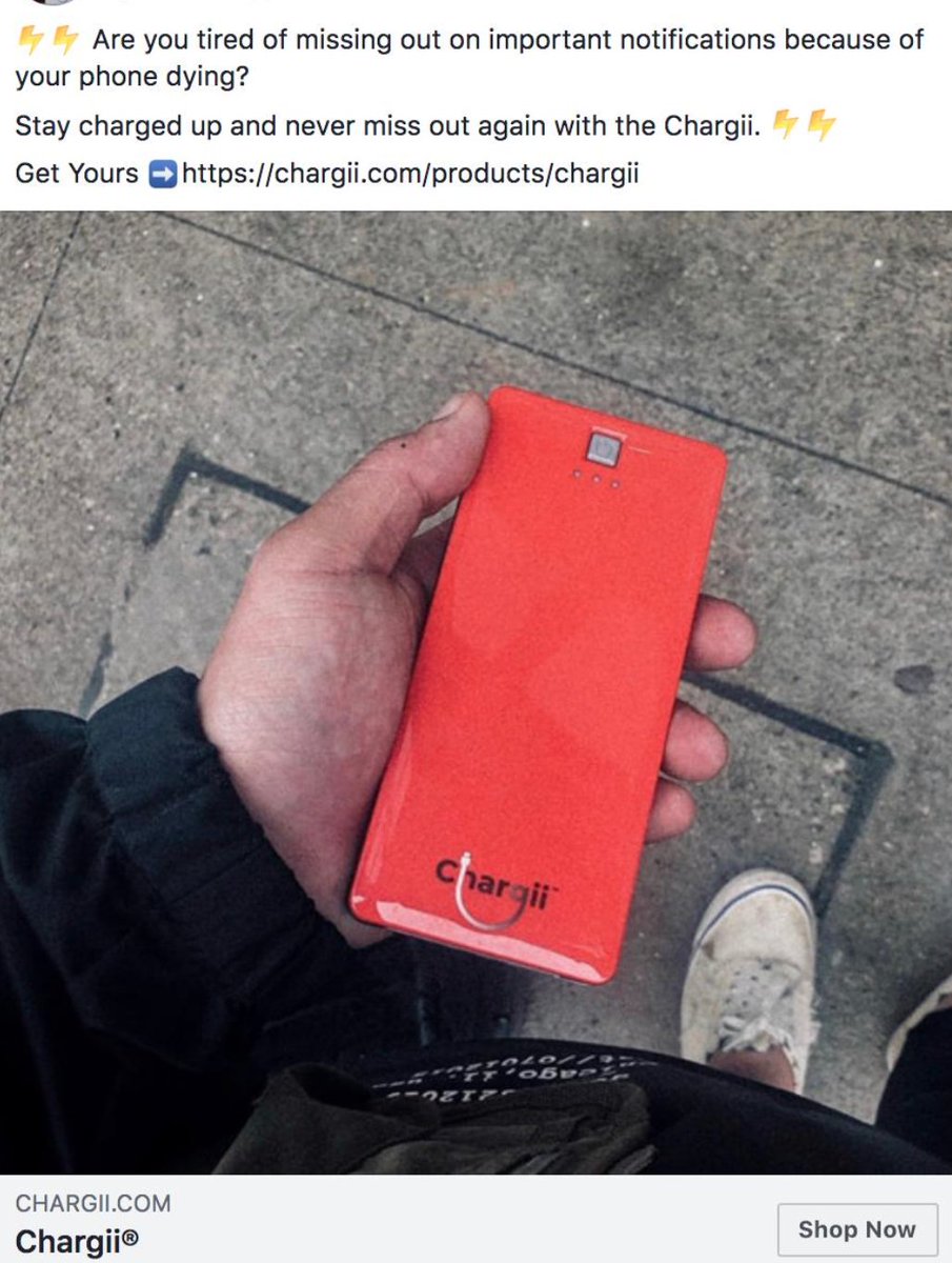
I have no big issue with the image or the text, they could definitely convert.
However, I do have an issue with the headline.
Having just the name of the store is not a good approach.
"Chargii, The World's Strongest Charging Bank"
Something like this would work better.
However, I do have an issue with the headline.
Having just the name of the store is not a good approach.
"Chargii, The World's Strongest Charging Bank"
Something like this would work better.
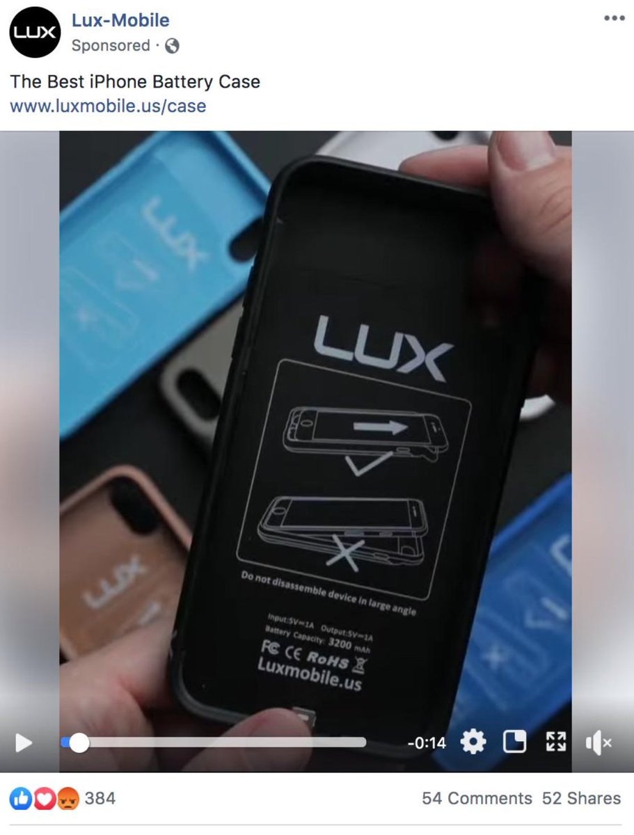
I've heard of Lux before and know they are a pretty large brand which is why I'm surprised with this ad.
There is no headline or call to action button.
Which makes me think they are just boosting a post which just doesn't make sense to me, especially for a company like them.
There is no headline or call to action button.
Which makes me think they are just boosting a post which just doesn't make sense to me, especially for a company like them.
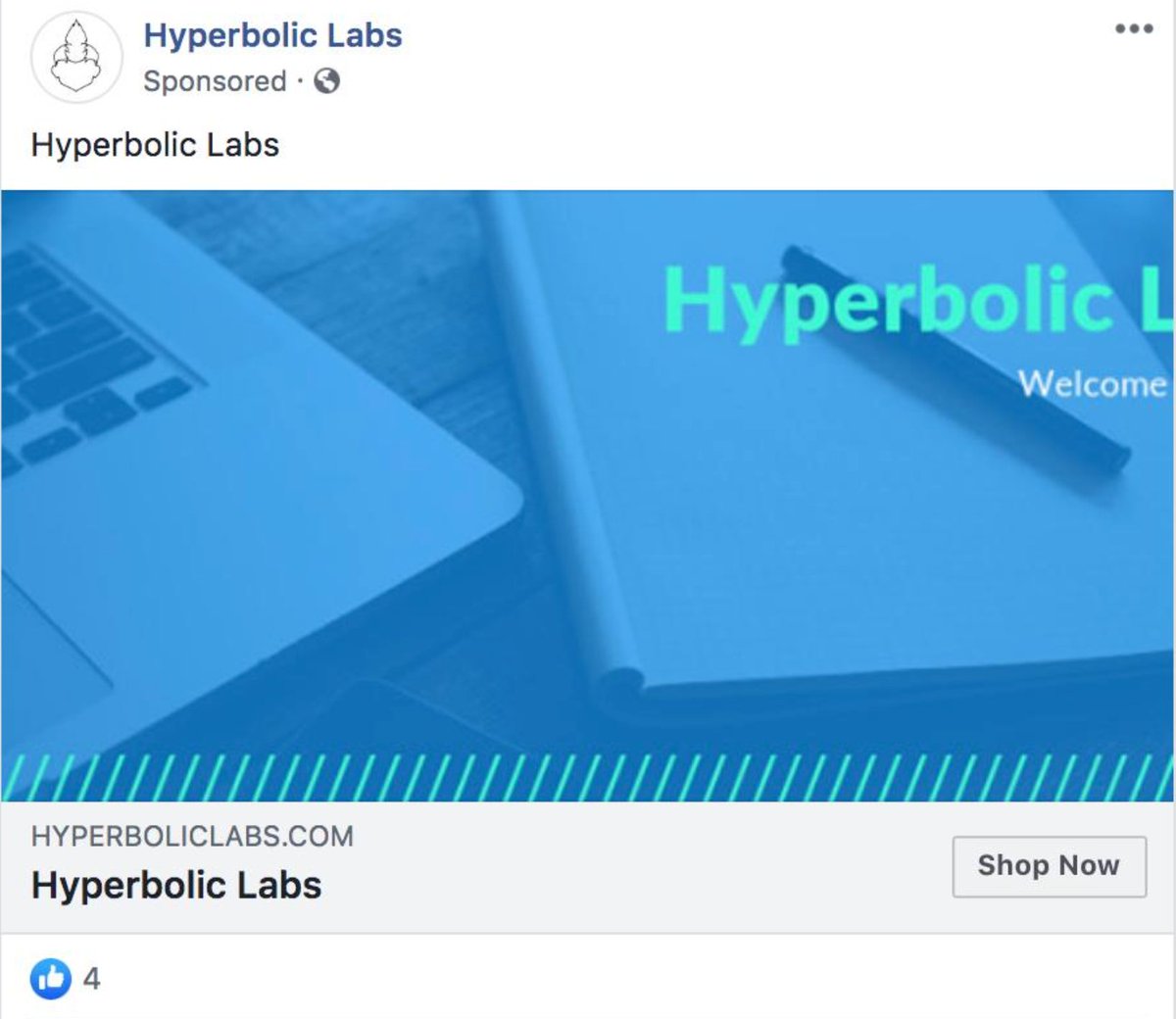
I hope this was put up on accident.
If not I feel really bad for the person who thought this ad would result in sales.
You can't even tell what the product is, which is really bad obviously.
I think we can all agree this ad is terrible haha
If not I feel really bad for the person who thought this ad would result in sales.
You can't even tell what the product is, which is really bad obviously.
I think we can all agree this ad is terrible haha
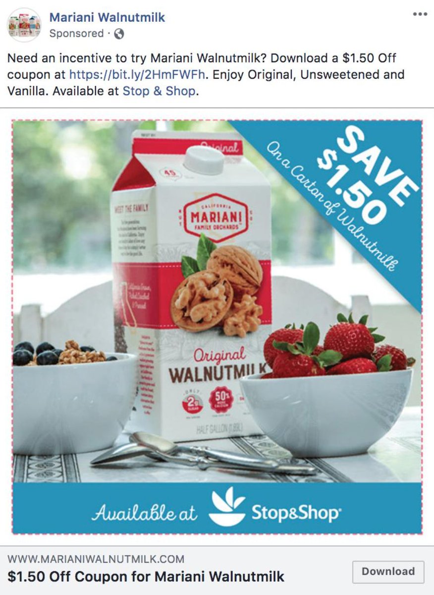
When you write your copy for an ad, it's important to have it organized in a way that's easy to read quickly.
Having things spaced out helps with that.
Because when you have things organized like the ad below people will end up, not reading the body text and not converting.
Having things spaced out helps with that.
Because when you have things organized like the ad below people will end up, not reading the body text and not converting.
Loading suggestions...