

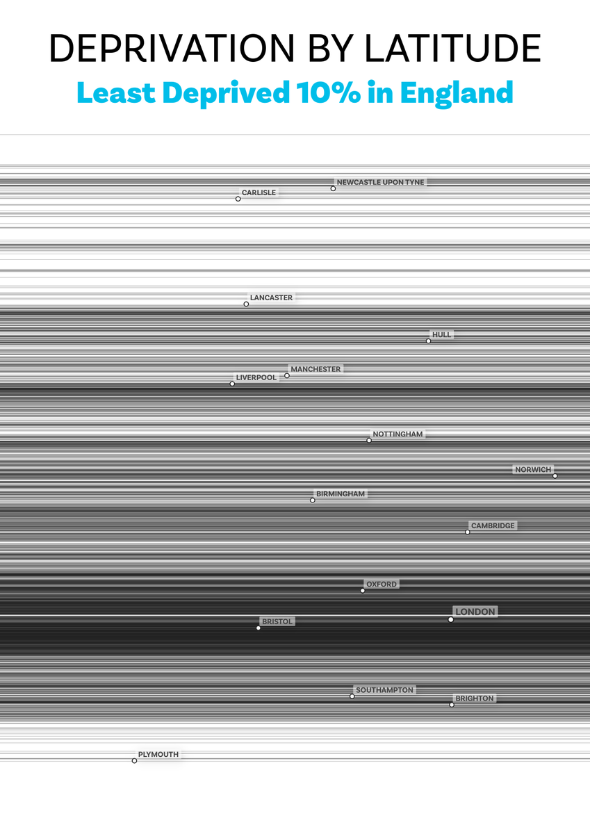
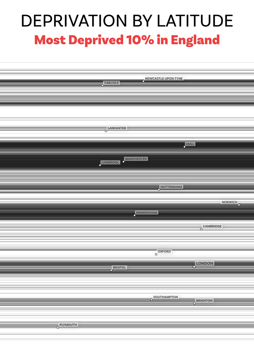
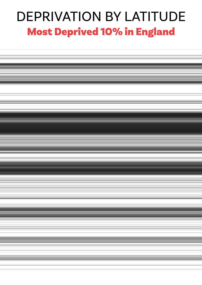
Map of the day today is deprivation in England in a barcode style plot - showing the latitude of the 10% least deprived vs 10% most deprived (IMD 2019)
same as above, but animated gif
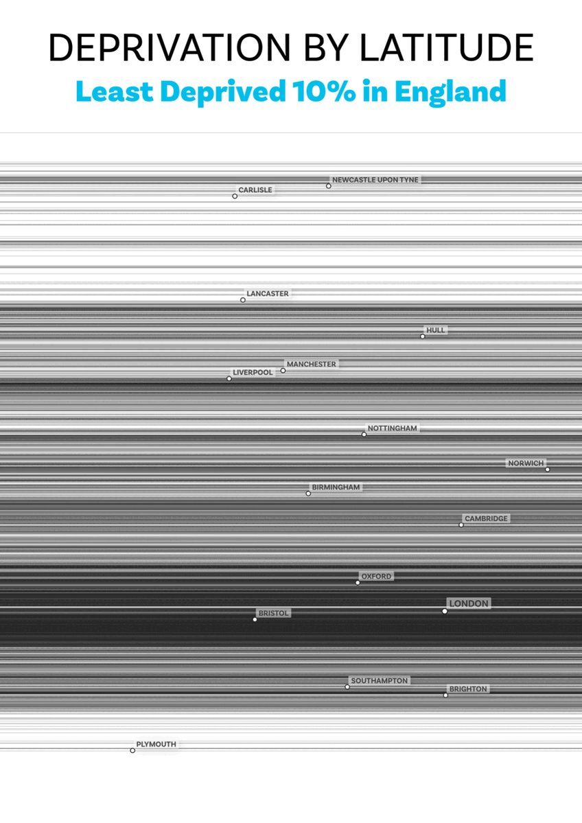
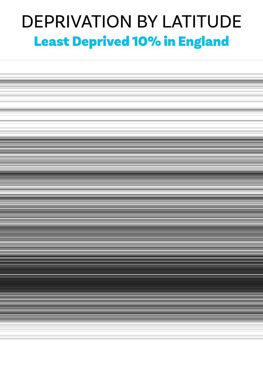
and same again, but no place name labels this time - just simple barcode maps
technical info, for keen boffins
- map layer is IMD2019 LSOA centroids, to which I added a lat and lng value for each point
- points are turned to horizontal lines using QGIS geometry generator (as in pic + Alt Text)
- then layer filtered to show only top or bottom IMD decile
- map layer is IMD2019 LSOA centroids, to which I added a lat and lng value for each point
- points are turned to horizontal lines using QGIS geometry generator (as in pic + Alt Text)
- then layer filtered to show only top or bottom IMD decile

make a point into a line, with funky beat and night mode

Loading suggestions...