

Some fun details on my last design 👇
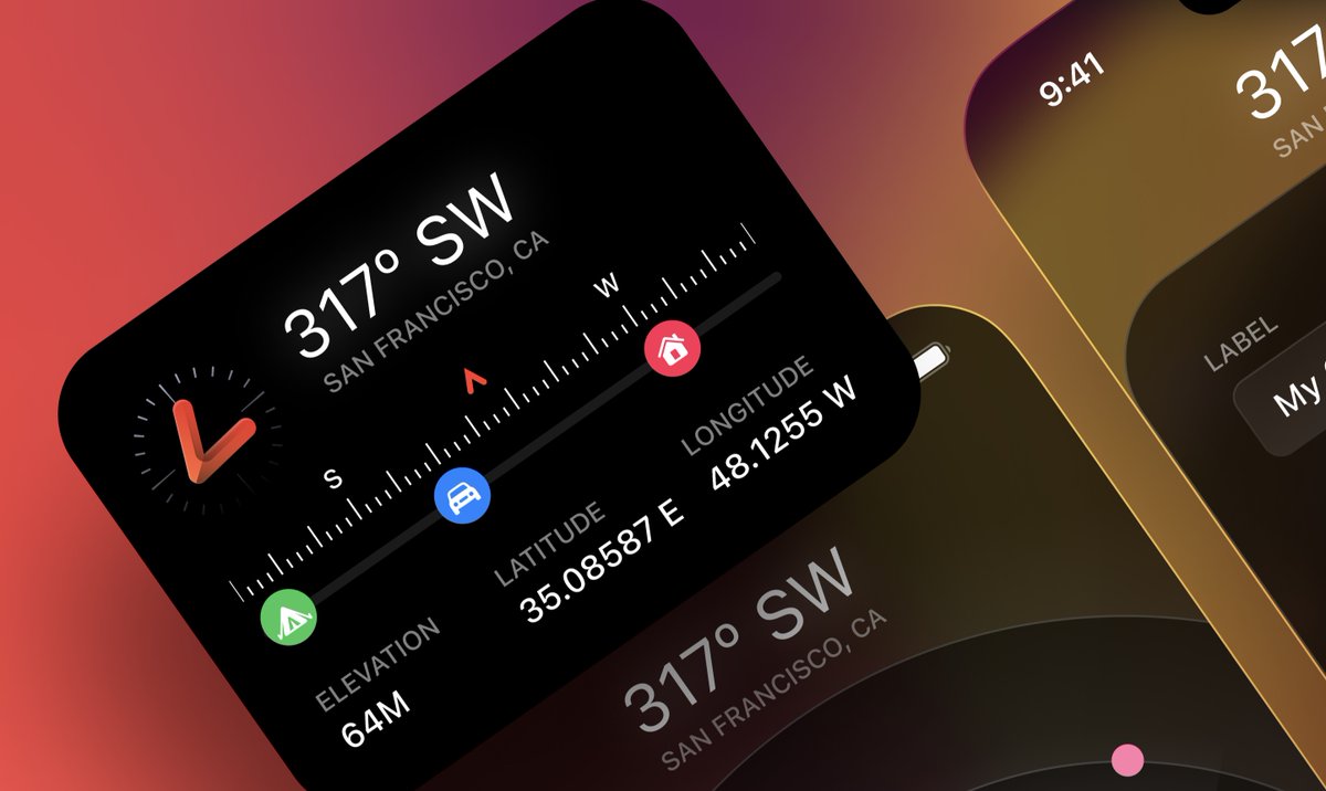
1. There are many ways to design an active button. Most recently, you can use angular gradient combined with blur. With the outline, an overlay blending mode works great to give more accent/contrast.
1. There are many ways to design an active button. Most recently, you can use angular gradient combined with blur. With the outline, an overlay blending mode works great to give more accent/contrast.
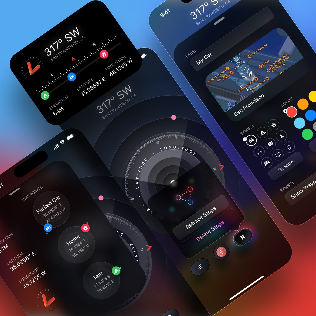
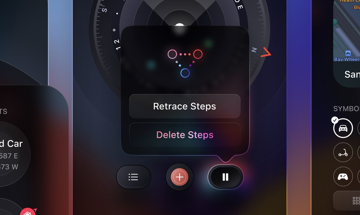
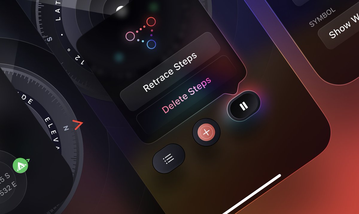
Because of the glow, you can get creative and use that as a source of lighting to the popover. Notice how I’m using gradient mask on an angular gradient to subtly at the bottom right.
I love creating translucent UI. This mainly separates iOS from Android, or web from print.
I love creating translucent UI. This mainly separates iOS from Android, or web from print.
It makes sense because we live in a digital world and we need to express depth when you have so many cards, windows and layers. VR/AR/Games use translucency a lot, otherwise it’s very 2-dimensional. It uses more CPU but new tech = new possibilities and you grow as a designer.
3. The dynamic island for example uses gooey + blur + translucency + sometimes 3D transforms all at once. Interactive 3D assets are more common. This is similar to games or the days of Flash. So for the directions here I got the inspiration from games like Skyrim and Elden Ring.
4. This app is adapted from the watch ultra’s compass app. A lot of elements are very similar for consistency. BUT, I try to get creative on some parts, like these circles that show a mini compass + direction. I also use outlines extensively versus Apple only use them desktop.
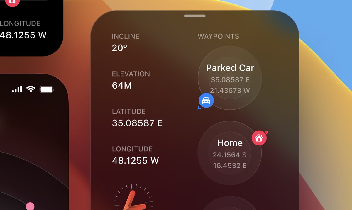
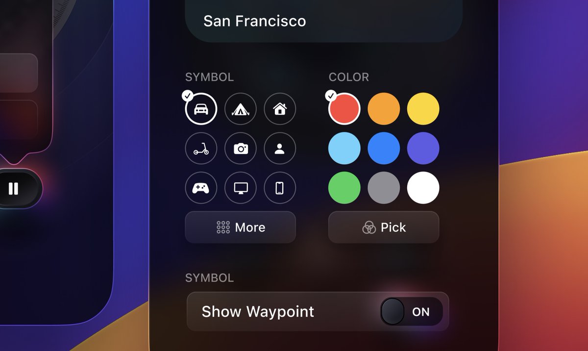
5. This part is very much like the watch design. BUT when you adapt to a bigger screen, you should try to show more content (more columns, bigger sizes, popovers, etc). Also, I decided to go with the more buttons for easier customizations instead of listing 20+ items.
6. I could go on forever but I don’t want to make this thread too long. If you enjoy reading these, let me know, maybe I’ll do more!
I put a ton of efforts into the designs of my courses. That’s my way to contribute as a designer that teaches code as well.
I put a ton of efforts into the designs of my courses. That’s my way to contribute as a designer that teaches code as well.
Loading suggestions...