

We saved a client over $500/month earlier this year just by getting rid of their popup app
Because they simply aren’t worth it
Here’s how you can make elite popups in Klaviyo and save on your software each month:
Because they simply aren’t worth it
Here’s how you can make elite popups in Klaviyo and save on your software each month:
Popup apps charge you per impression
And scale rapidly in terms of costs for your brand
Because your traffic is naturally going to increase over time...
And scale rapidly in terms of costs for your brand
Because your traffic is naturally going to increase over time...
The thing is, popup apps don’t allow you any more functionality than Klaviyo does
Although this used to not be the case.
Klaviyo has been improving, and you simply need to follow these 4 principles to have a strong signup conversion rate:
Although this used to not be the case.
Klaviyo has been improving, and you simply need to follow these 4 principles to have a strong signup conversion rate:
These Factors Are:
1. Offer Testing
2. 2 steps vs 1 step
3. Timing
4. Design
Here's how to manipulate these:
1. Offer Testing
2. 2 steps vs 1 step
3. Timing
4. Design
Here's how to manipulate these:
1. Different Popups Per Platform
What I mean here is that you need different popups for desktop and mobile
Because they’re a completely different UX and we have different rules for each.
Popups can harm a website’s conversion rate significantly if they’re too invasive
What I mean here is that you need different popups for desktop and mobile
Because they’re a completely different UX and we have different rules for each.
Popups can harm a website’s conversion rate significantly if they’re too invasive
And with desktop we can completely alleviate this by setting them for EXIT INTENT
So if someone gets the popup, they were going to exit the site anyway
In my opinion, a best practice is to do exit intent OR a long time on site (>12 seconds)
High CVR, good UX.
So if someone gets the popup, they were going to exit the site anyway
In my opinion, a best practice is to do exit intent OR a long time on site (>12 seconds)
High CVR, good UX.
Mobile is different
Exit intent is off the table since we can’t track thumbs.
So here’s what you can do:
Exit intent is off the table since we can’t track thumbs.
So here’s what you can do:
Set it to come up if someone scrolls 60-80% of the page OR is on the page 8-12 seconds
A good place to start is at 80% and 10 seconds
Maintains site CVR and gives us a lot of new leads once we follow the next 3 steps:
A good place to start is at 80% and 10 seconds
Maintains site CVR and gives us a lot of new leads once we follow the next 3 steps:
2. Two Steps
“In for a penny, in for a pound.”
Essentially, once we get a small commitment from someone it is then easier to get a large commitment as opposed to going for a large commitment up front.
“In for a penny, in for a pound.”
Essentially, once we get a small commitment from someone it is then easier to get a large commitment as opposed to going for a large commitment up front.
If you have 5 forms for people to fill out on your popup, I can guarantee you the conversion rate will be low as friction is sky-high
So here is how to properly use 2 steps:
So here is how to properly use 2 steps:
The first popup has next to no friction
Because we have either first name & email or just email for them to input
This is our penny, which is then followed by a…
Pound. In the form of an SMS popup right after
Which has superior results.
Because we have either first name & email or just email for them to input
This is our penny, which is then followed by a…
Pound. In the form of an SMS popup right after
Which has superior results.
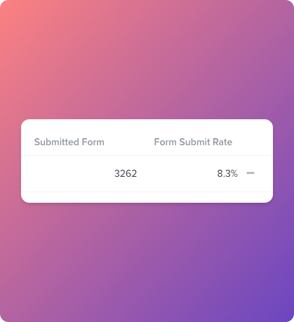
We can see a 5-12% conversion rate on our frictionless first popup
And then see up to 50% of those signups give us their phone number
Which is insane.
Let’s run the numbers:
And then see up to 50% of those signups give us their phone number
Which is insane.
Let’s run the numbers:
If you had first name, email & phone # on popup 1
Your cvr might be 2%
In this model, we could get 8% giving emails along with 40% of those people giving phone #
So with 1000 viewers, we get 80 emails and 32 phone numbers instead of 20 of each in the first example
Crazy stuff
Your cvr might be 2%
In this model, we could get 8% giving emails along with 40% of those people giving phone #
So with 1000 viewers, we get 80 emails and 32 phone numbers instead of 20 of each in the first example
Crazy stuff
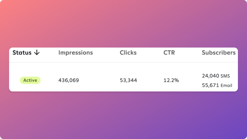
Look at this for an example:
12.2% cvr on email, and then 43% of those emails giving their phone #
This alone has transformed flows revenue
(Side note: Attentive popups are the GOAT, but we’re moving away from it as a platform for clients not in a long contract with them)
12.2% cvr on email, and then 43% of those emails giving their phone #
This alone has transformed flows revenue
(Side note: Attentive popups are the GOAT, but we’re moving away from it as a platform for clients not in a long contract with them)
3. Offer Testing
Unless the level of traffic is very high it won’t be worth testing things like images & button colour, etc.
Because it doesn’t move the needle half as much as testing offers does
So rotate these:
Unless the level of traffic is very high it won’t be worth testing things like images & button colour, etc.
Because it doesn’t move the needle half as much as testing offers does
So rotate these:
- % off
- $ amount off over a certain amount
- Decent % off first order in subscription
- B2G1
- Free gift w/purchase
- Free digital product
- Free shipping w/no minimum order amount
You will certainly find something that works here
- $ amount off over a certain amount
- Decent % off first order in subscription
- B2G1
- Free gift w/purchase
- Free digital product
- Free shipping w/no minimum order amount
You will certainly find something that works here
Here’s how important offer is:
With a skincare brand, we couldn’t make the popup budge past 4% cvr testing free shipping vs 10% off
Free shipping won out, but not by much
And it was dreadful for margins
So here was the drastic fix:
With a skincare brand, we couldn’t make the popup budge past 4% cvr testing free shipping vs 10% off
Free shipping won out, but not by much
And it was dreadful for margins
So here was the drastic fix:
Free shipping: 4% cvr, costed $12 (heavy parcels), and got $0.95/recipient on the welcome series
Not bad, probably better than most tbh.
So we found one SKU that had $4 COGS and retailed for $28
Side note: Skincare margins are lovely.
Not bad, probably better than most tbh.
So we found one SKU that had $4 COGS and retailed for $28
Side note: Skincare margins are lovely.
We quickly threw up a free gift w/purchase offer
And it got us: 9% cvr, costed $4, and got $5.58/recipient on the welcome flow
~6x the rev at a higher profit margin!
Game changer.
You’re only one offer away…
So be diligent here and find the right one
And it got us: 9% cvr, costed $4, and got $5.58/recipient on the welcome flow
~6x the rev at a higher profit margin!
Game changer.
You’re only one offer away…
So be diligent here and find the right one
4. Clear Design
Hands down the easiest part.
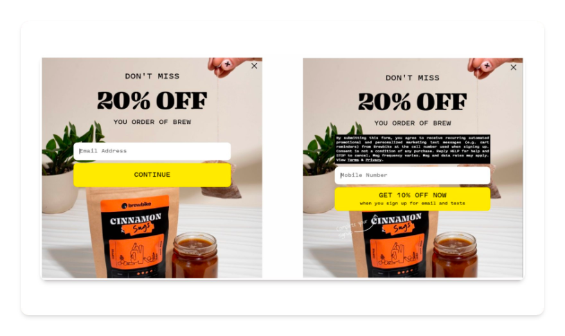
Look at the popups below
What do you notice?
They’re all really simple and make the offer prominent
There’s a simple visual hierarchy
Hands down the easiest part.
Look at the popups below
What do you notice?
They’re all really simple and make the offer prominent
There’s a simple visual hierarchy

Make the copy pretty small aside from the offer and make the CTA bright and attractive
That’s fairly much it.
Remember the menswear example above example? Very impactful.
Mainly down to removing friction and making the design clear as can be.
That’s fairly much it.
Remember the menswear example above example? Very impactful.
Mainly down to removing friction and making the design clear as can be.
So to recap, don’t use a popup app and follow the principles below:
1. Different popups per platform
2. 2 step submission
3. Offer testing
4. Clear design
That’s it, super simple!
1. Different popups per platform
2. 2 step submission
3. Offer testing
4. Clear design
That’s it, super simple!
If you run a brand doing over $80k/m - we will increase your revenue fast
If we don’t increase your revenue in 45 days, we will pay YOU
Click the link below to learn more: calendly.com
If we don’t increase your revenue in 45 days, we will pay YOU
Click the link below to learn more: calendly.com
Loading suggestions...