

𝗘𝘃𝗲𝗿𝘆 𝗘𝘅𝗰𝗲𝗹 𝗖𝗵𝗮𝗿𝘁, 𝗮𝗻𝗱 𝗪𝗵𝗲𝗻 𝘁𝗼 𝗨𝘀𝗲 𝗶𝘁
Charts are one of the most powerful features that Excel offers…
and each one has their own time & place for when you should use them.
Let’s do a walk through of each chart:
Charts are one of the most powerful features that Excel offers…
and each one has their own time & place for when you should use them.
Let’s do a walk through of each chart:
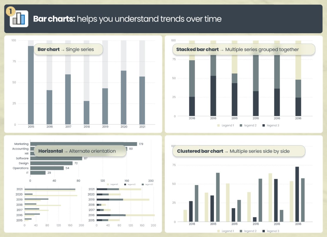
𝟭. 📊Bar charts → helps you understand trends over time.
• Bar chart → single series
• Stacked bar chart → multiple series grouped together
• Clustered bar chart → multiple series side by side
• Horizontal → alternate orientation
• Bar chart → single series
• Stacked bar chart → multiple series grouped together
• Clustered bar chart → multiple series side by side
• Horizontal → alternate orientation
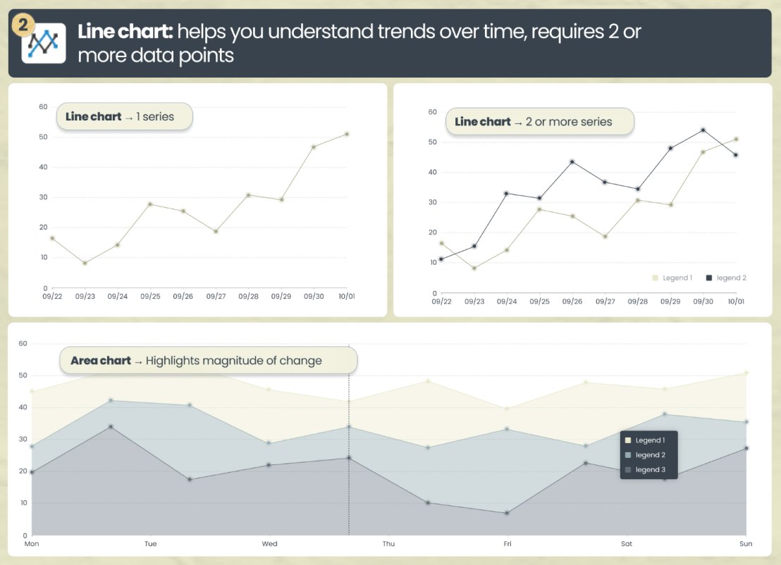
𝟮. 📈 Line chart → helps you understand trends over time, with a line
• Line chart → can show 1 or multiple series. I like to utilize 2 series when I’m trying to understand the intersection
• Area chart → highlights magnitude of change by shading the bottom
• Line chart → can show 1 or multiple series. I like to utilize 2 series when I’m trying to understand the intersection
• Area chart → highlights magnitude of change by shading the bottom
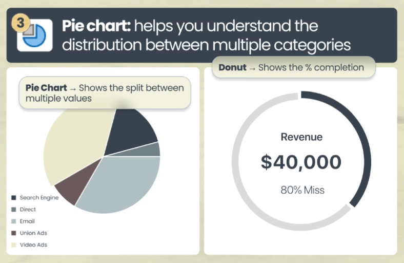
𝟯. 🟡 Pie chart → helps you understand the distribution between multiple categories
• Pie Chart → shows the split / distribution between multiple categories
• Donut → shows the % completion. This is in essence a hollow pie chart (my favorite for budget vs actuals)
• Pie Chart → shows the split / distribution between multiple categories
• Donut → shows the % completion. This is in essence a hollow pie chart (my favorite for budget vs actuals)
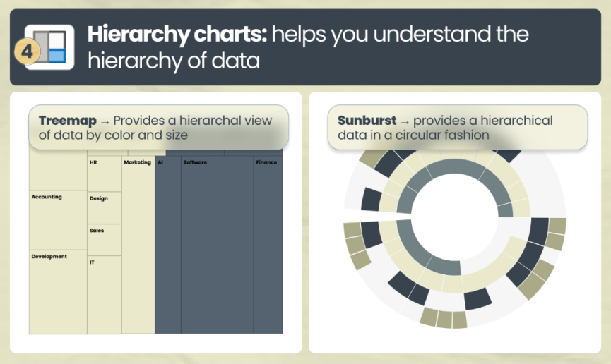
𝟰. Hierarchy charts → helps you understand the hierarchy of data
• Treemap → provides a hierarchal view of data by color and size
• Sunburst → provides a hierarchical data in a circular fashion
• Treemap → provides a hierarchal view of data by color and size
• Sunburst → provides a hierarchical data in a circular fashion
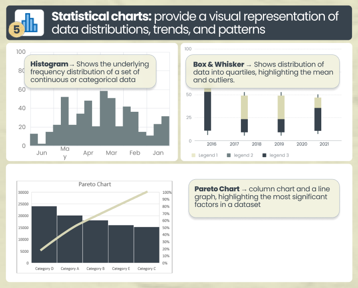
𝟱. 🔢 Statistical charts → provide a visual representation of data distributions, trends, and patterns
• Histogram → Shows the underlying frequency distribution
• Histogram → Shows the underlying frequency distribution
• Box & Whisker → Shows distribution of data into quartiles, highlighting the mean and outliers.
• Pareto Chart → displays both the individual and cumulative frequencies
• Pareto Chart → displays both the individual and cumulative frequencies
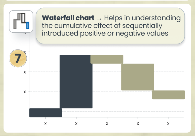
𝟲. Waterfall chart → Helps in understanding the cumulative effect of sequentially introduced positive or negative values
This is especially relevant when showcasing MRR and ARR
This is especially relevant when showcasing MRR and ARR
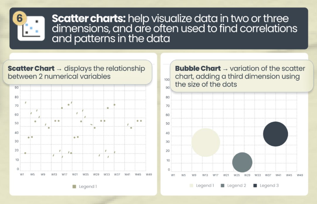
𝟳. Scatter charts → often used to find correlations and patterns in the data
• Scatter Chart → displays the relationship between 2 numerical variables
• Bubble Chart → variation of the scatter chart, adding a third dimension using the size of the dots.
• Scatter Chart → displays the relationship between 2 numerical variables
• Bubble Chart → variation of the scatter chart, adding a third dimension using the size of the dots.
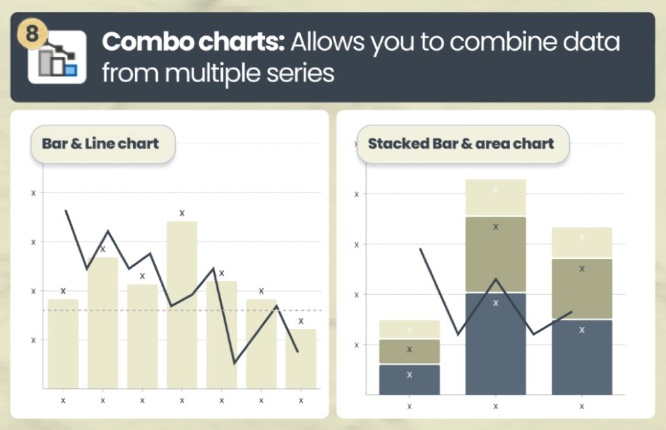
𝟴. Combo charts → allows you to combine data from multiple series
Helpful when you have information across 2 distinct series (like Revenue and Gross Margin)
Helpful when you have information across 2 distinct series (like Revenue and Gross Margin)
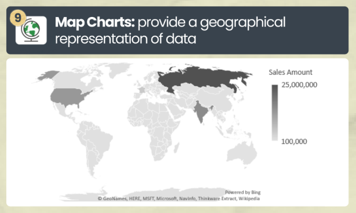
𝟵. 🗺️ Map Charts → provide a geographical representation of data
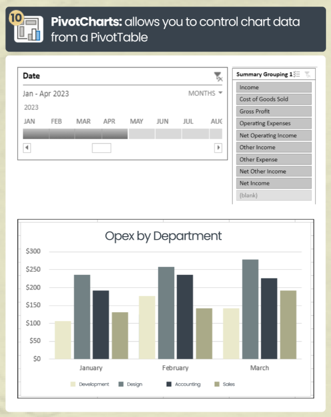
𝟭𝟬. PivotCharts → allows you to control chart data from a PivotTable
And that's a wrap!
Let me know your thoughts in the comments
𝗣𝗦: 𝗟𝗲𝘃𝗲𝗹 𝘂𝗽 𝘆𝗼𝘂𝗿 𝗰𝗮𝗿𝗲𝗲𝗿 𝗮𝗻𝗱 𝗴𝗲𝘁 𝗙𝗶𝗻𝗮𝗻𝗰𝗲 & 𝗔𝗰𝗰𝗼𝘂𝗻𝘁𝗶𝗻𝗴 𝘁𝗶𝗽𝘀 𝗹𝗶𝗸𝗲 𝘁𝗵𝗶𝘀 𝗱𝗲𝗹𝗶𝘃𝗲𝗿𝗲𝗱 𝗿𝗶𝗴𝗵𝘁 𝘁𝗼 𝘆𝗼𝘂𝗿 𝗶𝗻𝗯𝗼𝘅:
yourcfoguy.com
Let me know your thoughts in the comments
𝗣𝗦: 𝗟𝗲𝘃𝗲𝗹 𝘂𝗽 𝘆𝗼𝘂𝗿 𝗰𝗮𝗿𝗲𝗲𝗿 𝗮𝗻𝗱 𝗴𝗲𝘁 𝗙𝗶𝗻𝗮𝗻𝗰𝗲 & 𝗔𝗰𝗰𝗼𝘂𝗻𝘁𝗶𝗻𝗴 𝘁𝗶𝗽𝘀 𝗹𝗶𝗸𝗲 𝘁𝗵𝗶𝘀 𝗱𝗲𝗹𝗶𝘃𝗲𝗿𝗲𝗱 𝗿𝗶𝗴𝗵𝘁 𝘁𝗼 𝘆𝗼𝘂𝗿 𝗶𝗻𝗯𝗼𝘅:
yourcfoguy.com

Loading suggestions...