

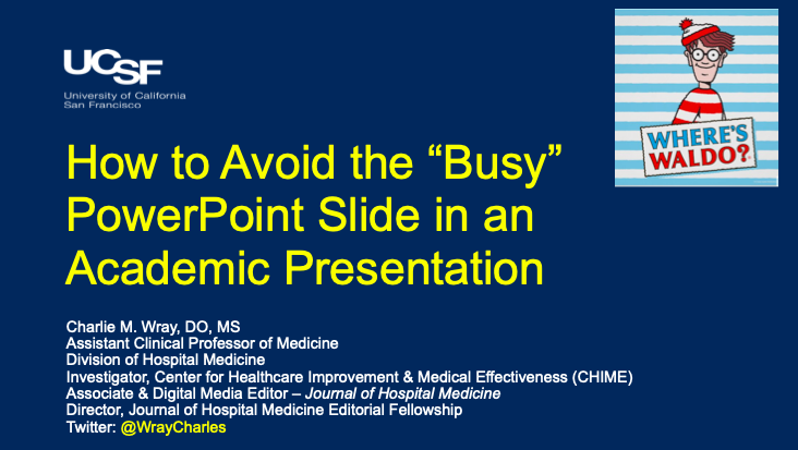
1/ A short #Tweetorial on how to (not) present a “busy” PowerPoint slide. The “Where’s Waldo?” of Academic Medicine.
We’ve all seen it, and we all grumble about it, but how can we do better? Here are a few pointers I've seen and received over the years...
We’ve all seen it, and we all grumble about it, but how can we do better? Here are a few pointers I've seen and received over the years...
2/ Starting with word count. The phrase “Less is More” applies here. Your slides should act as the backbone to your talk. People are there to hear you speak, not read a PowerPoint presentation…

3/ Let’s talk Tables. We’ve all sat through a presentation where the presenter starts off by saying “Sorry, I know this table is a little busy but bear with me…” At this point, they’ve lost their audience and lost the opportunity to share their important data…

4/ I believe there are two major principles in presenting tables in a PowerPoint presentation. Let’s start with the big picture…

5/ Don’t use a screenshot of a large, previously published table. This is rarely helpful unless the table is small. A good rule of thumb: no more than 4 columns or 4 rows for screenshot tables…

6/ If you do have a large table which you are pulling information from, it’s best to take the info you need to get your point across and make a whole new table in your presentation. It takes time, but trust me, everyone will appreciate it.

7/ Always walk your audience through the important column and rows. This literally takes 5 seconds. My preference is to do this right after the slide shows up - allowing people to read your table while you talk…

8/ Finally, if you can’t make a new table out of the data in PowerPoint, use other visual cues to help focus your audience's attention (boxes, underlines, arrows, etc). People like knowing where to look…Then tell them what they should be seeing.

9/ This also applies to graphs and figures! Take the time to describe what the x- and y-axis are. Again, it takes 5 seconds and can add so much clarity to your talk…
*Also, don’t forget to make the font on your axis BIG ENOUGH to read!
*Also, don’t forget to make the font on your axis BIG ENOUGH to read!

10/ PowerPoint has some great features that will even make you look like a visual media pro. Use these transitions in conjunction (ie. timed) w/your talk to make it interactive & engaging visually…
*Note: Nothing should ever spin, twirl, or make noises when coming onto a slide
*Note: Nothing should ever spin, twirl, or make noises when coming onto a slide

11/ A figure is worth 1,000 words! I find these resources to be underutilized in presentations. Sometimes looking through the “SmartArt” can help you think of a way to visually (more efficiently) present your data or idea…

12/ No presentation is perfect, but they can always be better. These are just a few techniques I’ve used and seen employed. I would love to hear what you do to overcome the “busy” slide?
Fin
Fin
Loading suggestions...