

NEW: Thurs 23 April update of coronavirus trajectories
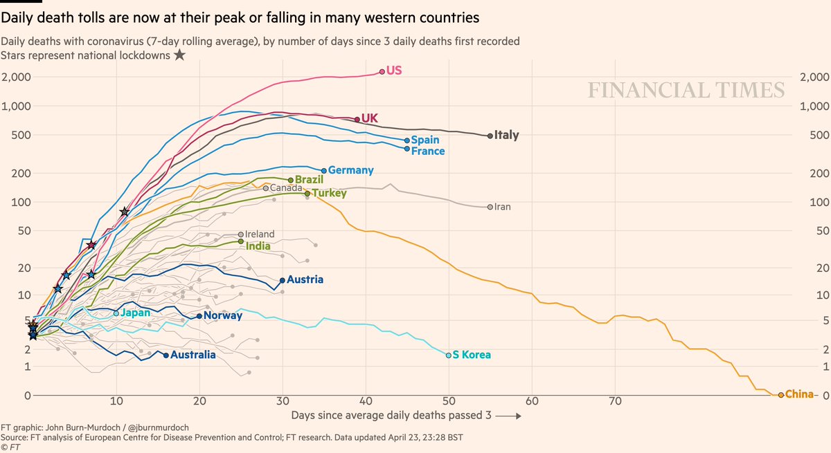
Daily deaths:
• Still too early to say if US has peaked
• Looks like UK has
• But descents appear to be much slower than ascents
• Successes in dark blue: Australia, Norway, Austria
Live charts ft.com
Daily deaths:
• Still too early to say if US has peaked
• Looks like UK has
• But descents appear to be much slower than ascents
• Successes in dark blue: Australia, Norway, Austria
Live charts ft.com

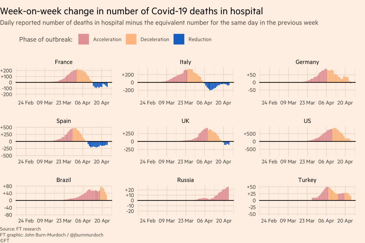
Why do I say UK daily deaths may have peaked?
Here’s week-on-week change in daily deaths.
This gets rid of weekly reporting patterns and asks, are more people dying than at same point last week?
In UK, blue bars mean we’re now seeing *fewer* deaths than same day last week.
Here’s week-on-week change in daily deaths.
This gets rid of weekly reporting patterns and asks, are more people dying than at same point last week?
In UK, blue bars mean we’re now seeing *fewer* deaths than same day last week.
This set of charts remains good for tracking whether or not a country has reached its peak etc, but we’re now also tracking total excess mortality.
My colleague @ChrisGiles_ estimates UK excess deaths linked to covid far exceed daily reported numbers
My colleague @ChrisGiles_ estimates UK excess deaths linked to covid far exceed daily reported numbers
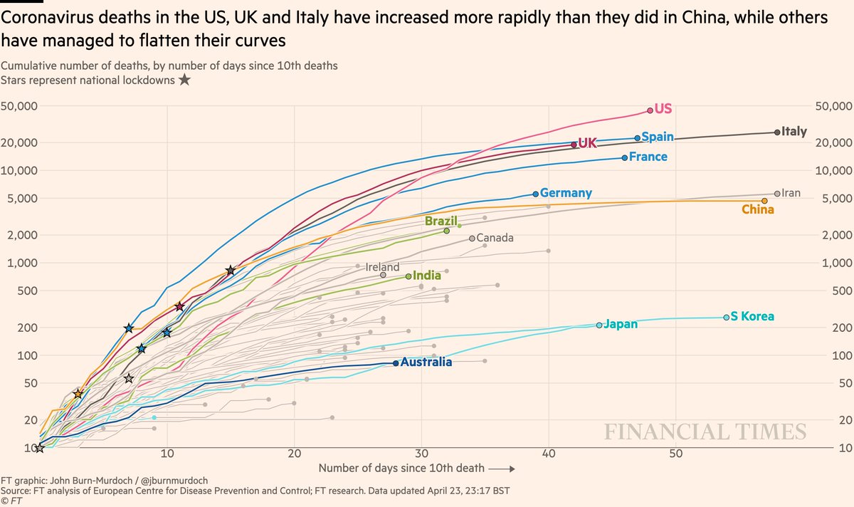
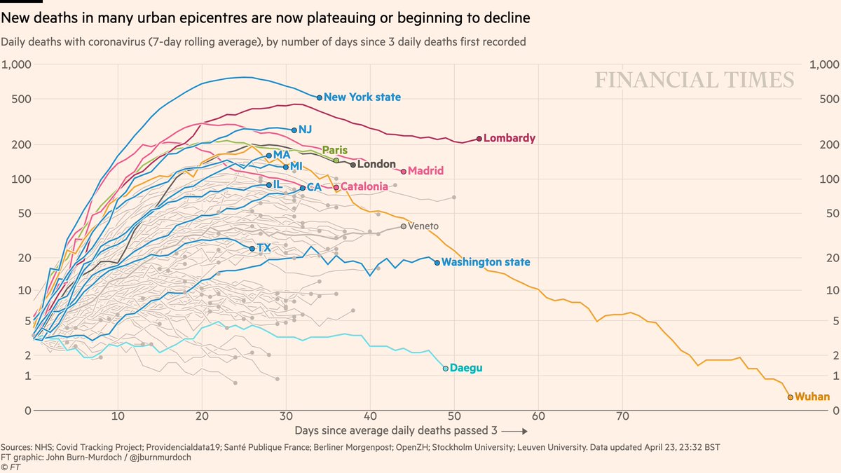
Now back to cumulative deaths:
• US death is highest worldwide and still rising fast Chart with upwards trend
• Japan could soon pass S Korea
• UK curve still matching Italy’s
• Australia still looks promising
All charts: ft.com
• US death is highest worldwide and still rising fast Chart with upwards trend
• Japan could soon pass S Korea
• UK curve still matching Italy’s
• Australia still looks promising
All charts: ft.com
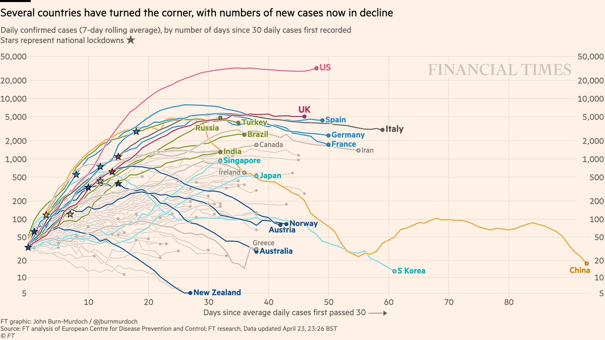
Daily new cases
• Not clear that US daily confirmed infections have peaked
• New cases falling in countries that acted early: New Zealand, Australia, Norway, Austria
• Singapore and Japan now on all-too-familiar trajectories after initially keeping outbreaks at bay
• Not clear that US daily confirmed infections have peaked
• New cases falling in countries that acted early: New Zealand, Australia, Norway, Austria
• Singapore and Japan now on all-too-familiar trajectories after initially keeping outbreaks at bay
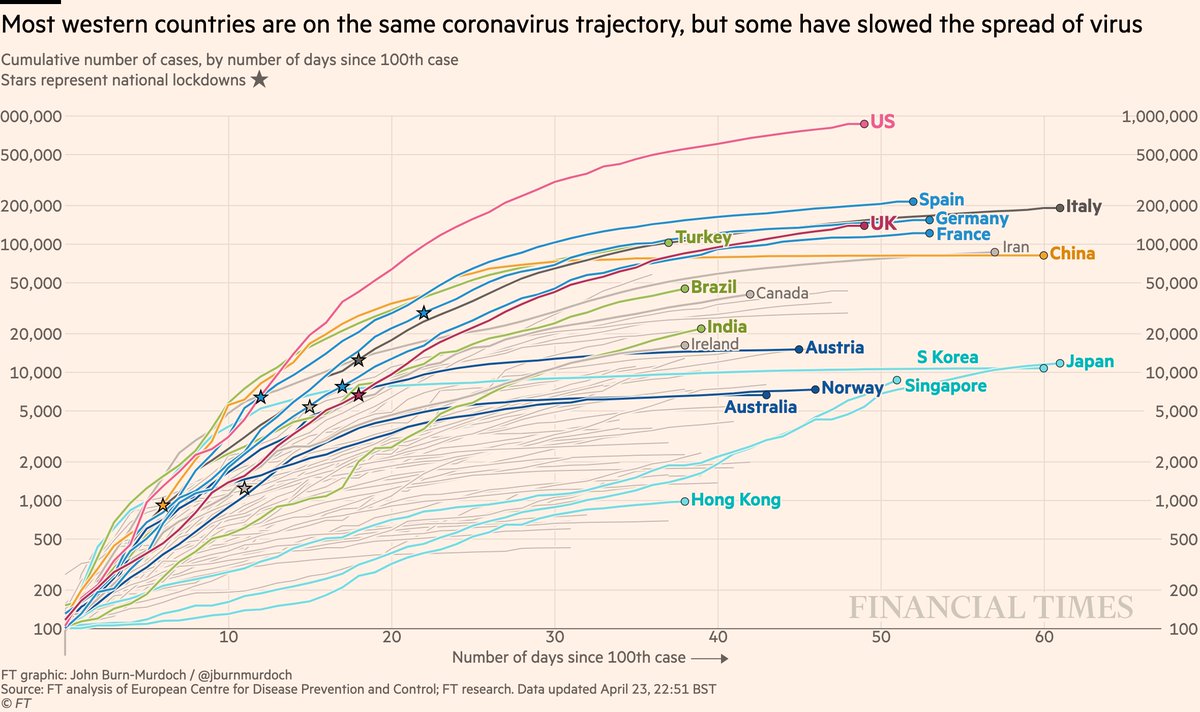
Cases in cumulative form:
• US curve beginning to taper?
• Turkey still battling a severe outbreak
• Japan has passed Korea’s total, Singapore has passed Japan’s curve: both show the danger of thinking a country has dealt with covid
All charts: ft.com
• US curve beginning to taper?
• Turkey still battling a severe outbreak
• Japan has passed Korea’s total, Singapore has passed Japan’s curve: both show the danger of thinking a country has dealt with covid
All charts: ft.com
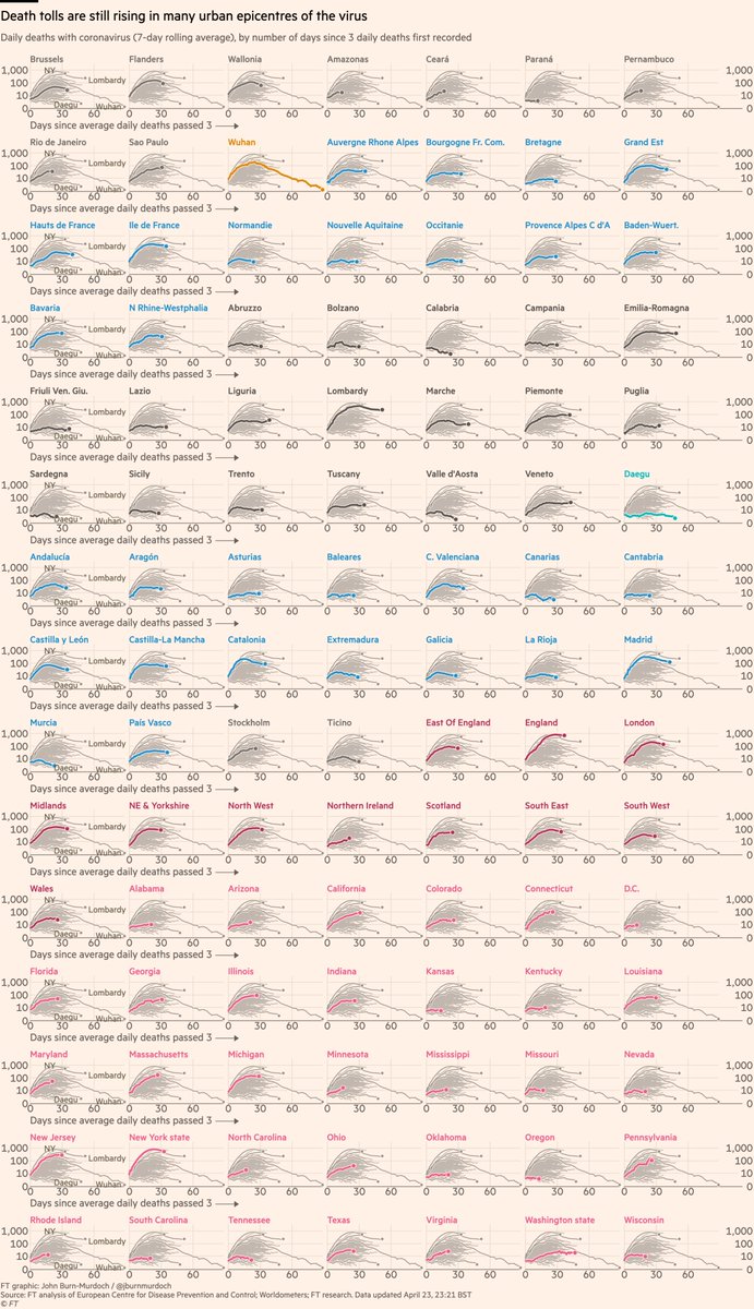
Subnational region daily deaths:
• NY daily confirmed covid deaths now descending (we’re excluding nursing homes for consistency)
• Daily London deaths also appear to have peaked
• Most Western cities/regions now in plateau or decline phase
All charts: ft.com
• NY daily confirmed covid deaths now descending (we’re excluding nursing homes for consistency)
• Daily London deaths also appear to have peaked
• Most Western cities/regions now in plateau or decline phase
All charts: ft.com
Covid outbreaks are better understood at regional level than national; here are >100 regions:
• Rio de Janeiro ?
• 35 US states now
• Stockholm yet to peak
• Sicily, Sardinia, Balearics, Canaries all low curves: do islands fare better?
All charts: ft.com
• Rio de Janeiro ?
• 35 US states now
• Stockholm yet to peak
• Sicily, Sardinia, Balearics, Canaries all low curves: do islands fare better?
All charts: ft.com
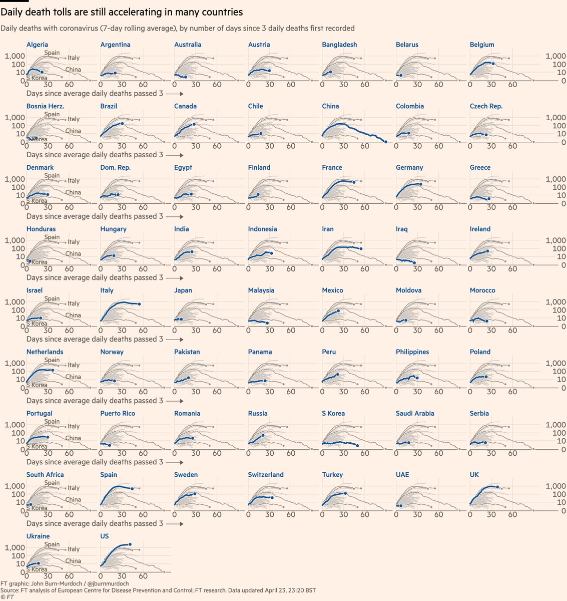
Small multiples for daily new deaths in countries:
• Norway locked down while Sweden didn’t; Norway’s daily death toll rising much more slowly than Sweden’s
• Australia faring well
• In Europe, Austria, Denmark, Norway faring well
All charts: ft.com
• Norway locked down while Sweden didn’t; Norway’s daily death toll rising much more slowly than Sweden’s
• Australia faring well
• In Europe, Austria, Denmark, Norway faring well
All charts: ft.com
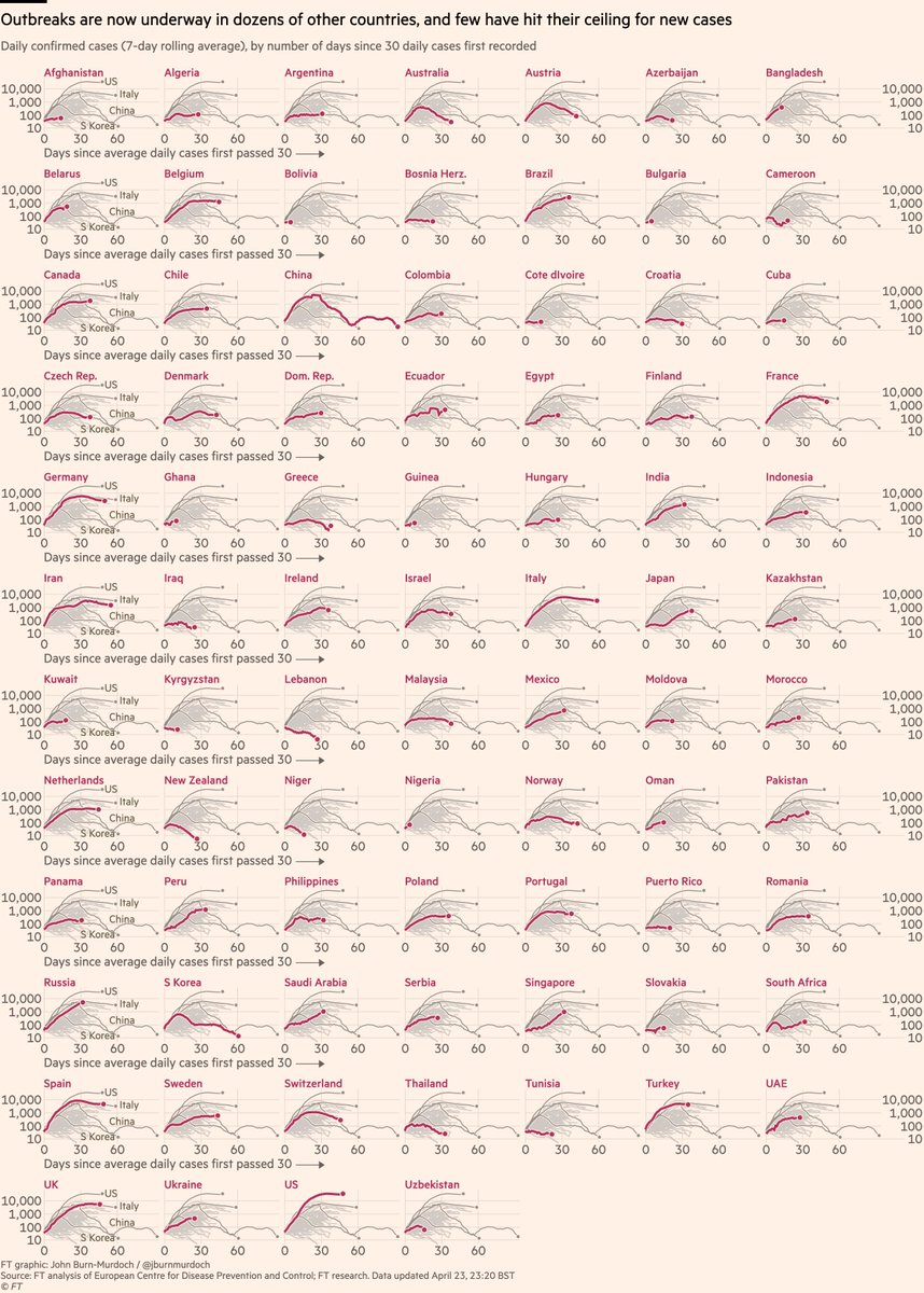
New daily cases in >80 countries:
• Adding more African and other emerging-market countries every day; today Nigeria
• Bangladesh ?
• Early action in Aus & NZ may have turned corner ?????
• Watch as European countries ease lockdowns ?
All charts: ft.com
• Adding more African and other emerging-market countries every day; today Nigeria
• Bangladesh ?
• Early action in Aus & NZ may have turned corner ?????
• Watch as European countries ease lockdowns ?
All charts: ft.com
I talk a lot about whether or not peaks have been reached.
A good metric for this is hospitalisations:
• More reliable than confirmed cases (not influenced by testing regimes)
• Shorter lag than deaths
So here are some charts showing hospitalisations in various countries:
A good metric for this is hospitalisations:
• More reliable than confirmed cases (not influenced by testing regimes)
• Shorter lag than deaths
So here are some charts showing hospitalisations in various countries:
First, Italy:
Colour = phase of outbreak
• Red: more new hospitalisations every day than day before
• Orange: total hospitalisations rising, but rate of increase slowing
• Blue: fewer people in hospital than before
Almost all Italian regions now in "reduction" phase :-)
Colour = phase of outbreak
• Red: more new hospitalisations every day than day before
• Orange: total hospitalisations rising, but rate of increase slowing
• Blue: fewer people in hospital than before
Almost all Italian regions now in "reduction" phase :-)

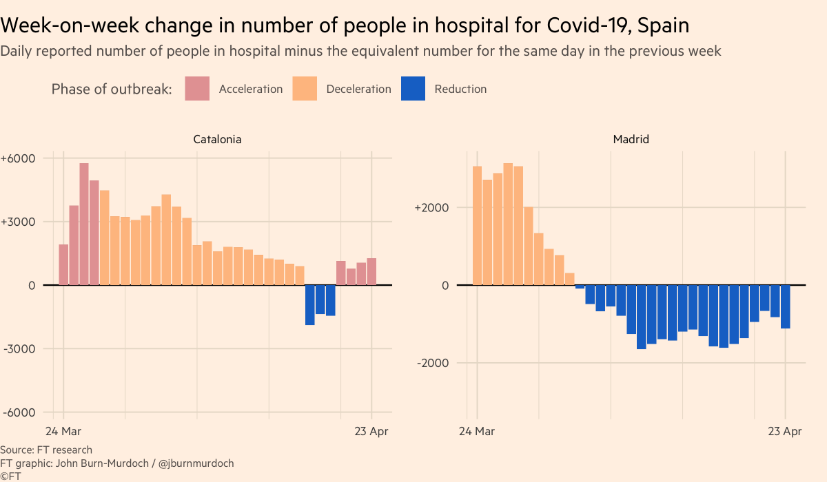
Next, Spain:
• Madrid now firmly in "reduction" phase, Catalonia fighting to get back into reduction
• Not showing other Spanish regions due to problems with their hospitalisation data
• Madrid now firmly in "reduction" phase, Catalonia fighting to get back into reduction
• Not showing other Spanish regions due to problems with their hospitalisation data
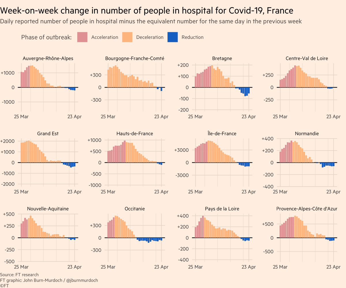
France:
• All regions beginning to see total occupancy fall, including former epicentres Ile de France & Grand Est
• All regions beginning to see total occupancy fall, including former epicentres Ile de France & Grand Est
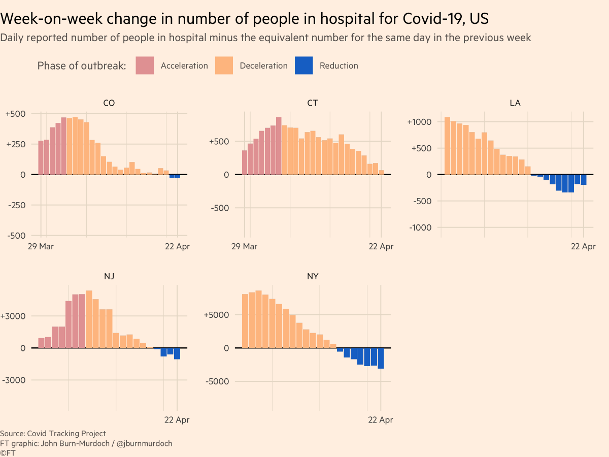
US:
• Hospitalisation data patchy from state to state
• NY & Louisiana both in the "reduction" phase, hospital bed occupancy dropping
• NJ & Colorado also now into net reduction
• Connecticut on the path towards falling occupancy
• Hospitalisation data patchy from state to state
• NY & Louisiana both in the "reduction" phase, hospital bed occupancy dropping
• NJ & Colorado also now into net reduction
• Connecticut on the path towards falling occupancy
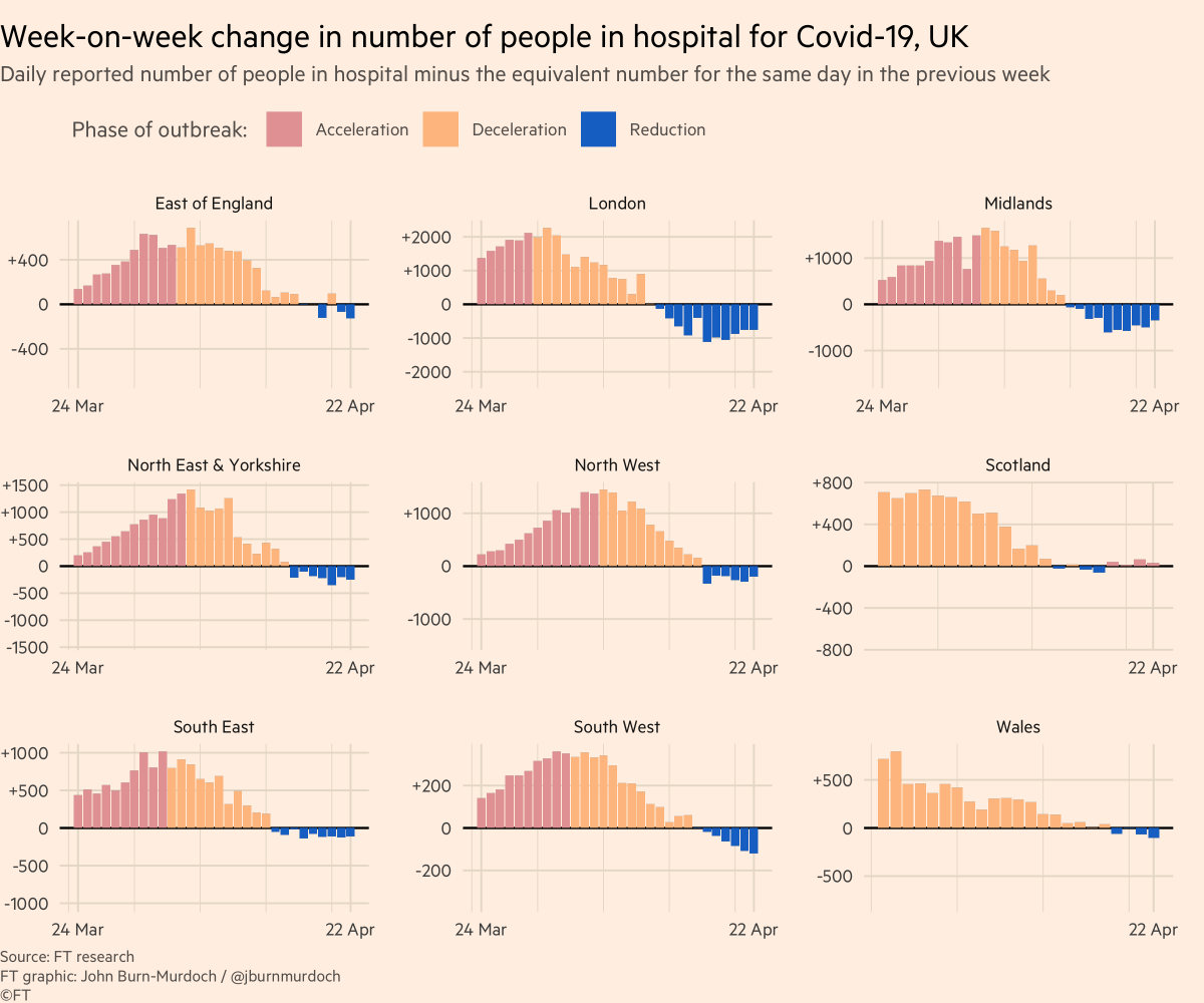
Great Britain:
• Hospitals in almost every region now have fewer covid patients than same time last week ?
• Suggests UK is at or near peak for new confirmed infections, though UK testing still lagging, and care homes of course absent from this view
• Hospitals in almost every region now have fewer covid patients than same time last week ?
• Suggests UK is at or near peak for new confirmed infections, though UK testing still lagging, and care homes of course absent from this view
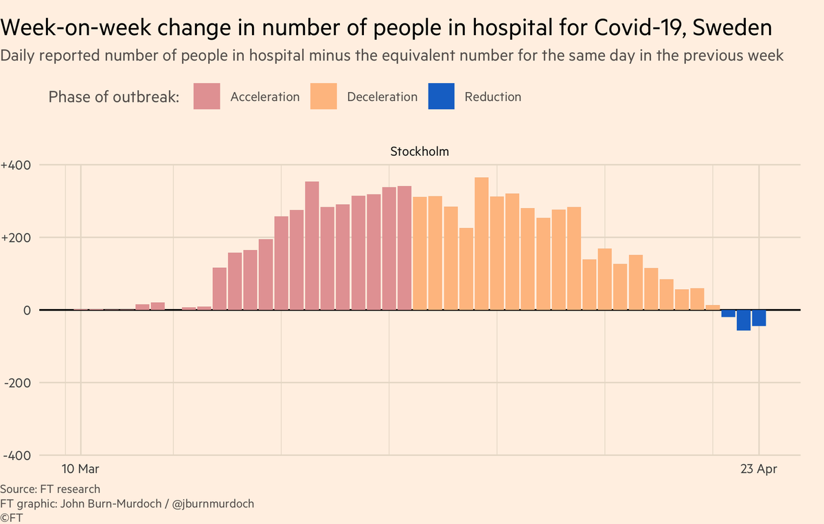
Stockholm:
• Sweden has not locked down like most places
• Data show Swedes moving around less than usual, but still plenty of socialising, closer to normal life than most countries
• But data show more people leaving hospital with covid than entering ?
• Sweden has not locked down like most places
• Data show Swedes moving around less than usual, but still plenty of socialising, closer to normal life than most countries
• But data show more people leaving hospital with covid than entering ?
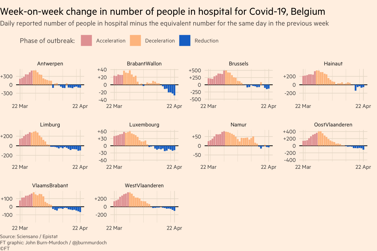
And new tonight: Belgium
• All regions now seeing falling hospital admissions ?
• All regions now seeing falling hospital admissions ?
Wrapping up: our focus has now shifted to tracking excess all-cause mortality (numbers of people dying for any reason at all) as we think this avoids pitfalls of different countries’ covid-death reporting methodologies.
So my call-out tonight is:
So my call-out tonight is:
Please point me to data on all-cause mortality (total numbers of deaths from all causes) in your country, by week, up to and including recent weeks ?
Reply here, email coronavirus-data@ft.com or add a link to this spreadsheet: #gid=0" target="_blank" rel="noopener" onclick="event.stopPropagation()">docs.google.com
Reply here, email coronavirus-data@ft.com or add a link to this spreadsheet: #gid=0" target="_blank" rel="noopener" onclick="event.stopPropagation()">docs.google.com
Final bits:
Here’s a video where I explain why we’re using log scales, showing absolute numbers instead of per capita, and much more:
Here’s a video where I explain why we’re using log scales, showing absolute numbers instead of per capita, and much more:
And a chart showing why we're using absolute numbers rather than population-adjusted rates:
Please email coronavirus-data@ft.com with feedback, requests & subnational data.
All of these are invaluable, and we incorporate your suggestions and data every day.
We’ll keep getting back to as many people as possible.
Have a good night, folks :-)
All of these are invaluable, and we incorporate your suggestions and data every day.
We’ll keep getting back to as many people as possible.
Have a good night, folks :-)
Footnote: charts delayed tonight due to problems with data, which required scouring for multiple sources to obtain correct number
You might think most of the time spent on these charts is spent on ... the charts, but sourcing & checking data takes up the bulk of time every night
You might think most of the time spent on these charts is spent on ... the charts, but sourcing & checking data takes up the bulk of time every night
Many of us who visualise data are used to working with clean, reliable inputs. Plug and play — CSV or JSON in, charts out.
Covid data is a million miles from that. Data is messy, unreliable, often highly suspect. Requires huge amount of work before a single pixel can be rendered
Covid data is a million miles from that. Data is messy, unreliable, often highly suspect. Requires huge amount of work before a single pixel can be rendered
Loading suggestions...