

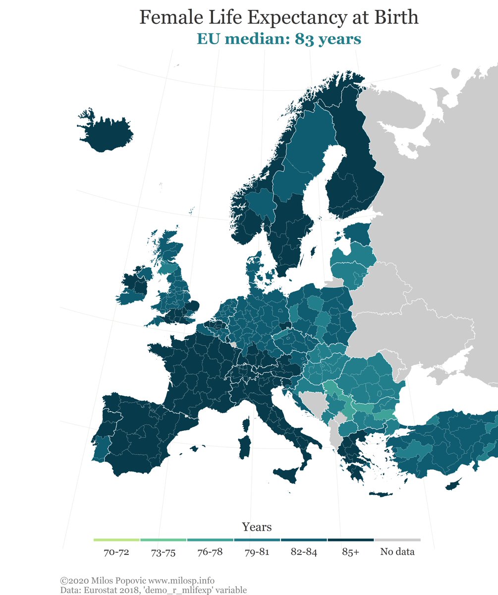
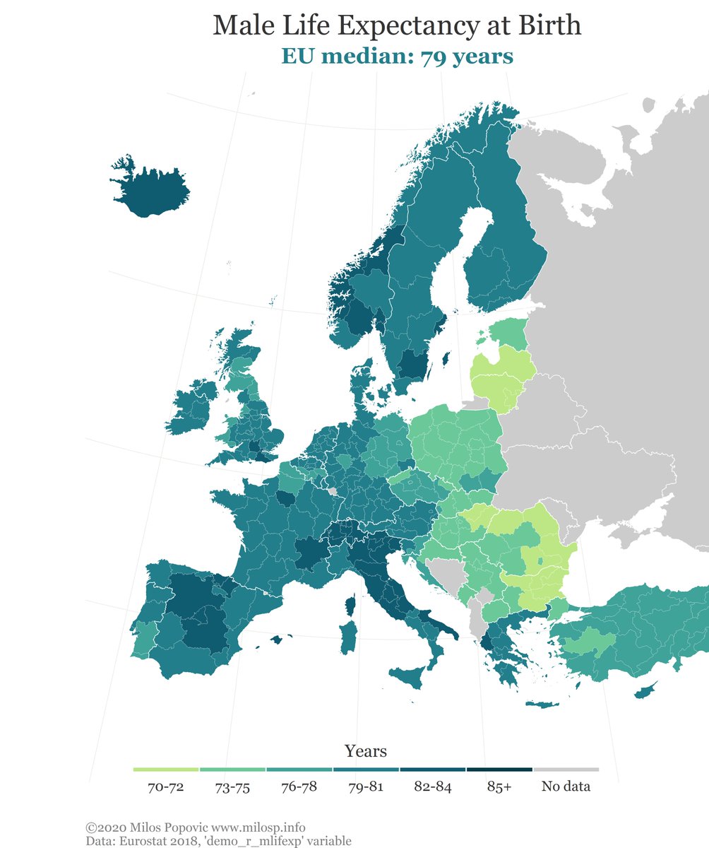
I mapped how many years a newborn is expected to live given the current mortality conditions by gender
#longevity #demographic #europe #eu #dataviz #DataScience #bigdata #maps #rstats
#longevity #demographic #europe #eu #dataviz #DataScience #bigdata #maps #rstats
h/t to my smart colleague @medzihorsky for an idea
The color palette I used to create these maps was mixed in chroma.js and the hex codes are:
#073b4c,
#0f5b6f,
#227e8a,
#3fa399,
#6bc899,
#bce784
#073b4c,
#0f5b6f,
#227e8a,
#3fa399,
#6bc899,
#bce784
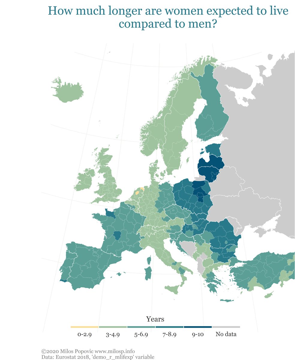
Bonus map: How much longer are women expected to live compared to men? There is no single region in which male life expectancy at birth is higher
#longevity #health #demographic #europe #dataviz #DataScience #bigdata #maps #rstats
#longevity #health #demographic #europe #dataviz #DataScience #bigdata #maps #rstats
Loading suggestions...