

A complete introduction to CSS animations 🚀
CSS animation is a module in CSS that lets you change the styling of elements and therefore creates an animate effect. It's little tricky but not much
Let's learn about it 🧵👇🏻
CSS animation is a module in CSS that lets you change the styling of elements and therefore creates an animate effect. It's little tricky but not much
Let's learn about it 🧵👇🏻

Before diving into it, we need to understand the importance of CSS animations
Animation can establish interaction between users and the user interface. This makes your website more interactive which ultimately attracts more visitors to your webpage.
Animation can establish interaction between users and the user interface. This makes your website more interactive which ultimately attracts more visitors to your webpage.
CSS animations is little tricky but not too tough to master. In this thread, we will try to gain some decent knowledge about it.
Animation is all about changing one style to another at certain intervals or times. For doing that, we need to learn about `@ keyframes` at rule
The keyframe provides us animation by changing the style sequentially according to the mentioned interval.
The keyframe provides us animation by changing the style sequentially according to the mentioned interval.
The syntax of keyframes at-rule 👇🏻

In order to bind the keyframe with a particular animation, we need to define few things like name and timing of animations.
We have several properties for that like animation-name, animation-timing, etc...
We have several properties for that like animation-name, animation-timing, etc...
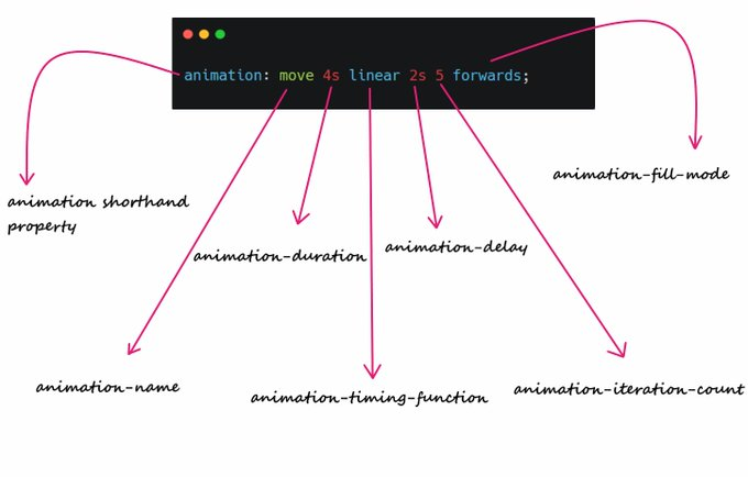
Either we can use each property of animation or we can use animation shorthand property which includes:
animation-name
animation-duration
animation-timing-function
animation-delay
animation-iteration-count
animation-direction
animation-fill-mode
animation-play-state
animation-name
animation-duration
animation-timing-function
animation-delay
animation-iteration-count
animation-direction
animation-fill-mode
animation-play-state
Lets create a simple animation which will solve all our doubts:
For example, suppose I want to move my element 500px left in four seconds. It's very easy
For example, suppose I want to move my element 500px left in four seconds. It's very easy

The output of above attached code:
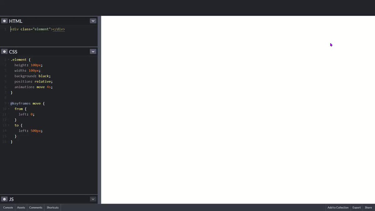
Explanation:
Black box is going 500px from left boundary in 4 seconds because we have mentioned 4 seconds in animation property and 500px in keyframe at rule.
Black box is going 500px from left boundary in 4 seconds because we have mentioned 4 seconds in animation property and 500px in keyframe at rule.
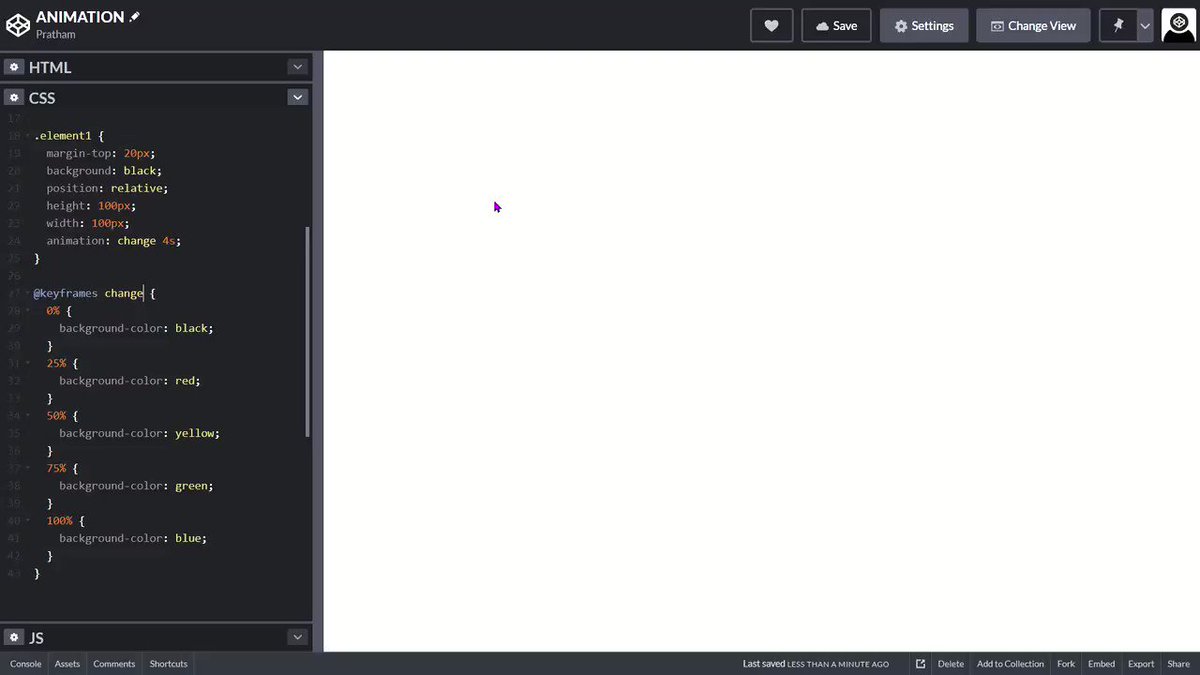
Alright moving further, we can also pass percentage in keyframes rule and make some amazing animations
For example, suppose I want on change the background-color of an element
For example, suppose I want on change the background-color of an element
You can also specify the delay in your animation using animation delay property.
It specifies a delay before the start of an animation
It specifies a delay before the start of an animation
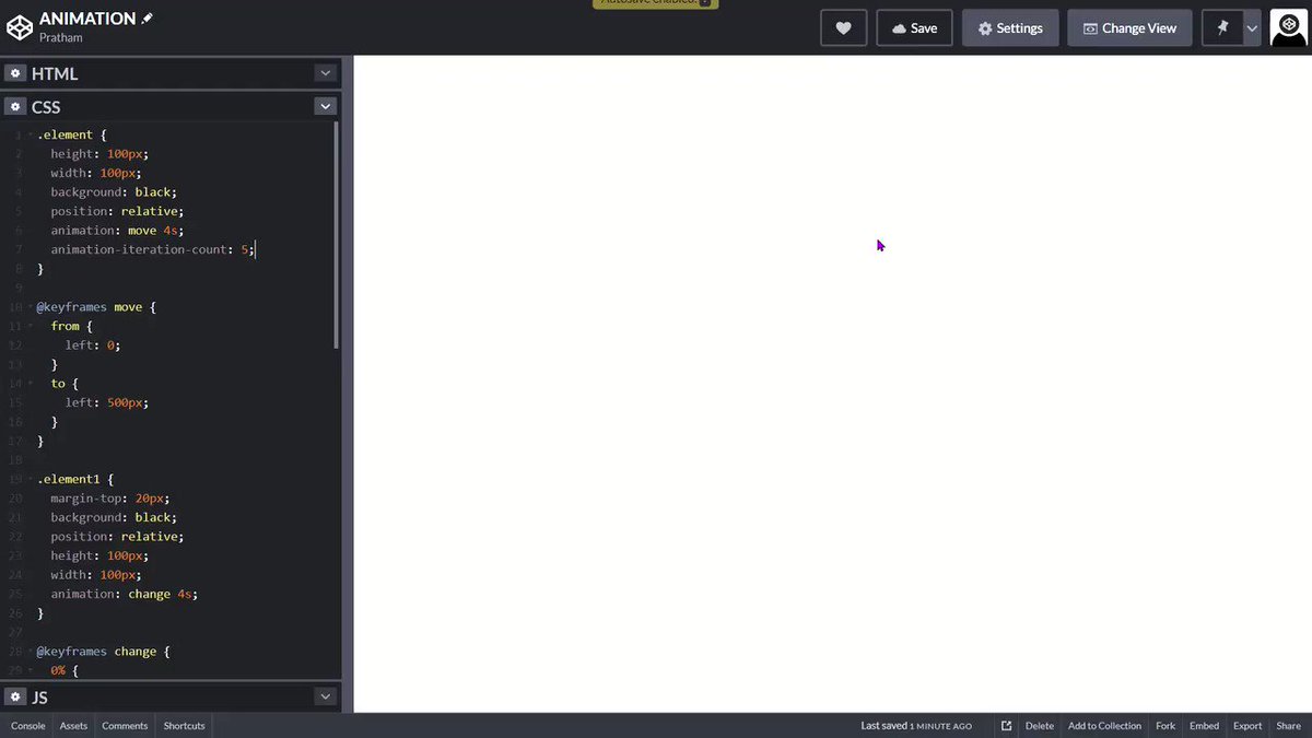
We have another cool property called "animation-iteration-count"
It specifies the number of times an animation should run repeatedly. You can pass a numeral value or "infinite" in this property
It specifies the number of times an animation should run repeatedly. You can pass a numeral value or "infinite" in this property
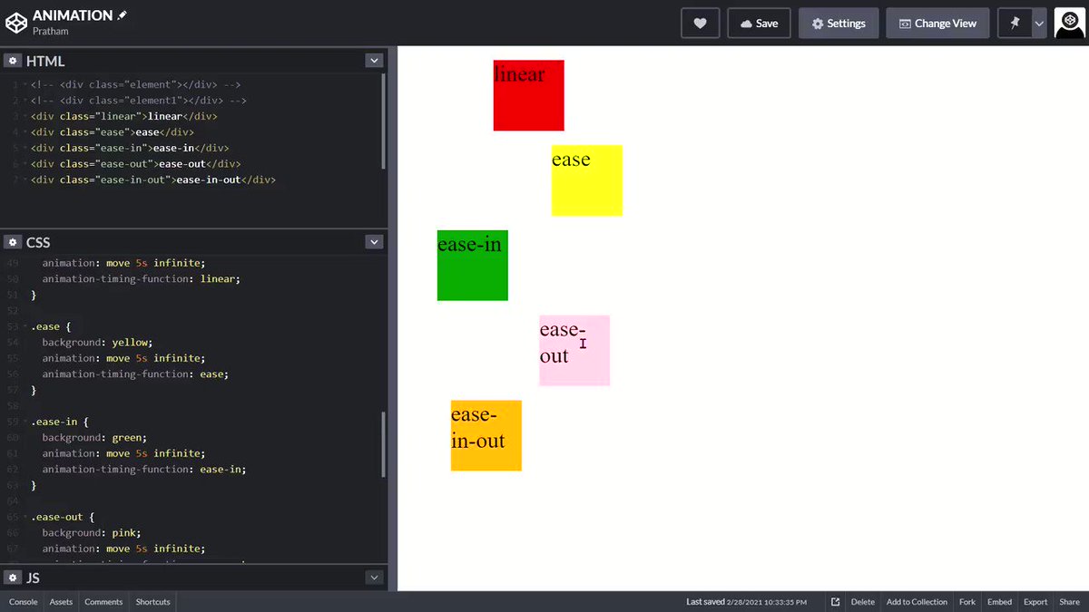
So far so good, But we can also change the speed curve of animation and can create more smooth animation. And we have animation-timing-function property for that.
You can pass following values in animation-timing function
- ease (slow start, then fast, then slow)
- linear (same speed)
- ease-in (slow start)
- ease-out (slow end)
- ease-in-out (slow start and slow end)
- cubic-bezier (customizable)
- ease (slow start, then fast, then slow)
- linear (same speed)
- ease-in (slow start)
- ease-out (slow end)
- ease-in-out (slow start and slow end)
- cubic-bezier (customizable)
Here are some visual representation of speed curve 👇🏻

See this video for better understanding or you can play with code here
codepen.io
codepen.io
One thing to note here is that animation do not affect element before or after the keyframes.
In order to persist the styling based on last or first keyframe, we have animation-fill-mode
In order to persist the styling based on last or first keyframe, we have animation-fill-mode
It accepts following value
- forwards (element will retain last keyframe styling)
- backwards (element will get the first keyframe value even in animation-delay period)
- both (both of the above)
- forwards (element will retain last keyframe styling)
- backwards (element will get the first keyframe value even in animation-delay period)
- both (both of the above)
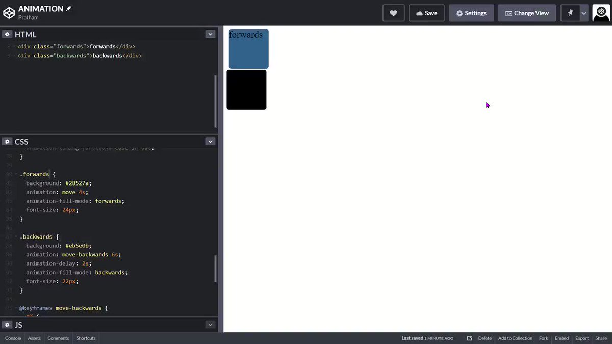
Let me explain animation-fill-mode by this video 👇🏻
- As you can see blue box stopped at left: 500px becuase forwards is begin applied on it
- And orange box has black background even it's in a delay period of 2 seconds because backwards is being applied on it
- As you can see blue box stopped at left: 500px becuase forwards is begin applied on it
- And orange box has black background even it's in a delay period of 2 seconds because backwards is being applied on it
This is the correct order to animation shorthand property 👇🏻
And that's it. I tried my best to give a quick overview of how CSS animations works
If you like this thread, drop a like and retweet, means a lot to me ❤️
Peace out 😉
If you like this thread, drop a like and retweet, means a lot to me ❤️
Peace out 😉
Loading suggestions...