

A new disease 'X' has been identified in a region, fatal enough to kill a patient if not treated.
A team of engineers develop a machine learning model to predict if someone has this disease or not, surprisingly it caught every infected person!
But there's a big problem
🧵 👇🏻
A team of engineers develop a machine learning model to predict if someone has this disease or not, surprisingly it caught every infected person!
But there's a big problem
🧵 👇🏻

You see, this is a special disease that affects only a very small group of people and the victims show no symptoms.
It is caused by several factors such as the amount of fat in someone's body, muscle density, etc.
It is caused by several factors such as the amount of fat in someone's body, muscle density, etc.
This infographic shows a particular group of 100 people, where the model was trained and tested on a similar dataset, only 10 of them have the disease.
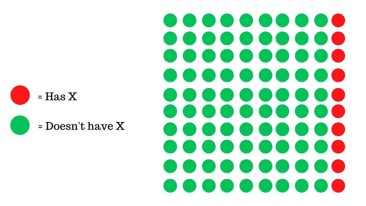
In this case, our machine learning model predicts 90 of them as having X.
While, technically this means that we caught all people that had this disease but in the process, we also had an overwhelming amount of false predictions.
While, technically this means that we caught all people that had this disease but in the process, we also had an overwhelming amount of false predictions.
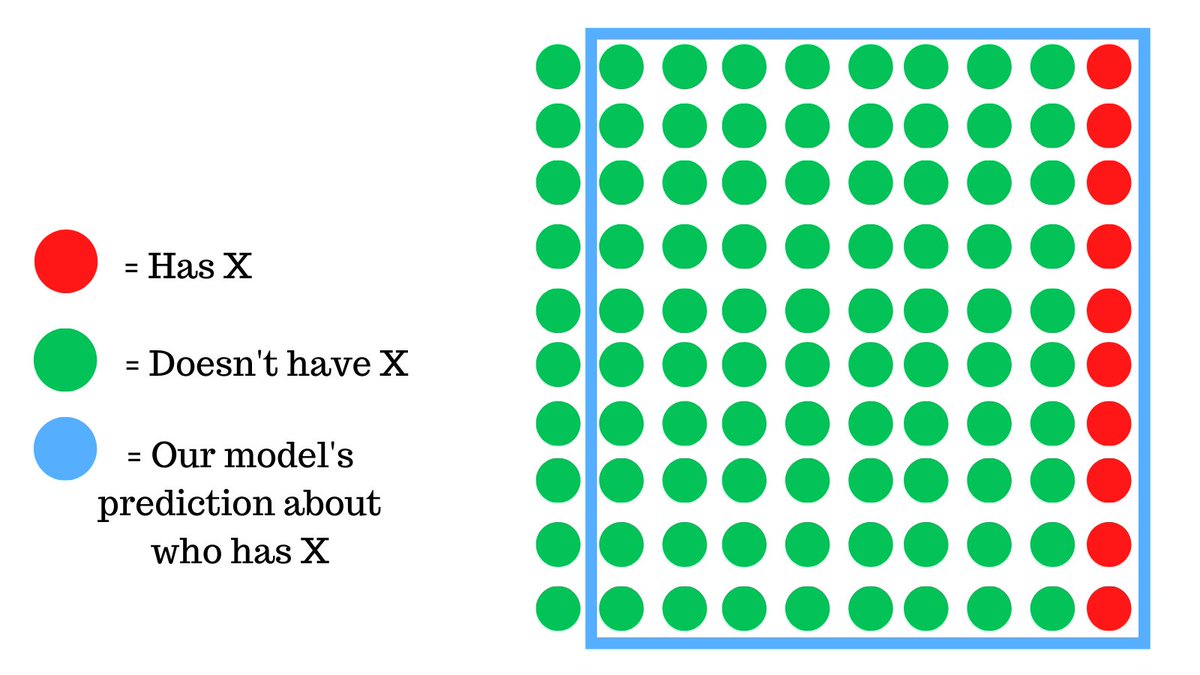
For every person that we caught with X, we falsely deemed 7 people who did not have X as being positive.
This is problematic for one main reason:
The model is essentially useless, it predicts almost everyone as being positive.
Why is this happening and how can we fix this?🤔
This is problematic for one main reason:
The model is essentially useless, it predicts almost everyone as being positive.
Why is this happening and how can we fix this?🤔
We need to realize is that this is certainly not the best model we could've trained. Binary classifications like these are hard to evaluate.
Let me explain.
Let me explain.
This is a binary classification problem, basically, there are two possibilities: either the person has the disease or not.
Then there are the 2 predictions by the models which are the same as above. This leads to 4 total cases.
Then there are the 2 predictions by the models which are the same as above. This leads to 4 total cases.
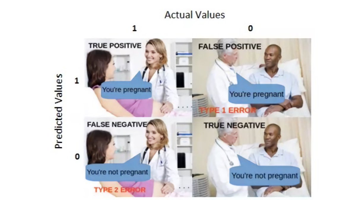
- Case 1: Our model predicts someone shoplifted when they actually did (TP - True Positive)
- Case 2: Our model predicts someone shoplifted when they didn't (FP - False Positive)
- Case 2: Our model predicts someone shoplifted when they didn't (FP - False Positive)
- Case 3: Our model predicts someone did not shoplift when they did (FN - False Negative)
- Case 4: Our model predicts someone did not shoplift when they didn't (TN - True Negative)
This meme helps me understand it better, case 3 and case 2 are errors.
- Case 4: Our model predicts someone did not shoplift when they didn't (TN - True Negative)
This meme helps me understand it better, case 3 and case 2 are errors.
We’ll come back to this in just a second, for now lets take a look at the model.
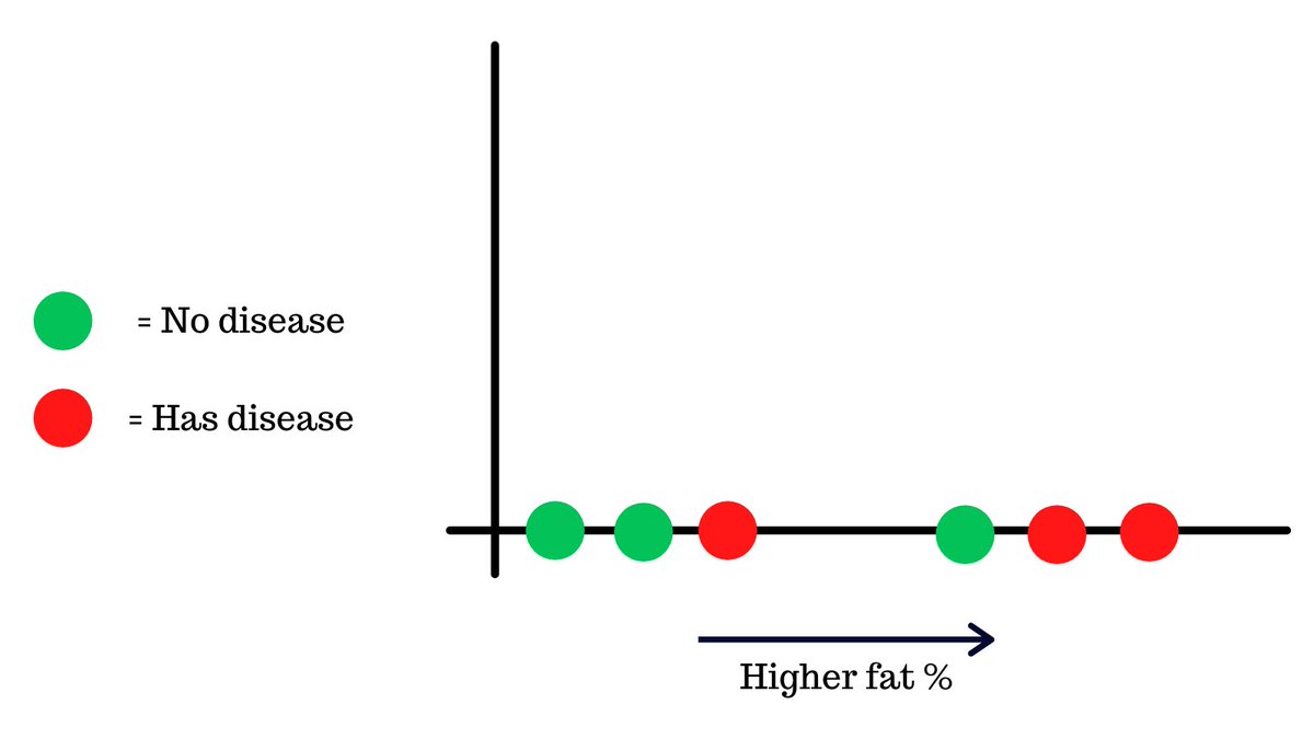
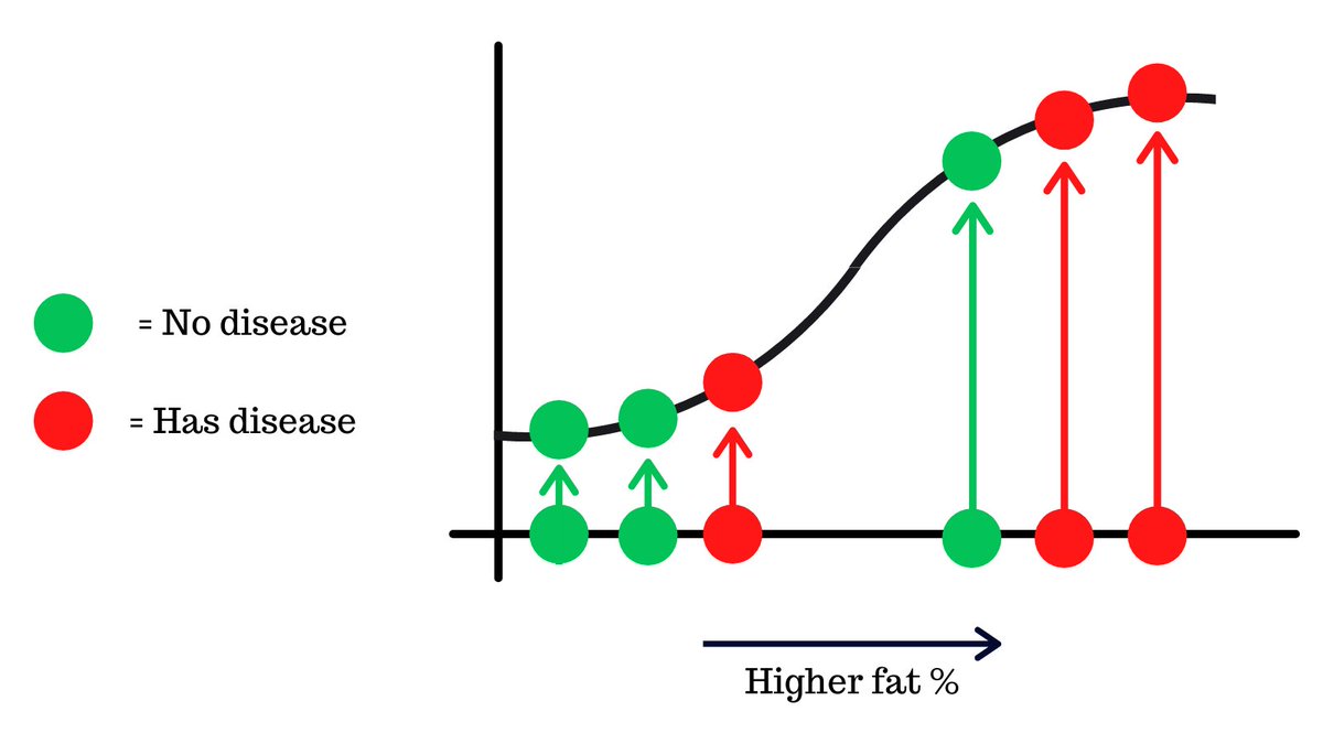
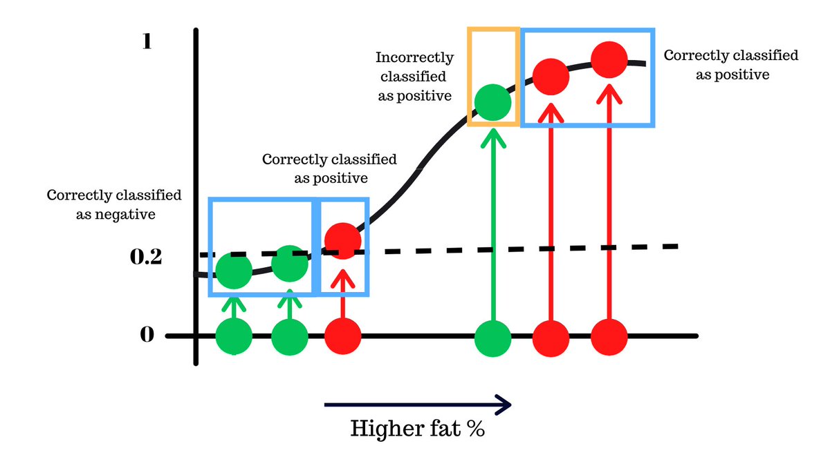
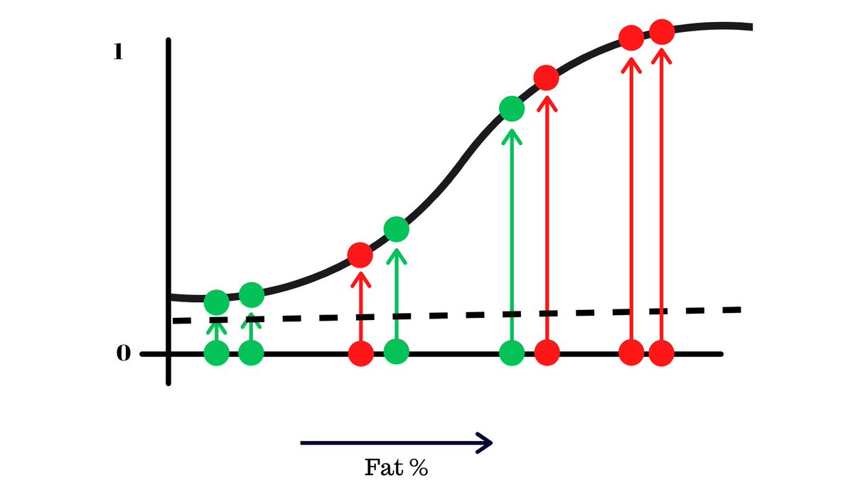
For the sake of simplicity, let’s focus one of the metrics that was used to train the model, body fat. Here’s a chart that shows the body fat of 6 people and whether they had the disease or not.
For the sake of simplicity, let’s focus one of the metrics that was used to train the model, body fat. Here’s a chart that shows the body fat of 6 people and whether they had the disease or not.
This data is fit onto a logistic regression curve, which is a machine learning algorithm that puts the values onto a s-like curve.
The y-axis shows the probability that someone has the disease from 0 to 1.
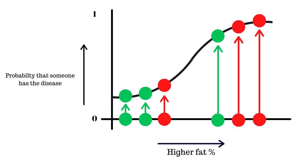
Since this is a binary classification problem (either a yes or a no), what would be optimal threshold where we decide if someone has the disease or not?
This will make more sense as we move on.
This will make more sense as we move on.
There are 2 things to keep in mind here:
- We must catch people that actually have the disease correctly
- We must not falsely classify people without X as positive, the model just ends up being useless
- We must catch people that actually have the disease correctly
- We must not falsely classify people without X as positive, the model just ends up being useless
Let’s try different probabilty thresholds and see what we get, starting with 0.5.
What we’re saying here is that when the model predicts that probabilty of someone having ‘X’ is more than 5, the model gives the output that they were positive.
What we’re saying here is that when the model predicts that probabilty of someone having ‘X’ is more than 5, the model gives the output that they were positive.

Let’s analyse this. We correctly classify 4 people and made 2 mistakes of different kinds.
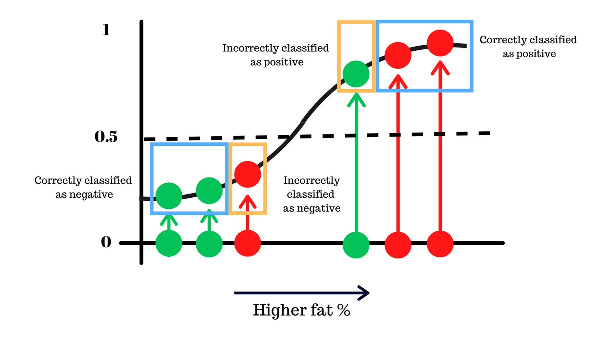
Can you think of a never threshold that can improve on this or make lesser mistakes?
Keeping it higher at 0.9, we make one less mistake as you see
Keeping it higher at 0.9, we make one less mistake as you see
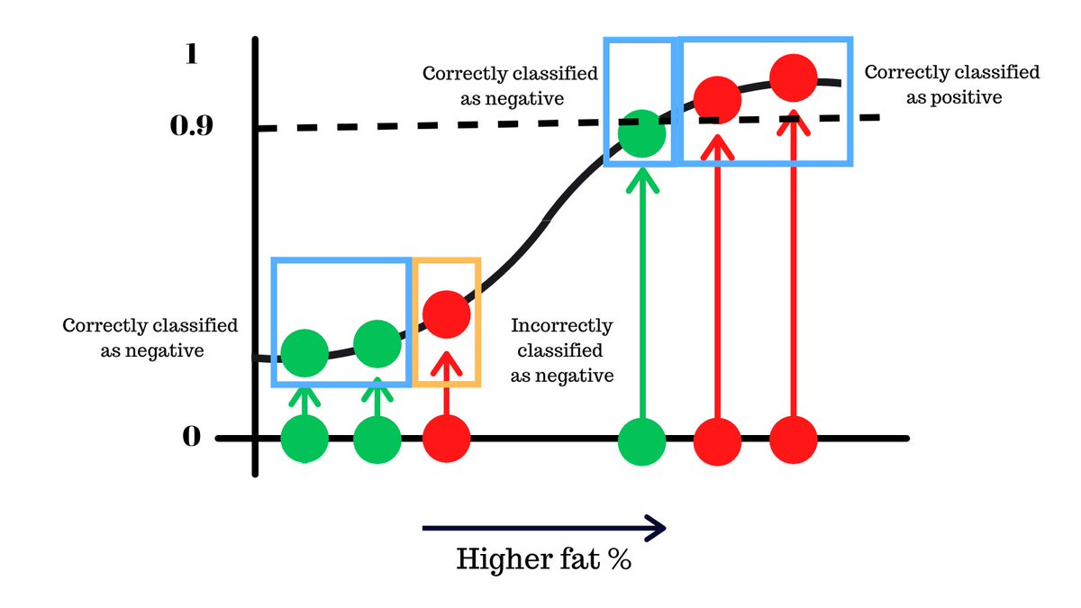
On the other hand keeping the threshold lower, we can avoid a different type of mistake, potentially better because we do not miss people who have the disease.
As you can see, just by changing this threshold, we can reduce the mistakes that our classifier model makes.
Now imagine thousands of data points on the logistc regression curve, how would you find the optimal threshold in this case?
Now imagine thousands of data points on the logistc regression curve, how would you find the optimal threshold in this case?
Now our previous method of trial error, this would be a painstaking and long process, fortunately there is a better solution.
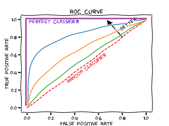
The ROC (Receiver operator characteristic) curve is a way of summarizing these findings in a simple graph to help us find the optimal threshold for bianary classification models. It looks something like this 👇
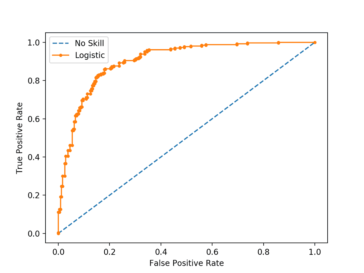
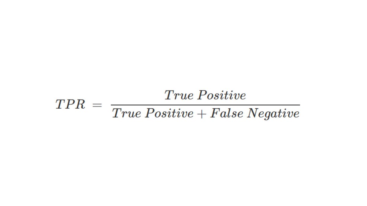
It compares the True Positivity Rate (TPR) and the False Positivity Rate(FPR) of binary classification model at different thresholds.
TPR is a measure how good is our model at identifying relevant samples. In this case, how good it is at catching people who actually have the virus.
Formally defined by this formula 👇
Formally defined by this formula 👇
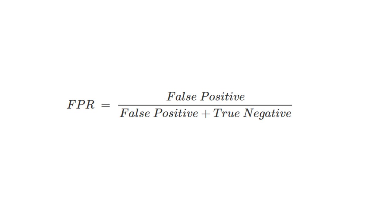
FPR on the other hand tells you the proportion of not diseased people that were incorrectly classified as being infected.
Formally defined by this formula 👇
Formally defined by this formula 👇
The ROC compares these two metrics and allows us to find the sweet spot for the threshold, let’s take a look an example.
The data is on the logistic regression curve and choose a threshold, starting from the bottom.
The data is on the logistic regression curve and choose a threshold, starting from the bottom.
Anything that’s below the line will output be people without X and above as people with X by the model. We’ll now find the FPR and TPR of this model with this threshold and plot it on another graph.
We have 👇
We have 👇
- 4 True Positive: People infected and predicted correctly
- 0 False Negatives: People infected but not predicted correctly
- 4 False Positives: People infected but not predicted correctly
- 0 True Negatives: People not infected and predicted correctly
- 0 False Negatives: People infected but not predicted correctly
- 4 False Positives: People infected but not predicted correctly
- 0 True Negatives: People not infected and predicted correctly
We can get the TPR = 4/(4 + 0) = 1, FPR = 4/(4+0) = 1
Now we plot this on the graph
Now we plot this on the graph
Now we move the threshold slightly above (only green point is below the threshold) and repeat this process This time we get TPR=1, FPR=0.75

Plotting this point…

We continue this process over and over (automated by our computer of course), in the end, we will get a graph like this, the ROC curve!
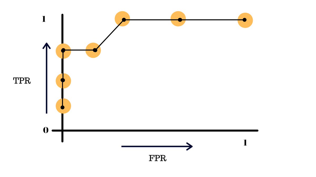
This essentially summarizes the performace of our model at different thresholds.
The more skewed the curve gets towards the top-left corner, the better the model is and the further you go in the other direction, the worse your model is.
The more skewed the curve gets towards the top-left corner, the better the model is and the further you go in the other direction, the worse your model is.
In our orignal problem, the engineers simply did not choose a good enough threshold for many features like the fat % that were used to train the model.
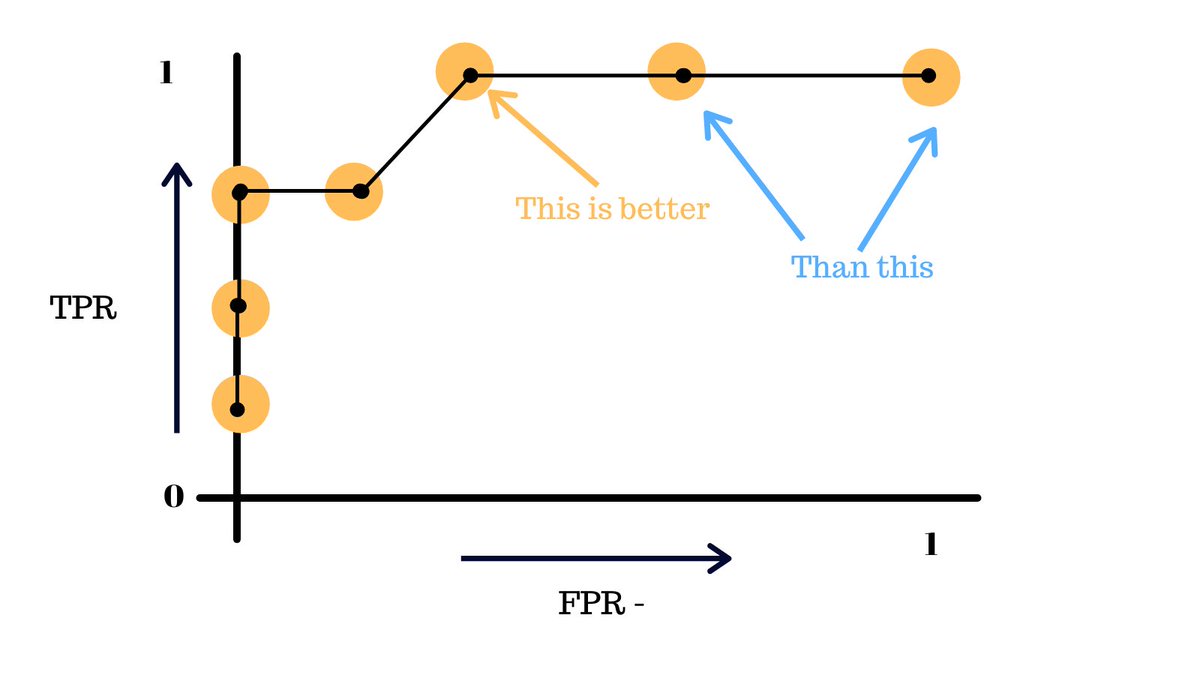
By simply using the optimal thresholds, we can dratically improve the accuracy of a binary classifier.
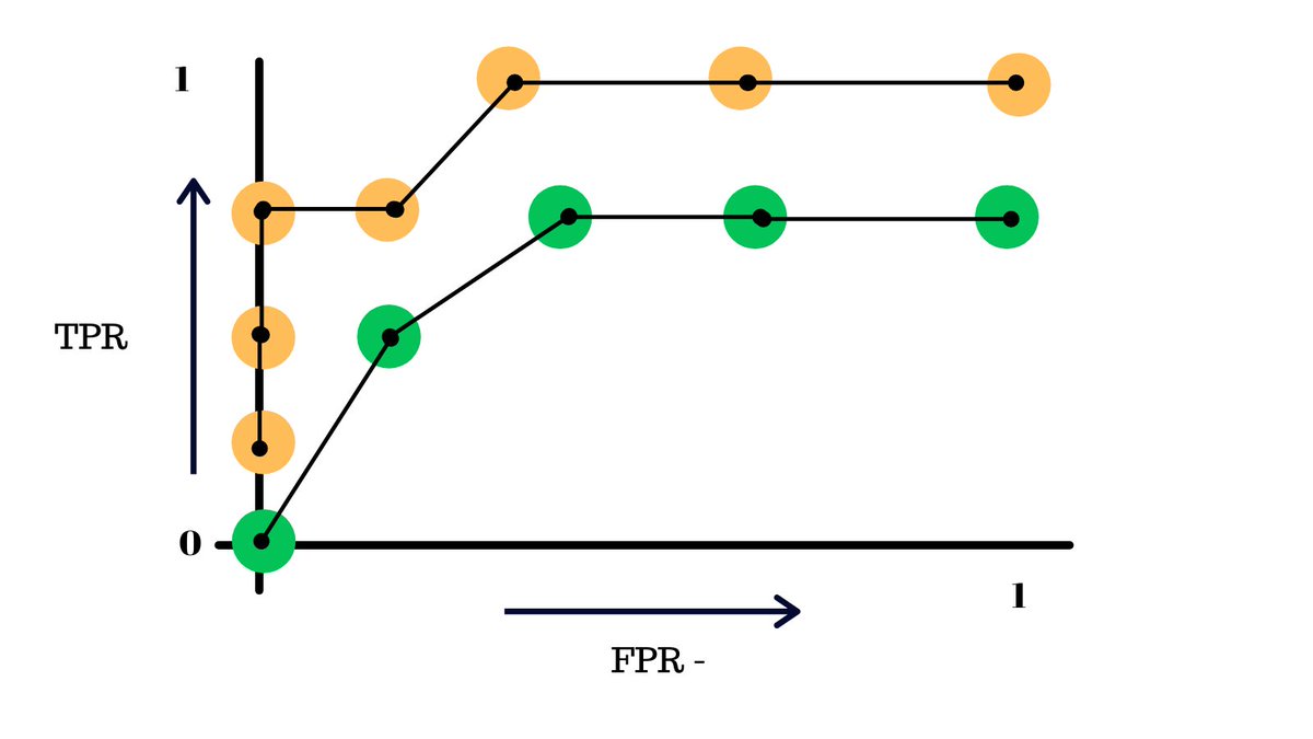
Another topic related to the ROC curve is AUC(Area under the curve), it a metric that helps us compare the performance of 2 models.
Another topic related to the ROC curve is AUC(Area under the curve), it a metric that helps us compare the performance of 2 models.
The AUC basically says that given the ROC curves of some models, the one with a greater area under it performs better the other one.
Like in this case, the yellow model is better than the green one.
Like in this case, the yellow model is better than the green one.
And all of this is what helped the engineers make a better model.
Follow @PrasoonPratham for more content like this and do retweet the first tweet in thread to spread the love of machine learning.
Follow @PrasoonPratham for more content like this and do retweet the first tweet in thread to spread the love of machine learning.
Loading suggestions...