

Is it just me who thinks that the Devanagari font used in @KBCsony is hard to read?
Here is an alternate sans-serif styled font that I think will help improve readability
Here is an alternate sans-serif styled font that I think will help improve readability
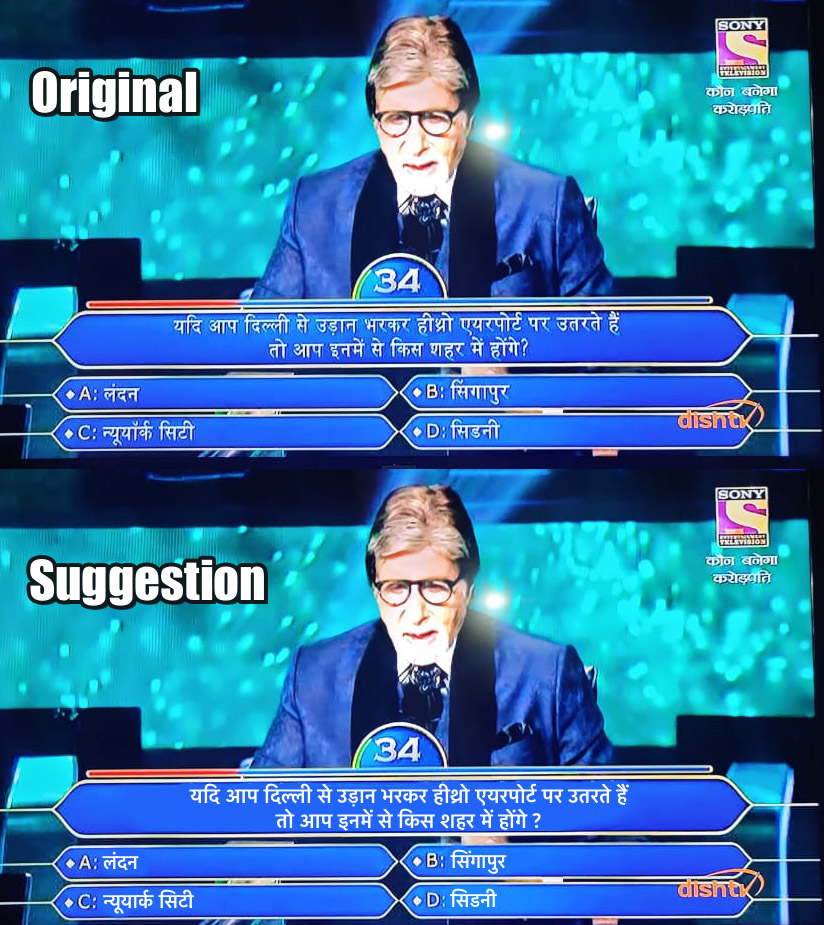
Serif fonts look fancy but they are harder to read - they are more suitable for print. On a digital medium, esp when your questions are bound by 45s limit, you want people to be able to read faster - so use a simpler font

Also, as Duolingo's research has shown, most next-billion Indians are okay with the Roman script to read and write Hindi - we use it to write in WhatsApp anyway. Why not just shorten your questions and simply use Roman letters?
blog.duolingo.com
blog.duolingo.com

Okay, Hindi in Roman Script seems a bit radical - I don't know what % of their viewers can or cannot read the Roman script
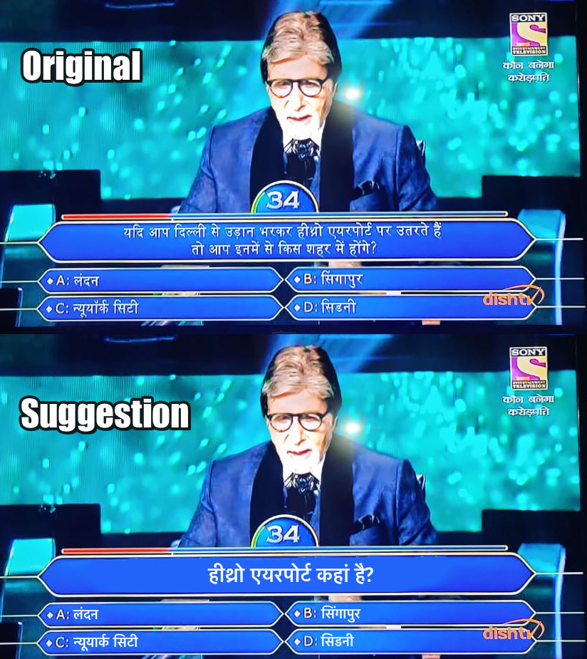
I think most of you will agree however that the questions can be shortened - that'll allow them to even increase the font size, making it even more readable
I think most of you will agree however that the questions can be shortened - that'll allow them to even increase the font size, making it even more readable
Loading suggestions...