

A firm grasp of Market Structure helps you avoid costly mistakes.
How good is your MS analysis?
Here's a🧵full of charts to test yourself:
How good is your MS analysis?
Here's a🧵full of charts to test yourself:
Before we start, here's a TLDR on MS
• A valid lower high is only confirmed AFTER a lower low or equal low forms. Vice Versa
• MSB = Market structure break
• Bearish MSB = last LL gets taken out
• Wicks or deviation outside of the S/R is evidence of a ranging structure
• A valid lower high is only confirmed AFTER a lower low or equal low forms. Vice Versa
• MSB = Market structure break
• Bearish MSB = last LL gets taken out
• Wicks or deviation outside of the S/R is evidence of a ranging structure
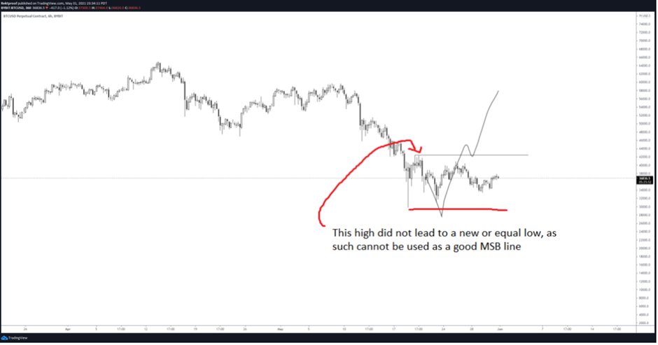
Example of a an invalid high ❌
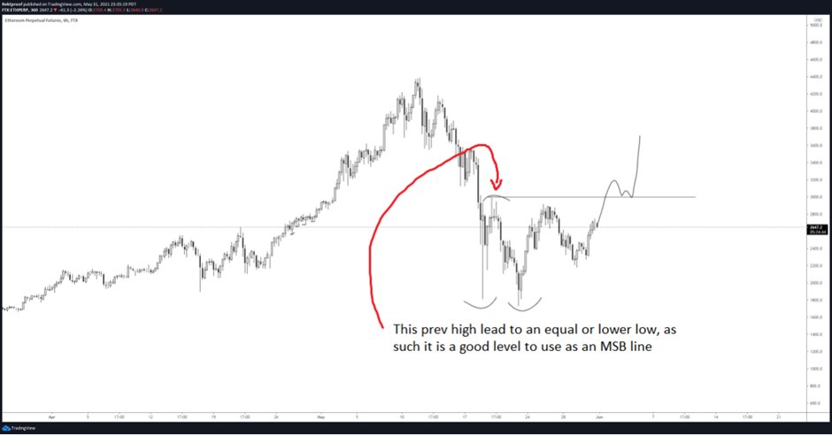
Example of a valid high 💪
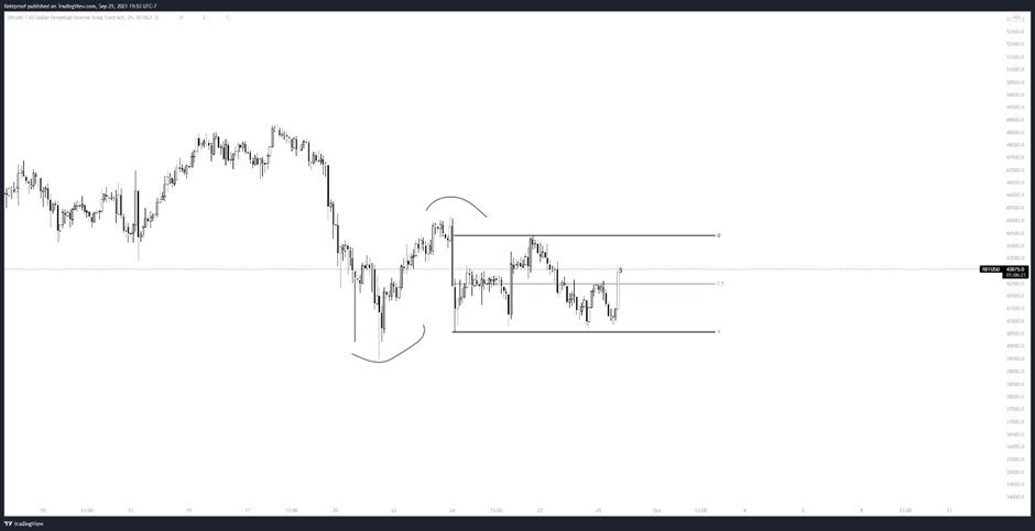
Example of prices just ranging
• The curve lines portray LH and LL
• Everything to the right has not shifted new lows/highs but is just ranging
• The MSB would only occur after we shift to a new high or low
Misinterpreting any MSB within the range will get you chopped up
• The curve lines portray LH and LL
• Everything to the right has not shifted new lows/highs but is just ranging
• The MSB would only occur after we shift to a new high or low
Misinterpreting any MSB within the range will get you chopped up
Example on how a poorly drawn range will rekt your PA analysis
Example #1
• The range drawn below implies that downside liquidity has not been collected, hence favoring downside movement
However if we were to re-draw the lines properly...
Example #1
• The range drawn below implies that downside liquidity has not been collected, hence favoring downside movement
However if we were to re-draw the lines properly...
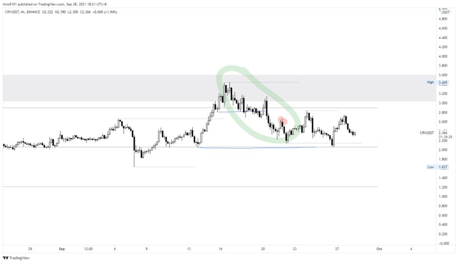
Example #2
• Remember deviations are evidence of a range?
• So lets move the support line to exclude the deviation
• The similar chart now shows breakout traders trapped below the support
This now shows downside liquidity has been exhausted and as such, favoring the upside
• Remember deviations are evidence of a range?
• So lets move the support line to exclude the deviation
• The similar chart now shows breakout traders trapped below the support
This now shows downside liquidity has been exhausted and as such, favoring the upside
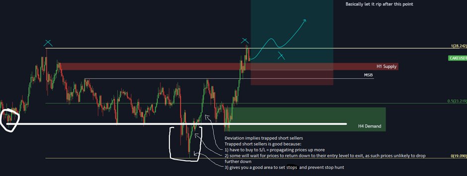
How to read MS in a V shaped market?
Example #1
Example #1
Example #2
• Green circle is just developing PA waiting to break significant market levels
• What you're looking for is MSB on the left (marked out in blue lines)
• As the lower blue line has not been broken, the swing high (highlighted in red) is not a significant MS level
• Green circle is just developing PA waiting to break significant market levels
• What you're looking for is MSB on the left (marked out in blue lines)
• As the lower blue line has not been broken, the swing high (highlighted in red) is not a significant MS level
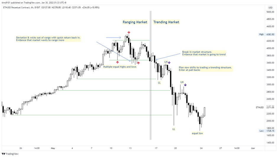
How to trade the Range
Signs of a range:
• Equal highs and lows
• Wicks & deviation out of S/R only to snap back in quickly
Plan is to enter at range ends as demarcated with red arrows
Signs of a range:
• Equal highs and lows
• Wicks & deviation out of S/R only to snap back in quickly
Plan is to enter at range ends as demarcated with red arrows

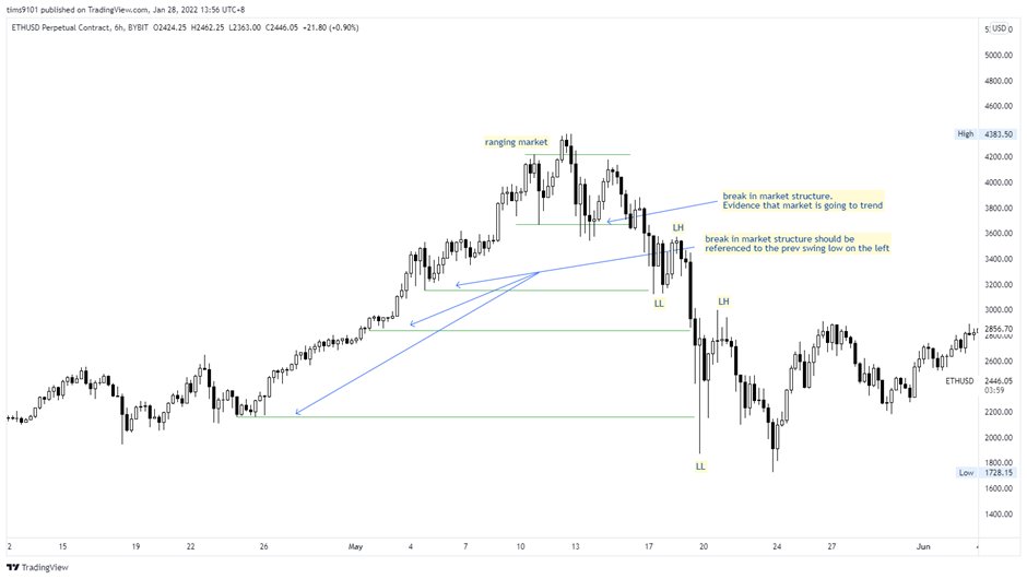
How to trade the Trend
Signs of a trend:
• Clear MSB last higher low
• LL is confirmed by formation of LH
Enter on pull backs as demarcated with purple arrows
Signs of a trend:
• Clear MSB last higher low
• LL is confirmed by formation of LH
Enter on pull backs as demarcated with purple arrows
How HTF structures influence your trading plan
Example #1
This chart clearly shows a change in market structure from down trending to up trending
Hence we favor buying dips instead of shorting the tops
Example #1
This chart clearly shows a change in market structure from down trending to up trending
Hence we favor buying dips instead of shorting the tops
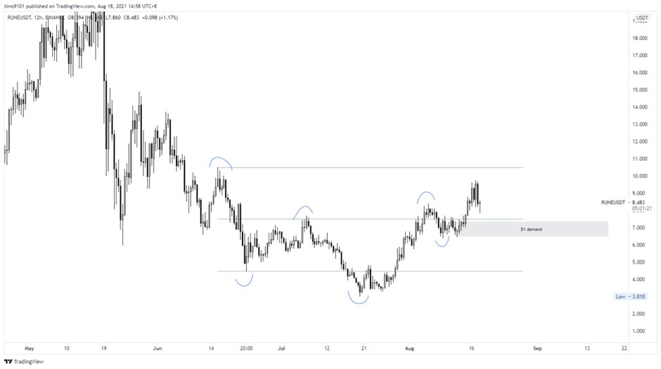
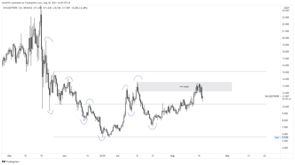
Example #2
• Both example #1 & 2 happened the same time, when market was bullish
• However this chart is not bullish
• Compared to Example #1, you can see that the market structure is different
You would be more favored to short the tops instead of buying the dips
• Both example #1 & 2 happened the same time, when market was bullish
• However this chart is not bullish
• Compared to Example #1, you can see that the market structure is different
You would be more favored to short the tops instead of buying the dips
Alright that's all folks.
Interpret the right Market Structure and you'll be 1 step closer to printing $$.
If you enjoyed this thread,
• Follow me at @Tims9101 for more trading related content
• Retweet to share the good stuff. Sharing is caring.
Cheers 😇
Interpret the right Market Structure and you'll be 1 step closer to printing $$.
If you enjoyed this thread,
• Follow me at @Tims9101 for more trading related content
• Retweet to share the good stuff. Sharing is caring.
Cheers 😇
Loading suggestions...