

🧵 Improving the visual design of an interface often feels subjective and mysterious. Here's a basic framework to help you refine your designs:
📐 Layout
🔤 Typography
🎨 Color
✨ Effects
📐 Layout
🔤 Typography
🎨 Color
✨ Effects
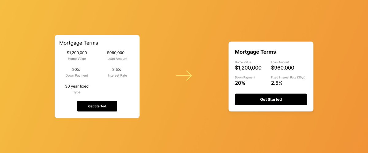
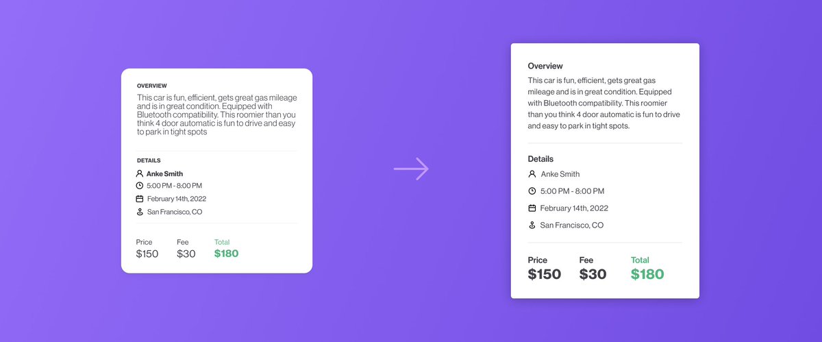
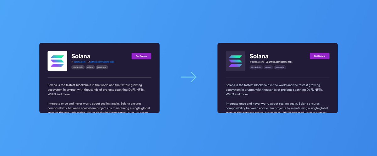
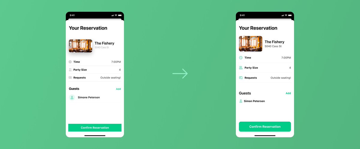
📐 Layout: use scale, alignment, and proportion to create visual balance and establish clear hierarchy.
Remove unessential elements, and make things as scannable as possible:
Remove unessential elements, and make things as scannable as possible:
🔤 Typography: reduce the number of discrete font sizes and styles to simplify visual complexity.
Optimize line height and line length so things are easy to read.
Optimize line height and line length so things are easy to read.
🎨 Color: use fewer colors than you think you should, and tint hues to create colors that feel cohesive and harmonious.
Make sure there's enough contrast to make things accessible and readable.
Make sure there's enough contrast to make things accessible and readable.
✨ Effects: simplify the number of effects used, and be cohesive with properties like shadows, stroke widths, border radius and icon shape and style.
Loading suggestions...