

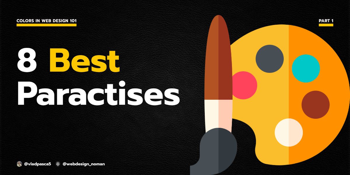
Colors 101
8 Best Practises when working with colors
A thread:
8 Best Practises when working with colors
A thread:
Before you begin, if you like these types of threads make sure you:
1. Follow me @VladPasca5 and @webdesign_noman for more content like this
2. RT the above tweet
3. DM me if you need help with any web design related stuff
Now let's continue with our thread...
1. Follow me @VladPasca5 and @webdesign_noman for more content like this
2. RT the above tweet
3. DM me if you need help with any web design related stuff
Now let's continue with our thread...
@webdesign_noman 1. Less is more.
Using too many colors on a page is confusing and it is unclear which parts are more important.
One or two colors are enough to visually highlight what is really important.
Using too many colors on a page is confusing and it is unclear which parts are more important.
One or two colors are enough to visually highlight what is really important.


@webdesign_noman 2. Consistency.
Chose one color palette and stick to it on your entire site.
Chose one color palette and stick to it on your entire site.


@webdesign_noman 3. Use The 60–30–10 rule.
When you choose a new color palette:
Dedicate 60% of the palette to one color (for backgrounds)
Another color makes up 30% of the palette (for text and images)
And a third color is used for the remaining 10% of the design (for buttons/links)
When you choose a new color palette:
Dedicate 60% of the palette to one color (for backgrounds)
Another color makes up 30% of the palette (for text and images)
And a third color is used for the remaining 10% of the design (for buttons/links)

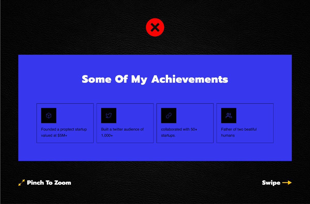
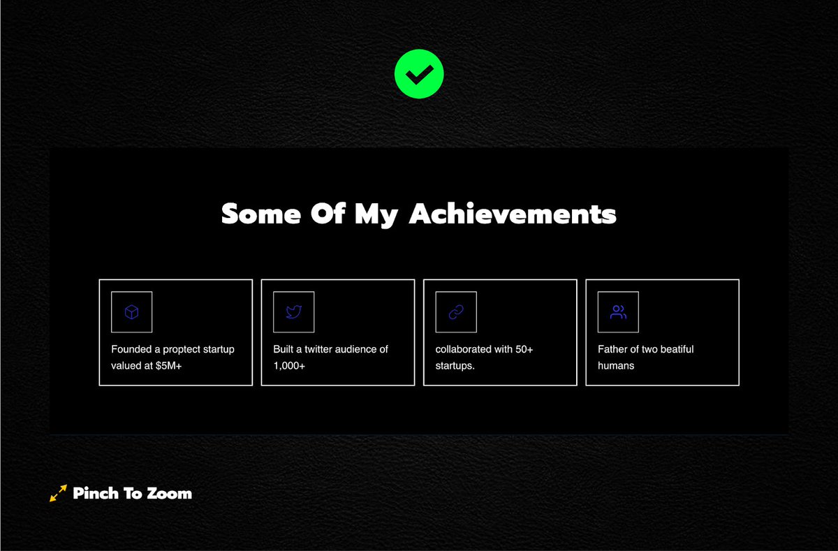
@webdesign_noman 4. Contrast.
Keep sufficient contrast between the background and the elements.
Avoid using similar colors for them.
Keep sufficient contrast between the background and the elements.
Avoid using similar colors for them.


@webdesign_noman 5. Design for color-blind users.
Convert your designs to grayscale to ensure color-blind users can read important info.
Convert your designs to grayscale to ensure color-blind users can read important info.


@webdesign_noman 6. Gradients.
Avoid abrupt transitions.
Ensure soft and gradual transitions.
And...
Use 2-3 colors at max.
Avoid abrupt transitions.
Ensure soft and gradual transitions.
And...
Use 2-3 colors at max.

@webdesign_noman 7. Use color for hierarchy.
Colors can be used similarly to size and weight to give importance to elements in your design.
Brighter colors are typically going to grab the viewer’s attention much more than dull, non-saturated colors.
Colors can be used similarly to size and weight to give importance to elements in your design.
Brighter colors are typically going to grab the viewer’s attention much more than dull, non-saturated colors.

@webdesign_noman 8. Backgrounds.
Only use cold/dark colors for the background.
Using bright colors for backgrounds can be heavy on the eyes.
Only use cold/dark colors for the background.
Using bright colors for backgrounds can be heavy on the eyes.
@webdesign_noman That's it for this thread If you liked this thread make sure you:
1. Retweet the first tweet
2. Follow me @VladPasca5 and @webdesign_noman
3. DM me if you need help with any web design stuff
4. Subscribe to my newsletter - vladpasca.substack.com
1. Retweet the first tweet
2. Follow me @VladPasca5 and @webdesign_noman
3. DM me if you need help with any web design stuff
4. Subscribe to my newsletter - vladpasca.substack.com
Loading suggestions...