

Guide on Responsive Web Development🚀
A thread🧵👇
A thread🧵👇
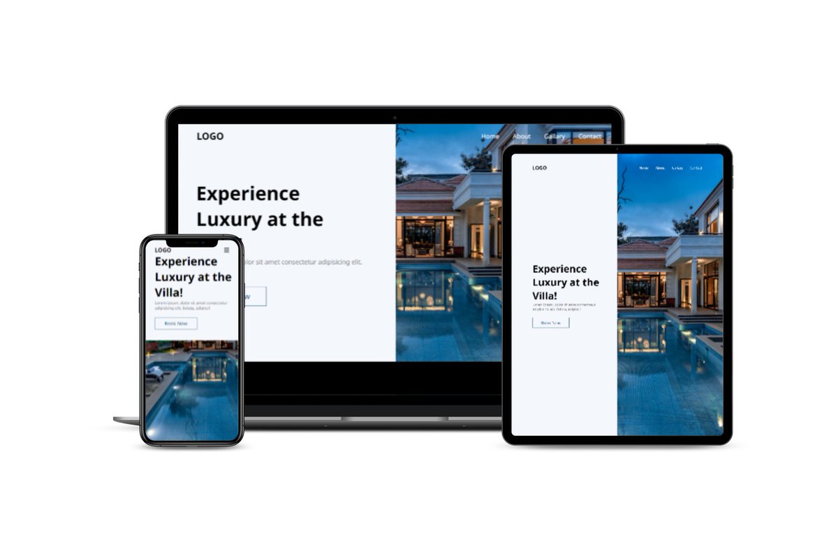
Currently 57% of the traffic on Web comes from Mobile Devices. Hence it is important for your websites to be optimized and performant for small screen devices like Phones, Tablets and small screen laptops! Here are some points on how to develop and Responsive Website.
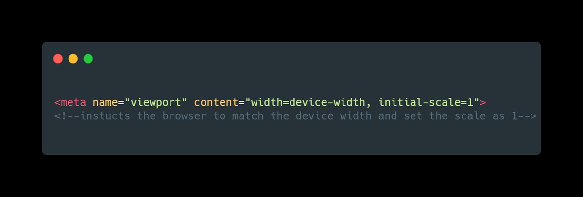
1. Setting the viewport
All the pages must include a meta viewport tag in the head section of the document. The Viewport handles the scaling of the page on various screen sizes.
All the pages must include a meta viewport tag in the head section of the document. The Viewport handles the scaling of the page on various screen sizes.
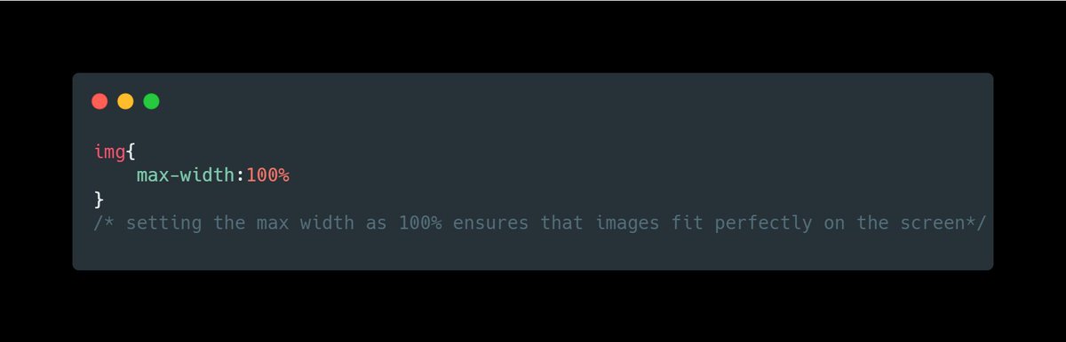
2. Set the sizes of the content to match the viewport
Never set width and height of content elements like images or videos in pixels. Density of pixels differ from device to device.
Never set width and height of content elements like images or videos in pixels. Density of pixels differ from device to device.
This leads to ugly looking horizontal scroll on smaller devices. Instead set sizes in relative units like “%” or “vh/vw” .
Read this to understand units in CSS
Read this to understand units in CSS
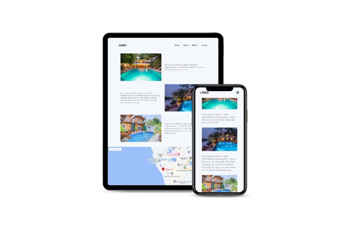
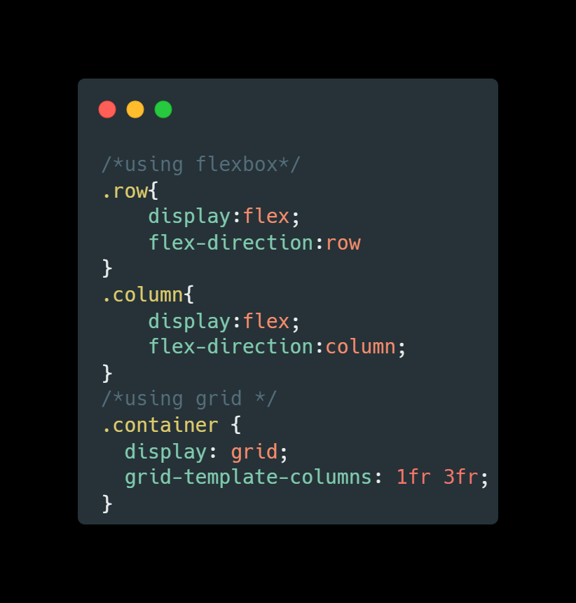
3. Content layout
Use flexbox to layout the content as per the screen size. In General use, always spread the elements horizontally (row layout) on bigger screens and vertically stacked(column layout) upon each other on smaller screens.
Use flexbox to layout the content as per the screen size. In General use, always spread the elements horizontally (row layout) on bigger screens and vertically stacked(column layout) upon each other on smaller screens.
Use “flex-direction” property in this case. Only on some rare cases use row layout on all screen types. You can also use "grid" instead of “flex-box”.
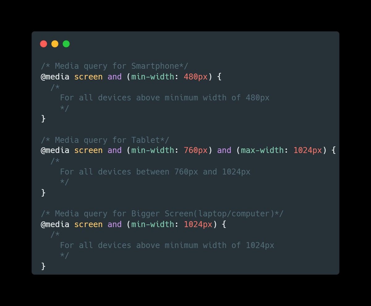
4. CSS Media queries
CSS Media queries are like conditional statements in CSS. Using Media queries we can set CSS properties based on the size of screen.
CSS Media queries are like conditional statements in CSS. Using Media queries we can set CSS properties based on the size of screen.
For example, On a larger screen you can set the display of navigation bar as “display : flex” and on smaller display you can completely hide the navbar using “display : hidden”
5. Using JavaScript to toggle elements.
Some components like Navbar, Dropdowns, Modals would need use of JavaScript to manipulate the styling on events. For example, in Navbar you can use a onclick handle on the button, which opens up a Menu when clicked.
Some components like Navbar, Dropdowns, Modals would need use of JavaScript to manipulate the styling on events. For example, in Navbar you can use a onclick handle on the button, which opens up a Menu when clicked.
6. Use CSS Frameworks
If you are someone who still find responsive Web difficult, go with CSS frameworks. All CSS frameworks are built with mobile first approach and handles responsiveness effectively.
If you are someone who still find responsive Web difficult, go with CSS frameworks. All CSS frameworks are built with mobile first approach and handles responsiveness effectively.
All the queries and classes are pre written, you only have to use them in your HTML. For beginners I’ll suggest you start with Bootstrap. Then you can try your hands on Tailwind CSS, Bulma, Skeleton and various other CSS frameworks out there as per your need.
Thank you for reading❤️
I am Anurag, a Full Stack Developer from India.
I post content about:-
🔸HTML / CSS / JS
🔸React / Next.JS
🔸Web Development tips & Resources
🔸Programming
If you love such content, follow me at
@anurag_gharat
I am Anurag, a Full Stack Developer from India.
I post content about:-
🔸HTML / CSS / JS
🔸React / Next.JS
🔸Web Development tips & Resources
🔸Programming
If you love such content, follow me at
@anurag_gharat
Loading suggestions...