

Statistics like “40% of patients experience severe illness” seem very straightforward and easy to understand, but this simplicity is deceptive.
Here’s a taste of what goes into creating them:
Here’s a taste of what goes into creating them:
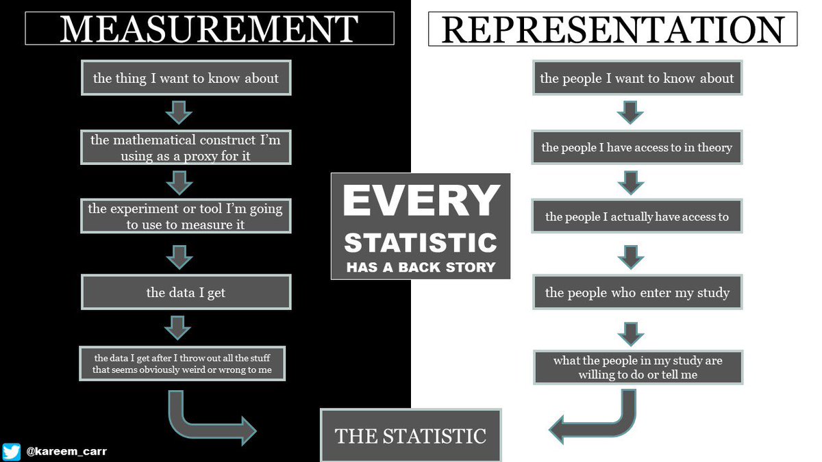
This infographic is adapted from scholarship on the “total survey error” framework. Although originally developed for thinking about surveys, I find it a very useful framework for thinking critically about statistics in general.
You can read more about it here: academic.oup.com
Just realized “back story” should be “backstory”. Just in case this bothers you as much as it bothers me, here’s the correction. 😅

Loading suggestions...