

Some gradients between two colours look good, others suck. It's easy to tell the difference, but what *is* that difference?
I think @JoshWComeau has figured it out! Here's the thought: gradients trace a line between two points in colour space, but there's more than one way to represent colours in a (typically 3D) space.
One way to pick out a colour is by specifying how much red, green, and blue it contains. These are RGB colour spaces.
Second pic is my phone screen under a microscope, which uses this idea of adding together R, G, and B
Second pic is my phone screen under a microscope, which uses this idea of adding together R, G, and B


Another way to pick out a colour is by specifying its 'hue' (where on the colour wheel?), its saturation (how pastel vs colourful?), and its 'value' (how bright?). These are 'HSV' or 'HSB' colour spaces.

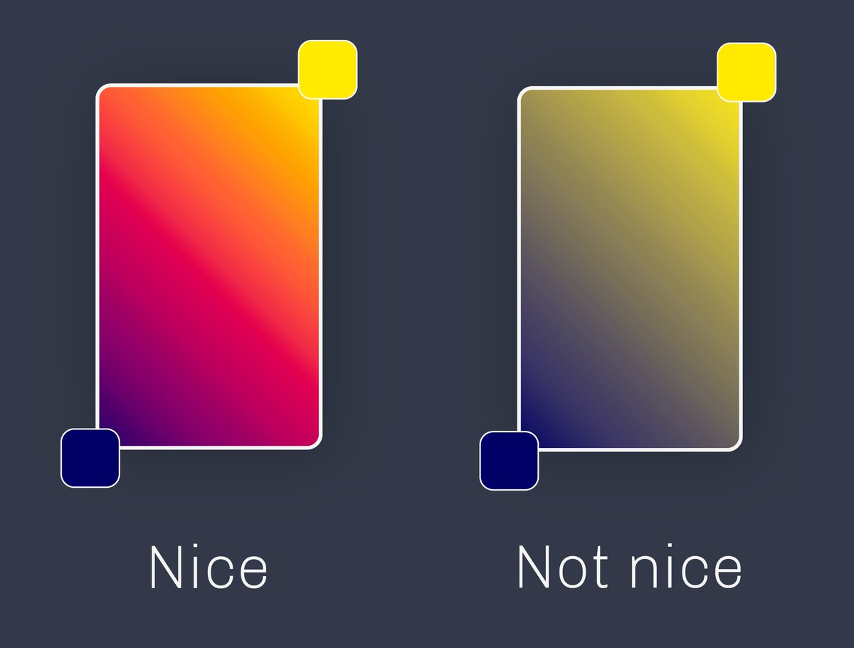
Josh's idea is that attractive-looking colour gradients are linear gradients in HSV-type colour spaces, and other gradients are unattractive because they trace a straight line through RGB-type spaces.
This is because bad-looking gradients typically have a greyish bit between the two colours, while attractive gradients are colourful throughout (see above).
If you imagine the RGB cube, there is a channel of greyish colours running between the "all 0%" corner and the "all 100%" corner. Two colours with significantly different hues are going to have to pass through that channel.
In HSV space, two colours with significantly different hues avoid that grey zone by orbiting around it, remaining colourful.
Notice that just varying the hue to get between two colours of similar S and V means circling around vs cutting through the colour wheel.
Notice that just varying the hue to get between two colours of similar S and V means circling around vs cutting through the colour wheel.
Here are two slices of the HSV cylinder for colours of the same value (~brightness).
The linear gradient in RGB space is on the left, the linear gradient in HSV space is on the right.
The linear gradient in RGB space is on the left, the linear gradient in HSV space is on the right.

Here's @JoshWComeau's excellent article where I got this from: joshwcomeau.com
I thought it was a very neat point! 🎨
I thought it was a very neat point! 🎨
Loading suggestions...