

Data Visualization
I found this image on LinkedIn that shows how to communicate with your charts more effectively.
Useful for those that struggle with colors & legends on their charts or dashboards.
Developed by 3 individuals from Warsaw University.
More below 👇🏽
I found this image on LinkedIn that shows how to communicate with your charts more effectively.
Useful for those that struggle with colors & legends on their charts or dashboards.
Developed by 3 individuals from Warsaw University.
More below 👇🏽
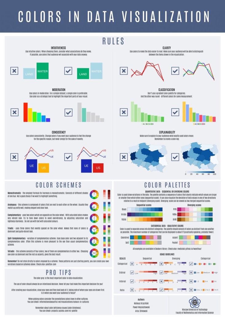
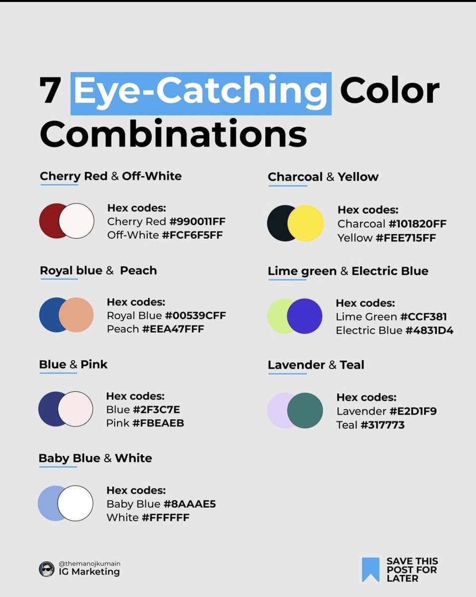
2/ Colors
Image shows colors that contrast properly (*except the last two for me). Also, it doesn’t mean one of the colors should be used as background.
If you’re new to visualization, white background is the safest choice for dashboards.
Done by @themanoikumain on IG.
Image shows colors that contrast properly (*except the last two for me). Also, it doesn’t mean one of the colors should be used as background.
If you’re new to visualization, white background is the safest choice for dashboards.
Done by @themanoikumain on IG.
3/ Sequential colors: if you’re working with filled maps e.g. covid deaths in countries or population, these colors are good to show low to high figures.
Qualitative colors: For showing distinction btw multiple categories. Be careful not to use too many colors, check next tweet*
Qualitative colors: For showing distinction btw multiple categories. Be careful not to use too many colors, check next tweet*

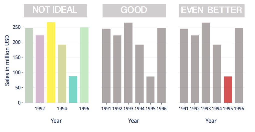
4/ Categorical variables:
One way to show these is to use distinct colors, if you don’t have a lot*. A better way to is to use a single colour like below & add an highlight. e.g the lowest or highest amount.
P.S. the years aren’t categorical variables in the image below*
One way to show these is to use distinct colors, if you don’t have a lot*. A better way to is to use a single colour like below & add an highlight. e.g the lowest or highest amount.
P.S. the years aren’t categorical variables in the image below*
Loading suggestions...