

Ultimate CSS Cheat sheet - Part 4
Lets understand the basics of CSS Flexbox and Grid in this thread.
Lets understand the basics of CSS Flexbox and Grid in this thread.

If you missed the previous part here is the link.
Table of Contents:
🔸CSS Flexbox
🔸CSS Grid
🔸CSS Flexbox
🔸CSS Grid
CSS Flexbox
• Display flex, defines a element as a flex container.
• Flexbox is also called as flexible box layout.
• Flexbox is used to layout components on the screen.
• Display flex, defines a element as a flex container.
• Flexbox is also called as flexible box layout.
• Flexbox is used to layout components on the screen.

Flex direction:
This property is used to provide direction to the content inside the flexbox.
This property is used to provide direction to the content inside the flexbox.

justify-content
Used to specify the layout of content along the main axis.
For col -> y axis
For row -> x axis
Used to specify the layout of content along the main axis.
For col -> y axis
For row -> x axis

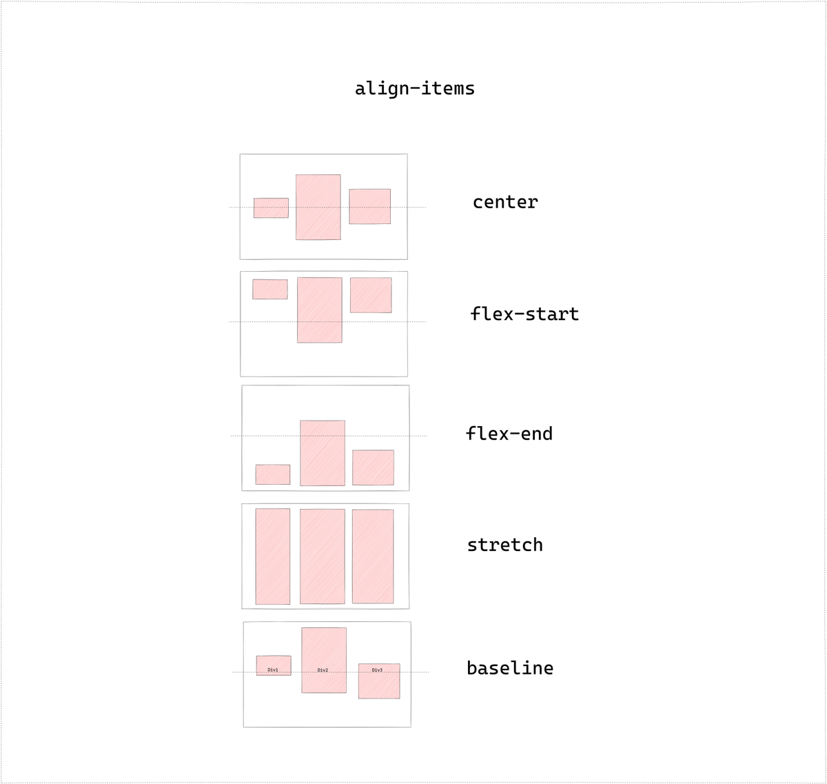
align-items
Used to specify the alignment along the cross axis.
For col -> x axis
For row -> y axis
Used to specify the alignment along the cross axis.
For col -> x axis
For row -> y axis
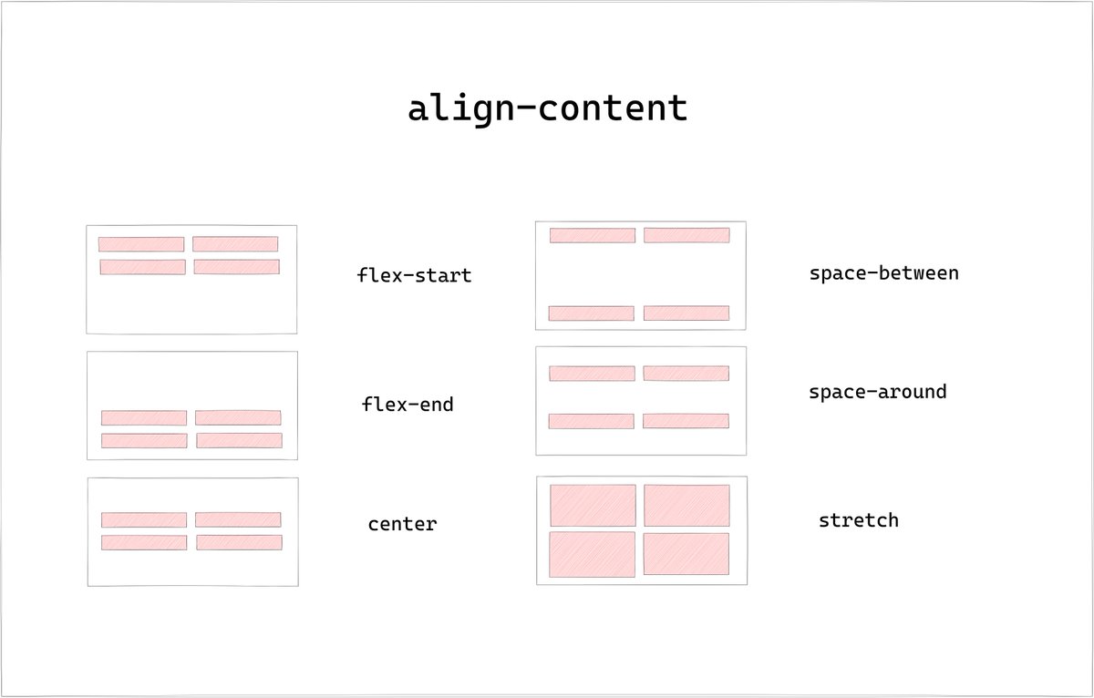
align-content
Used to specify the alignment of flex lines along cross axis
Used to specify the alignment of flex lines along cross axis
CSS Grid
• CSS Grid is 2D Grid based Layout System in CSS.
• We can create non-linear layouts using Grid.
• CSS Grid is 2D Grid based Layout System in CSS.
• We can create non-linear layouts using Grid.

The element on which display property is set as grid is called Grid container while the child elements inside are grid items.
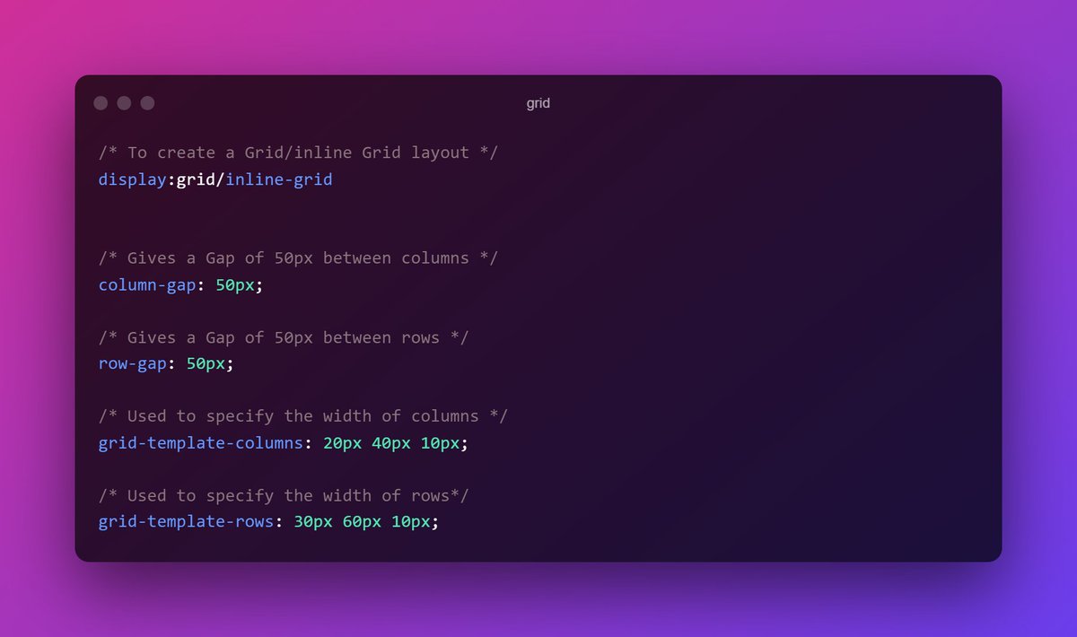
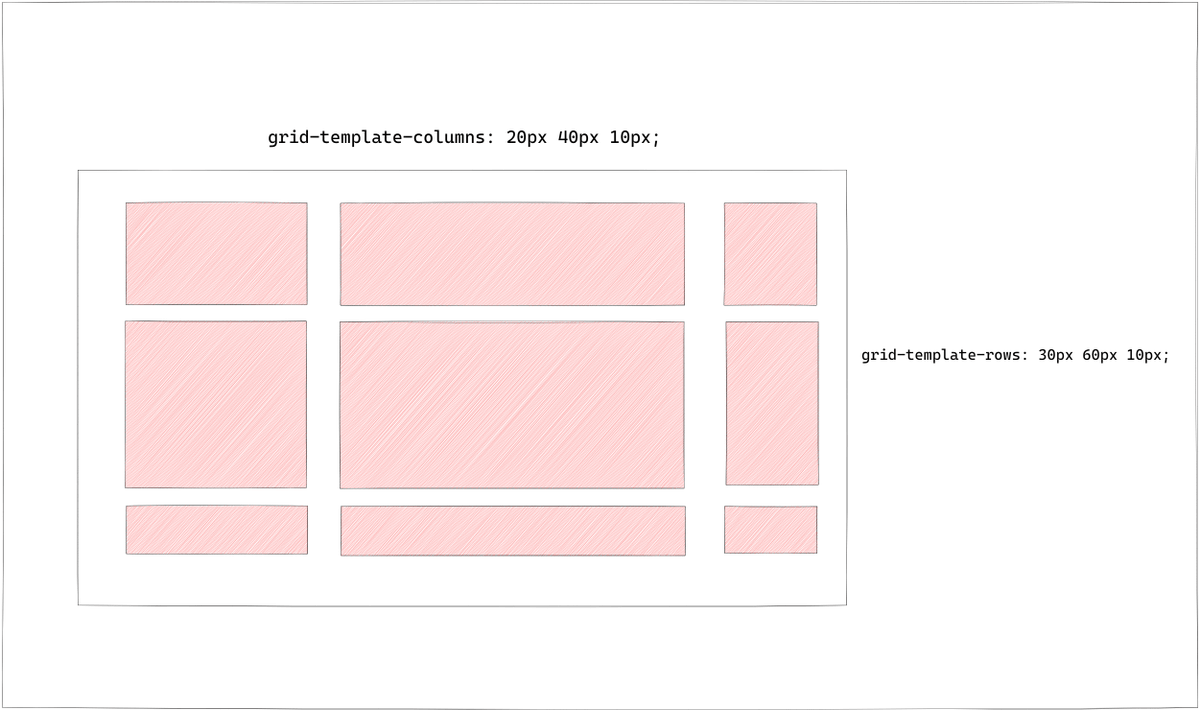
grid-template-rows/columns
This property is used to position the elements inside the grid container.
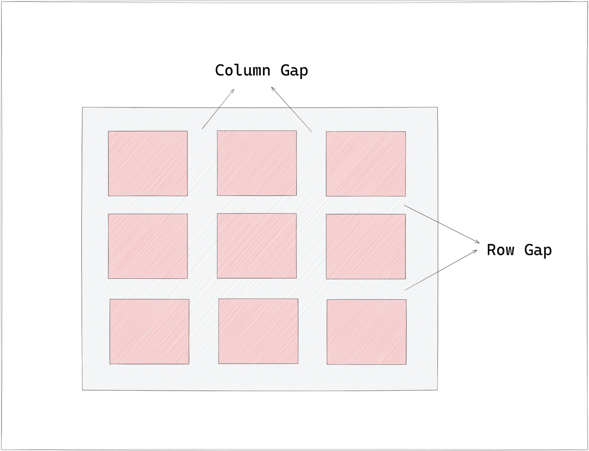
row-gap/column-gap
Specifies the gap between the items.
This property is used to position the elements inside the grid container.
row-gap/column-gap
Specifies the gap between the items.
That's it for the thread.
What's next ?
In Part 5 we will check not so popular but important properties of CSS
🔸border-outline
🔸opacity
🔸float
🔸overflow
What's next ?
In Part 5 we will check not so popular but important properties of CSS
🔸border-outline
🔸opacity
🔸float
🔸overflow
Thank you for reading❤️
I am Anurag, a Full Stack Developer from India.
I post content about:-
🔸HTML / CSS / JS
🔸React / Next.JS
🔸Web Development tips & Resources
🔸Programming
If you love such content, follow me!
I am Anurag, a Full Stack Developer from India.
I post content about:-
🔸HTML / CSS / JS
🔸React / Next.JS
🔸Web Development tips & Resources
🔸Programming
If you love such content, follow me!
Loading suggestions...