

💡Figma tip: Optimize color styles for your users, the design team
After years of building a refining design systems. Here are 4 ways I’ve learned to make color styles teams will actually use.. *correctly*
After years of building a refining design systems. Here are 4 ways I’ve learned to make color styles teams will actually use.. *correctly*

1. Make color pallets small yet scalable
Start every design system with a small number of cohesive color styles. And an easy way to scale them as your product grows and evolves (process fully stollen from @lindadong!). e.g..
Start every design system with a small number of cohesive color styles. And an easy way to scale them as your product grows and evolves (process fully stollen from @lindadong!). e.g..
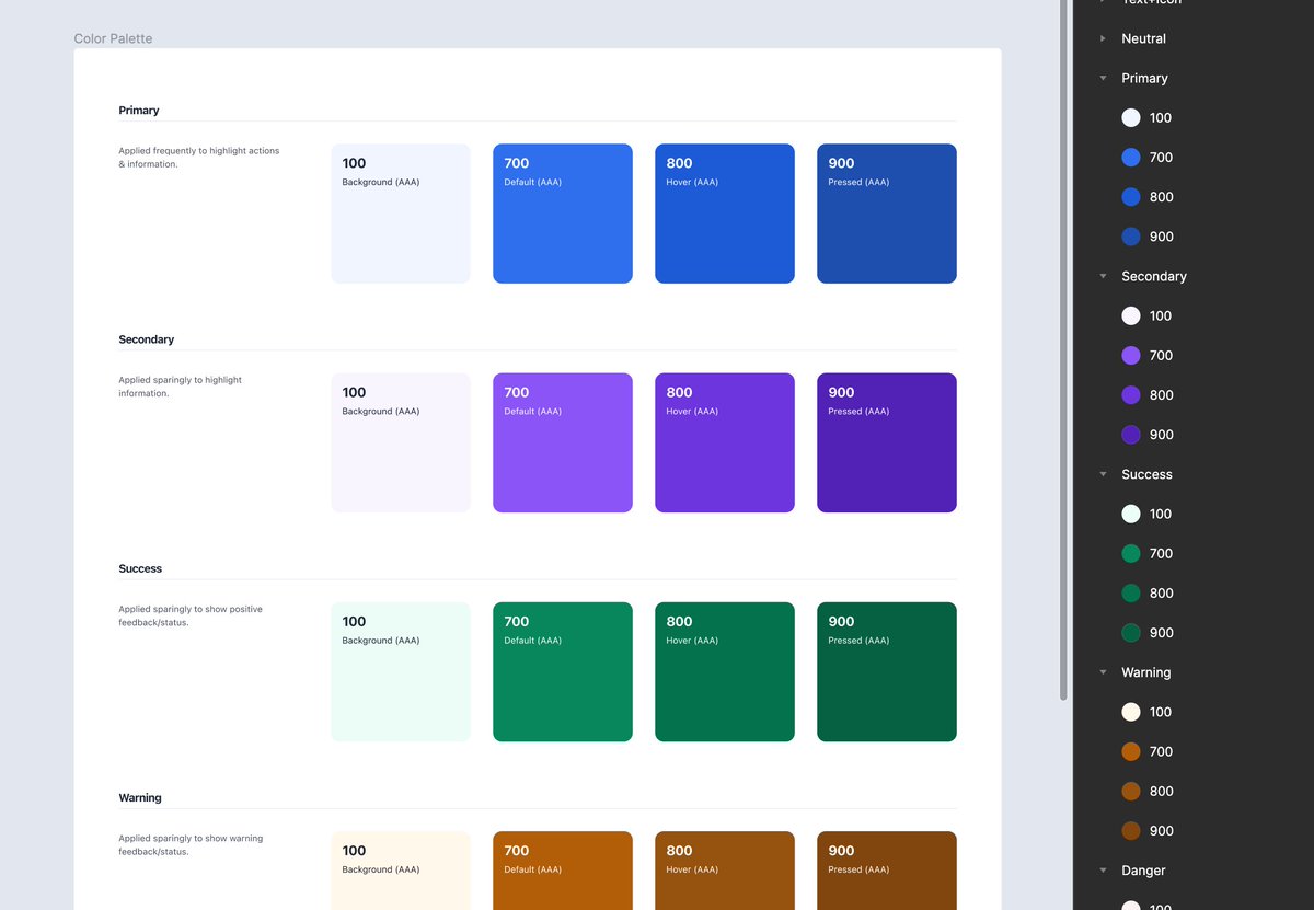
A) Create a color key that includes a wide range of tints and shades (~10) for each color. Making them all accessible starting at the 7th (contrast with white/black above 4.5).

B) For feedback and branding colors, add 4 variants as styles.
100 = Background
700 = Default
800 = Hover
900 = Pressed
If more variants are needed as your product evolves. Pull directly from the key (e.g., add 200 = outline)
100 = Background
700 = Default
800 = Hover
900 = Pressed
If more variants are needed as your product evolves. Pull directly from the key (e.g., add 200 = outline)
2. Give text colors VIP status
Colors used for text are the most important and most frequently used styles. Finding the right one needs to be foolproof. And they all need to look good and be accessible on any background. e.g..
Colors used for text are the most important and most frequently used styles. Finding the right one needs to be foolproof. And they all need to look good and be accessible on any background. e.g..
A) Create separate color styles for each supported state (white and black)
Black/Primary
Black/Secondary
Black/Disabled
White/Primary
White/Secondary
White/Disabled
Black/Primary
Black/Secondary
Black/Disabled
White/Primary
White/Secondary
White/Disabled
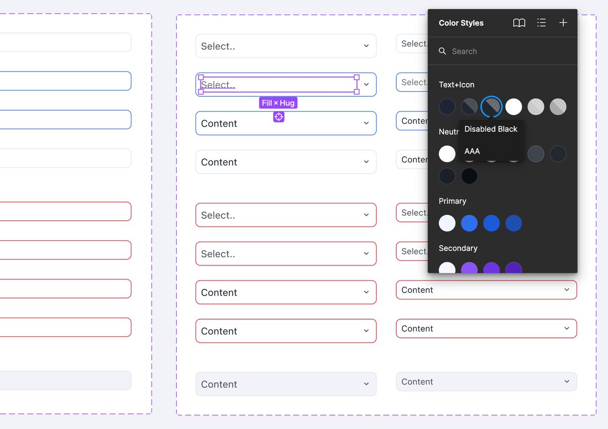
B) Set the Hex for each black color to match “Neutral 900” and adjust the opacities to create a range.
Set the Hex for each white color to “fffff” and adjust the opacities to create a range..
Set the Hex for each white color to “fffff” and adjust the opacities to create a range..

..Dead set on using colors from the neutral palette? That’s fine, keep the text color styles and paste in the desired neutral hex codes at 100% opacity.
3. Basic dark theme support goes a long way
Most products need light theme colors 95% of the time. But what about the occasional dark component (e.g., menu, tooltip, button, footer)? Add *some* dark theme styles to provide full support and avoid misuse. e.g..
Most products need light theme colors 95% of the time. But what about the occasional dark component (e.g., menu, tooltip, button, footer)? Add *some* dark theme styles to provide full support and avoid misuse. e.g..
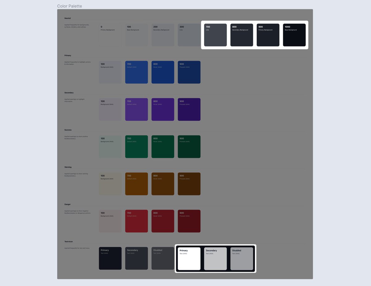
A) Include the following color styles for basic/local dark theme support in a light or neutral library.
Backgrounds: ~4 dark neutral colors (accounting for hover/active states)
Text: ~3 white colors at varying opacities (primary, secondary, disabled)
Backgrounds: ~4 dark neutral colors (accounting for hover/active states)
Text: ~3 white colors at varying opacities (primary, secondary, disabled)
4. Use a practical naming structure
Use a hierarchical and systemic naming structure for each color style. Then add helpful information in the description field. This will keep styles scalable and easy to use. e.g..
Use a hierarchical and systemic naming structure for each color style. Then add helpful information in the description field. This will keep styles scalable and easy to use. e.g..
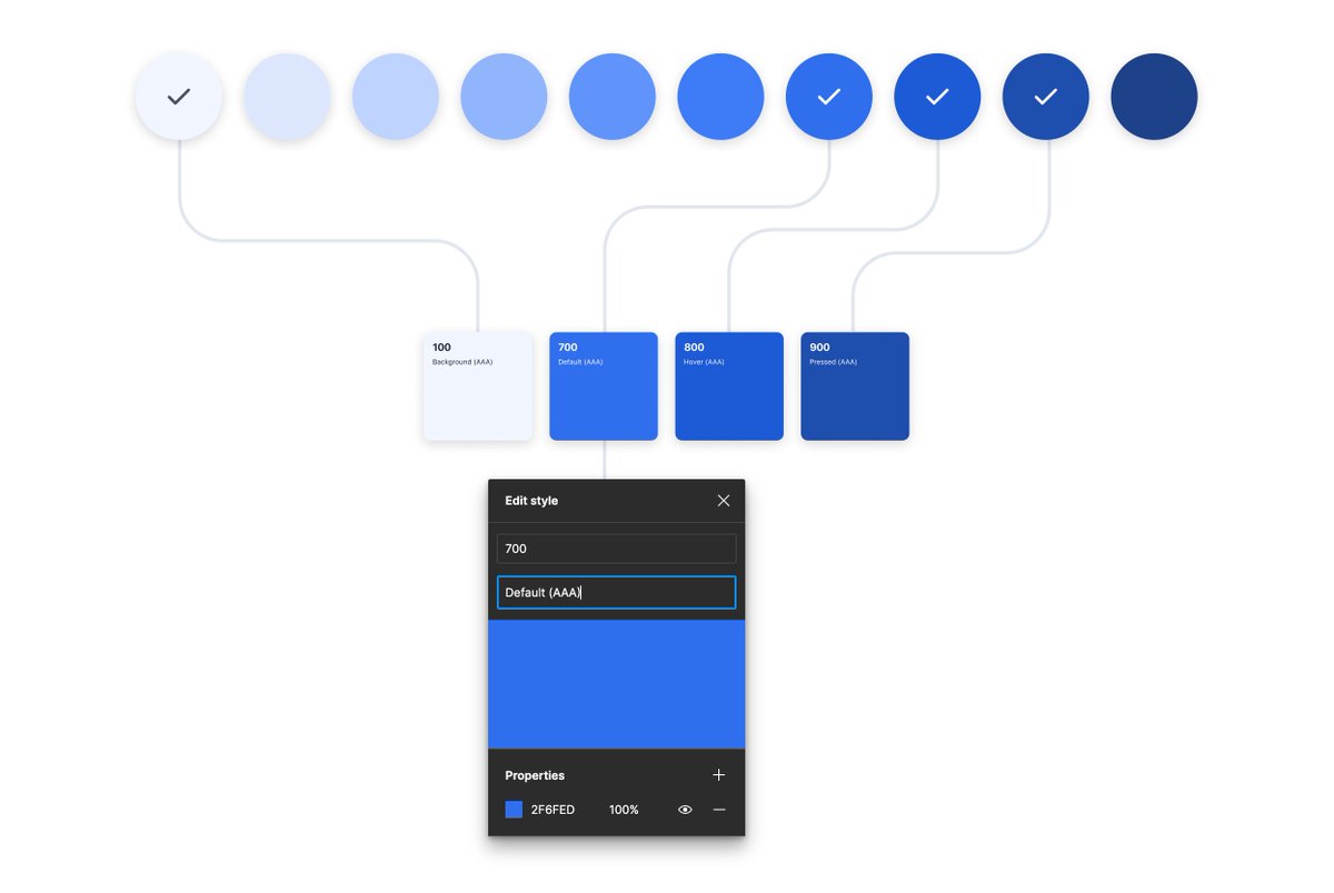
A) Name each primary color after its corresponding global number. Then add a description for its primary purpose and accessibility rating.
Primary/100: Background (AAA)
Primary/700: Default (AAA)
Primary/800: Hover (AAA)
Primary/900: Pressed (AAA)
Primary/100: Background (AAA)
Primary/700: Default (AAA)
Primary/800: Hover (AAA)
Primary/900: Pressed (AAA)
Use these tips with your existing design system, or give them a whirl in the latest version of UI Prep 👇
Loading suggestions...