

Since its emergence in late 2019, #SARSCoV2 has diversified into multiple distinct variants.
In a new preprint, I quantify evolution within these variants and compare it to the process that gave rise to these variants.
biorxiv.org
1/N
In a new preprint, I quantify evolution within these variants and compare it to the process that gave rise to these variants.
biorxiv.org
1/N

Within each variant, diversity and divergence increase linearly with time. The rate of synonymous evolution is around 6 changes per year in all variants, while the non-synonymous rate varies from variant to variant.
2/N
2/N

In this graph, each dot/square marks the emergence of a variant in time and distance from the root. The line starting at the dot shows the subsequent within variant evolution.
Non-synonymous evolution within variants is much slower than the overall rate of change.
3/N
Non-synonymous evolution within variants is much slower than the overall rate of change.
3/N
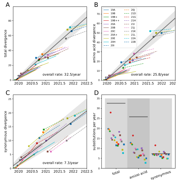
Remarkably, all variants we observed to date are compatible with a back-bone evolutionary rate of about 30 changes per year (0.001/site/year), while the within-variant rate is around 12/year (0.004/site/year).
4/N
4/N
The non-synonymous rate (blue dots) within variants was initially substantially higher (10-15/y) than it is now (~5/y). The biggest drop occurred in early 2020 and coincides with the acquisition of S:D614G and ORF1b:P314L.
5/N
5/N
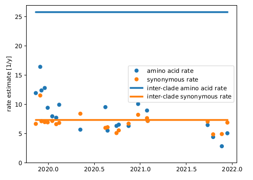
Since the synonymous rate doesn't change, this has likely more to do with selection than intrinsic mutation rate.
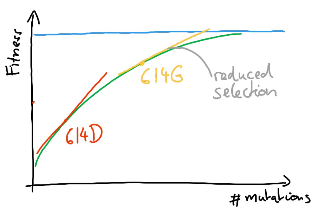
But surely these few early mutations didn't exhaust the supply of beneficial mutations -- we know the virus kept adapting. So why do we see this drop?
6/N
But surely these few early mutations didn't exhaust the supply of beneficial mutations -- we know the virus kept adapting. So why do we see this drop?
6/N
I don't know. A plausible explanation could be that in D614G viruses other beneficial mutations have a smaller benefit because the virus is already very good at exploiting the cell's resources. This would be an example of diminishing returns epistasis.
7/N
7/N
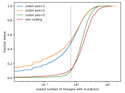
I also tried to quantify how strongly different parts of the genome are constrained by purifying selection. To do so, I counted rare mutations in each Pango lineage and used the number of lineages in which a position is polymorphic as an inverse proxy for constraint.
8/N
8/N
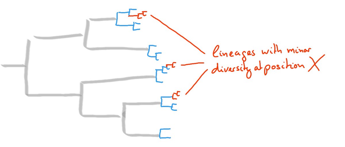
As expected, 3rd positions in codons are much more tolerant to mutations than 1st and 2nd. The latter have a wide distribution with ~50% of sites more conserved than the most conserved 3rd positions (marked by vertical grey line).
9/N
9/N
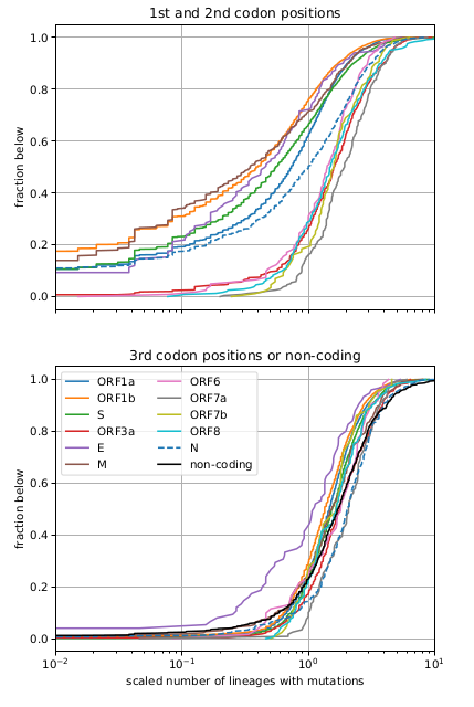
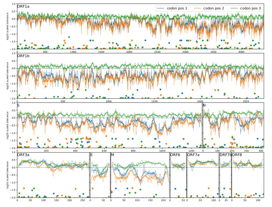
Mutational tolerance varies strongly by gene. ORF1b and M are most conserved, while ORF3a, ORF6, ORF7ab, ORF8 are not at all. The graphs below shows distributions and the landscape of fitness costs across genes.
10/N
10/N
The analyses underlying the results and graphs above are simple descriptive statistics that revealed some clear patterns. But this simplicity hopefully makes interpretation easier.
We will see whether similar patterns hold in the future!
11/N
We will see whether similar patterns hold in the future!
11/N
This work builds on the work of 1000s of scientists that generate SARS-CoV-2 sequence data from millions of patients around the world! Thank you very much!
12/N
12/N
Loading suggestions...