

📌Just like Flexbox containers we have Grid containers but have different container properties.
Simplifying GRID layout for you in this thread 🧵
( PART - 2)
Simplifying GRID layout for you in this thread 🧵
( PART - 2)
As I said, the grid is complicated and has lots of properties to learn about.
Following are the grid container properties.
1. grid
2. gap
3. justify items
4. align items
5. place items
6. justify content
7. align content
8. place content
Following are the grid container properties.
1. grid
2. gap
3. justify items
4. align items
5. place items
6. justify content
7. align content
8. place content
▶️grid:
It is a shorthand property for the following:
➀ grid-template-rows
➁ grid-template-columns
➂ grid-template-areas
➃ grid-auto-rows
➄ grid-auto-columns
➅ grid-auto-flow
It is a shorthand property for the following:
➀ grid-template-rows
➁ grid-template-columns
➂ grid-template-areas
➃ grid-auto-rows
➄ grid-auto-columns
➅ grid-auto-flow
➀ grid-template-rows:
This property specifies the number of rows and their height in a grid layout.
➁ grid-template-column:
This property specifies the number of columns and their width in a grid layout.
This property specifies the number of rows and their height in a grid layout.
➁ grid-template-column:
This property specifies the number of columns and their width in a grid layout.

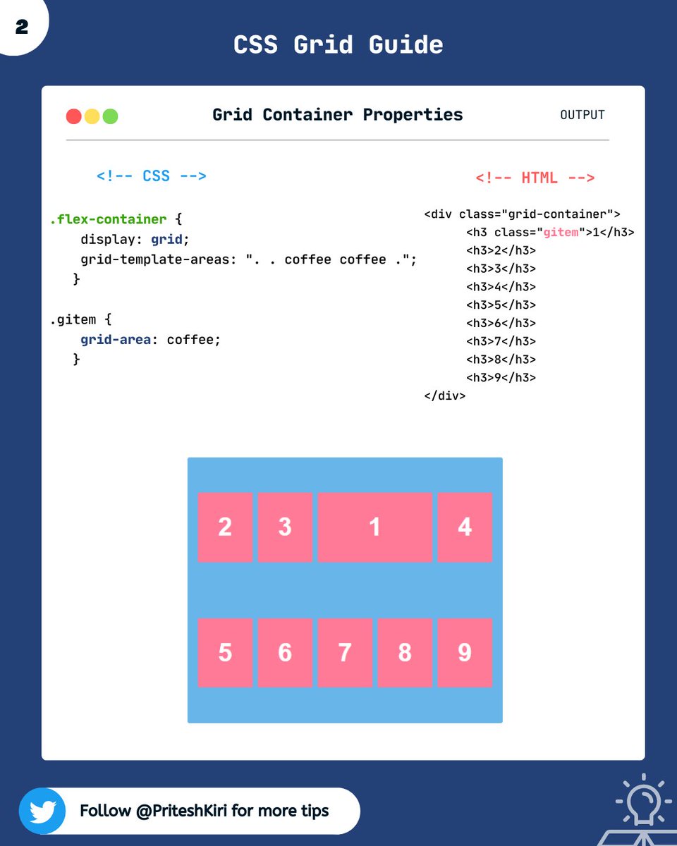
➂ grid-template-areas:
This property specifies areas within the grid layout.
This property specifies areas within the grid layout.
➃ grid-auto-rows:
It sets the size for the rows in a grid container.
➄ grid-auto-columns:
It sets size for the column in a grid container
Note: grid-template- properties are used to define the position and size, and grid-auto-* properties are used to define the size.
It sets the size for the rows in a grid container.
➄ grid-auto-columns:
It sets size for the column in a grid container
Note: grid-template- properties are used to define the position and size, and grid-auto-* properties are used to define the size.
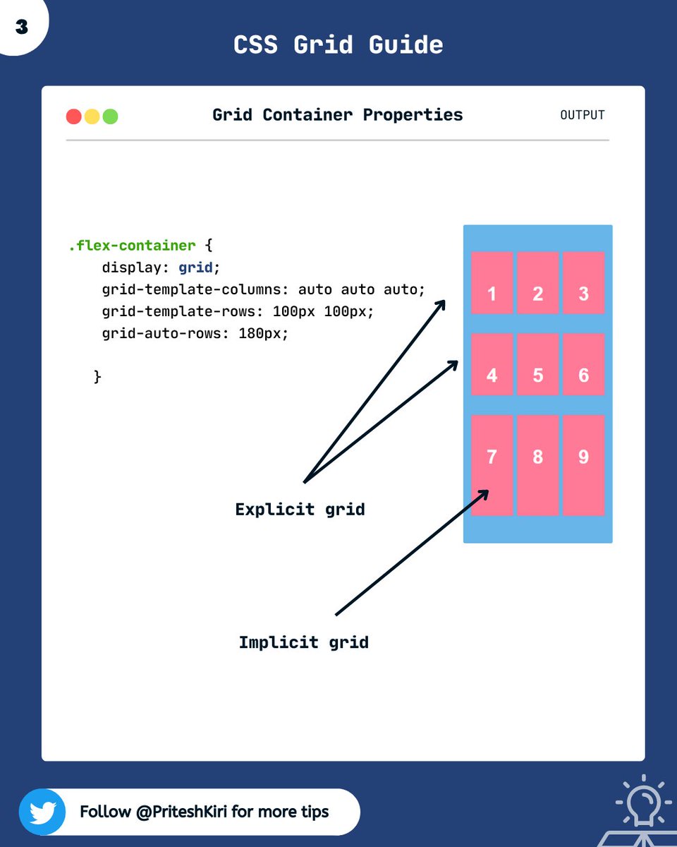
EXPLICIT GRID :
The three properties grid-template-rows, grid-template-columns, and grid-template-areas together define the explicit grid.
IMPLICIT GRID:
When grid items are positioned outside of the explicit grid, the grid generates implicit grid tracks.
The three properties grid-template-rows, grid-template-columns, and grid-template-areas together define the explicit grid.
IMPLICIT GRID:
When grid items are positioned outside of the explicit grid, the grid generates implicit grid tracks.
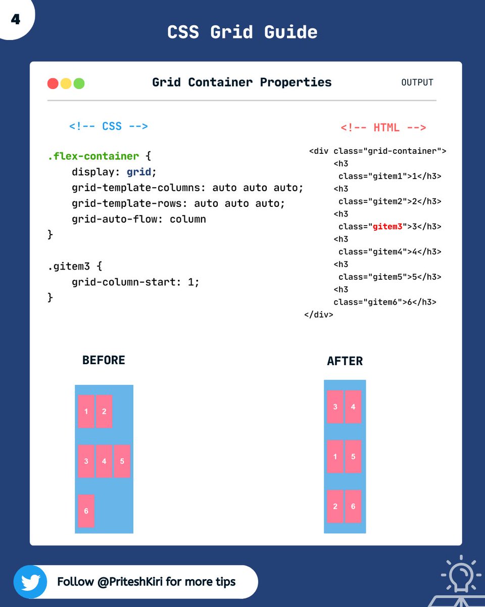
➅ grid-auto-flow :
This property controls how auto-placed items get inserted into the grid.
Here, it auto-fills the columns.
This property controls how auto-placed items get inserted into the grid.
Here, it auto-fills the columns.
That's a wrap!!!!!🎁
I hope, the grid property was clear to you.
In the next thread, I will discuss other grid container properties.
Stay tuned and keep practicing🙌
I hope, the grid property was clear to you.
In the next thread, I will discuss other grid container properties.
Stay tuned and keep practicing🙌
Thanks for reading this thread till the end 😃
🔖 Bookmark this thread for the future
🔃 Retweet the first tweet
🚀 Follow @PriteshKiri for more daily web development tips and tricks
#codewithcoffee #codewithcoffeeindia
🔖 Bookmark this thread for the future
🔃 Retweet the first tweet
🚀 Follow @PriteshKiri for more daily web development tips and tricks
#codewithcoffee #codewithcoffeeindia
Loading suggestions...