

Where have all the serifs gone?
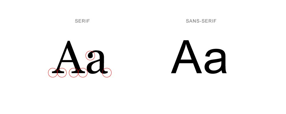
The default online typeface is now Sans Serif.
These letters you are reading have no serifs. The same is true of any words displayed on your browser, the keyboard on your phone, your emails...
But why? Things weren't always this way.
These letters you are reading have no serifs. The same is true of any words displayed on your browser, the keyboard on your phone, your emails...
But why? Things weren't always this way.
Well, Sans Serif fonts are older than you might think. They predate the Internet Age by a long way.
Gill Sans MT, most famously associated with Penguin Books, was designed in 1928:
Gill Sans MT, most famously associated with Penguin Books, was designed in 1928:

And it was actually based on a 1916 font called Johnston, which was taken up by the London underground and has been used ever since:
While Futura, Stanley Kubrick's favourite typeface, was released in 1927:
However, Sans Serif goes back even further.
But before that, some context.
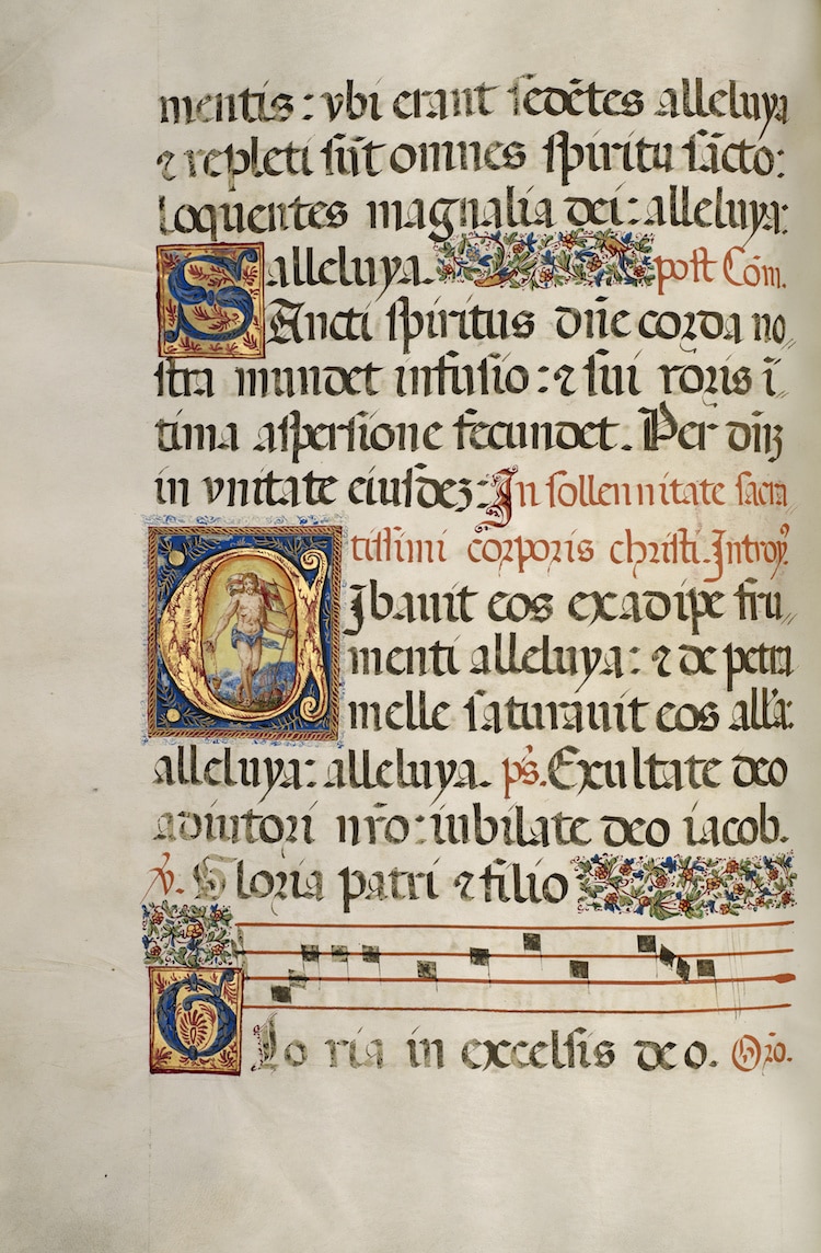
In Medieval Europe the great tradition of monastic manuscripts had produced writing in these brilliant, ornate, serif letters:
But before that, some context.
In Medieval Europe the great tradition of monastic manuscripts had produced writing in these brilliant, ornate, serif letters:
When Gutenberg invented his movable-type printing press in 1440 he initially used a "black-letter" typeface which was borrowed from the Medieval manuscripts:
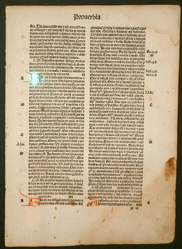
Typefaces soon became an art form of their own and went through various trends and developments over the centuries, but that's a thread for another day.
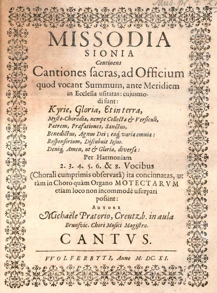
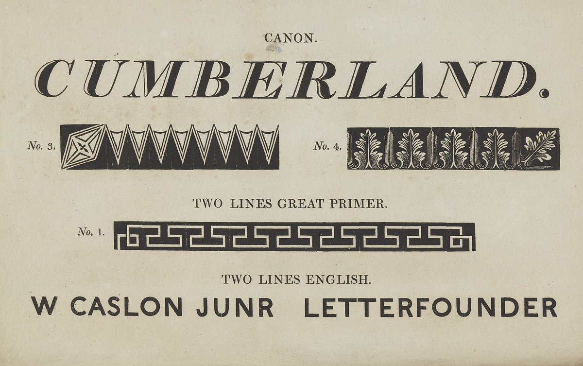
Crucially, they all had serifs. See below for an example from 1611.
But for now we move to the late 18th century...
Crucially, they all had serifs. See below for an example from 1611.
But for now we move to the late 18th century...
The English neoclassical architect John Soane discovered some ancient Roman writing which had minimal serifs - and he borrowed it.
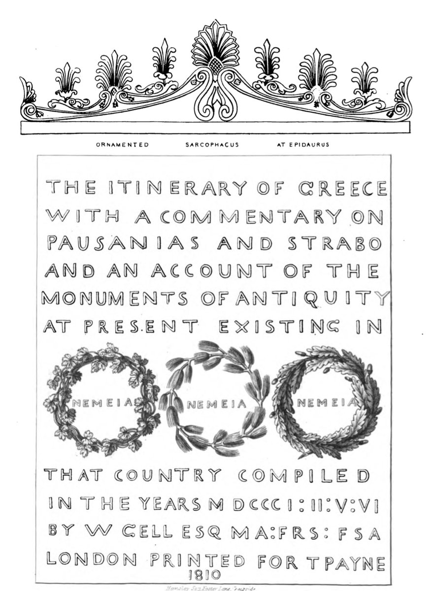
It spread from Soane to other artists and soon became associated with classical antiquity. Consider this, from the year 1810:
It spread from Soane to other artists and soon became associated with classical antiquity. Consider this, from the year 1810:
It then spread yet further from these artists and architects and historians and became more widely used.
The British public were apparently "astonished" by this strange new font - and they loved it.
Because of its association with Antiquity, Sans Serif was known as "old Roman".
The British public were apparently "astonished" by this strange new font - and they loved it.
Because of its association with Antiquity, Sans Serif was known as "old Roman".
And although Sans Serif fonts did not yet have a proper typeface for printing, shopkeepers had started painting their signs without serifs.
Perhaps because Sans Serif font is much easier to read from a distance, or perhaps simply because it stood out as something different.
Perhaps because Sans Serif font is much easier to read from a distance, or perhaps simply because it stood out as something different.
And in 1816 came the first proper Sans Serif typeface ever created: Caslon's Egyptian.
It was called Egyptian because of a contemporary interest in Ancient Egypt, and the font's "blockiness" seemed to reference monolithic Egyptian architecture.
It was called Egyptian because of a contemporary interest in Ancient Egypt, and the font's "blockiness" seemed to reference monolithic Egyptian architecture.
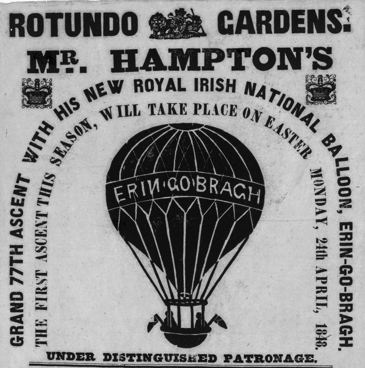
And from there, as more Sans Serif typefaces were produced, they became especially common in advertising. This poster is from 1848.
The relationship between clean-cut, highly legible letters and advertising (or, more cynically, grabbing your attention) had already begun...
The relationship between clean-cut, highly legible letters and advertising (or, more cynically, grabbing your attention) had already begun...
But Sans Serif faced a backlash.
One critic described them as "deprived of all beauty and all proportion."
Despite any criticism, the rise of Sans Serif had started and would prove unstoppable. Notice the mixture of Serif and Sans Serif here:
One critic described them as "deprived of all beauty and all proportion."
Despite any criticism, the rise of Sans Serif had started and would prove unstoppable. Notice the mixture of Serif and Sans Serif here:

Sans Serif continued to grow in popularity and usage throughout the 20th century.
And, despite its origins as a reference to Antiquity, Sans Serif soon became associated with modernism!
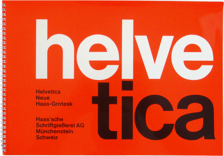
Helvetica was produced in 1957 as an ultra-modern typeface:
And, despite its origins as a reference to Antiquity, Sans Serif soon became associated with modernism!
Helvetica was produced in 1957 as an ultra-modern typeface:
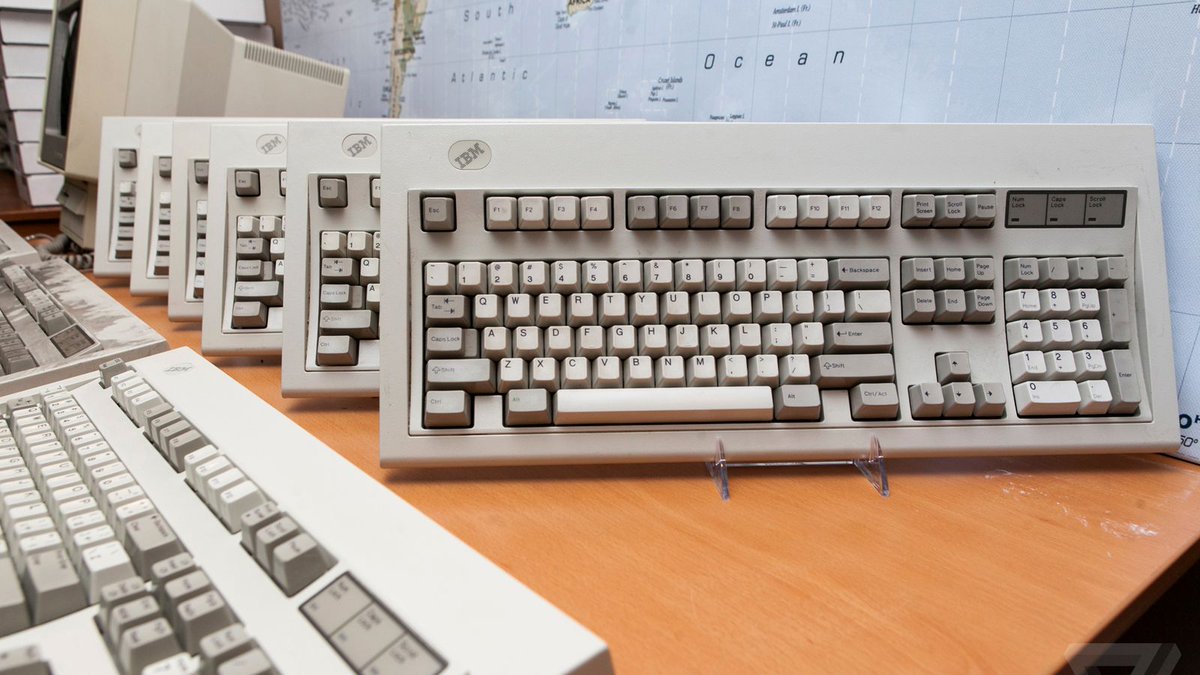
But the ultimate triumph of Sans Serif has come with the digital age, of course.
The clarity of Sans Serif letters - especially when they're smaller - make them easier to read and display on a digital screen.
Hence why the words you're reading now are Sans Serif...
The clarity of Sans Serif letters - especially when they're smaller - make them easier to read and display on a digital screen.
Hence why the words you're reading now are Sans Serif...
But it's more complicated than that.
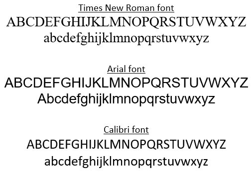
After all, Times New Roman used to be the default font on Microsoft Word. Now it's Calibri.
And studies have proven inconclusive on whether Sans Serif or Serif typefaces are actually easier to read.
After all, Times New Roman used to be the default font on Microsoft Word. Now it's Calibri.
And studies have proven inconclusive on whether Sans Serif or Serif typefaces are actually easier to read.
And the elephant in the room throughout all of this has been that, even while Sans Serif typefaces have become dominant in advertising and signage and digital writing, most books are still printed in Serif typefaces:

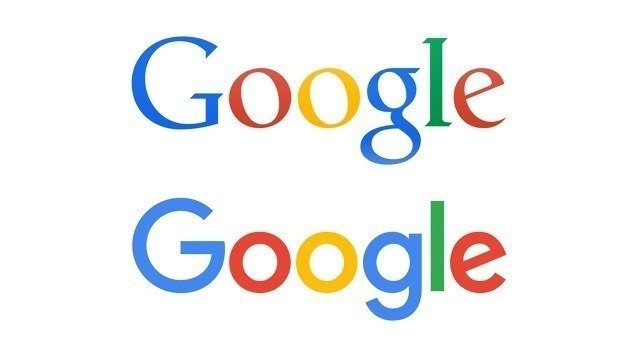
Which brings us to the aesthetic difference between Serif and Sans Serif, as epitomised in Google's famous change of font.
No doubt the lack of serifs gives a much more modern and sleeker appearance. It's also more neutral.
No doubt the lack of serifs gives a much more modern and sleeker appearance. It's also more neutral.

See, this stratification of Serif and Sans Serif has some depth to it.
You'll notice that some online news outlets use Sans Serif - like the BBC, for example - while others, especially "reputable" online newspapers, use Serif.
You'll notice that some online news outlets use Sans Serif - like the BBC, for example - while others, especially "reputable" online newspapers, use Serif.
Perhaps it is now the case that typeface indicates what *kind* of content you're reading.
Sans Serif is neutral, default, and modern.
Whereas Serif feels more considered, like you have something to say. It reminds us of books rather than, perhaps, messages on social media.
Sans Serif is neutral, default, and modern.
Whereas Serif feels more considered, like you have something to say. It reminds us of books rather than, perhaps, messages on social media.
In this way, the prevalence of Sans Serif fonts has given the Serif room to breathe.
Rather than being the default, and therefore unnoteworthy, to use a Serif font is to make a clear aesthetic statement.
So, in the end, the serifs haven't gone. They speak more loudly than ever.
Rather than being the default, and therefore unnoteworthy, to use a Serif font is to make a clear aesthetic statement.
So, in the end, the serifs haven't gone. They speak more loudly than ever.
Loading suggestions...