12 Tweets 25 reads Aug 29, 2022
Let's redesign the login form of an Armenian bank.
Ultimate Visual Thread πŸ”₯
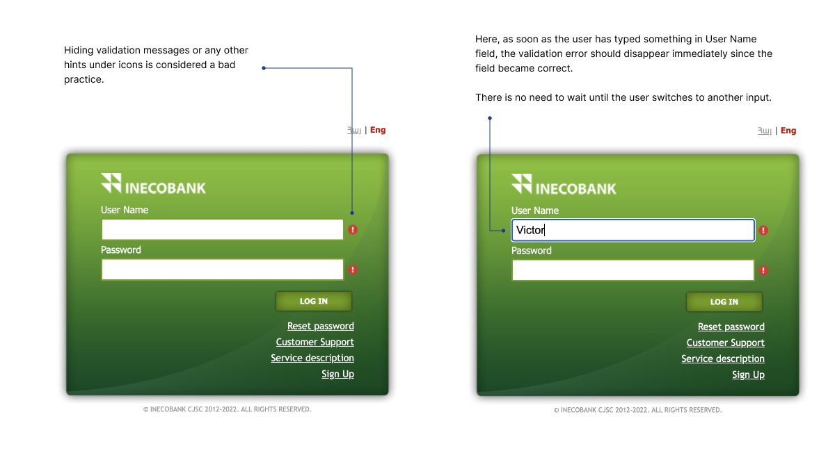
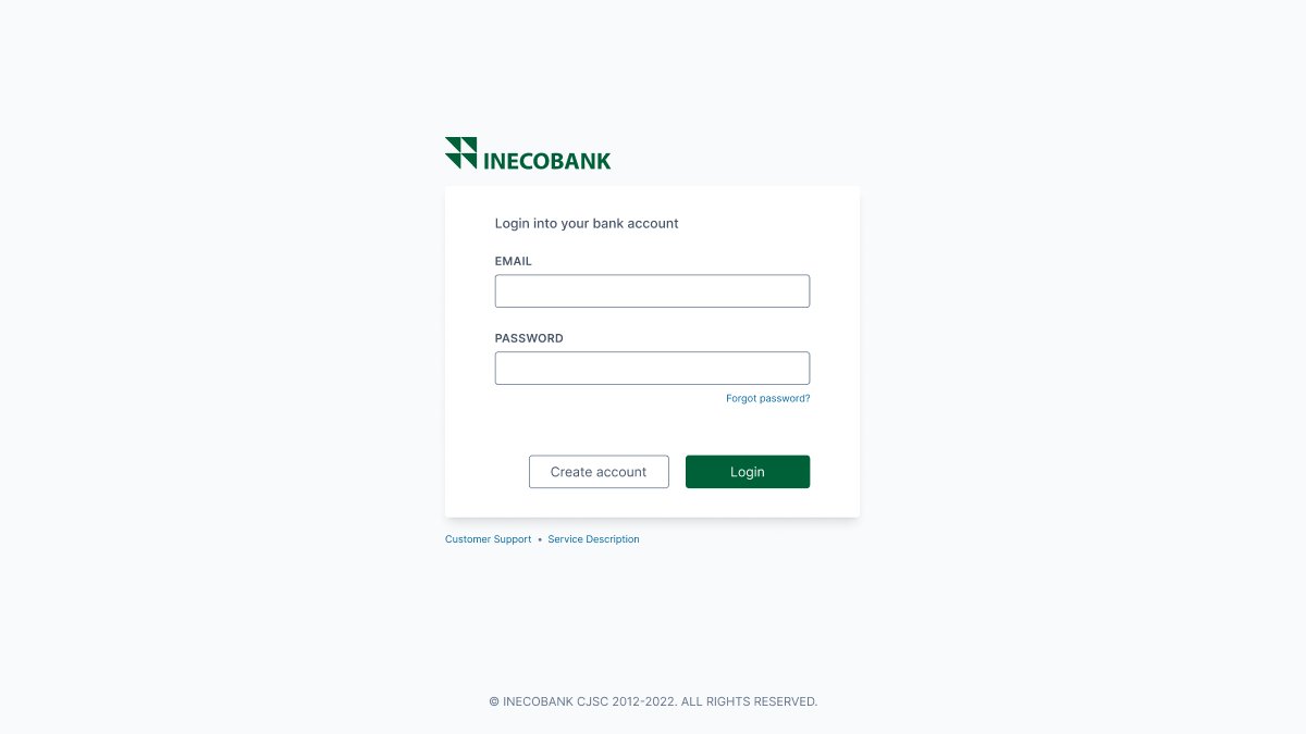
Let's first indicate the problems:
- Low-quality logo
- Proximity law violation
- A lot of space is not used
- Harsh shadows
- Using the user name field instead of email
- No reveal password icon
- Outdated styling
- Mixing logically unrelated links
- Copyright text
Also, we have some problems with focus & attention
CTA button is green, the background is also green, and there is no clear separation of visual hierarchy.
Validation problems
First, when you click the submit button the errors appear as icons without any messages.
Second, when users start typing a value inside an input the message doesn't disappear (even if the value became correct).
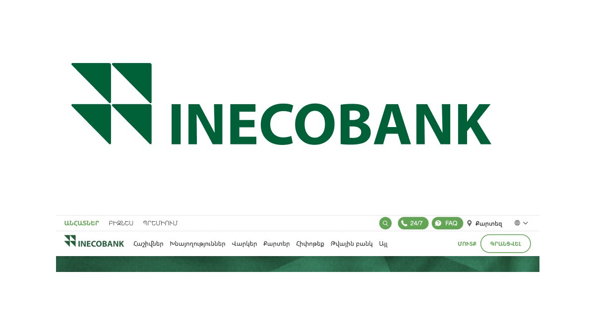
Let's go to the main site and grab the SVG logo.
Gladly they have it.
Let’s start our redesign
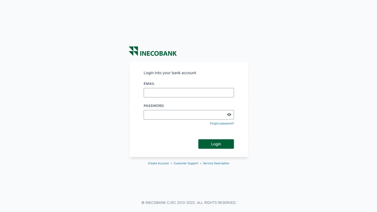
I made the page background gray, while the login panel - is white so that we push our focus to the panel.
Apparently, the login form is not a big one and is not going to take the full space of the screen. It’s something small β€œby default”.
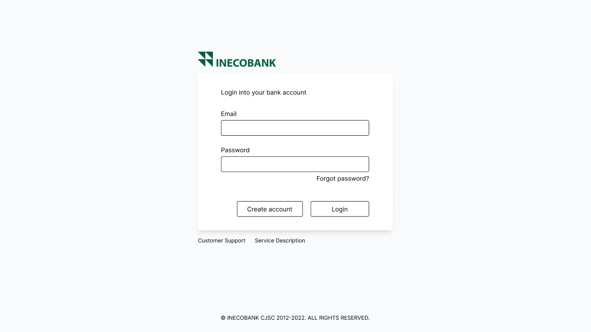
This is the first mockup that I came up with.
Notice that I moved the service links below the main card.
Now we can add some styling.
The CTA button should apparently stand out, so I used the same color as in the logo.
Links look like links, blue.
Now, there is one specific thing.
In banks, you usually cannot sign up online. You go to the branch and make a bank account there.
The "Create account" link actually redirects to a bank static page.
Assuming that, I moved it to the "service link section".
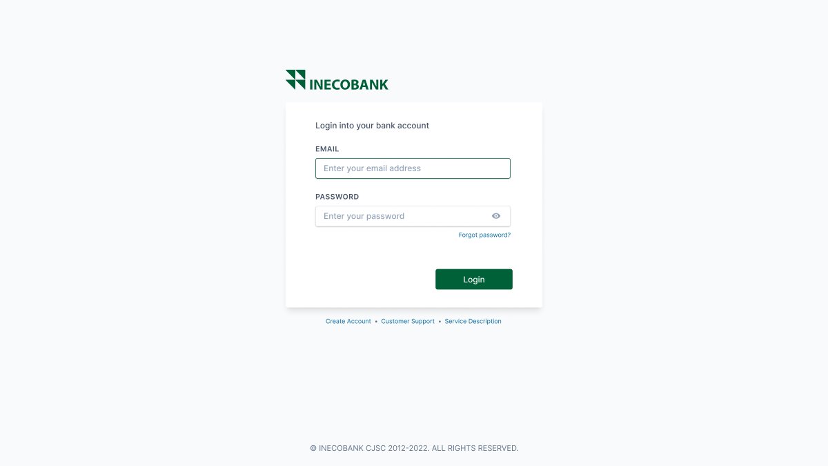
Now we can add some cool styling.
- Placeholders
- Shadows/Input highlighting on the hover state
- Password reveal icon
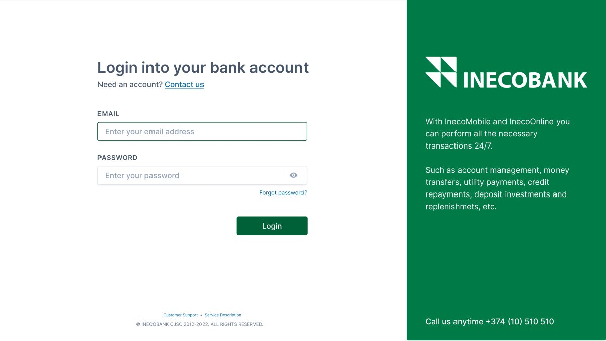
As a bonus, I would like to show you another pattern that is widely used on login pages.
You can take part of the page for some app descriptions, along with the login form.
Just another pattern, yet - useful.
Just a mention to subscribers of @DenisJeliazkov
I collaborated with him and made this material for his newsletter at first, and then posted it here.
If you are not subscribed to his newsletter - GO and subscribe. You'll receive unique materials first!

Loading suggestions...