

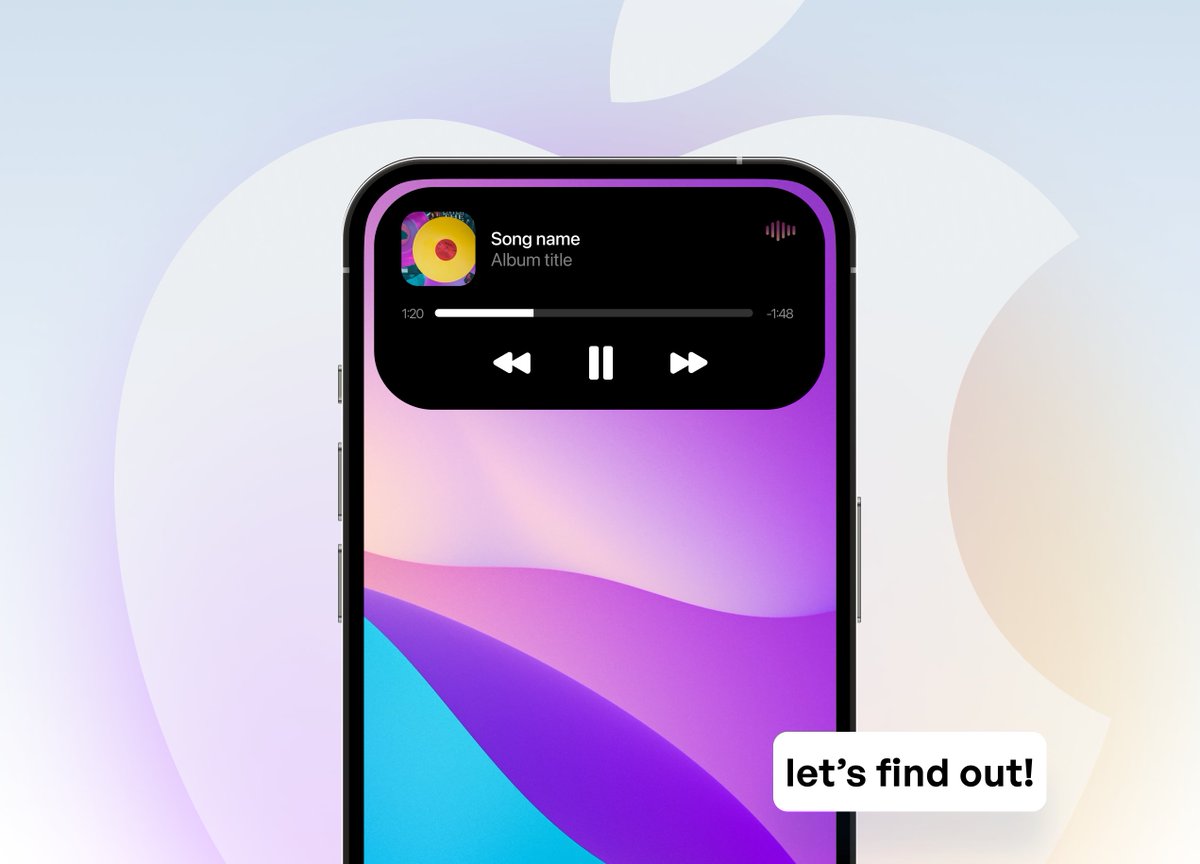
Is Apple's Dynamic Island a good UX practice, or is it a bad mistake?
Let's talk about this (thread)👇
Let's talk about this (thread)👇
1/ from notch to an oval
Apple is moving away from the notch to an oval shape that is now disconnected from the device's frame.
Why the sudden change?
Apple is moving away from the notch to an oval shape that is now disconnected from the device's frame.
Why the sudden change?

2/ is it a distraction?
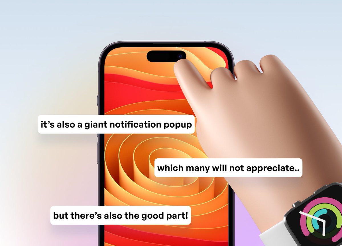
The dynamic island might be a UI element designed to cover up the hardware problems of having the embedded front camera and multiple sensors taking more screen estate.
The dynamic island might be a UI element designed to cover up the hardware problems of having the embedded front camera and multiple sensors taking more screen estate.
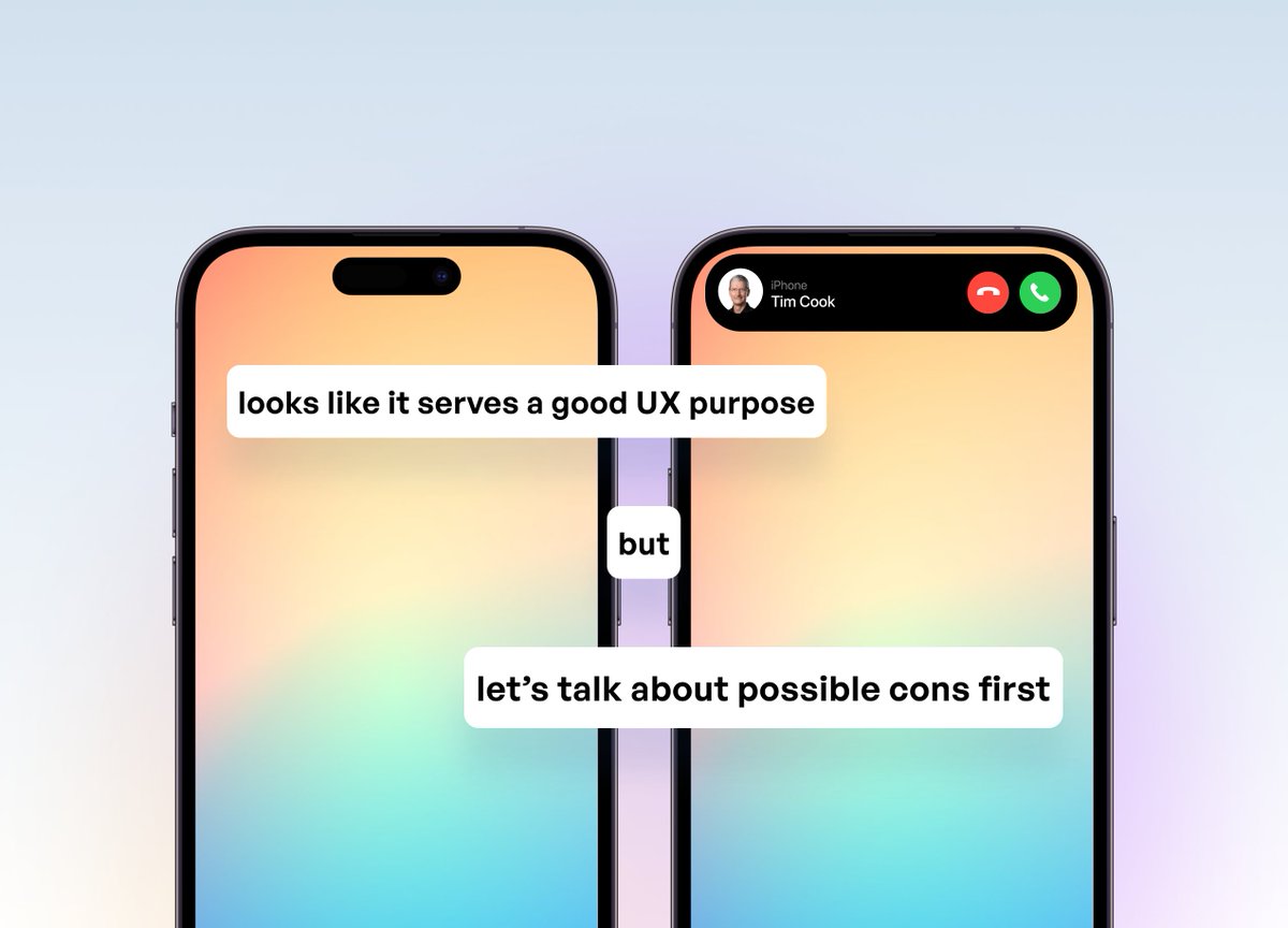
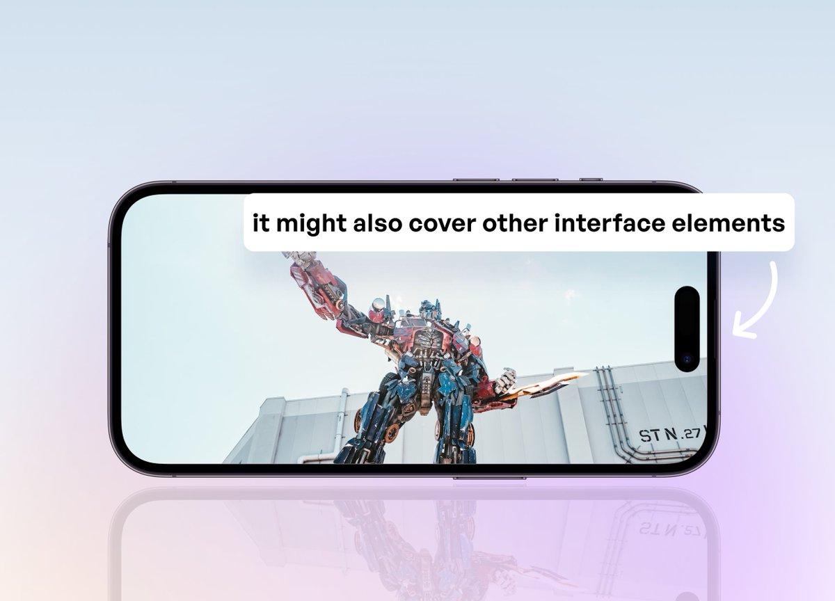
3/ it might be impractical
At first glance, there are a few impractical "issues".
Imagine watching a video or playing a game. Now you have that huge oval plastered onto your screen, covering parts of the interface. Not ideal, right?
At first glance, there are a few impractical "issues".
Imagine watching a video or playing a game. Now you have that huge oval plastered onto your screen, covering parts of the interface. Not ideal, right?
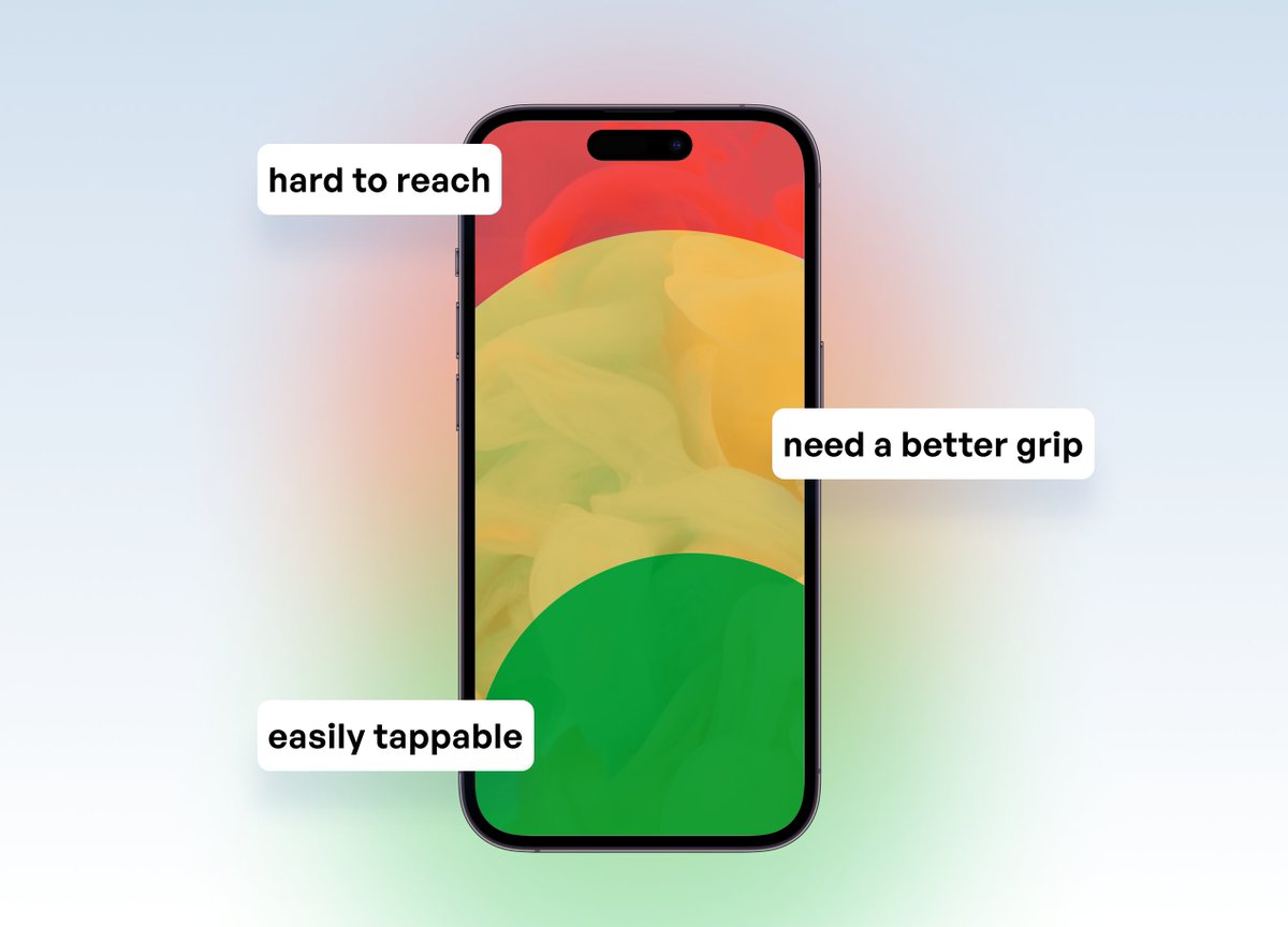
4/ it’s (supposedly) out of reach
Many point out that Dynamic Island is far from the standard thumb zone area. But...
We were still reaching up there to get to the control center and the notifications.
So, what's the big deal now?
Many point out that Dynamic Island is far from the standard thumb zone area. But...
We were still reaching up there to get to the control center and the notifications.
So, what's the big deal now?
5/ it might get dirty
It’s in the way of your front camera and multiple important camera sensors, so get equipped with a good quality screen cloth, my guys; we’ll need it.
It’s in the way of your front camera and multiple important camera sensors, so get equipped with a good quality screen cloth, my guys; we’ll need it.
6/ it's (apparently) intentional
Apple admitted they want to take advantage of their hardware limitations and provide a better experience by creating better software.
Is it better, though? Time will tell.
Apple admitted they want to take advantage of their hardware limitations and provide a better experience by creating better software.
Is it better, though? Time will tell.
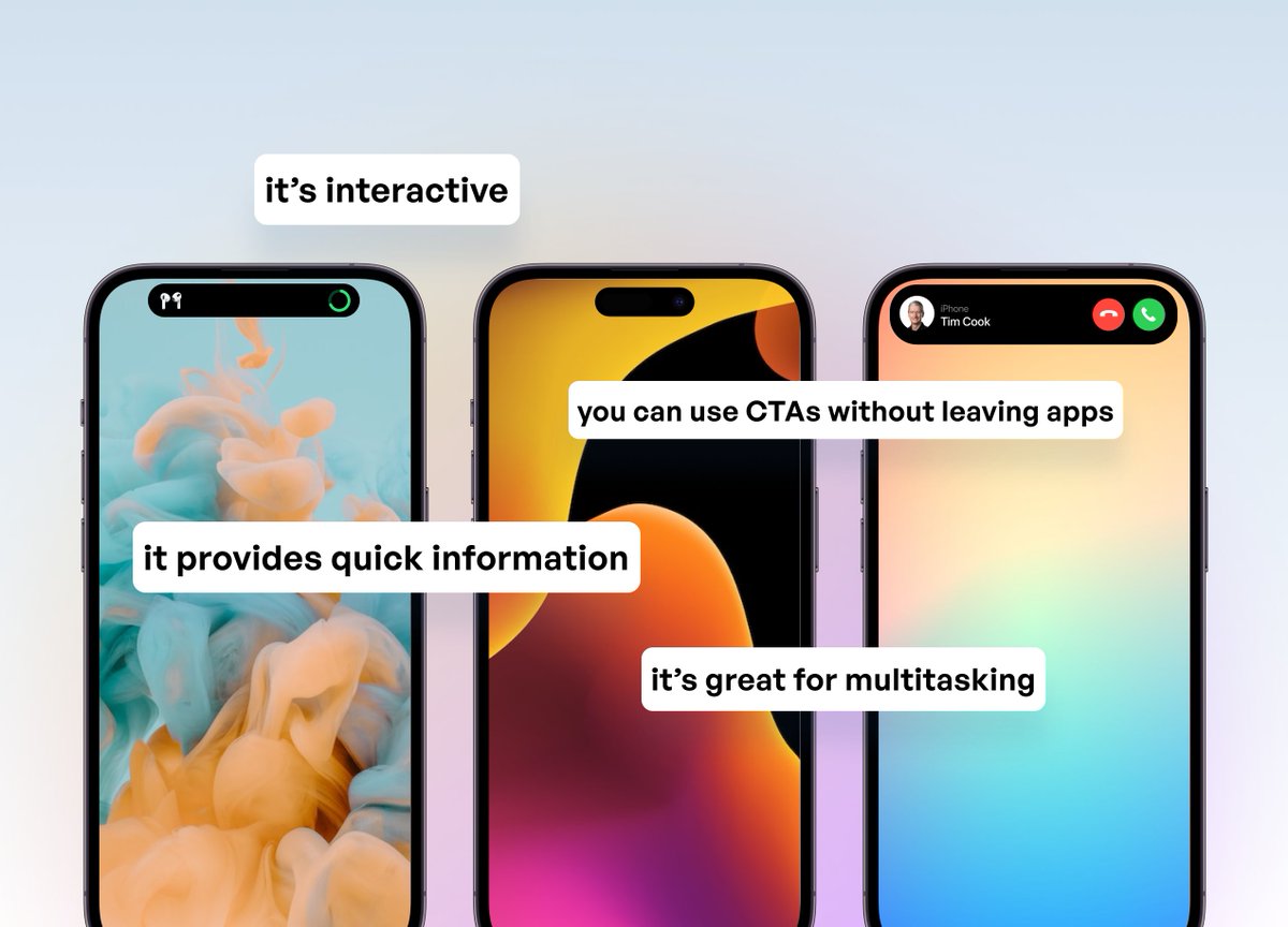
7/ ...and innovative
I think Dynamic Island is a small accessibility upgrade that users will grow to understand and appreciate, like with most Apple ideas.
And we’ll most definitely see its capability being pushed to new levels in the future.
I think Dynamic Island is a small accessibility upgrade that users will grow to understand and appreciate, like with most Apple ideas.
And we’ll most definitely see its capability being pushed to new levels in the future.
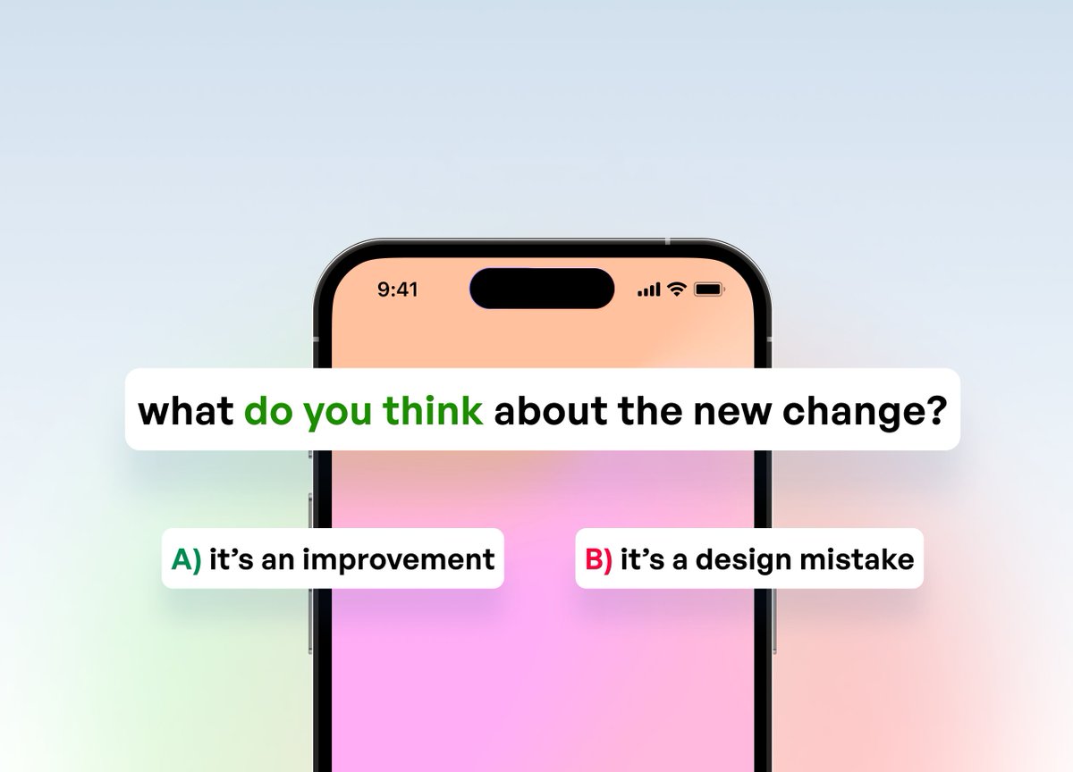
What are your thoughts about the Dynamic Island? 🤔
Is it an ✅ improvement
- or -
a ⛔️ UX mistake?
Tweet it around to hear more opinions! Thanks 💙
Is it an ✅ improvement
- or -
a ⛔️ UX mistake?
Tweet it around to hear more opinions! Thanks 💙
Loading suggestions...