
Technology
Business
Business Strategy
Storytelling
Investment
Data Analysis
Data Visualization
Consulting

McKinsey charges $500k per project, telling stories through data.
Here are 5 frameworks they use (that you can too):
Here are 5 frameworks they use (that you can too):
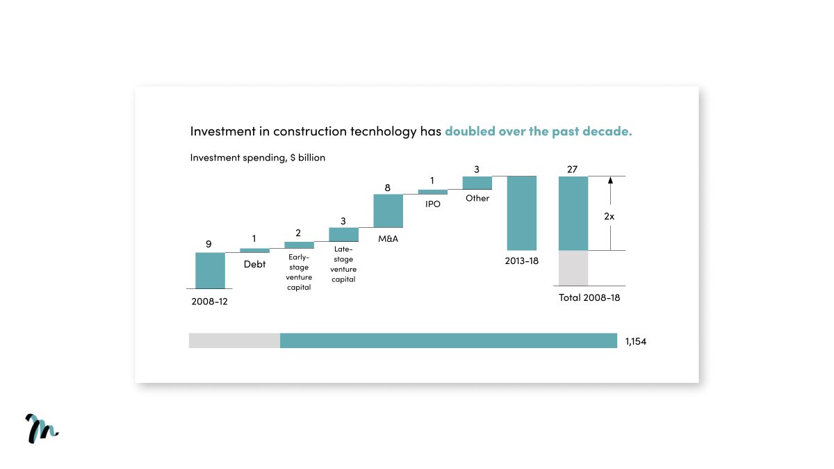
Waterfall chart:
• Shows the story behind a total value.
McKinsey use it here to show the breakdown on investment in construction technology.
Use it when:
→ You want to give a snapshot of how a data point is made up, or to show a change in data over time.
• Shows the story behind a total value.
McKinsey use it here to show the breakdown on investment in construction technology.
Use it when:
→ You want to give a snapshot of how a data point is made up, or to show a change in data over time.
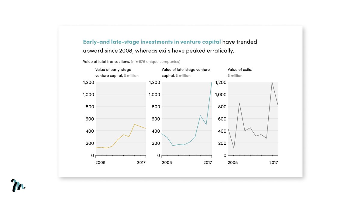
The scissor lift:
• Demonstrate a particularly dramatic change in events.
McKinsey use it here to show the erratic kick then drop in construction tech exits.
Use it when:
→ You want to show a significant shift in reality.
• Demonstrate a particularly dramatic change in events.
McKinsey use it here to show the erratic kick then drop in construction tech exits.
Use it when:
→ You want to show a significant shift in reality.
Amplify data:
• Use neutral or grey for secondary elements, then one colour to make a piece of data stand out.
McKinsey use it here to highlight the construction area consistently ahead in growth.
Use it when:
→ You want to draw the eye to a particular trend in your story.
• Use neutral or grey for secondary elements, then one colour to make a piece of data stand out.
McKinsey use it here to highlight the construction area consistently ahead in growth.
Use it when:
→ You want to draw the eye to a particular trend in your story.

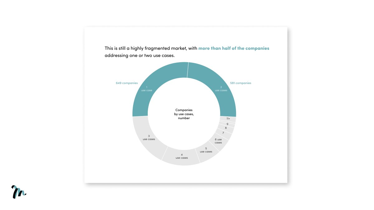
Pie chart:
• To present a snapshot of a trend where 2 or 3 segments dominate the data.
McKinsey use it here to show that the market is made up of specialists.
Use it when:
→ You want to convey the general ratios of segments and specific size differences aren’t important.
• To present a snapshot of a trend where 2 or 3 segments dominate the data.
McKinsey use it here to show that the market is made up of specialists.
Use it when:
→ You want to convey the general ratios of segments and specific size differences aren’t important.
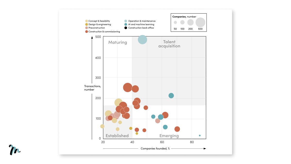
Bubble chart:
• To clearly present variances in data.
McKinsey use it here to give a picture on the types of transactions taking place in ConTech.
Use it when:
→ You want to help your reader explore, not explain, the variance in data (for that, use a bar chart).
• To clearly present variances in data.
McKinsey use it here to give a picture on the types of transactions taking place in ConTech.
Use it when:
→ You want to help your reader explore, not explain, the variance in data (for that, use a bar chart).
How McKinsey tell stories through data:
1/ Waterfall chart
2/ The scissor lift
3/ Amplify data
4/ Pie chart
5/ Bubble chart
1/ Waterfall chart
2/ The scissor lift
3/ Amplify data
4/ Pie chart
5/ Bubble chart
Hope you enjoyed the thread.
If you found this valuable, please retweet the 1st Tweet.
Want more?
Follow @liammotivado for weekly threads on Visual Storyselling
If you found this valuable, please retweet the 1st Tweet.
Want more?
Follow @liammotivado for weekly threads on Visual Storyselling
Loading suggestions...