

Let’s play a game
It's called Brainy Battles 🧠
How it Works:
1. We compare 2 marketing assets—like product pages—and explain how each brand uses buyer psychology concepts to drive sales
2. You vote for your fav for a chance to win a prize (worth $997)
What could you win?
It's called Brainy Battles 🧠
How it Works:
1. We compare 2 marketing assets—like product pages—and explain how each brand uses buyer psychology concepts to drive sales
2. You vote for your fav for a chance to win a prize (worth $997)
What could you win?
If you read this thread to the end and vote for your fav brainy brand...
You’ll be entered to win:
👉 A free mini ad in my Why We Buy newsletter (reaching ~20,000 readers)
👉 A free 15-min audit of one of your marketing assets by yours truly
Pretty sweet deal, huh?
You’ll be entered to win:
👉 A free mini ad in my Why We Buy newsletter (reaching ~20,000 readers)
👉 A free 15-min audit of one of your marketing assets by yours truly
Pretty sweet deal, huh?
Today’s Brainy Battles contest is generously sponsored by @SupersideHQ
Imagine this:
You need new ads designed for a big launch and you need them yesterday
The problem? No one on your team to make it happen
And you don’t have time to find and vet an awesome designer
Imagine this:
You need new ads designed for a big launch and you need them yesterday
The problem? No one on your team to make it happen
And you don’t have time to find and vet an awesome designer

Smart brands like Amazon, Caraway & Shopify use @SupersideHQ
Superside is a design subscription service that combines top designers with tech
You get:
✅ Access to the top 1% of design talent
✅ A dedicated team
✅ Super fast
✅ No surprise bills
Be sure to check them out!
Superside is a design subscription service that combines top designers with tech
You get:
✅ Access to the top 1% of design talent
✅ A dedicated team
✅ Super fast
✅ No surprise bills
Be sure to check them out!
Ok—let’s do this...
In today’s Brainy Battle we’ll compare two product pages
The average bounce rate for eCommerce sites was 47% in 2020
Once buyers leave your website they may never come back
That leads to lost $$$ and higher CAC
Your product page has gotta be 🔥🔥🔥
In today’s Brainy Battle we’ll compare two product pages
The average bounce rate for eCommerce sites was 47% in 2020
Once buyers leave your website they may never come back
That leads to lost $$$ and higher CAC
Your product page has gotta be 🔥🔥🔥
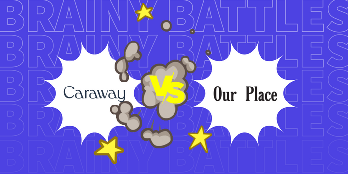
Meet the Fighters 💪
In the red corner: Our Place
In the blue corner: Caraway
These two brands are fighting for the title of best product page in the cookware industry
Let the battle begin!
In the red corner: Our Place
In the blue corner: Caraway
These two brands are fighting for the title of best product page in the cookware industry
Let the battle begin!
Fighter #1: Our Place’s Product Page
One look at Our Place’s Product Page and you can tell they’re taking things seriously
There are tiny details throughout the page that nudge buyers towards the ‘Add to Cart’ button and they all have a purpose
Let’s explore why it’s brainy...
One look at Our Place’s Product Page and you can tell they’re taking things seriously
There are tiny details throughout the page that nudge buyers towards the ‘Add to Cart’ button and they all have a purpose
Let’s explore why it’s brainy...
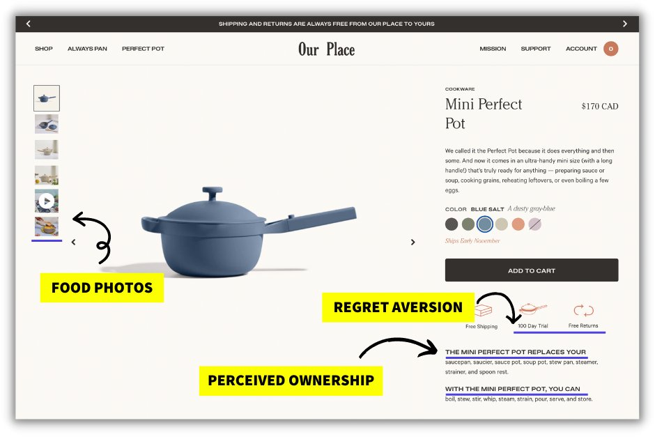
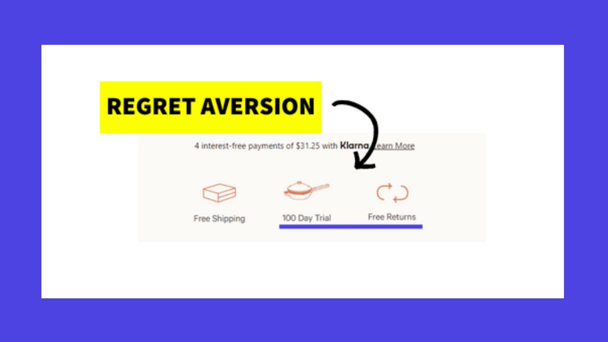
🧠 Regret Aversion
People like making decisions that come with minimal regret
Our Place clearly plays into this with their 100-Day Trial and Free Returns
They lower the threshold of potential regret from the purchase — there won’t be any friction in getting their money
People like making decisions that come with minimal regret
Our Place clearly plays into this with their 100-Day Trial and Free Returns
They lower the threshold of potential regret from the purchase — there won’t be any friction in getting their money
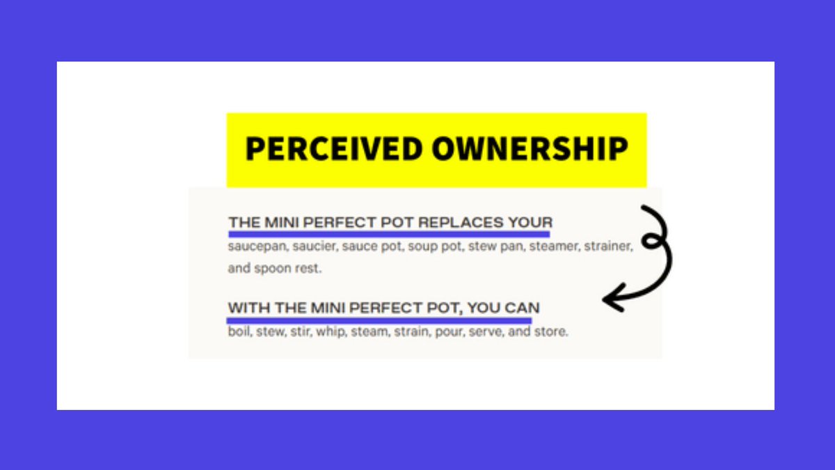
🧠 Perceived Ownership
Our Place generates perceived ownership by adding in the magical words “you” and “your”
This makes buyers picture replacing THEIR saucepan and boiling water in THEIR Mini Perfect Pot
Our Place generates perceived ownership by adding in the magical words “you” and “your”
This makes buyers picture replacing THEIR saucepan and boiling water in THEIR Mini Perfect Pot
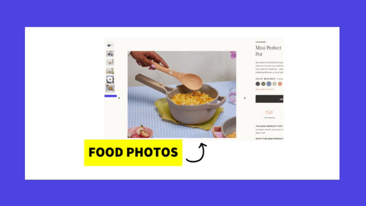
🧠 Food Photos
Using images of food is a great way to capture people’s attention
We need food to survive so we’re instinctively drawn to images of food
People can easily recognize a lasagna in a product pic which makes them dream about what they’ll make with their cookware
Using images of food is a great way to capture people’s attention
We need food to survive so we’re instinctively drawn to images of food
People can easily recognize a lasagna in a product pic which makes them dream about what they’ll make with their cookware
Fighter #2: Caraway’s Product Page
Caraway’s product page is beautifully designed
(As a @SupersideHQ customer, it’s clear that good design matters to the team at Caraway)
But they’re also doing some *very* smart things on their product page to convert visitors into buyers
Caraway’s product page is beautifully designed
(As a @SupersideHQ customer, it’s clear that good design matters to the team at Caraway)
But they’re also doing some *very* smart things on their product page to convert visitors into buyers
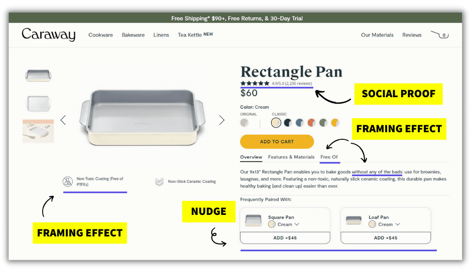
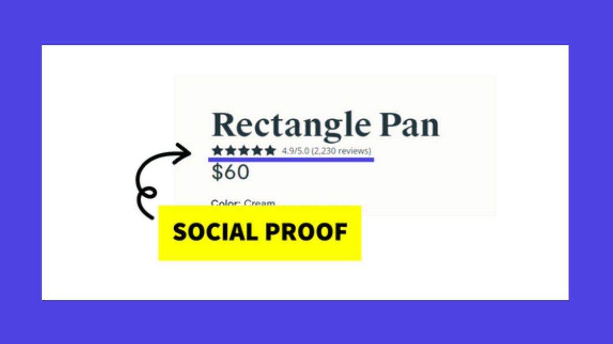
🧠 Social Proof
Caraway wants site visitors to know that 2,000+ other people have purchased and reviewed this pan before them
Better yet, they don’t have a perfect 5-star rating
Why is this smart?
Studies show that brands with imperfect ratings actually sell more
Caraway wants site visitors to know that 2,000+ other people have purchased and reviewed this pan before them
Better yet, they don’t have a perfect 5-star rating
Why is this smart?
Studies show that brands with imperfect ratings actually sell more
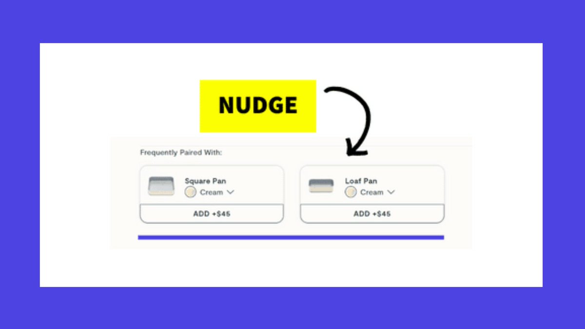
🧠 Nudges
Besides the upsell with complementary products, they make sure to nudge their buyers toward purchasing by showing products in the same color scheme as the main product
By doing this, they get buyers to imagine owning the whole set
Besides the upsell with complementary products, they make sure to nudge their buyers toward purchasing by showing products in the same color scheme as the main product
By doing this, they get buyers to imagine owning the whole set
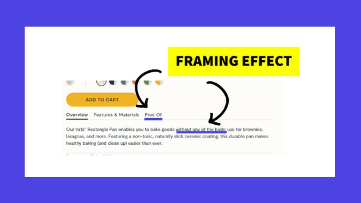
🧠 Framing Effect
Caraway frames their pots as “free of” and “without any of the bads”
This positions their cookware as products without bad chemicals and makes buyers begin to wonder:
“What’s in my other pots and pans?”
Caraway frames their pots as “free of” and “without any of the bads”
This positions their cookware as products without bad chemicals and makes buyers begin to wonder:
“What’s in my other pots and pans?”
Ok. It’s time to cast your vote!
Which brand do *you* think has the smartest product page?
Caraway? Or Our Place?
Comment below with your answer for a chance to win the prize (worth $997)
Which brand do *you* think has the smartest product page?
Caraway? Or Our Place?
Comment below with your answer for a chance to win the prize (worth $997)
P.S. Want another chance to win?
We’re doing another Brainy Battle today!
The battleground? Pricing Pages
Subscribe to my newsletter Why We Buy to learn more and enter the next Brainy Battle contest → @katebour
We’re doing another Brainy Battle today!
The battleground? Pricing Pages
Subscribe to my newsletter Why We Buy to learn more and enter the next Brainy Battle contest → @katebour
Loading suggestions...