
Education
Technology
Business
Communication
Communication Skills
Public Speaking
Presentation Skills

Most people suck at PowerPoint.
But, if you follow these 5 frameworks, I guarantee you won’t:
But, if you follow these 5 frameworks, I guarantee you won’t:
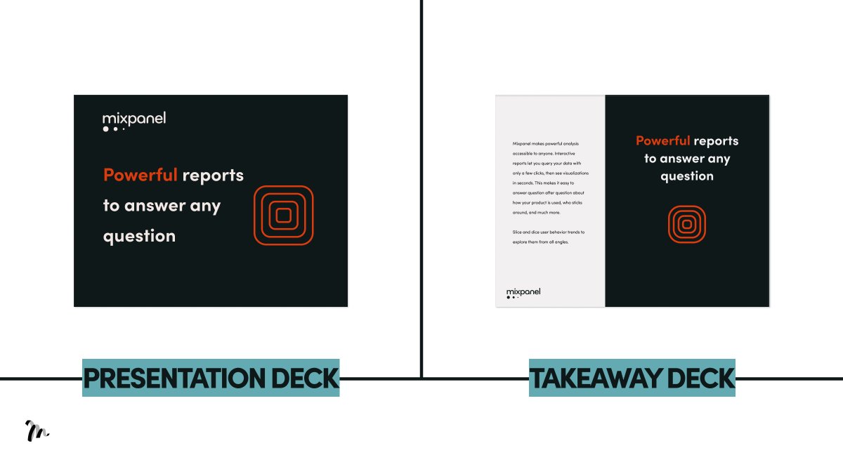
1/ Working memory
If you have sentences on your slide and you speak at the same time, your audience will remember nothing.
This is the redundancy effect.
→ What you do: for presentation decks, include headlines only. Add text for the takeaway deck.
If you have sentences on your slide and you speak at the same time, your audience will remember nothing.
This is the redundancy effect.
→ What you do: for presentation decks, include headlines only. Add text for the takeaway deck.
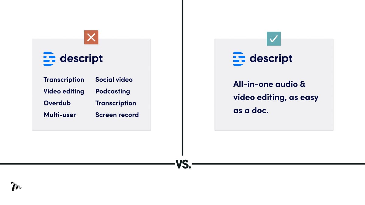
2/ Simplicity
Focus on one message per slide. Anything more confuses and diverts direction.
→ What you do: don’t load up each slide with more info. If you have more points, make more slides.
Focus on one message per slide. Anything more confuses and diverts direction.
→ What you do: don’t load up each slide with more info. If you have more points, make more slides.
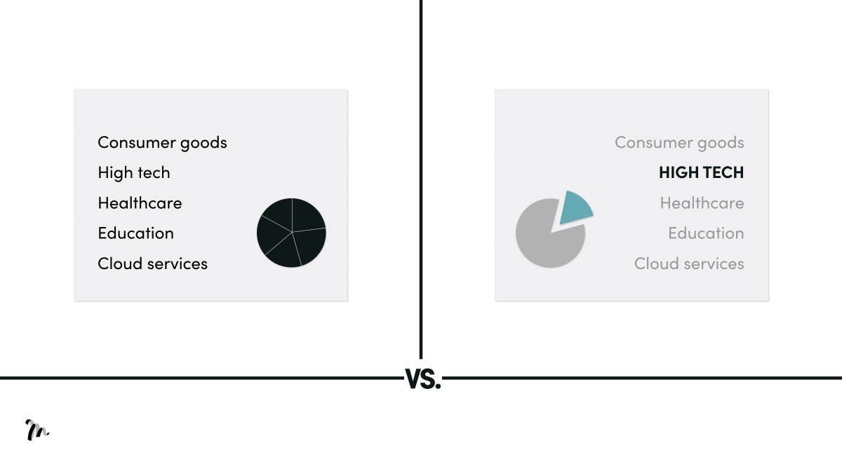
3/ Size
Your audience focus on the following:
• Moving objects
• Signalling colours
• Big objects
→ What you do: Identify the most important message in the slide and present it with as many of the above points as possible.
Your audience focus on the following:
• Moving objects
• Signalling colours
• Big objects
→ What you do: Identify the most important message in the slide and present it with as many of the above points as possible.

4/ Contrast
You lose focus on our visual example without contrast, but the one with contrast allows you to focus on the core object.
→ What you do: select the focal point on the slide and use one contrasting colour to draw the eye.
You lose focus on our visual example without contrast, but the one with contrast allows you to focus on the core object.
→ What you do: select the focal point on the slide and use one contrasting colour to draw the eye.
5/ Objects
Count the number of circles in the visual. On average, it’ll take you 1.2 seconds.
Now compare the visual in the next tweet...
Count the number of circles in the visual. On average, it’ll take you 1.2 seconds.
Now compare the visual in the next tweet...

This took you 0.2 seconds.
In the previous example, you had to count the circles.
In this example, you simply see.
7 required 500% more energy resources than simply seeing.
If they have to think hard, they won't.
→ What you do: never include more than 5 points on a slide.
In the previous example, you had to count the circles.
In this example, you simply see.
7 required 500% more energy resources than simply seeing.
If they have to think hard, they won't.
→ What you do: never include more than 5 points on a slide.

TL;DR 5 Design Principles to Avoid Death by PowerPoint
1/ Working memory
2/ Simplicity
3/ Size
4/ Contrast
5/ Objects
1/ Working memory
2/ Simplicity
3/ Size
4/ Contrast
5/ Objects
Hope you enjoyed the thread.
If you found this valuable, please retweet the 1st Tweet.
Want more?
Follow @liammotivado for weekly threads on Visual Storyselling
If you found this valuable, please retweet the 1st Tweet.
Want more?
Follow @liammotivado for weekly threads on Visual Storyselling
The 5 design principles and ideas from this thread come from David JP Phillips and his TEDx talk on How to avoid death by PowerPoint.
A must watch!
A must watch!
Loading suggestions...