

McKinsey charges $500k+ per project, telling stories through data.
Here are 5 frameworks they use (that you can too):
Here are 5 frameworks they use (that you can too):
Delineate the data:
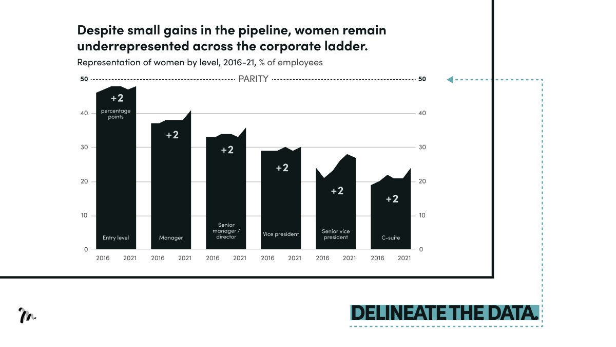
McKinsey use the parity line to show how, despite small gains in employment roles, women still remain unrepresented across the corporate ladder.
→ Use it to instantly demonstrate how current performance is below or above a goal.
McKinsey use the parity line to show how, despite small gains in employment roles, women still remain unrepresented across the corporate ladder.
→ Use it to instantly demonstrate how current performance is below or above a goal.
Drilling into weightings:
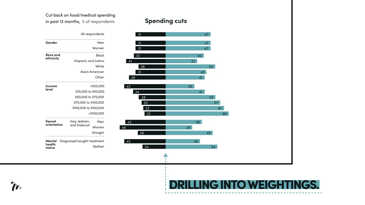
McKinsey use the centre line and colour to separate demographic weightings into categories of those who did and did not have to cut back food spending during the pandemic.
→ Use it to compare weightings in two different categories.
McKinsey use the centre line and colour to separate demographic weightings into categories of those who did and did not have to cut back food spending during the pandemic.
→ Use it to compare weightings in two different categories.
Heat & tree map:
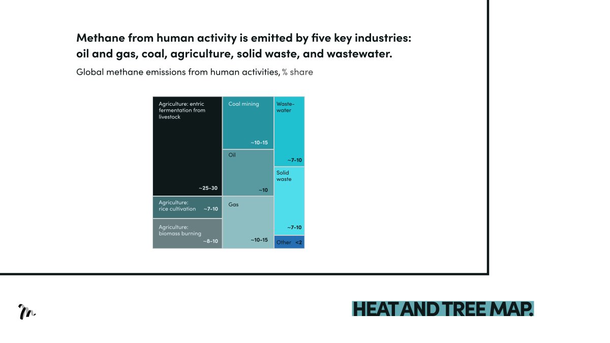
McKinsey display methane emissions, differentiating industry share by tile size and colour.
→ Use it to categorise groups and demonstrate contributions to a specific outcome.
McKinsey display methane emissions, differentiating industry share by tile size and colour.
→ Use it to categorise groups and demonstrate contributions to a specific outcome.
Weighted bubble chart:
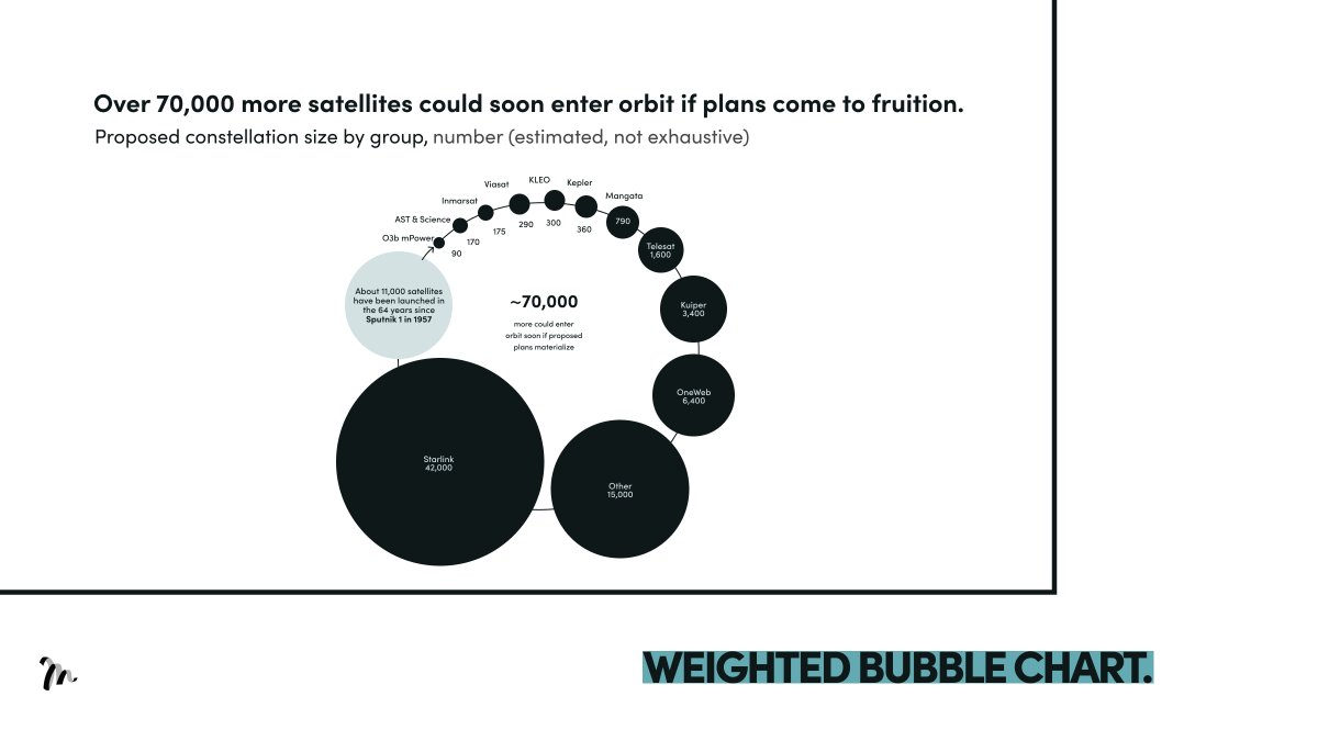
McKinsey present the number of satellites that could enter into orbit with bubble size to demonstrate the volume of each constellation.
→ Use it to present an instant visual scale of a problem or opportunity and the contribution of each party.
McKinsey present the number of satellites that could enter into orbit with bubble size to demonstrate the volume of each constellation.
→ Use it to present an instant visual scale of a problem or opportunity and the contribution of each party.
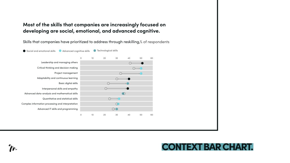
Context bar chart:
McKinsey use it to present the change in skills that companies were focused on between 2019 and 2020.
→Use it to compare the shift in 'before and after' across several categories.
McKinsey use it to present the change in skills that companies were focused on between 2019 and 2020.
→Use it to compare the shift in 'before and after' across several categories.
TL;DR How McKinsey tell stories through data:
1/ Delineate the data
2/ Drilling into weightings
3/ Heat & tree map
4/ Weighted bubble chart
5/ Context bar chart
1/ Delineate the data
2/ Drilling into weightings
3/ Heat & tree map
4/ Weighted bubble chart
5/ Context bar chart
Hope you enjoyed the thread.
If you found this valuable, please retweet the 1st Tweet.
Want more?
Follow @liammotivado for weekly threads on Visual Storyselling
If you found this valuable, please retweet the 1st Tweet.
Want more?
Follow @liammotivado for weekly threads on Visual Storyselling
Loading suggestions...