

Most PowerPoint designs suck.
But, if you follow these 5 Apple principles, I guarantee yours won’t:
But, if you follow these 5 Apple principles, I guarantee yours won’t:
Background Colour:
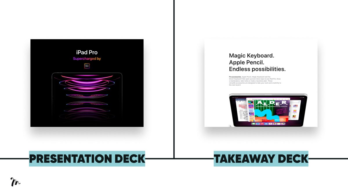
→ What you do for the presentation deck
Use a dark background. We want them focused on you, the speaker. Plus, bright visuals pop more against dark
→ What you do for the takeaway deck
Use a light background. It’s easier to read black on white.
→ What you do for the presentation deck
Use a dark background. We want them focused on you, the speaker. Plus, bright visuals pop more against dark
→ What you do for the takeaway deck
Use a light background. It’s easier to read black on white.
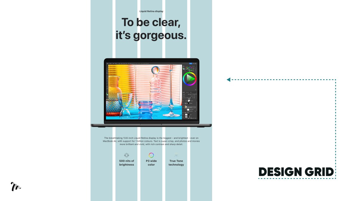
Layout:
Ever wondered how Apple create a beautiful aesthetic with seemingly very little content?
They use a consistent layout.
Everything is working towards a grid. The spacing isn’t random, it’s all aligned.
→ What you do
Turn on gridlines.
Ever wondered how Apple create a beautiful aesthetic with seemingly very little content?
They use a consistent layout.
Everything is working towards a grid. The spacing isn’t random, it’s all aligned.
→ What you do
Turn on gridlines.
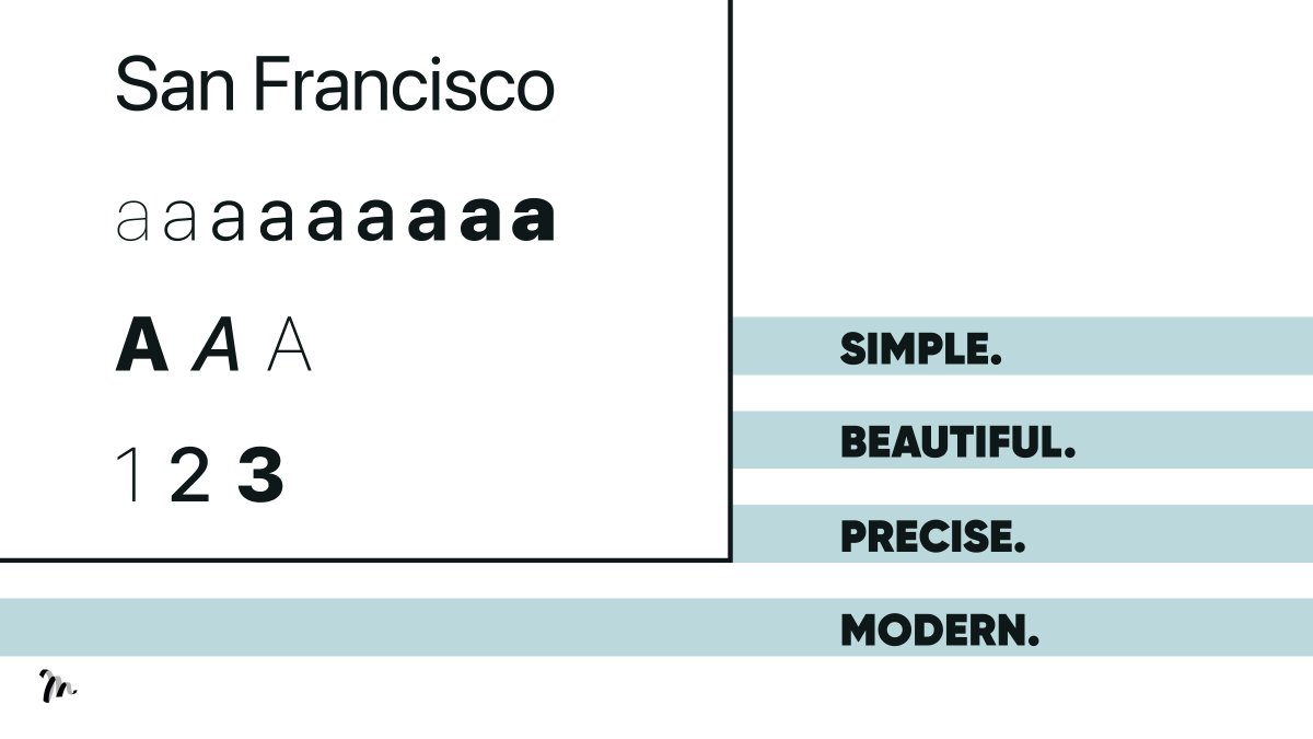
Typography:
You can create interesting slides with nothing other than great font. They have a voice, so choose your font with intention.
→ What you do:
Identify 4 qualities you'd like to be associated with and look for a font conveying them.
You can create interesting slides with nothing other than great font. They have a voice, so choose your font with intention.
→ What you do:
Identify 4 qualities you'd like to be associated with and look for a font conveying them.
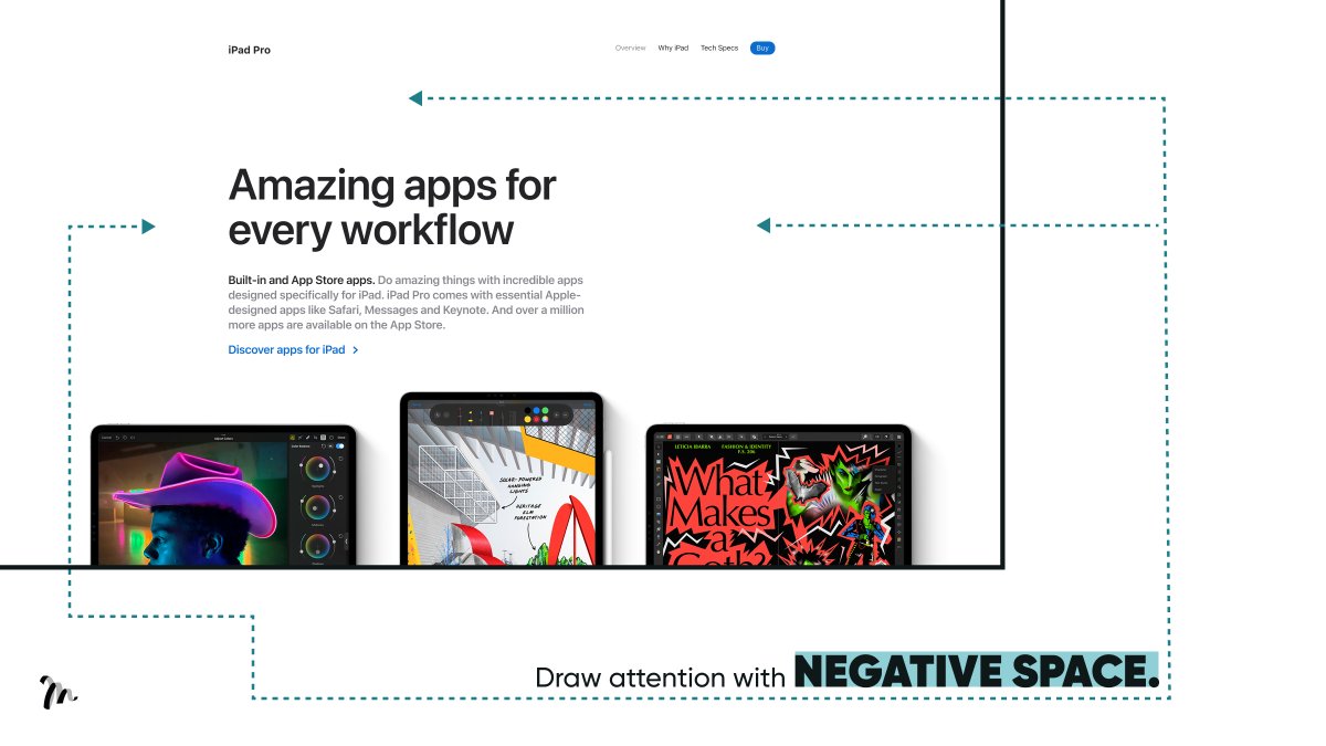
Negative space:
Apple use negative (white) space in their stores and design.
Firstly, because we all associate big space with luxury. Secondly, they use it to draw attention to key messaging.
→ What you do: Give your content room to breathe.
Apple use negative (white) space in their stores and design.
Firstly, because we all associate big space with luxury. Secondly, they use it to draw attention to key messaging.
→ What you do: Give your content room to breathe.
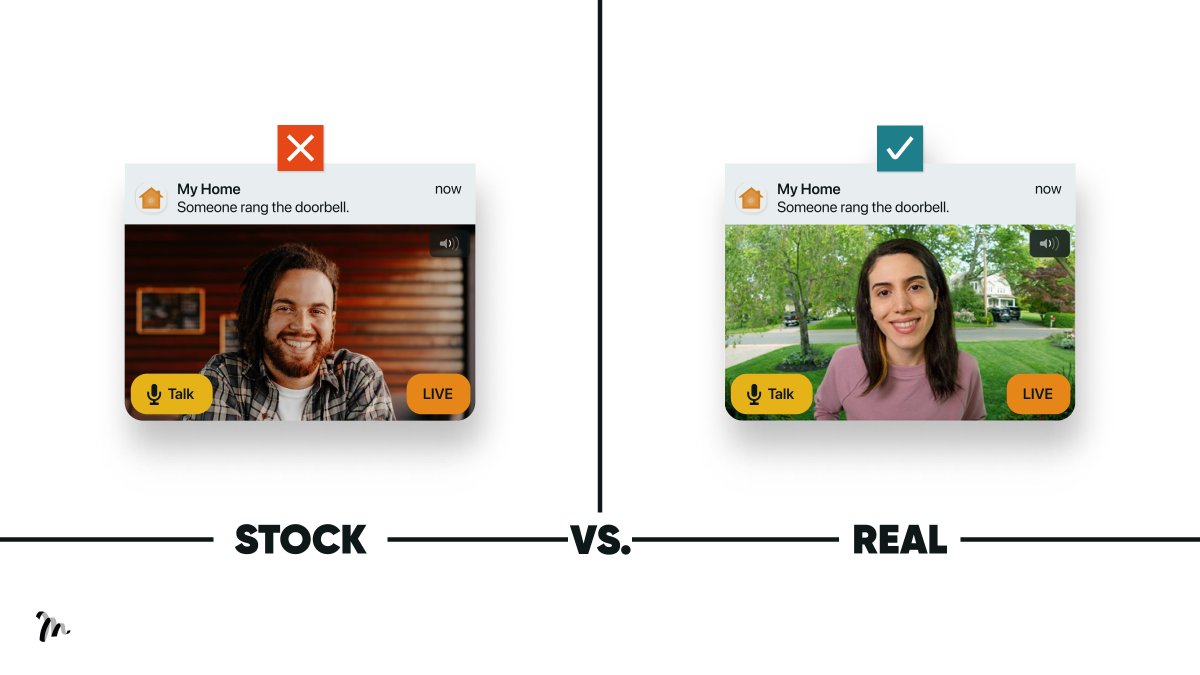
Photography:
Apple use great photography. You can see the subtle difference in the visual of a real photo taken in context versus a stock image (fake happy).
→ What you do:
Don’t be lazy. If you don’t have access to great photos, take real ones yourself.
Apple use great photography. You can see the subtle difference in the visual of a real photo taken in context versus a stock image (fake happy).
→ What you do:
Don’t be lazy. If you don’t have access to great photos, take real ones yourself.
TL;DR 5 Apple Design Principles to Create a Beautiful PowerPoint:
1/ Background colour
2/ Layout
3/ Typography
4/ Negative space
5/ Photography
1/ Background colour
2/ Layout
3/ Typography
4/ Negative space
5/ Photography
Hope you enjoyed the thread.
If you found this valuable, please retweet the 1st Tweet.
Want more?
Follow @liammotivado for weekly threads on Visual Storyselling.
If you found this valuable, please retweet the 1st Tweet.
Want more?
Follow @liammotivado for weekly threads on Visual Storyselling.
Loading suggestions...