

This is fascinating
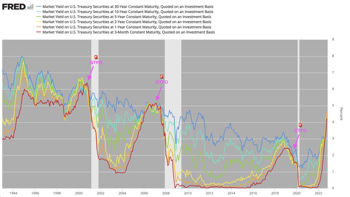
Visualization of all yield curve inversions vs. total US stock market since 1980:
Visualization of all yield curve inversions vs. total US stock market since 1980:


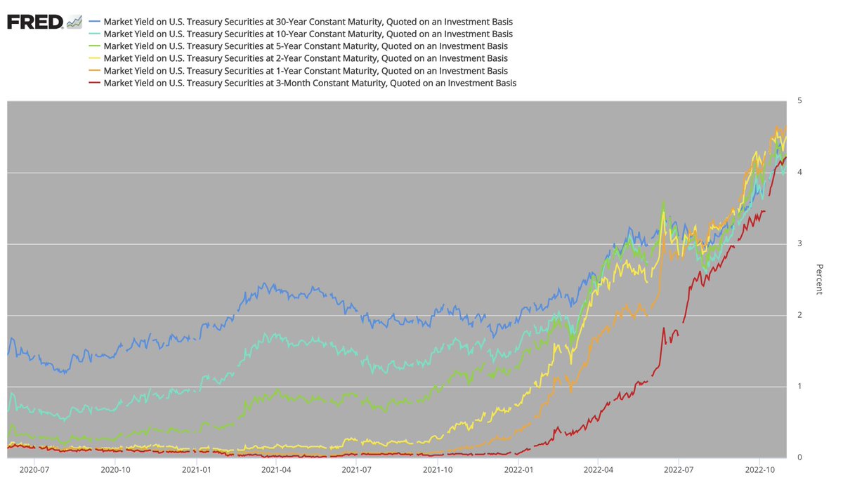
Zoomed in to highlight past few recessions:

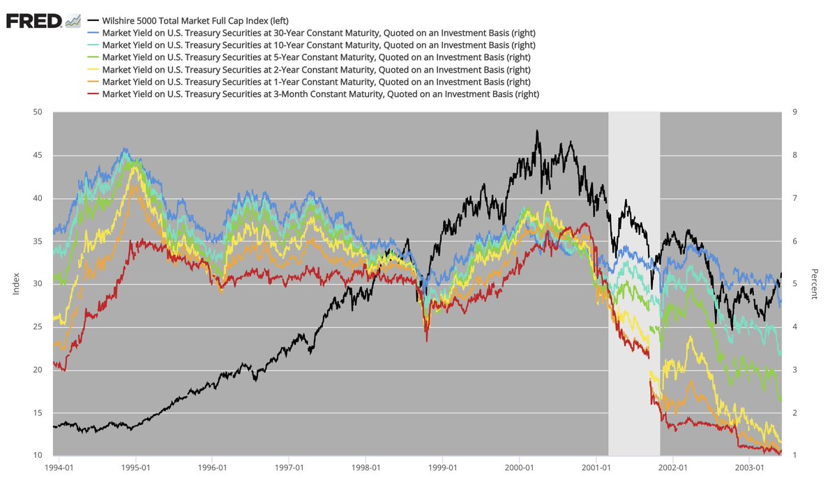


In the '91, '01, and '08 recessions:
- 2y/10yr🟡 inverted 1st, giving early warning ⚠️ sign
- followed by sharper + deeper 3mo/10yr🔴 inversion, giving the GTFO 🚨 signal
In '20, no early warning ⚠️, just the GTFO 🚨 signal
(makes sense given exogenous nature of that crash)
- 2y/10yr🟡 inverted 1st, giving early warning ⚠️ sign
- followed by sharper + deeper 3mo/10yr🔴 inversion, giving the GTFO 🚨 signal
In '20, no early warning ⚠️, just the GTFO 🚨 signal
(makes sense given exogenous nature of that crash)
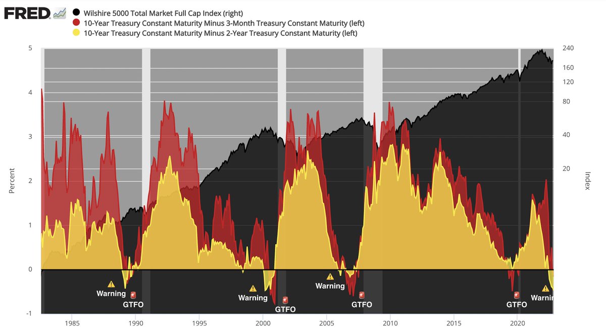
In '22, so far, we've had a clear early warning ⚠️ flashing since early July, w/ a deep + prolonged inversion of the 2yr/10yr 🟡
The 3mo/10yr 🔴 has now also become inverted over past few days, but arguably not *yet* to the degree that would constitute a glaring GTFO 🚨 signal
The 3mo/10yr 🔴 has now also become inverted over past few days, but arguably not *yet* to the degree that would constitute a glaring GTFO 🚨 signal
Takeaway:
Yield curve inversions are a gradual, rolling process
Long-end yields (cooler colors 🟢🔵) tend to peak first and begin rolling over
Yield curve inversions are a gradual, rolling process
Long-end yields (cooler colors 🟢🔵) tend to peak first and begin rolling over
Then, sequentially, shorter-dated yields (warmer colors) rocket upwards until they eventually surpass longer-dated yields
And then those too begin to peak and roll over, one by one
Beginning with the 2yr🟡, then the 1yr🟠, and then finally the 3mo🔴
And then those too begin to peak and roll over, one by one
Beginning with the 2yr🟡, then the 1yr🟠, and then finally the 3mo🔴

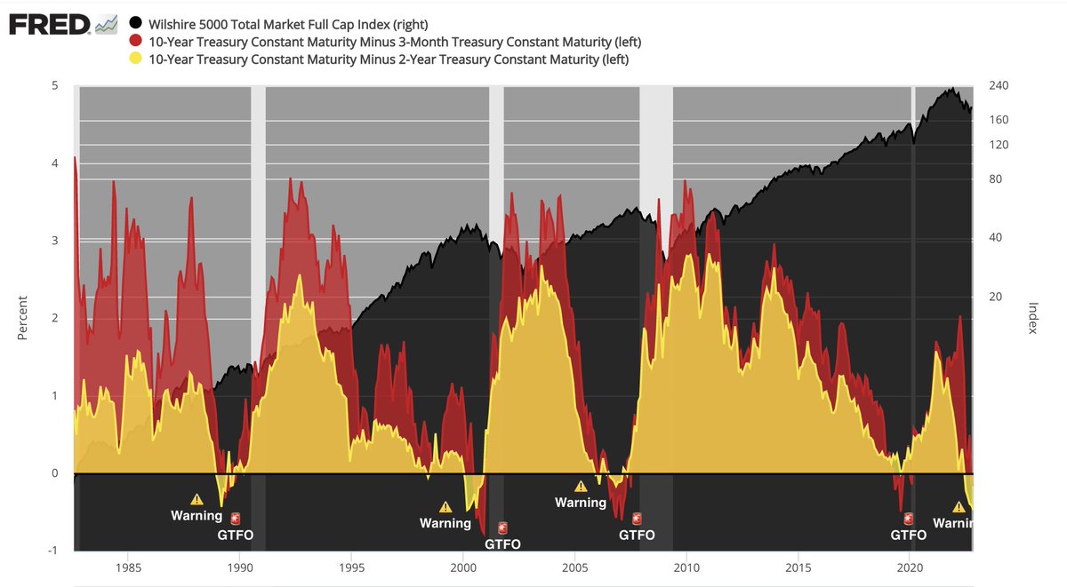
Zooming in on '22 & comparing to past few recessions
It looks clear where we're headed
But also clear we're not there *yet* in terms of a glaring GTFO🚨 signal
When the 3mo🔴 is above all the others, it's time to stampede for the exits
Until then, it's still a trader's game
It looks clear where we're headed
But also clear we're not there *yet* in terms of a glaring GTFO🚨 signal
When the 3mo🔴 is above all the others, it's time to stampede for the exits
Until then, it's still a trader's game
Loading suggestions...