CRO Insights 📈: My agency @conversionwise has been in businesses for 10 years. We do 50-70 new CRO projects per month.
I'm lifting the lid on internal projects and breaking down:
1. Before and after designs
2. What we've changed and why it will increase conversion rates
I'm lifting the lid on internal projects and breaking down:
1. Before and after designs
2. What we've changed and why it will increase conversion rates
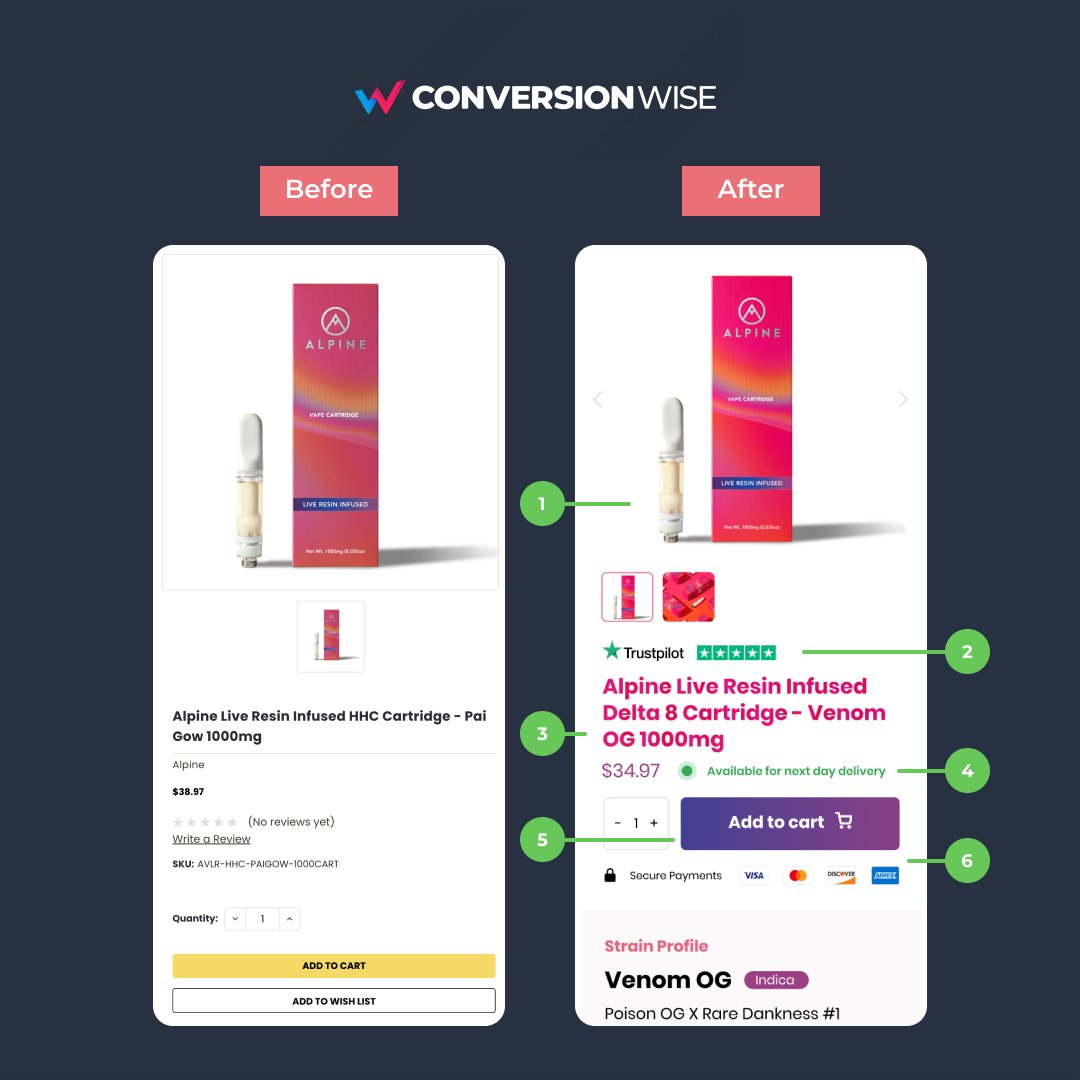
1. Optimise your image section for mobile
❌ Before: The product image took up way too much real estate and didn't showcase more than one image.
✅ After: By using the 1:1 ratio we can pull up more important elements above the fold. We also added <> chevrons and highlights.
❌ Before: The product image took up way too much real estate and didn't showcase more than one image.
✅ After: By using the 1:1 ratio we can pull up more important elements above the fold. We also added <> chevrons and highlights.
2. Showcase social proof
❌ Before: There was zero social proof above the fold.
✅ After: We've leveraged the trust and credibility of TrustPilot and instantly added some social proof as soon as you land on the page.
❌ Before: There was zero social proof above the fold.
✅ After: We've leveraged the trust and credibility of TrustPilot and instantly added some social proof as soon as you land on the page.
3. Highlight the product title/headline
❌ Before: The product title was small and hard to read.
✅ After: Increasing the font weight and colour has enabled us to highlight the product and value proposition.
❌ Before: The product title was small and hard to read.
✅ After: Increasing the font weight and colour has enabled us to highlight the product and value proposition.
4. Add urgency and convenience
❌ Before: This page lacked any kind of urgency nor did it tell the consumer when they can expect the product.
✅ After: Adding this simple call out tells them that the product is available and that they can have it as soon as tomorrow.
❌ Before: This page lacked any kind of urgency nor did it tell the consumer when they can expect the product.
✅ After: Adding this simple call out tells them that the product is available and that they can have it as soon as tomorrow.
5. One, clear, call to action!
❌ Before: The call to action was too far down the fold, not big enough and wasn't the only one.
✅ After: We've added one, clear, call to action higher above the fold. It's bigger and bolder in colour and uses an icon/emoji to stand out.
❌ Before: The call to action was too far down the fold, not big enough and wasn't the only one.
✅ After: We've added one, clear, call to action higher above the fold. It's bigger and bolder in colour and uses an icon/emoji to stand out.
6. Anchor your call to actions
❌ Before: The call to action button wasn't anchored with any type of social proof or trust.
✅ After: Again, we've managed to tick two further boxes of trust and security by showcasing payment logos and a secure payments text/icon.
❌ Before: The call to action button wasn't anchored with any type of social proof or trust.
✅ After: Again, we've managed to tick two further boxes of trust and security by showcasing payment logos and a secure payments text/icon.
TL;DR
📈 Use 1:1 ratio for your images on mobile
📈 Leverage social proof
📈 Make your product title stand out
📈 Show your product available
📈 Only use one, clear, call to action
📈 Use trust and security anchors for your buttons
📈 Use 1:1 ratio for your images on mobile
📈 Leverage social proof
📈 Make your product title stand out
📈 Show your product available
📈 Only use one, clear, call to action
📈 Use trust and security anchors for your buttons
That's all from todays CRO Insights 📈.
If you enjoyed this please follow @oliverkenyon and retweet. 🙏
📧 Join 10k+ marketers getting my weekly Conversion Rate Optimisation newsletter
getrevue.co
If you enjoyed this please follow @oliverkenyon and retweet. 🙏
📧 Join 10k+ marketers getting my weekly Conversion Rate Optimisation newsletter
getrevue.co
Loading suggestions...


