

CRO Insights #5 📈
This week one of our CRO design team optimized this 🍑 of a website. Let me break down exactly what we did and how we've optimized for high conversions rates.
🧵
This week one of our CRO design team optimized this 🍑 of a website. Let me break down exactly what we did and how we've optimized for high conversions rates.
🧵
CRO Insights 📈: My company @conversionwise has been in businesses for 10 years. We do 50-70 new CRO projects per month.
I'm lifting the lid on internal projects and breaking down:
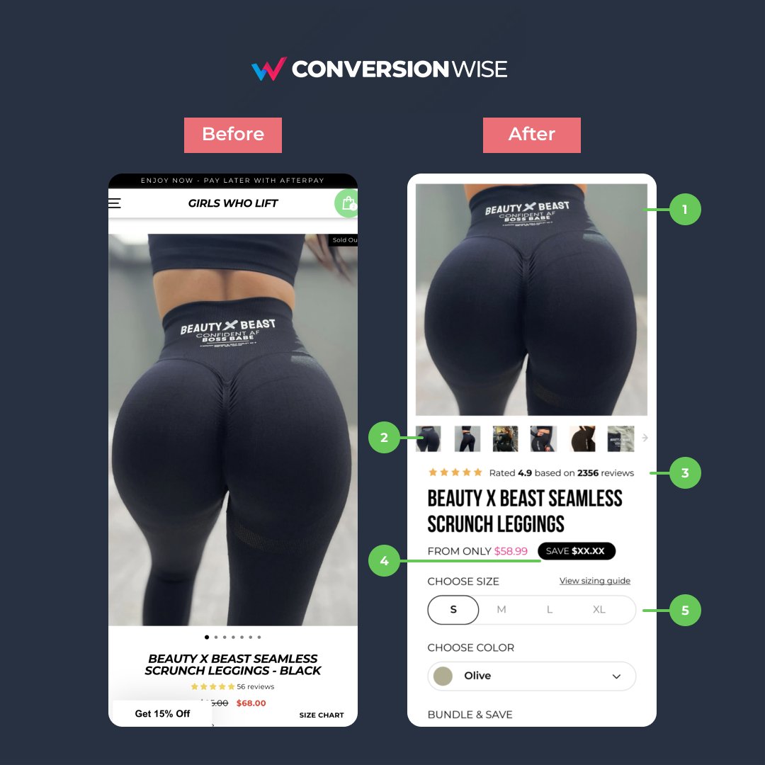
1. Before and after designs
2. What we've changed and why it will increase conversion rates
I'm lifting the lid on internal projects and breaking down:
1. Before and after designs
2. What we've changed and why it will increase conversion rates
1. Use 1:1 ratio on mobile images
❌ Before: Although the images was very peachy, it took up almost 75% of above the fold pushing important elements down.
✅ After: By using 1:1 ratio we're able to show the same image but also alongside important conversion principles.
❌ Before: Although the images was very peachy, it took up almost 75% of above the fold pushing important elements down.
✅ After: By using 1:1 ratio we're able to show the same image but also alongside important conversion principles.
2. Highlight important elements
❌ Before: Could you easily see that there's more amazing product images? Nope.
✅ After: Improve your buyers user experience by showing them there's more images with < > chevrons and previews. These images help sell the product, don't hide them!
❌ Before: Could you easily see that there's more amazing product images? Nope.
✅ After: Improve your buyers user experience by showing them there's more images with < > chevrons and previews. These images help sell the product, don't hide them!
3. Social strength is in numbers
❌ Before: The reviews were being pushed down to the bottom of the fold by the large image. (I said image!).
✅ After: Pulling the image up and also leveraging the amount of reviews pull way more weight than just showing the rating itself.
❌ Before: The reviews were being pushed down to the bottom of the fold by the large image. (I said image!).
✅ After: Pulling the image up and also leveraging the amount of reviews pull way more weight than just showing the rating itself.
4. Do the maths for them
❌ Before: The discounted price was small, down the fold and didn't actually tell me how much I was saving.
✅ After: Showcase the price and discounted price higher up the fold and use a "savings" label to tell your buyers EXACTLY how much they save.
❌ Before: The discounted price was small, down the fold and didn't actually tell me how much I was saving.
✅ After: Showcase the price and discounted price higher up the fold and use a "savings" label to tell your buyers EXACTLY how much they save.
5. Simple, easy to follow steps
❌ Before: No call to action or steps to purchase anywhere near the above the fold.
✅ After: If you have multiple options on any product, walk your buyer through them - STEP BY STEP. Keep it really simple to read and even easier to take action.
❌ Before: No call to action or steps to purchase anywhere near the above the fold.
✅ After: If you have multiple options on any product, walk your buyer through them - STEP BY STEP. Keep it really simple to read and even easier to take action.
TL;DR
📈 Use 1:1 ratio images on mobile
📈 Don't hide functionality or important elements
📈 Put a number to those reviews
📈 Showcase exactly how much the buyer is saving
📈 Walk your buyers through each step at a time
📈 Use 1:1 ratio images on mobile
📈 Don't hide functionality or important elements
📈 Put a number to those reviews
📈 Showcase exactly how much the buyer is saving
📈 Walk your buyers through each step at a time
That's all from todays CRO Insights 📈.
I want to be able to afford to buy these for my wife for Christmas so please help me with a follow @oliverkenyon and retweet. 🙏
📧 Join 10k+ marketers getting my weekly Conversion Rate Optimisation newsletter 👇
getrevue.co
I want to be able to afford to buy these for my wife for Christmas so please help me with a follow @oliverkenyon and retweet. 🙏
📧 Join 10k+ marketers getting my weekly Conversion Rate Optimisation newsletter 👇
getrevue.co
Loading suggestions...