

Day 26 of #60daysOfMachineLearning
🔷 Data Visualization - Matplotlib 🔷
💠 Creating Scatter Plots
With Pyplot, you can use the scatter() function to draw a scatter plot.
The scatter() function plots one dot for each observation.
🔷 Data Visualization - Matplotlib 🔷
💠 Creating Scatter Plots
With Pyplot, you can use the scatter() function to draw a scatter plot.
The scatter() function plots one dot for each observation.

💠 Result
The observation in this example is the result of 13 cars passing by.
The X-axis shows how old the car is.
The Y-axis shows the speed of the car when it passes.
The observation in this example is the result of 13 cars passing by.
The X-axis shows how old the car is.
The Y-axis shows the speed of the car when it passes.

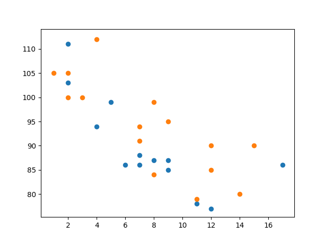
💠 Compare Plots
In the example above, there seems to be a relationship between speed and age, but what if we plot the observations from another day as well? Will the scatter plot tell us something else?
Draw two plots on the same figure:
In the example above, there seems to be a relationship between speed and age, but what if we plot the observations from another day as well? Will the scatter plot tell us something else?
Draw two plots on the same figure:

💠 Result
If you missed the previous days, don't worry! You can follow along and go back to day 1 by going to this link 👇
Loading suggestions...