

Some charts to help understand where each sector is at in terms of their aggregate profits and aggregate market cap. (1/9)
Starting with metals: does market know something that we don’t?
Starting with metals: does market know something that we don’t?

Healthcare: always bottoms when the line converges. So some more time before bottom?

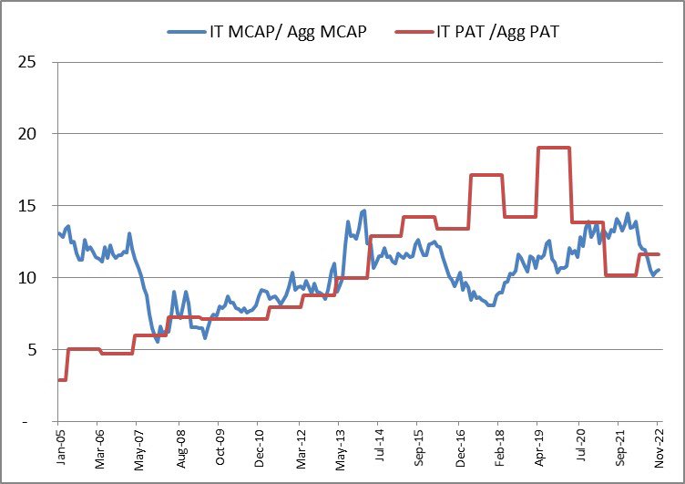
IT: bottom done? Possible accumulation phase now.
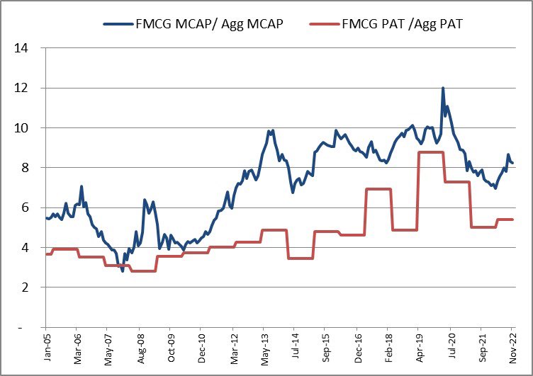
FMCG: Beginning of a new cycle?
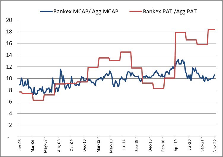
Banks: Undervalued?
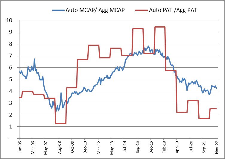
Auto: (perennial) dark horse?
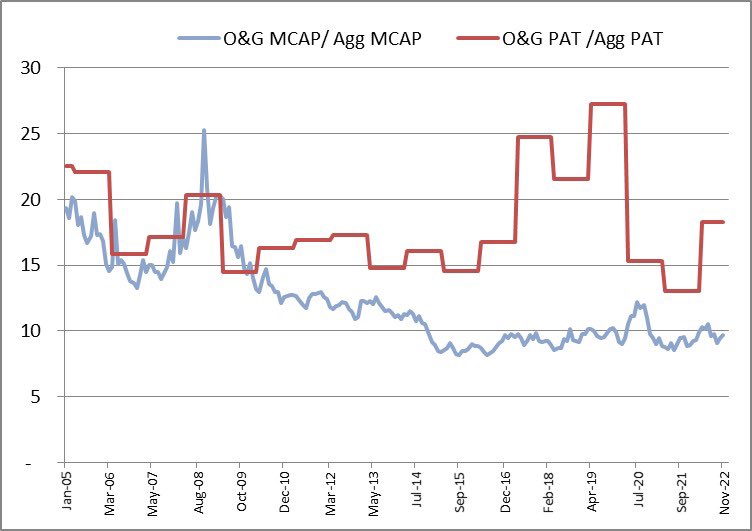
Oil & Gas: Lull continues
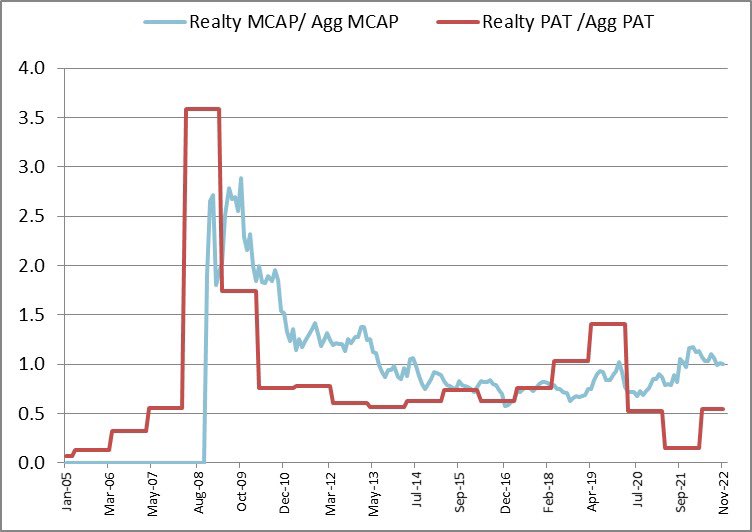
Realty: Nothing different
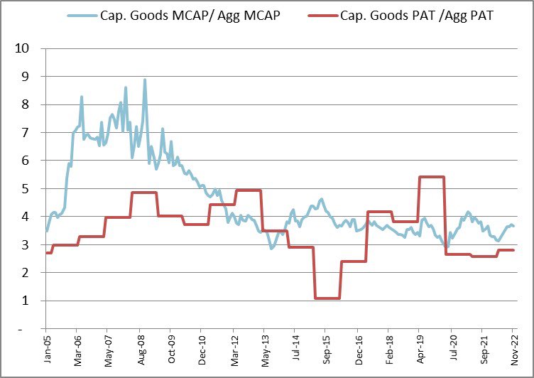
Cap goods: 2004 to 2007 like baby steps(s)?
Loading suggestions...