

CRO Insights #8 📈
Ok so today we're going to look at how our team is redesigning this free trial offer landing page for our client and how we're optimising it for more conversions.
I'll breakdown exactly what we're doing to optimise for high conversion rates. 🚀
🧵
Ok so today we're going to look at how our team is redesigning this free trial offer landing page for our client and how we're optimising it for more conversions.
I'll breakdown exactly what we're doing to optimise for high conversion rates. 🚀
🧵
CRO Insights 📈: My company @conversionwise has been in businesses for 10 years. We do 50-70 new CRO projects per month.
I'm lifting the lid on internal projects and breaking down:
1. Before and after designs
2. What we've changed and why it will increase conversion rates
I'm lifting the lid on internal projects and breaking down:
1. Before and after designs
2. What we've changed and why it will increase conversion rates
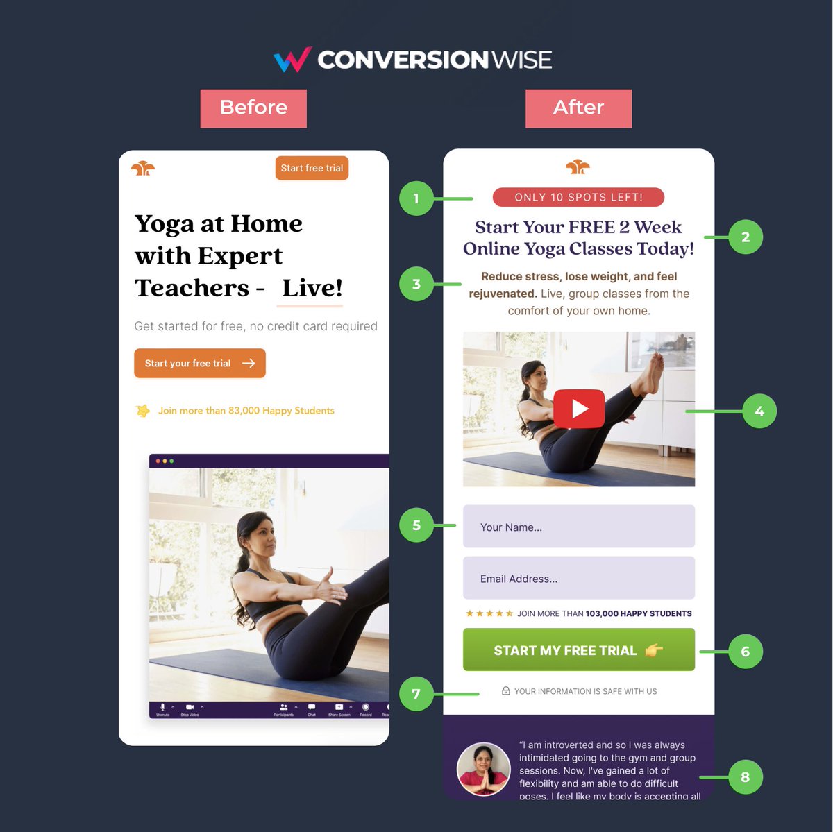
1. Add some scarcity/urgency
❌ Before: Nothing on the page created any sense of urgency or a need to "act now".
✅ After: By adding a simple call out in the header section using a red colour (alert) we're able to instantly add some scarcity and add subtle pressure for action.
❌ Before: Nothing on the page created any sense of urgency or a need to "act now".
✅ After: By adding a simple call out in the header section using a red colour (alert) we're able to instantly add some scarcity and add subtle pressure for action.
2. Make your offer too good to say no
❌ Before: The page is a free trial page but both mentions of "free" are in small and faint fonts.
✅ After: We've used the headline to not only highlight this incredible offer but to make our value proposition much more desirable.
❌ Before: The page is a free trial page but both mentions of "free" are in small and faint fonts.
✅ After: We've used the headline to not only highlight this incredible offer but to make our value proposition much more desirable.
3. Highlight the benefits to the consumer
❌ Before: The before version told us about the yoga at home but didn't tell us what we'd get out of it personally.
✅ After: People want to know the exact benefit that THEY are going to get from your offer. Show the transformation.
❌ Before: The before version told us about the yoga at home but didn't tell us what we'd get out of it personally.
✅ After: People want to know the exact benefit that THEY are going to get from your offer. Show the transformation.
4. Switched from image to video
❌ Before: The resolution of the image didn't display correctly on mobile, not did it really tell us too much about the offer.
✅ After: Instead, we opted for a video that sat far better above the fold ascetically and explained the offer better.
❌ Before: The resolution of the image didn't display correctly on mobile, not did it really tell us too much about the offer.
✅ After: Instead, we opted for a video that sat far better above the fold ascetically and explained the offer better.
5. Place important elements above the fold
❌ Before: The call to action button although high above the fold then scrolled to the all important form.
✅ After: Showing the form higher eliminates one step that it took before to just get to the form fill thus removing friction.
❌ Before: The call to action button although high above the fold then scrolled to the all important form.
✅ After: Showing the form higher eliminates one step that it took before to just get to the form fill thus removing friction.
6. Make your call to action contrasting
❌ Before: Brand colours = orange, logo = orange, call to action = orange.
✅ After: Quite simply we can uplift the call to action but picking a contrasting colour and making the button span full width for ease of click on mobile.
❌ Before: Brand colours = orange, logo = orange, call to action = orange.
✅ After: Quite simply we can uplift the call to action but picking a contrasting colour and making the button span full width for ease of click on mobile.
7. Anchor fields and forms with trust
❌ Before: Although we see the statement "Get started for free", there's a lack of trust for filling in the form.
✅ After: By adding a simple one liner we can instantly instil trust and credibility to the form fields.
❌ Before: Although we see the statement "Get started for free", there's a lack of trust for filling in the form.
✅ After: By adding a simple one liner we can instantly instil trust and credibility to the form fields.
8. Showcase social proof
❌ Before: The page lacked any real form of social proof in the way of a testimonial or case study.
✅ After: By rearranging elements above the fold we've been able to show a full quote that acts as another anchor to the call to action section.
❌ Before: The page lacked any real form of social proof in the way of a testimonial or case study.
✅ After: By rearranging elements above the fold we've been able to show a full quote that acts as another anchor to the call to action section.
TL;DR
📈 When "Free", play on scarcity and urgency
📈 Make your offer to good to pass up on
📈 Use benefit driven headlines and bullets
📈 Explainer videos can work
📈 Important elements above the fold, always
📈 Contrasting button colours
📈 Add trust and social proof
📈 When "Free", play on scarcity and urgency
📈 Make your offer to good to pass up on
📈 Use benefit driven headlines and bullets
📈 Explainer videos can work
📈 Important elements above the fold, always
📈 Contrasting button colours
📈 Add trust and social proof
That's all from todays CRO Insights 📈.
If you enjoyed this please help me with a ReTweet and a follow @oliverkenyon. 🙏
📧 Join 10k+ marketers getting my weekly Conversion Rate Optimisation newsletter
getrevue.co
If you enjoyed this please help me with a ReTweet and a follow @oliverkenyon. 🙏
📧 Join 10k+ marketers getting my weekly Conversion Rate Optimisation newsletter
getrevue.co
Loading suggestions...