

Optimization by Oliver #08 🚀
If I was optimising Harry's trial sign up page for higher conversion rates and sign ups, here's exactly what i'd do and why..
Brand: @harrys
🧵
If I was optimising Harry's trial sign up page for higher conversion rates and sign ups, here's exactly what i'd do and why..
Brand: @harrys
🧵
Optimization by Oliver 🚀: My aim is to visually show you how I would improve conversion rates, in this thread i'll breakdown:
1. What we changed and why it should help conversions
2. Before and after designs
3. Subtle changes that can make huge differences
1. What we changed and why it should help conversions
2. Before and after designs
3. Subtle changes that can make huge differences
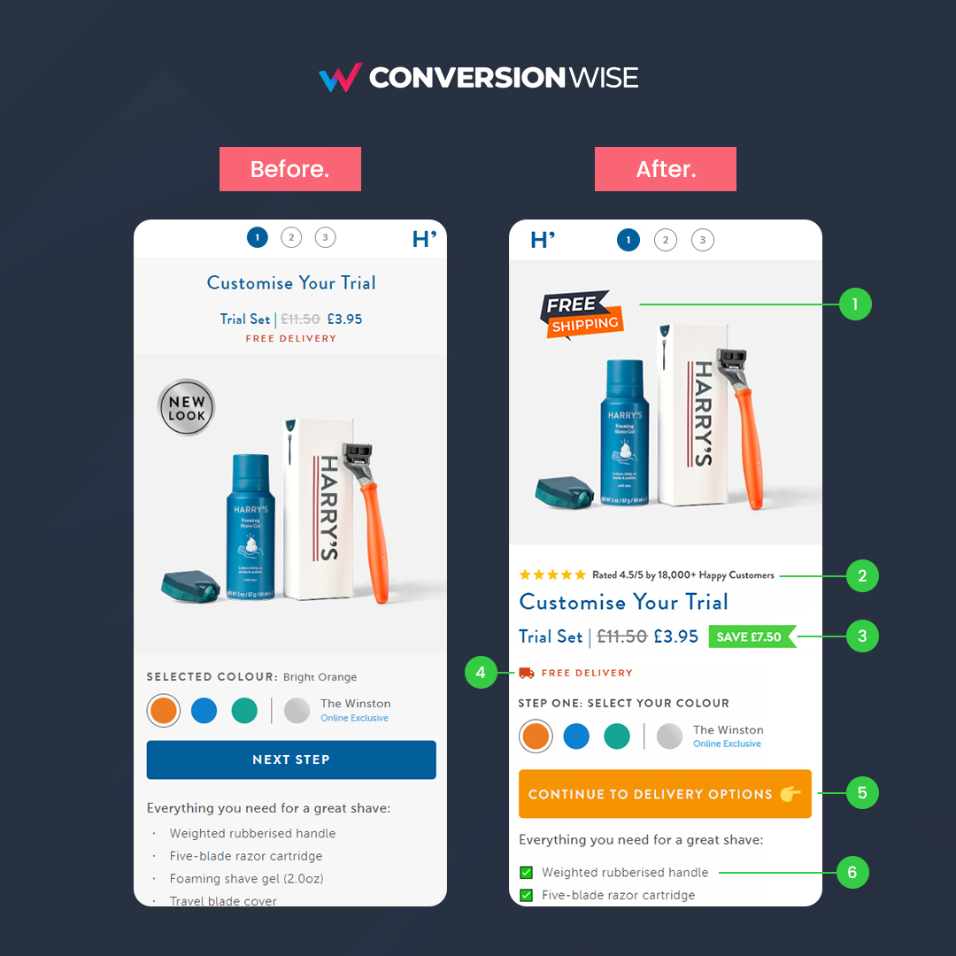
1. Add FREE SHIPPING seal to product image
❌ Before: Harry's focused on a "new look" seal which really serves as zero benefit to the potential buyer.
✅ After: Instead we opted to focus more on a benefit. If you offer free shipping then add a seal to your product images.
❌ Before: Harry's focused on a "new look" seal which really serves as zero benefit to the potential buyer.
✅ After: Instead we opted to focus more on a benefit. If you offer free shipping then add a seal to your product images.
2. Always add social proof
❌ Before: The page lacked any kind of social proof, no reviews, nothing.
✅ After: Harry's have over 18,000 4.5+ star reviews, this is HUGE for credibility and trust. Be sure to show it off to your buyers as soon as possible.
❌ Before: The page lacked any kind of social proof, no reviews, nothing.
✅ After: Harry's have over 18,000 4.5+ star reviews, this is HUGE for credibility and trust. Be sure to show it off to your buyers as soon as possible.
3. Show the EXACT monetary saving
❌ Before: Although they do a good job of showing the before price strikethrough, they don't make the saving obvious.
✅ After: Treat people like they're 6 and visually do the working outs for them. Add a label of the EXACT money they save.
❌ Before: Although they do a good job of showing the before price strikethrough, they don't make the saving obvious.
✅ After: Treat people like they're 6 and visually do the working outs for them. Add a label of the EXACT money they save.
4. Use icons and emojis for highlights
❌ Before: The FREE DELIVERY does stand out due to the colour choice BUT.....
✅ After: We can further draw attention to it by adding a simple truck emoji or icon. Quickly look at before/after, which do you notice more? Bingo!....
❌ Before: The FREE DELIVERY does stand out due to the colour choice BUT.....
✅ After: We can further draw attention to it by adding a simple truck emoji or icon. Quickly look at before/after, which do you notice more? Bingo!....
5. Hold your buyers hand through the steps
❌ Before: "Next Step" as a CTA creates friction and has the buyer guessing "what is the next step?".
✅ After: Eliminate this by using the word "continue" and telling them what to expect on the next step. Use a colour that stands out.
❌ Before: "Next Step" as a CTA creates friction and has the buyer guessing "what is the next step?".
✅ After: Eliminate this by using the word "continue" and telling them what to expect on the next step. Use a colour that stands out.
6. Make your bullets POP!
❌ Before: Although Harry's do a good job of listing features/benefits in bullets, the plain text gets lost.
✅ After: Use eye popping emojis or bullet points to make these more visual and put emphasis on the benefits. Especially when showing 3-5.
❌ Before: Although Harry's do a good job of listing features/benefits in bullets, the plain text gets lost.
✅ After: Use eye popping emojis or bullet points to make these more visual and put emphasis on the benefits. Especially when showing 3-5.
TL;DR
🚀 Use free shipping seals to increase perceived value.
🚀 Have reviews? SHOW THEM OFF ASAP!
🚀 Do the math on saving for your buyers.
🚀 Draw attention with icons/emojis.
🚀 Tell your buyers what to expect on the next step.
🚀 Make features and benefits stand out.
🚀 Use free shipping seals to increase perceived value.
🚀 Have reviews? SHOW THEM OFF ASAP!
🚀 Do the math on saving for your buyers.
🚀 Draw attention with icons/emojis.
🚀 Tell your buyers what to expect on the next step.
🚀 Make features and benefits stand out.
That's all from todays second Optimization by Oliver. If you enjoyed this please follow @oliverkenyon and retweet. 🙏
📧 Join 10k+ marketers getting my weekly Conversion Rate Optimisation newsletter
getrevue.co
📧 Join 10k+ marketers getting my weekly Conversion Rate Optimisation newsletter
getrevue.co
@harrys @jeffreyraider, give this a go 🤝
Loading suggestions...