

📌 Forget breakpoints! Use CSS clamp to size your text based on the viewport width.
Sandbox + details below 👇
Sandbox + details below 👇
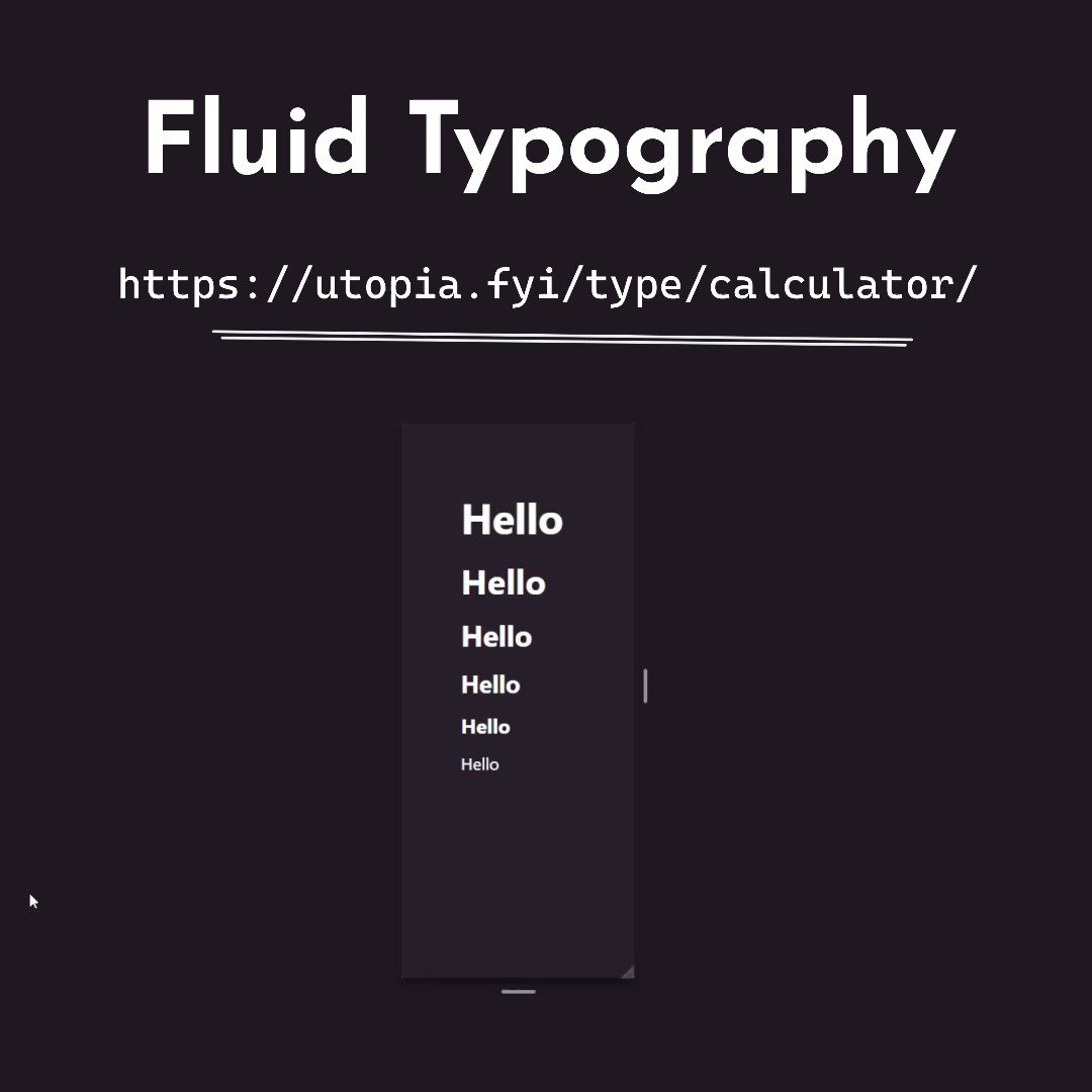
CSS Clamp property scales your value between min and max.

Don't stress about doing the CSS clamp math yourself - there's a calculator available to help!
🔗 utopia.fyi
🔗 utopia.fyi

Here's the final result:
codesandbox.io
codesandbox.io
Loading suggestions...