Optimization by Oliver #12 🚀
I'm 1000% convinced these changes would more than double the sign up conversion rates of Zendesk.
Let me break down exactly why in the thread below!
Brand:
@Zendesk
🧵
I'm 1000% convinced these changes would more than double the sign up conversion rates of Zendesk.
Let me break down exactly why in the thread below!
Brand:
@Zendesk
🧵
Optimization by Oliver 🚀: My aim is to visually show you how I would improve conversion rates, in this thread i'll breakdown:
1. What we changed and why it should help conversions
2. Before and after designs
3. Subtle changes that can make huge differences
1. What we changed and why it should help conversions
2. Before and after designs
3. Subtle changes that can make huge differences
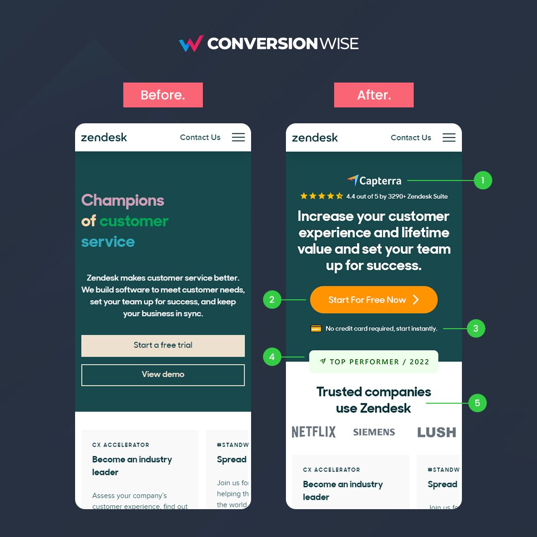
1. Social proof is so, so, so powerful!
❌ Before: I'm amazed that a company of Zendesk's size doesn't show any form of social proof above the fold.
✅ After: We've added the
@Capterra (authority) logo and reviews to instantly establish trust and credibility through reviews.
❌ Before: I'm amazed that a company of Zendesk's size doesn't show any form of social proof above the fold.
✅ After: We've added the
@Capterra (authority) logo and reviews to instantly establish trust and credibility through reviews.
2. ONE, direct response call to action
❌ Before: Not only did the buttons not stand out but they aren't nearly direct enough.
✅ After: Give people one clear call to action. Use an actionable word like "Now", directional cue > and remove a negative word like "trial".
❌ Before: Not only did the buttons not stand out but they aren't nearly direct enough.
✅ After: Give people one clear call to action. Use an actionable word like "Now", directional cue > and remove a negative word like "trial".
3. Eliminate any friction
❌ Before: Using the call to action including "trial" normally means free for now but credit card needed.
✅ After: We've instantly removed any friction by including an emoji and one liner about no credit cards and starting instantly = more sign ups.
❌ Before: Using the call to action including "trial" normally means free for now but credit card needed.
✅ After: We've instantly removed any friction by including an emoji and one liner about no credit cards and starting instantly = more sign ups.
4. Establish authority
❌ Before: Can you tell by the left image that Zendesk won an important award for their product? Me neither!
✅ After: Leverage any awards or certifications of any importance above the fold. This is the perfect way to establish Zendesks authority.
❌ Before: Can you tell by the left image that Zendesk won an important award for their product? Me neither!
✅ After: Leverage any awards or certifications of any importance above the fold. This is the perfect way to establish Zendesks authority.
5. Showoff your best customers
❌ Before: We don't see any brands or companies that Zendesk works with in the view.
✅ After: We can piggy back on other amazing brands that use and love the software by showing their logos above the fold.
❌ Before: We don't see any brands or companies that Zendesk works with in the view.
✅ After: We can piggy back on other amazing brands that use and love the software by showing their logos above the fold.
TL;DR
🚀 ALWAYS add social proof above the fold.
🚀 Use one clear call to action with an action word.
🚀 Remove any doubt or friction.
🚀 Showcase any awards or certifications.
🚀 Leverage your best customers logos.
🚀 ALWAYS add social proof above the fold.
🚀 Use one clear call to action with an action word.
🚀 Remove any doubt or friction.
🚀 Showcase any awards or certifications.
🚀 Leverage your best customers logos.
That's all from todays second Optimization by Oliver. If you enjoyed this please follow @oliverkenyon and retweet. 🙏
📧 Join 10k+ marketers getting my weekly Conversion Rate Optimisation newsletter
getrevue.co
📧 Join 10k+ marketers getting my weekly Conversion Rate Optimisation newsletter
getrevue.co
Loading suggestions...


