

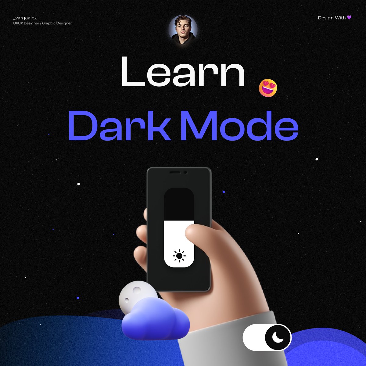
Learn dark mode with me ✅
Thread 🧵
Thread 🧵
1/ One important thing to note is that pure black (# 000000) should not be used as the background color in dark mode. This is because it can be too harsh on the eyes and can cause strain. Instead, opt for a dark gray (# 1c1c1c) or a similar color. ✅
2/ Avoid using saturated colors in dark mode. Saturated colors can be difficult to read and can cause eye strain. Instead, use muted or desaturated colors to create a more comfortable experience for users. ✅
3/ Shadows and contrast are important in dark mode design. Using subtle shadows and contrasting colors can help to create visual hierarchy and make it easier for users to navigate the interface. ✅
4/ Keep in mind that while dark mode can be more comfortable for some users, it's not appropriate for all situations. For example, it may not be suitable for users with certain visual impairments. ✅
5/ Always test your dark mode design with different users, especially those with visual impairments, to make sure that it's accessible and easy to use for everyone. ✅
6/ Allow users to switch mode. It is good to let the user decide what theme to choose. Not everyone likes a dark or light theme. ✅
7/ To sum it up, when designing dark mode, avoid using pure black background, avoid using saturated colors, use subtle shadows and contrasting colors, consider accessibility and always test your design with different users. ✅
Thanks for reading 🤙
If you found this tweet helpful, don't forget to:
✅ Follow me @_vargaalex for more content.
🔁 Retweet the first tweet.
🔔 Enable notifications.
If you found this tweet helpful, don't forget to:
✅ Follow me @_vargaalex for more content.
🔁 Retweet the first tweet.
🔔 Enable notifications.
Loading suggestions...