

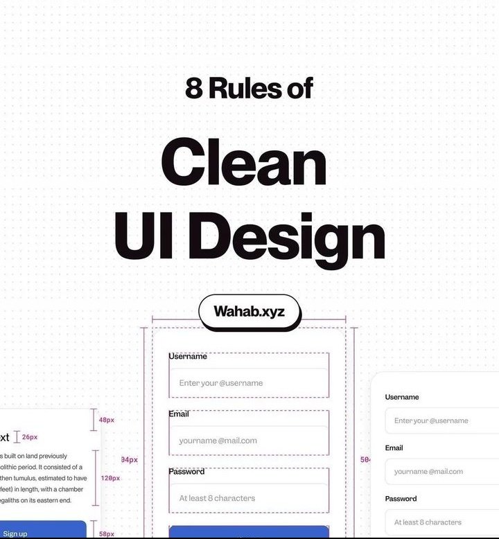
One thing about good designs is that obviously they are always clean and it doesn't just come clean like that. There are some basic rules to achieving clean UI design.
Open thread ⬇️
(CC on IG at uiuxcenter)
#figma #uiuxdesign #uiux #design
Open thread ⬇️
(CC on IG at uiuxcenter)
#figma #uiuxdesign #uiux #design

Less is more. Simplicity speaks design maturity and helps user have ease of accessibility.
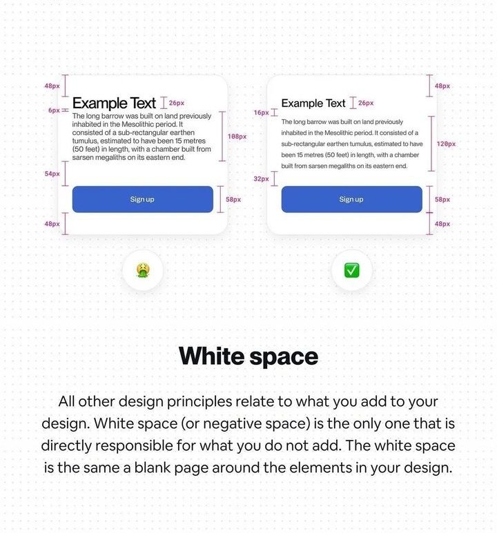
Keeping moderate whitespace is one of the key ways in achieving clean designs in any form. It helps user navigate the design easily
By being consistent with your UI elements, you register certain patterns in the mind of your users and help them ease the flow of usage
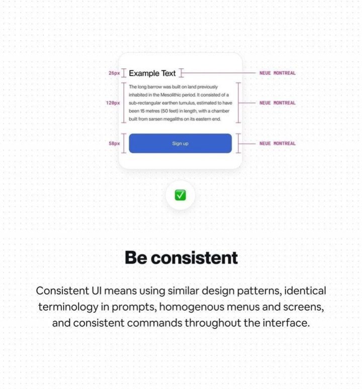
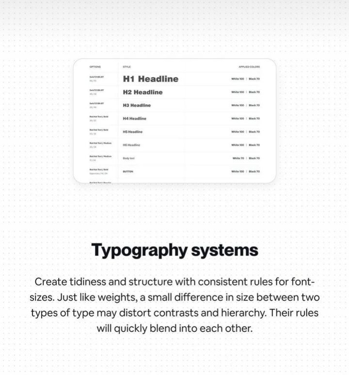
Professionally, it's best to use two typography or a maximum of 3 that blends well with each other. It's a practice used in attaining consistent design.
Like I said earlier, less is more. Less colours helps a design retain it clean look. Most times when many colours are used, it relates to childish stuffs.

Legibility is key to achieving a neat design. Users mostly use design as a medium to consuming content so if your design ain't legible the cleanness is reduced.

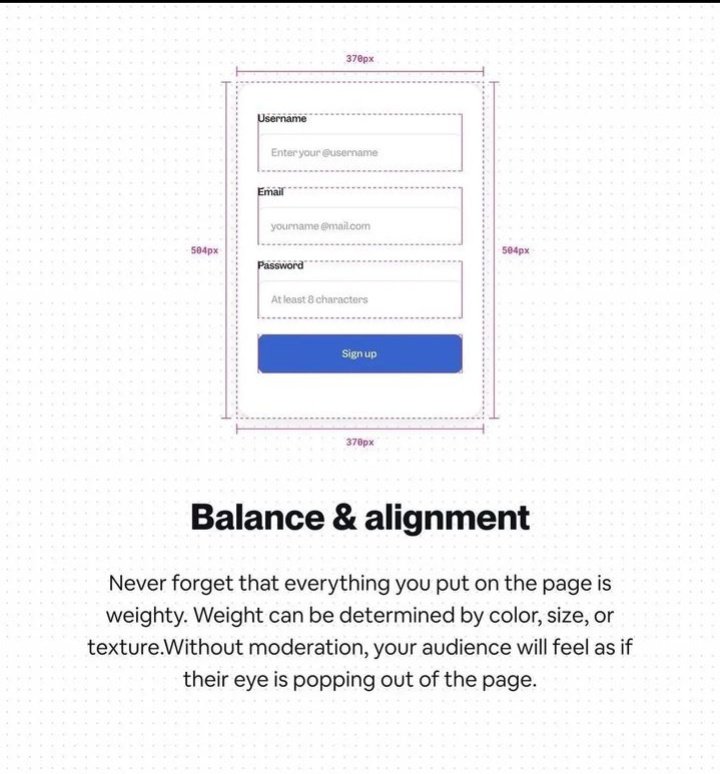
The way you arrange elements can denote how you want your design content to be perceived. Good hierarchy helps to achieve clean design.

Loading suggestions...