

Design can be both easy and difficult.
They say that simplicity is the most difficult part and I think that’s true.
Let's explore 🧵👇
They say that simplicity is the most difficult part and I think that’s true.
Let's explore 🧵👇
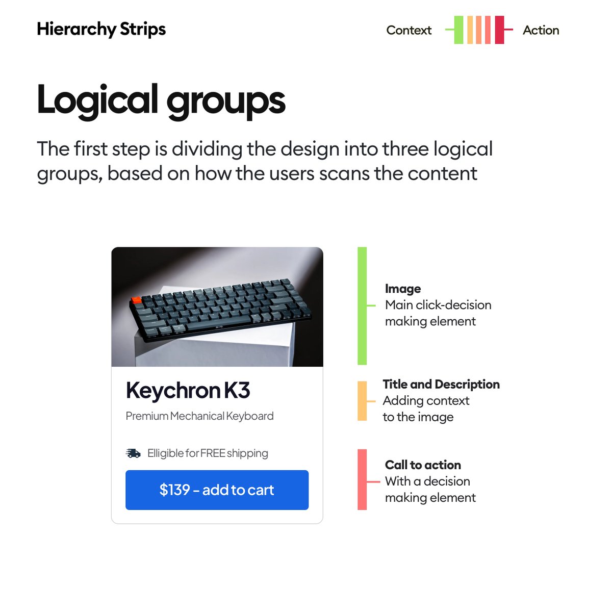
As always we start with the logical groups.
Here it's quite simple, so the most interesting part is the final group - how we're grouping the free shipping information with the button because one thing reinforces the other here.
👇
Here it's quite simple, so the most interesting part is the final group - how we're grouping the free shipping information with the button because one thing reinforces the other here.
👇
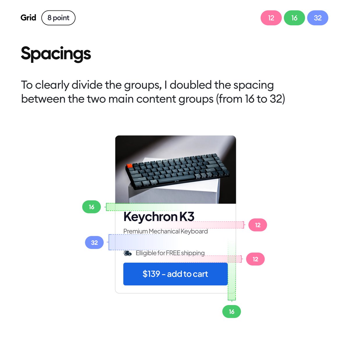
And that clear group division comes from good, consistent, grid-based spacing.
The biggest space (32) is the one between the main groups, which helps us to process them as individual groups.
That larger space helps us focus on each group individually.
👇
The biggest space (32) is the one between the main groups, which helps us to process them as individual groups.
That larger space helps us focus on each group individually.
👇
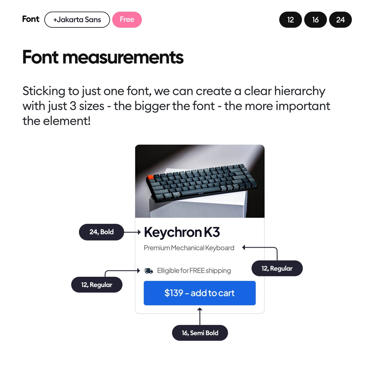
Fonts help deliver the message, so as always one typeface and just three sizes.
We could probably do away with two here too, but three is still a safe amount.
We could probably do away with two here too, but three is still a safe amount.
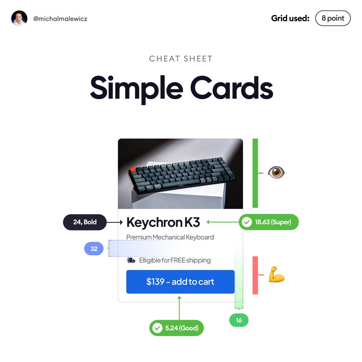
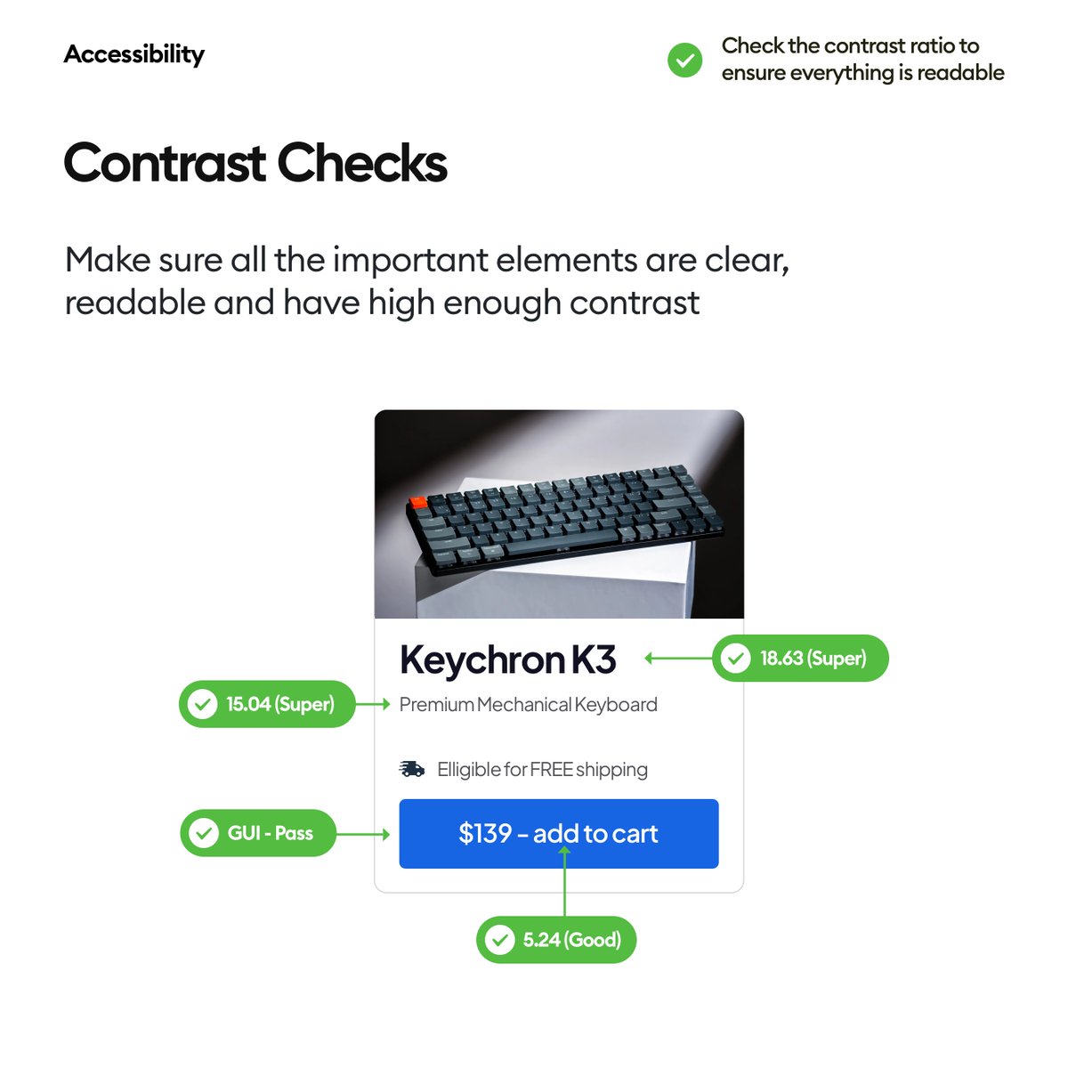
Then check the contrasts for all the main elements.
You can use a plugin or a website for that.
Make sure everything is clear and readable.
You can use a plugin or a website for that.
Make sure everything is clear and readable.
Want to be an awesome designer?
✅ Follow me - @michalmalewicz
✅ Share the thread so more people can see it 🙏
✅ Have a beautiful day ❤️
✅ Follow me - @michalmalewicz
✅ Share the thread so more people can see it 🙏
✅ Have a beautiful day ❤️
Loading suggestions...