

Designers, learn how to use the 60-30-10 rule of color for UI/UX.
It's easier than you think:
It's easier than you think:

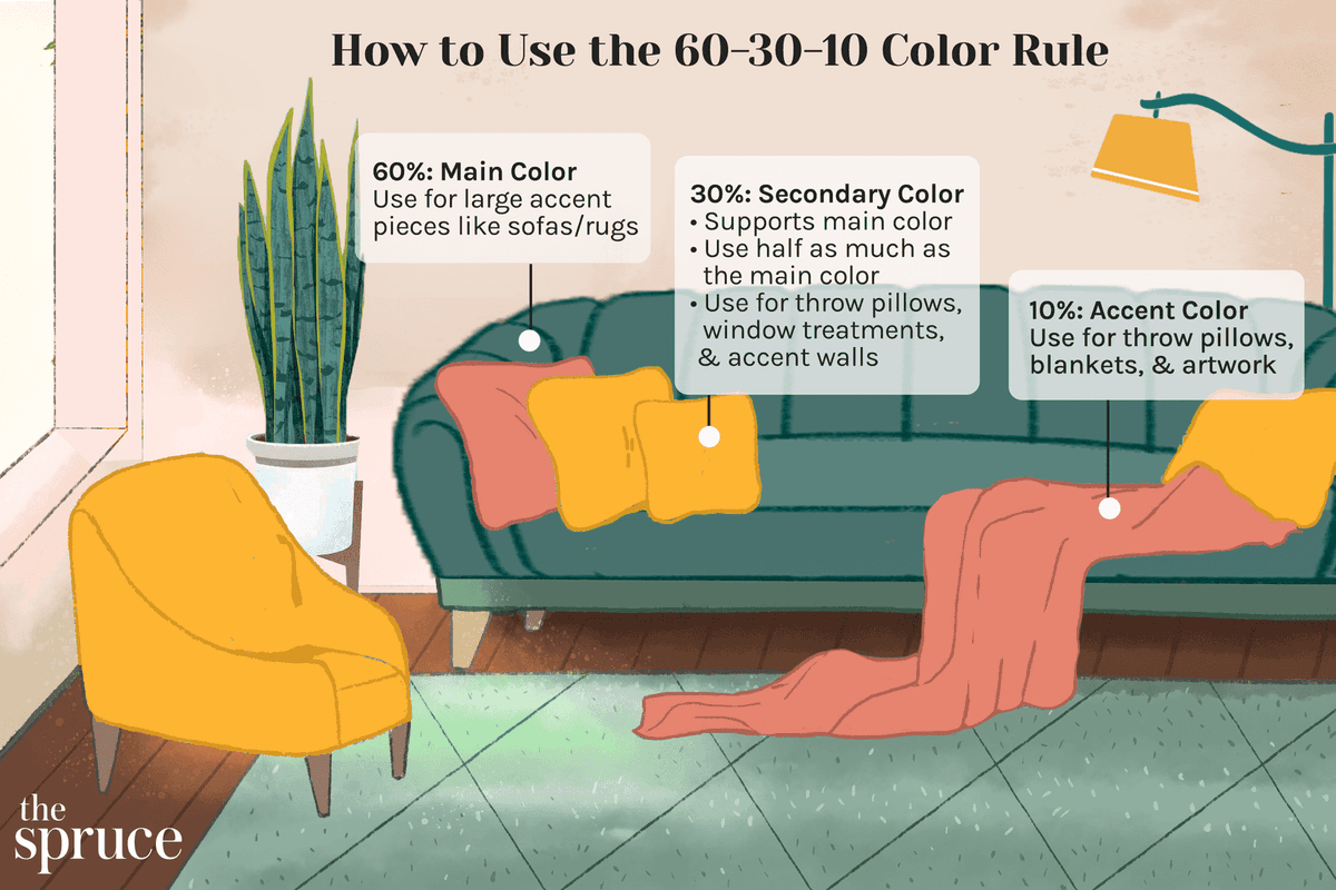
1/ The 60-30-10 rule of color is a popular design principle in the world of UI/UX design. It suggests that 60% of the visual weight in a design should be a dominant color, 30% should be a secondary color, and 10% should be an accent color.
2/ This rule helps create a harmonious and visually balanced color scheme that draws the eye where it needs to go and guides the user through the interface.
3/ The dominant color is the base color that sets the tone for the entire design and is used for the majority of the interface. This color should be consistent and help establish the brand identity. This color is usually a neutral or primary color.
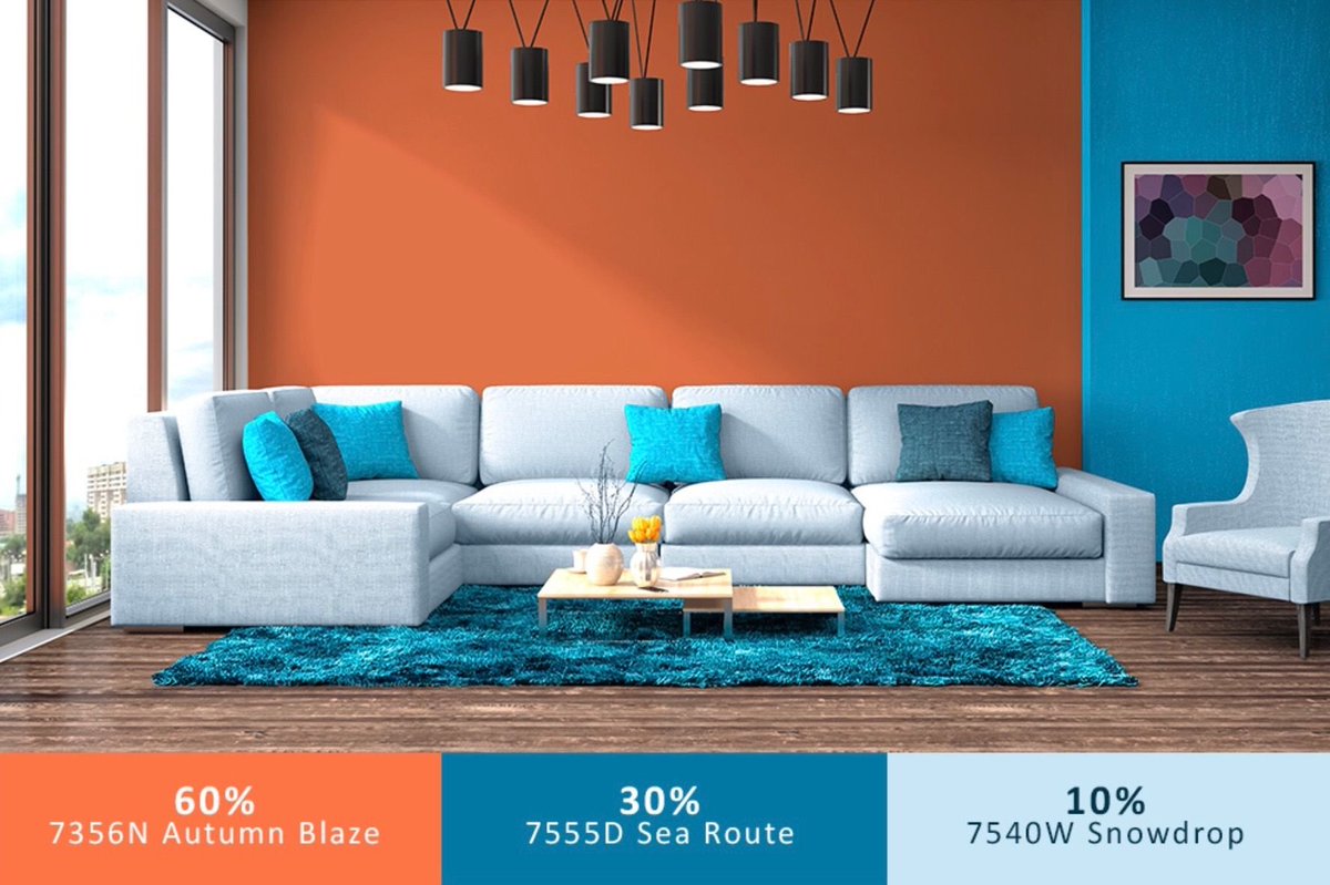
4/ The secondary color is used to provide visual interest and contrast to the dominant color. It should complement the dominant color and be used in smaller quantities.
5/ The accent color is used sparingly to draw attention to specific elements or call-to-action buttons. This color should be a bold and contrasting color that stands out against the dominant and secondary colors.
6/ To use the 60-30-10 rule effectively, start by selecting your dominant color, then choose a secondary color that complements it, and finally, select an accent color that provides contrast.
7/ When applying the colors to your design, be mindful of the visual weight of each color and aim to keep the 60-30-10 ratio consistent throughout.
8/ Keep in mind that the 60-30-10 rule is a guideline and not a strict rule. Experiment with different color combinations and find the one that works best for your project.
9/ By following the 60-30-10 rule, you can create a cohesive and visually appealing color scheme for your UI/UX design that helps guide users and establishes your brand identity.
Note: Visual weight refers to the perceived importance or emphasis of a visual element in a design, such as an image, text, or shape. It is determined by factors such as size, color, contrast, and position,
and it affects how the eye moves through the design and which elements are perceived as dominant or subordinate.
Loading suggestions...