Adham Dannaway
Adham Dannaway

@AdhamDannaway

6 Tweets 1 reads Feb 19, 2023
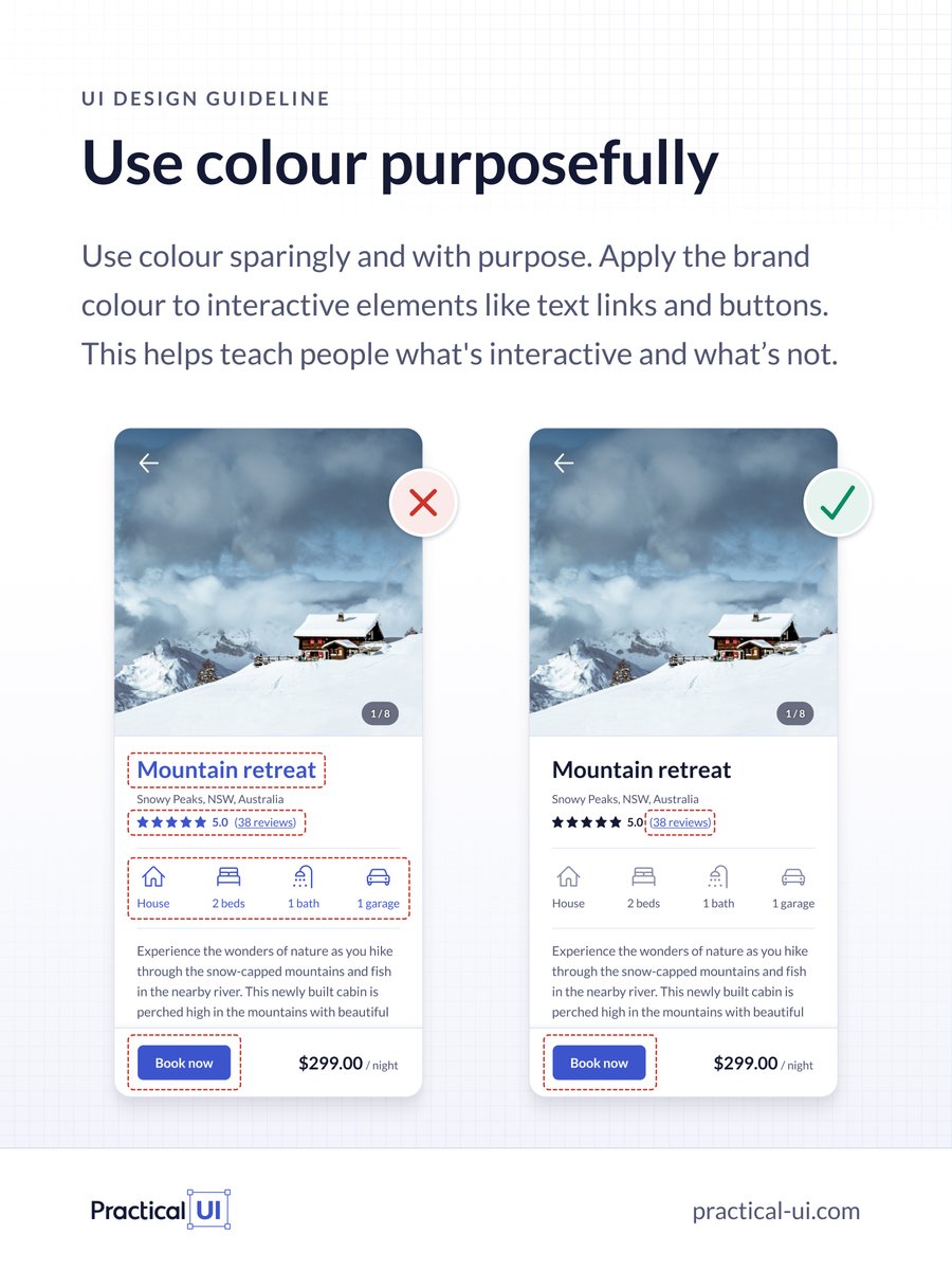
⚡️ UI design tip - Use colour purposefully
Use colour sparingly and with purpose. Apply the brand colour to interactive elements like text links and buttons.
This helps teach people what's interactive and what’s not.
More tips 👇
#design #uidesign #uxdesign #uxui
Try to avoid using colour on non-interactive elements, as they could be mistaken for being interactive.
In this example, using blue for the heading text and icons might look nice, but it makes them seem interactive when they're not.
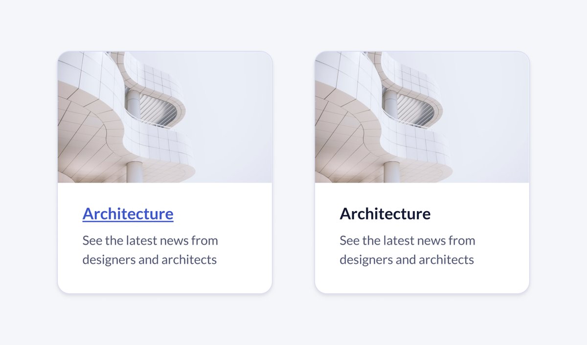
You don’t need to add colour to all interactive elements, as some already have visual cues that indicate they’re interactive.
The cards in the following example still feel interactive, with or without the conventional blue underlined text.
If there are multiple brand colours, try using the highest contrast colour exclusively for interactive elements and use the others sparingly for decorative elements.
🚨 PS This is just 1 of over 100 logic-driven design guidelines you'll find in my UI design book - Practical UI.
practical-ui.com
If you found this thread useful:
❤️ Follow me @AdhamDannaway for daily design tips
🔁 Retweet the below tweet to share it 👇

Loading suggestions...