

My last thread asked: Did the market find bottom last October, even though earnings are only now beginning to decelerate? Here's a closer look at similar periods in history. 🧵
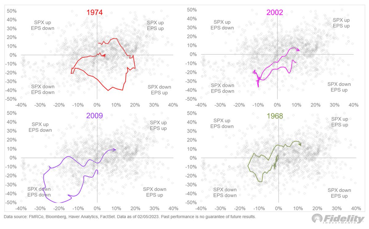
Note how all cycles start in the upper right quadrant (price and earnings are up) and return to that same quadrant (during the next bull market cycle). But what they do in between is where it gets interesting. /2
First up is the 1974 bear market (top left). To me this is a very interesting analog because like 2022, the market fell while earnings grew (even in real terms). It was all about the P/E. /3
Then the Fed stopped tightening, a recession started and earnings went into a contraction, and the bear market ended! /4
You can see in the chart that the red line starts in the upper right quadrant (P/E & EPS up), moves to the lower right quadrant (P/E down, EPS still up), and then moves to the lower left (P/E moving higher while EPS moves lower). /5
The 1974 bear was bigger than 2022 (48% vs 28%), and the P/E slide was worse (from 20x to 7x, vs from 30x to 15x), but the valuation side was the mirror image of earnings. It’s a reminder that a new bull market could be underway just as earnings start to fall. /6
The Great Recession of 2007-09 (purple line in the bottom left panel) was a different beast. That cycle produced a concurrent contraction in both earnings and valuation, a vicious double-whammy that took the market down 57%. /7
You can see how deep into the lower left quadrant that price cycle went. Then, price started to recover two quarters before earnings bottomed. Again, you can see that when the purple line starts to move higher while still in the earnings contraction quadrant. /8
The 2000-02 dot-com bust (pink line, upper right panel) produced only a mild recession but a significant valuation derating that took the 5-year CAPE from 30x to 17x (much like the current cycle). Price actually bottomed after earnings. /9
This is unusual and probably had something to do with the crisis of confidence around the quality of earnings at the time. Remember Enron’s made-up earnings? Anyway, you can see how the pink line never hooked up in the contraction quadrant. /10
In my next thread, we'll examine some additional analogs relevant to today's cycle. /END
Loading suggestions...