

CSS Grid is tricky.
But you won't have any difficulties working with the CSS grids after this post:
But you won't have any difficulties working with the CSS grids after this post:

Grid is used for making complex web design layouts more easily as it's not so hard to master.
Using Flex, you can make only 1D layout but Grid gives you the full power of creating a 2D layout.
Let's start:
Using Flex, you can make only 1D layout but Grid gives you the full power of creating a 2D layout.
Let's start:
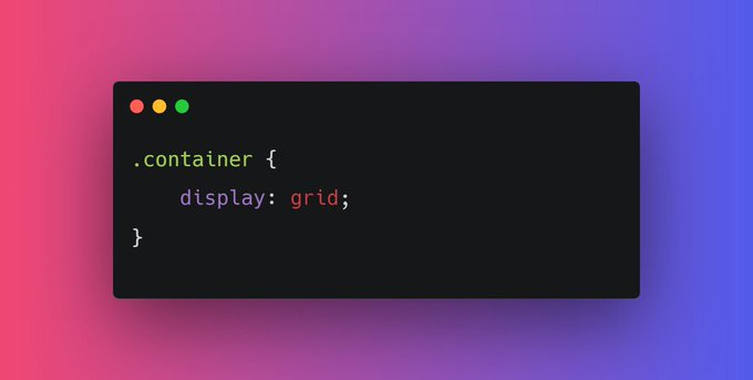
First things first, start with giving the display property "grid" to the container element or parent element.
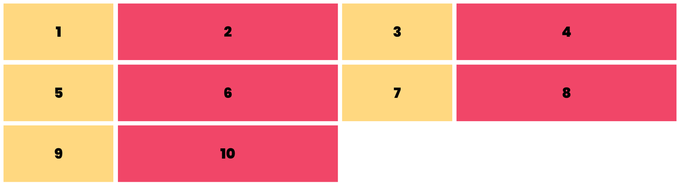
Nothing will change after adding display: flex; in the parent container because we need to define the width of columns. In order to set that column's width, we have the `gird-template-columns` property.
Let's start with defining the width of our columns.
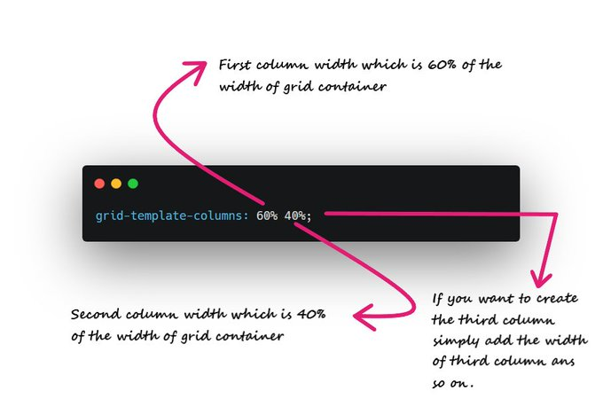
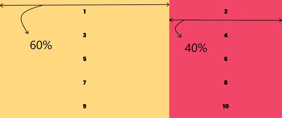
For example, I need two columns of width 60% and 40% respectively.
`grid-template-columns: 60% 40%;`
For example, I need two columns of width 60% and 40% respectively.
`grid-template-columns: 60% 40%;`
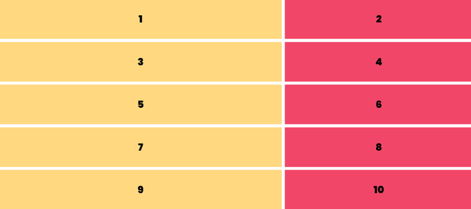
Ahh!! My grid items look ugly as there is no spacing between them.
Here "grid-gap" property comes into play. For example, I need 10px spacing along columns and rows.
`grid-gap: 10px;`
Here "grid-gap" property comes into play. For example, I need 10px spacing along columns and rows.
`grid-gap: 10px;`
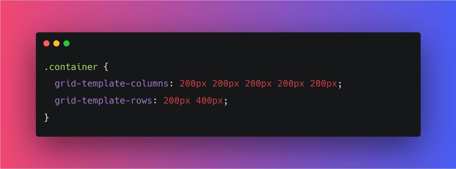
Similarly, we have grid-template-rows.
It is used to define the number of rows and the height of rows.
`grid-template-rows: 200px 400px;`
It is used to define the number of rows and the height of rows.
`grid-template-rows: 200px 400px;`
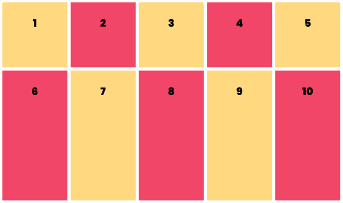
As you can see, there is a lot of repeated code in
grid-template-columns: 200px 200px 200px 200px 200px;
Instead of this, we can use the repeat function:
`grid-template-columns: repeat(5, 200px);`
grid-template-columns: 200px 200px 200px 200px 200px;
Instead of this, we can use the repeat function:
`grid-template-columns: repeat(5, 200px);`

You might run into some responsiveness issues if you pass pixel unit or percentage in your grid-template-columns.
In order to prevent this, it is recommended to use fraction values.
For example:
In order to prevent this, it is recommended to use fraction values.
For example:
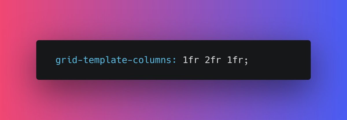
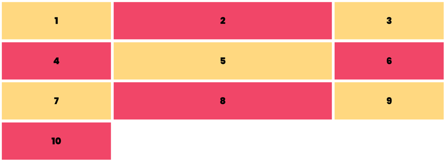
You can use the repeat function for `fr` as well.
repeat(2, 1fr 2fr);
It will repeat 1fr 2fr two times.
repeat(2, 1fr 2fr);
It will repeat 1fr 2fr two times.
Moving forward, you can set the height of the grid element using grid-auto-rows.
`For ex, grid-auto-rows: 200px;`
`For ex, grid-auto-rows: 200px;`
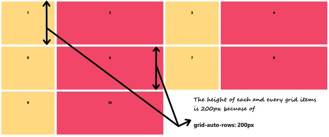
Though there is a problem, by doing this, we are setting the fixed height so content inside items can overflow.
For example:
For example:
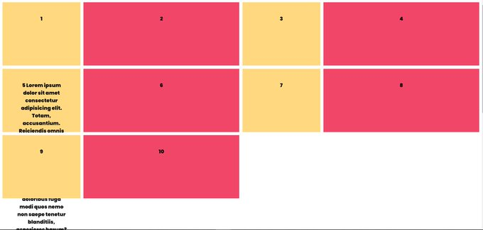
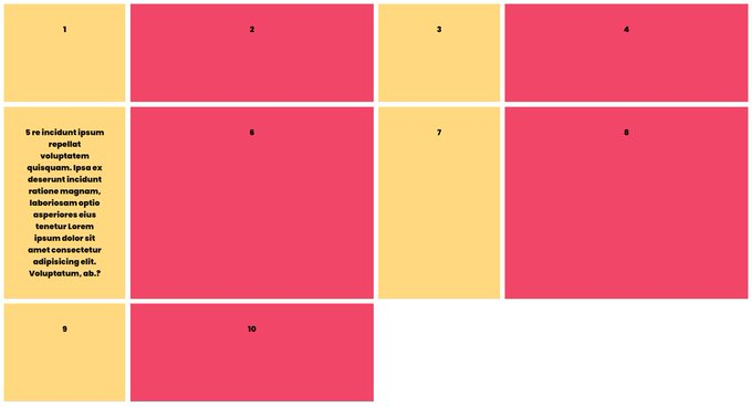
In order to prevent this kind of issue, we have `minmax` function.
grid-auto-rows: minmax(200px, auto);
It's pretty intuitive that the height of gird items will be 200px minimum and "auto" maximum(according to content).
grid-auto-rows: minmax(200px, auto);
It's pretty intuitive that the height of gird items will be 200px minimum and "auto" maximum(according to content).
We can do all that we have covered so far using flexbox also.
Let's understand the two dimensions of the `grid` layout.
Let's understand the two dimensions of the `grid` layout.
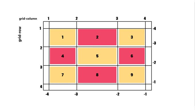
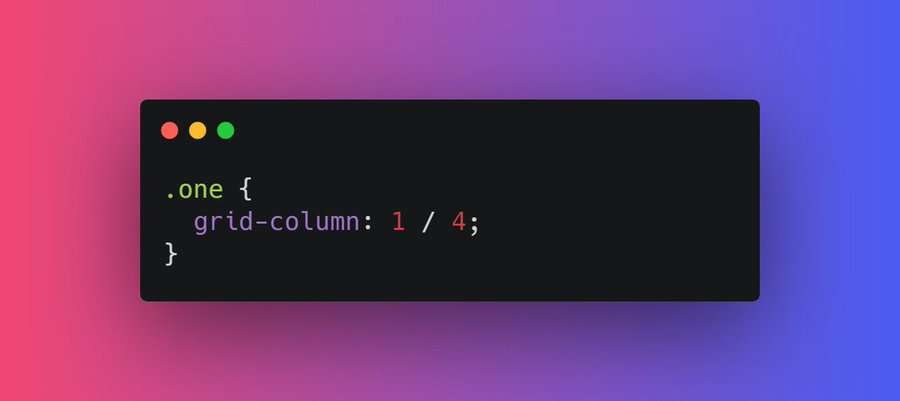
We can change the position of a particular item in accordance with row and column.
For example, I want my first item to take up an entire row from the first column to the last column.
`grid-column: 1 / 4;`
For example, I want my first item to take up an entire row from the first column to the last column.
`grid-column: 1 / 4;`
Alright moving forward, The next property we have is `grid-template-areas` which specifies the areas within the grid layout.
Each row is defined by apostrophes (' ')
Sounds confusing? Let's see this in action.
Each row is defined by apostrophes (' ')
Sounds confusing? Let's see this in action.
Let's break down this code.
grid-template-areas: 'areaName areaName areaName areaName areaName';
• Each row is defined by apostrophes (' ')
• Hence only one row in this case as there is only one pair of apostrophes
• Five "areaName" hence five columns
CONT...
grid-template-areas: 'areaName areaName areaName areaName areaName';
• Each row is defined by apostrophes (' ')
• Hence only one row in this case as there is only one pair of apostrophes
• Five "areaName" hence five columns
CONT...
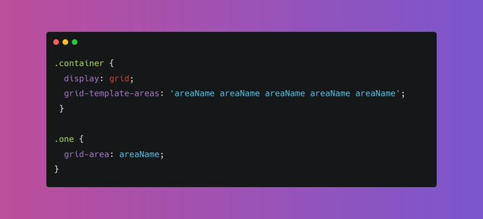
Now let's apply this area (areaName) to the first grid item.
.one {
grid-area: areaName;
}
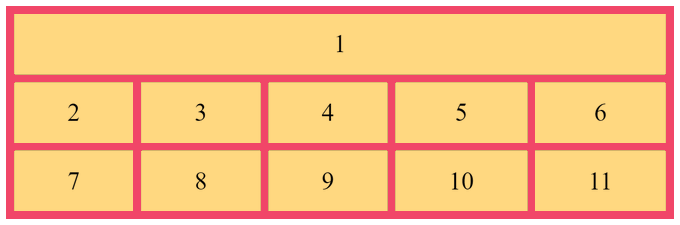
As you can see item1 takes one entire row and 5 columns. As simple as that
codepen.io
.one {
grid-area: areaName;
}
As you can see item1 takes one entire row and 5 columns. As simple as that
codepen.io

Alright, moving further let's talk about the context of Grid items.
We can set the ordering and alignment of a particular item. Let's dive into it.
We can set the ordering and alignment of a particular item. Let's dive into it.
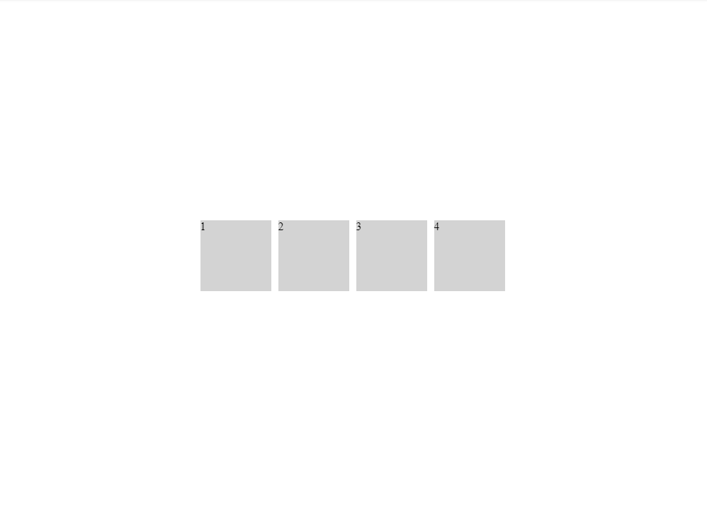
📌 The Order of the items
The order is nothing but used to set the order of an item within the grid container.
The order is nothing but used to set the order of an item within the grid container.
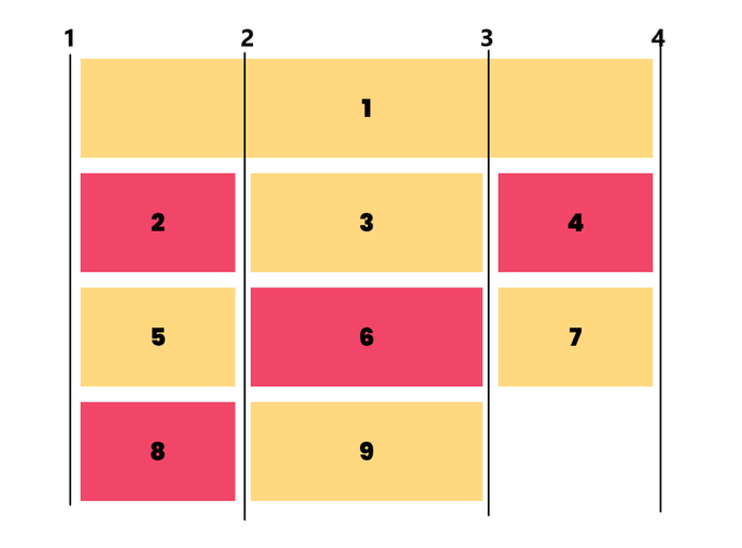
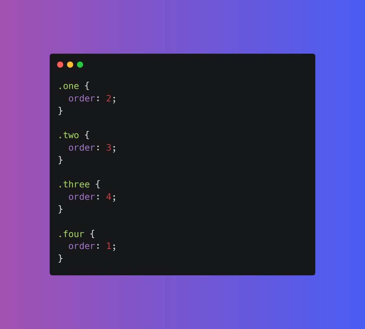
Here is the visual example, by default the correct order should be 1 2 3 4 but I have applied order property to change the actual ordering.

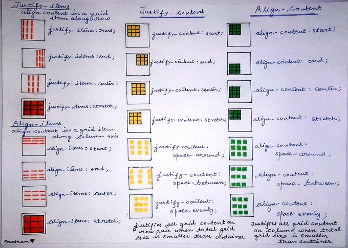
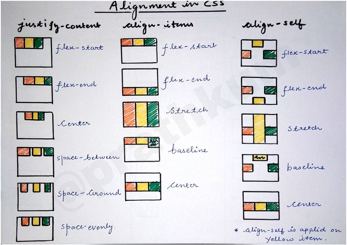
📌 Alignment in CSS Grid Layout
This is confusing, but we will cover everything in this thread.
justify-content
align-items
justify-self
align-self
This is confusing, but we will cover everything in this thread.
justify-content
align-items
justify-self
align-self
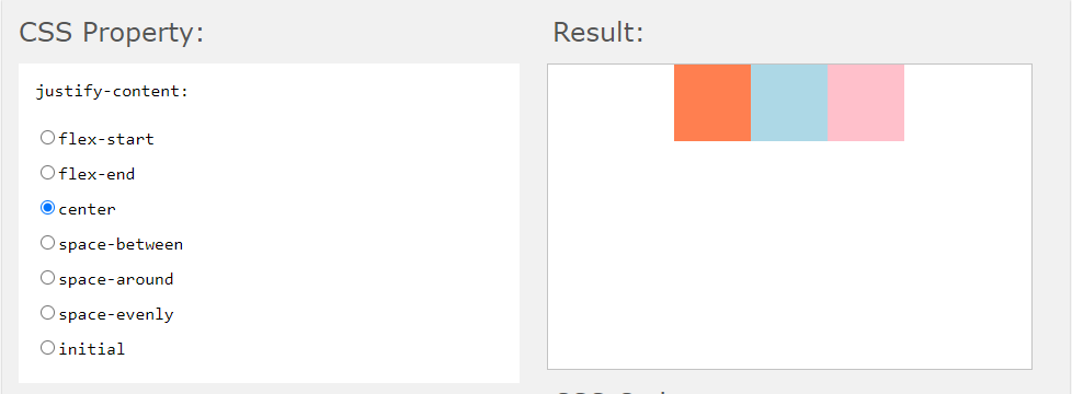
The `justify-content` is used to align the container's items when the items do not use all available space on the `main-axis` (horizontally).
🔗 w3schools.com
🔗 w3schools.com
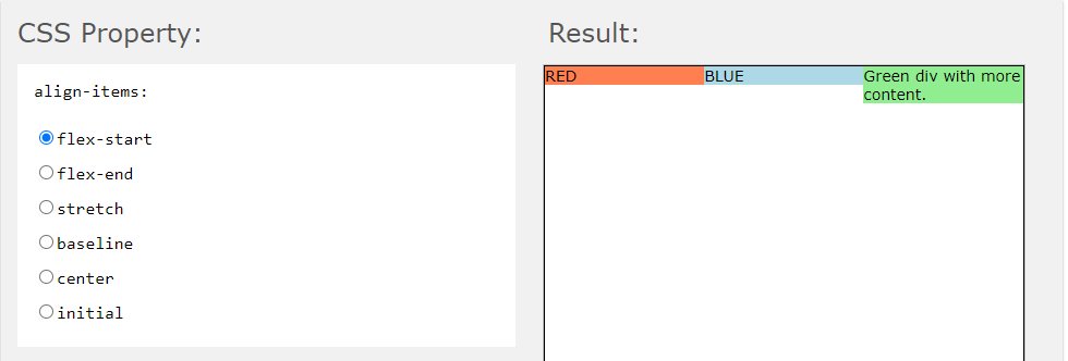
The `align-items` property specifies the default alignment for items inside the flexible container.
🔗 w3schools.com
🔗 w3schools.com
We can use justify-self and align-self in order to set the alignment of a particular item with the grid container.
Let's tackle the trickiest part:
How to center horizontally and vertically using one line of CSS?
It's simple using only one line of code
`place-content: center;`
How to center horizontally and vertically using one line of CSS?
It's simple using only one line of code
`place-content: center;`
Try to play around with the code here. This might be a little confusing initially, but once you get used to it, it all becomes pretty easy.
codepen.io
codepen.io

I think that's pretty much it, If you like this thread share it with your connections. 😁
Follow @Prathkum for more!
Follow @Prathkum for more!
Loading suggestions...