

Call to Action buttons are very important.
Yet I still often see pastel, barely visible buttons that say "Next".
🤦♂️
Let's explore in a thread 👇🧵
(and share this post if you want more of these)
Yet I still often see pastel, barely visible buttons that say "Next".
🤦♂️
Let's explore in a thread 👇🧵
(and share this post if you want more of these)
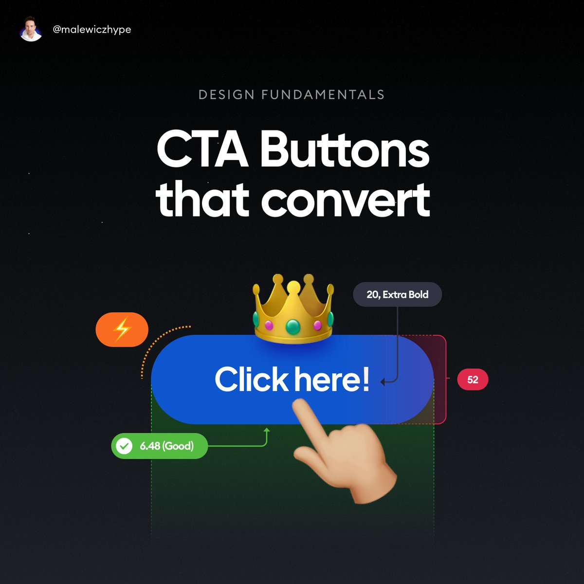
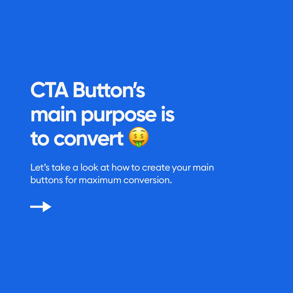
First thing we need to understand is that the main purpose of the CTA is to convert.
It's not to look good, funky or interesting.
People need to CLICK/TAP on it.
👇
It's not to look good, funky or interesting.
People need to CLICK/TAP on it.
👇
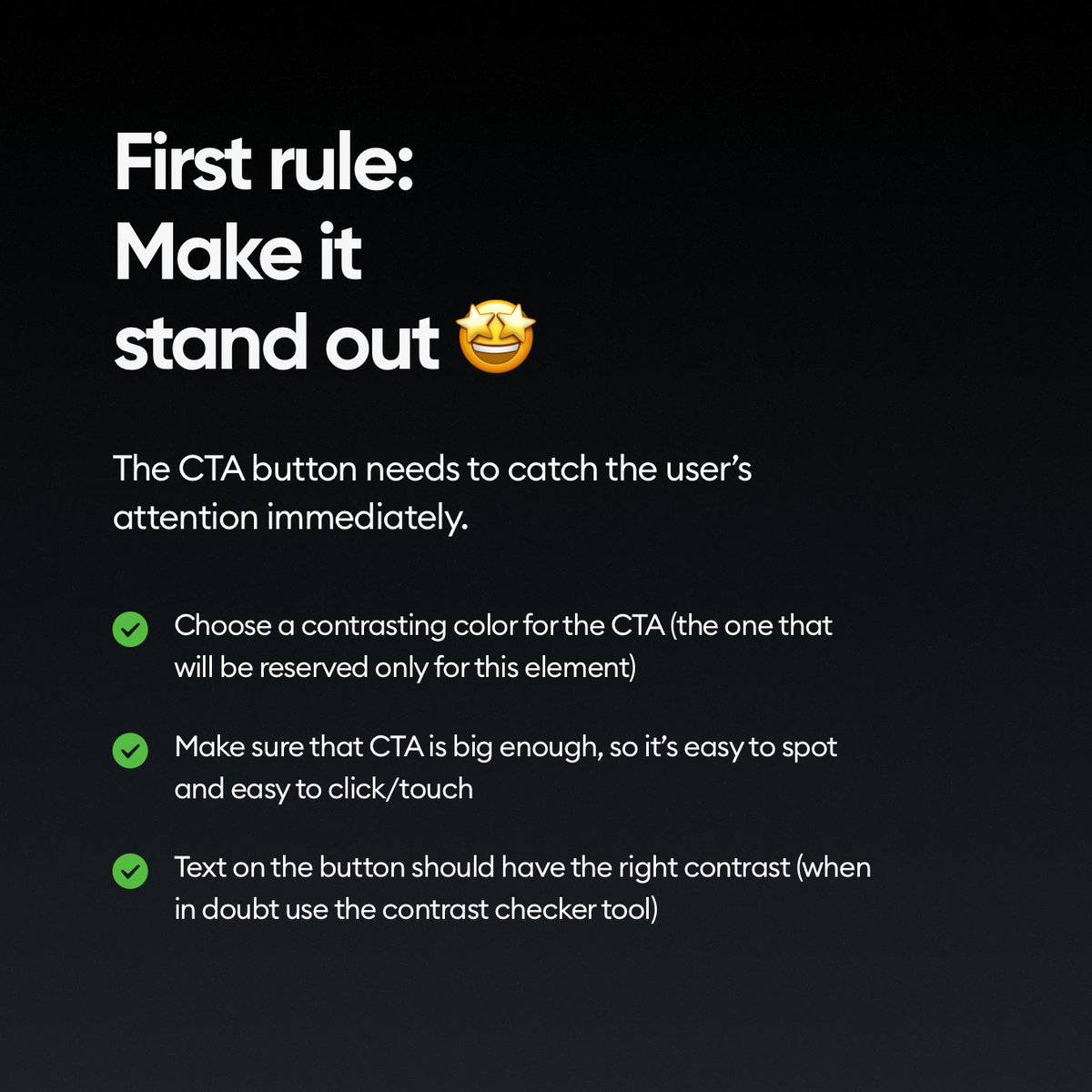
So the first rule is obvious.
✅ Make it stand out!
What it means that there should be NO element on the screen that's MORE visible, punchy or has higher contrast than the CTA button.
👇
✅ Make it stand out!
What it means that there should be NO element on the screen that's MORE visible, punchy or has higher contrast than the CTA button.
👇
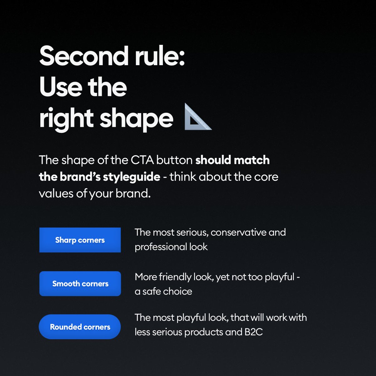
We talked about what shapes (rectangles) to use in another post.
Don't use random blobby shapes for CTA's. That's easy.
But even the roundness is a part of the message here.
👇
Don't use random blobby shapes for CTA's. That's easy.
But even the roundness is a part of the message here.
👇
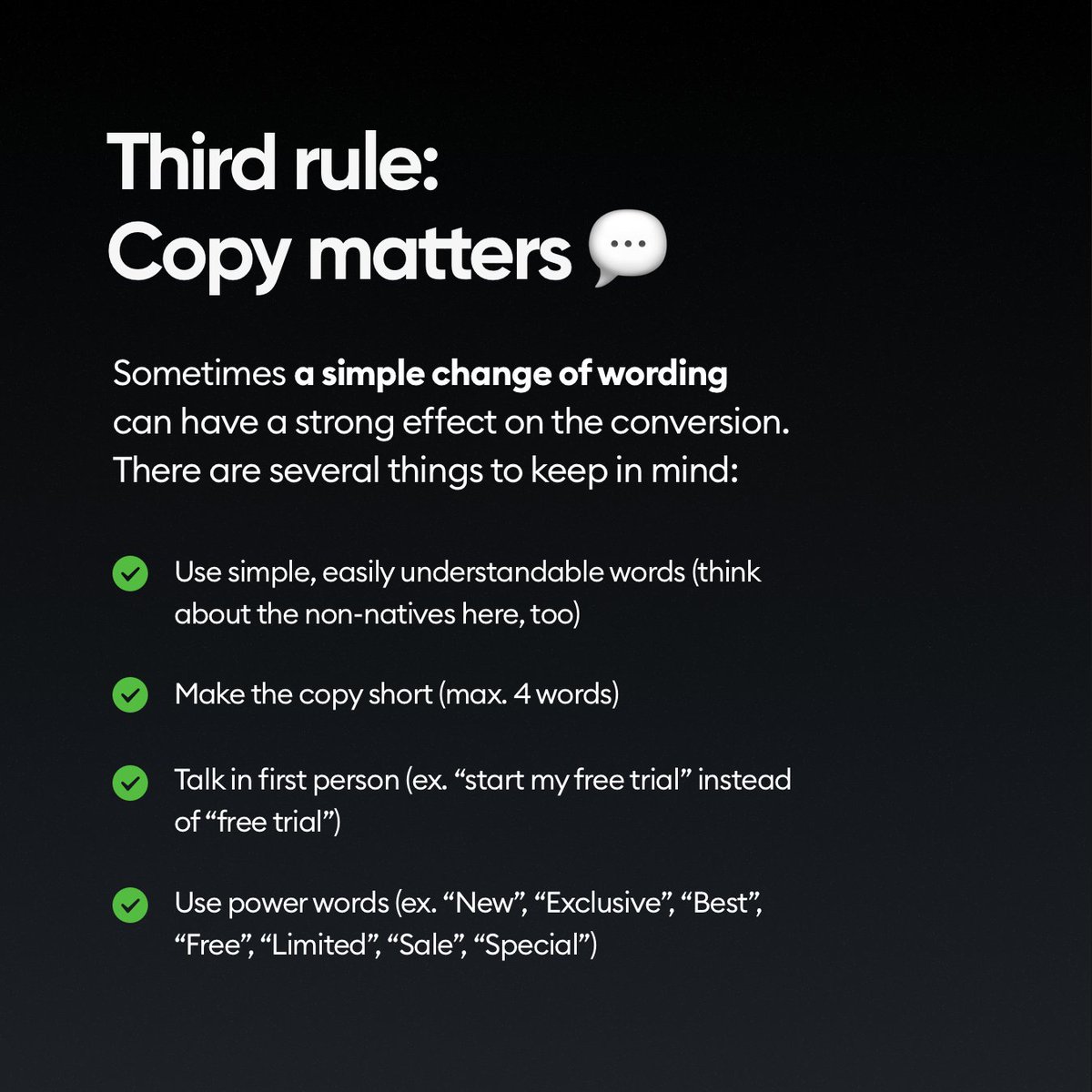
What you write on the button is super important.
You can dream about having a copywriter, or UX writer in the team, but chances are YOU need to do it yourself.
Do it wisely. 👇
You can dream about having a copywriter, or UX writer in the team, but chances are YOU need to do it yourself.
Do it wisely. 👇
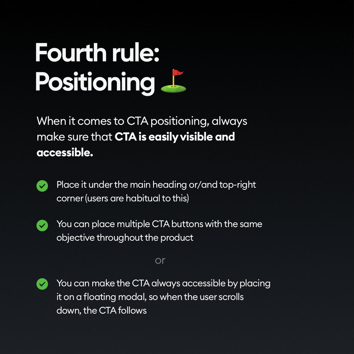
Where you place the CTA button also matters a lot.
If you have multiple CTA buttons, make sure there's only ONE per visible screen portion though!
👇
If you have multiple CTA buttons, make sure there's only ONE per visible screen portion though!
👇
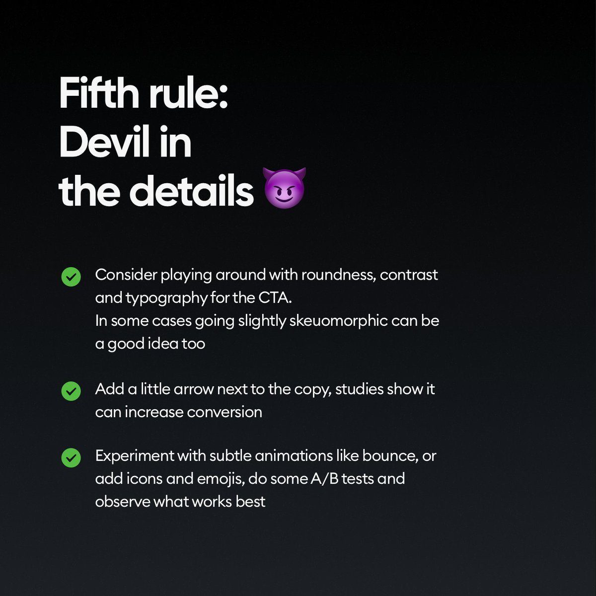
And of course remember that all the little details matter.
You can try different styles, effects and contrasts, but make sure the fundamental part of the button works well.
That it's well aligned, readable and clear! Then experiment.
👇
You can try different styles, effects and contrasts, but make sure the fundamental part of the button works well.
That it's well aligned, readable and clear! Then experiment.
👇
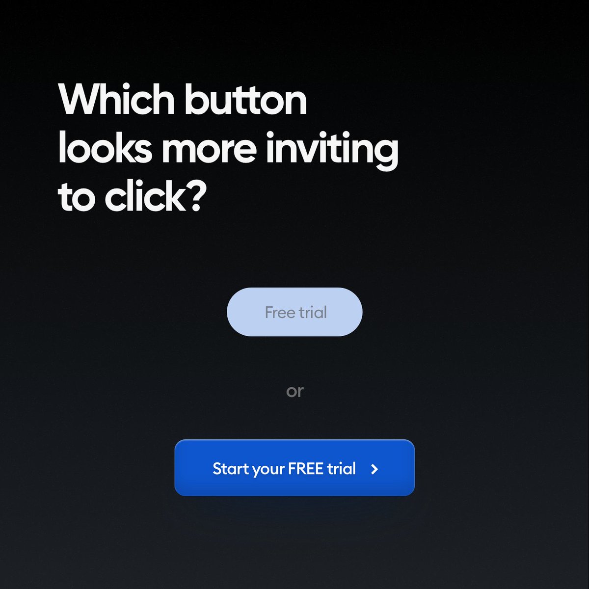
Which one do you think will convert better?
👇
👇
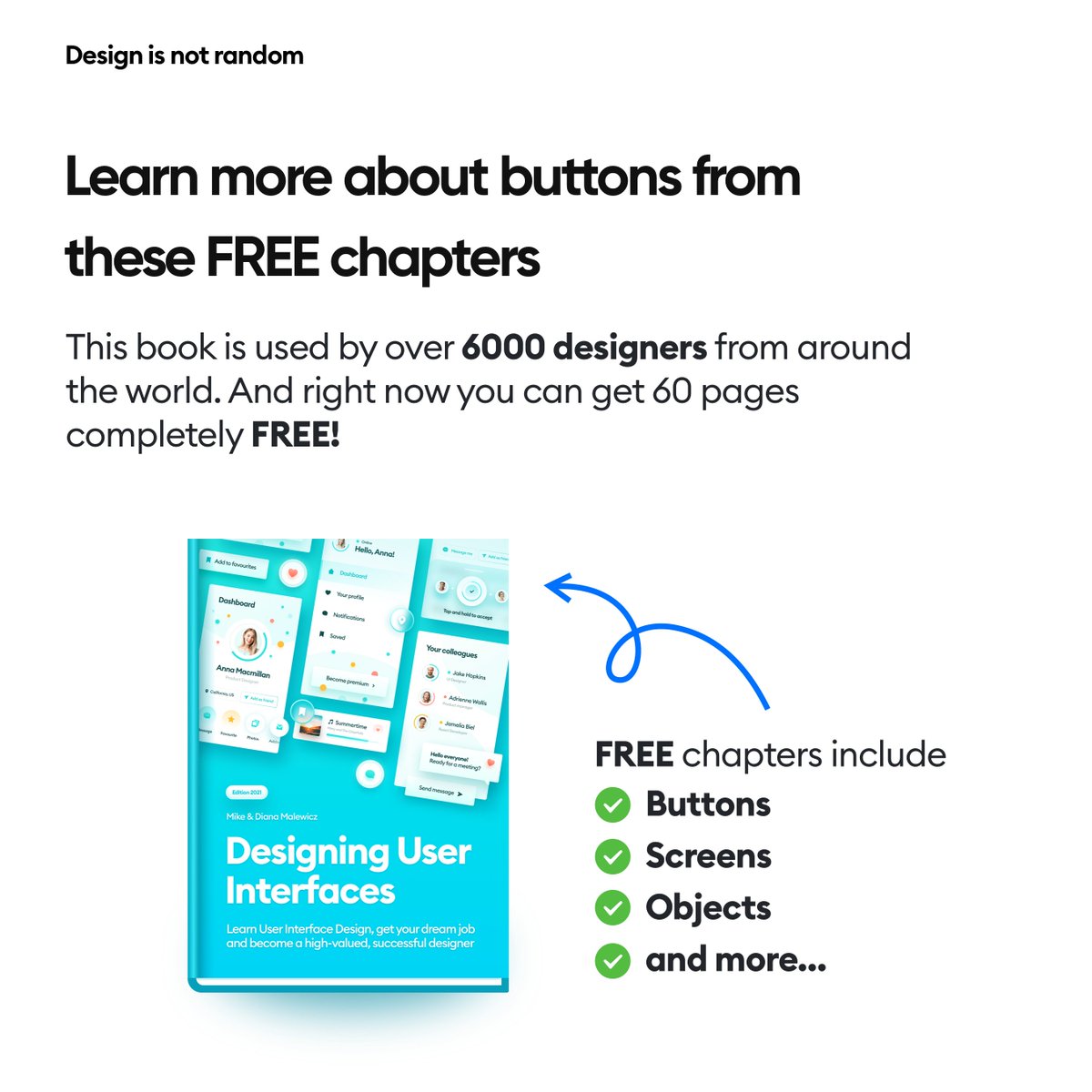
You can learn more about best button practices by getting this free eBook
hype4academy.gumroad.com
It's part of our full Designing User Interfaces book, that you can try for FREE right now.
hype4academy.gumroad.com
It's part of our full Designing User Interfaces book, that you can try for FREE right now.
Want to be an awesome designer?
► Follow me - @michalmalewicz for ORIGINAL content (not recycled 💩 many others do)
► Share the thread so more people can see it 🙏
► Have a beautiful day ❤️
► Follow me - @michalmalewicz for ORIGINAL content (not recycled 💩 many others do)
► Share the thread so more people can see it 🙏
► Have a beautiful day ❤️
Loading suggestions...