

The first rule of font pairing is:
✅ If you're a junior designer, you don't do font pairing.
But there are some other rules. Let's explore 👇🧵
✅ If you're a junior designer, you don't do font pairing.
But there are some other rules. Let's explore 👇🧵
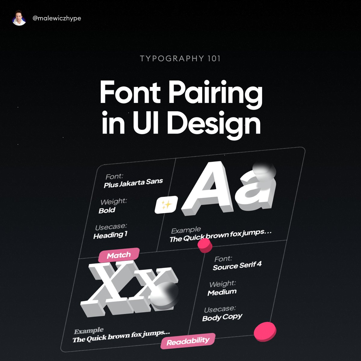
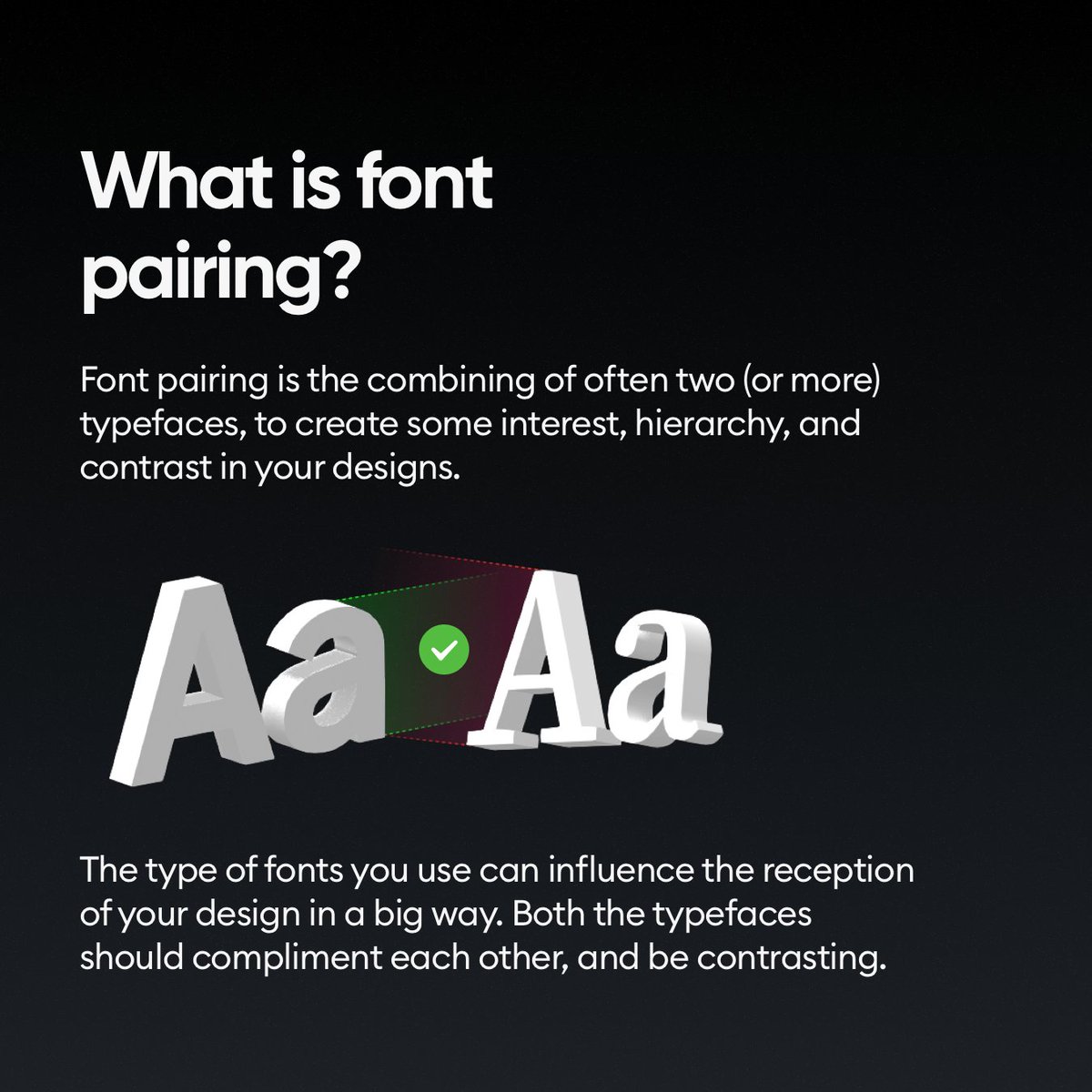
Font pairing means combining two or more typefaces in one design.
The most common type is headline and body copy, but there are some other use cases too.
It's REALLLY hard to do it well...
👇
The most common type is headline and body copy, but there are some other use cases too.
It's REALLLY hard to do it well...
👇
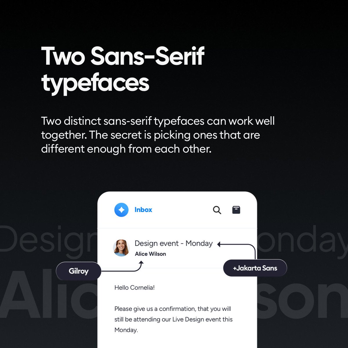
Some go with two sans-serif typefaces.
It's relatively safe, but it's important to not pick two that are very similar to each other, because the small differences will make the users confused.
Doing that without going over the top is tough!
👇
It's relatively safe, but it's important to not pick two that are very similar to each other, because the small differences will make the users confused.
Doing that without going over the top is tough!
👇
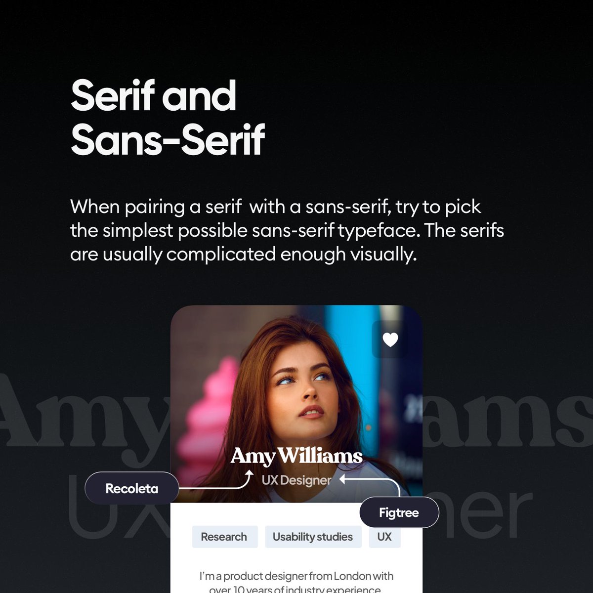
You can also pair a serif (or decorative serif) with a sans-serif.
Here the most common example is actually using a sans-serif for headlines and a readable serif for body copy (longer text).
The less funky the fonts, the better though! 👇
Here the most common example is actually using a sans-serif for headlines and a readable serif for body copy (longer text).
The less funky the fonts, the better though! 👇
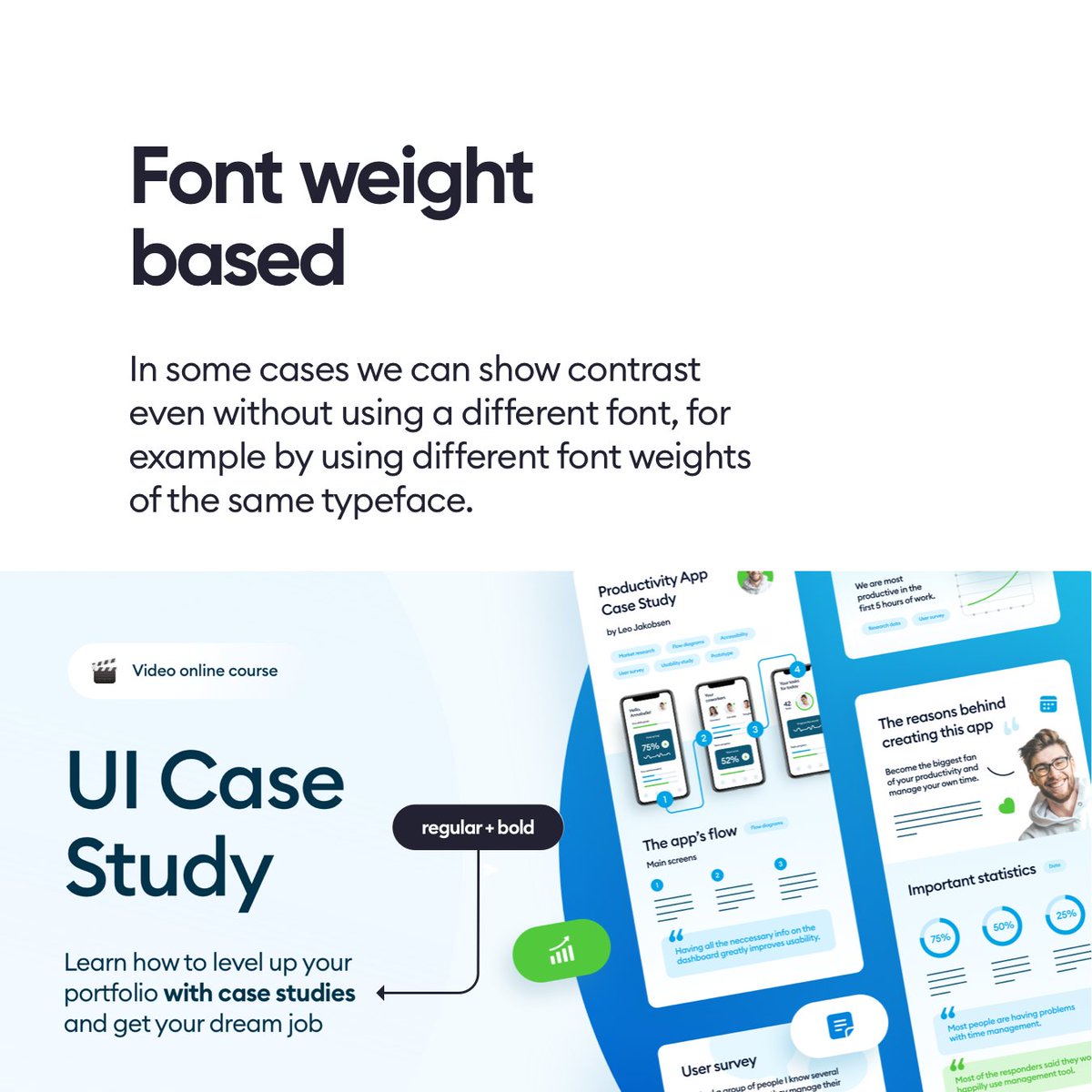
But you don't really have to pair - especially at the beginning.
Use one typeface with weights and sizes to differentiate the different types of content.
It's way easier and safer! 👇
Use one typeface with weights and sizes to differentiate the different types of content.
It's way easier and safer! 👇
Want to be an awesome designer?
► Follow me - @michalmalewicz for ORIGINAL content (not recycled 💩 many others do)
► Share the thread so more people can see it 🙏
► Have a beautiful day ❤️
► Follow me - @michalmalewicz for ORIGINAL content (not recycled 💩 many others do)
► Share the thread so more people can see it 🙏
► Have a beautiful day ❤️
Loading suggestions...